Let's paint snowy landscapes
Presentation
Welcome back. It's almost the end of the year and part of the world is starting to be painted white, and there's nothing better than trying to recreate the beautiful landscapes that are created. In this tutorial I'll show you the steps I followed to paint a couple of these snowy landscapes. Without further ado...
Let's get started!! (o・ω・o)
1. Mountainous landscape
The basis of snowy landscapes is snow, but don't worry, painting it is not that complicated.
Throughout this journey I have repeatedly mentioned the use of a Gouache-style brush; there are many types of brushes that simulate it, but I specifically used this one:
(A) Sketch - Composition
Composition is the way we distribute the elements that make up the subject of the illustration. It is a means based on compositional schemes and laws through which we can tell a story, making it visually striking, captivating and dynamic. The laws of composition are not absolute, but they are certainly a good universal reference that will allow us to transmit emotions, ideas and dreams.
In the following Tips I explain in greater detail different compositions that I will not explain here, in case you want to take a look:
- MIRROR COMPOSITION -
Illustrations of this type often break the first rule about the horizon in the first third of the height. By placing it in the center of the canvas, in many cases, the symmetry is highlighted with a corresponding element in the other half, since both halves of the illustration, the upper and the lower, are very similar, that makes it visually attractive.
This is what I will do, my central object will be a series of mountains that I will place a little higher than the center.
- SIZE DEPTH -
Using different sizes helps us focus an illustration. Small, medium, and large shapes are parameters we use to know how close or far an object is. The largest elements are the ones that are closest and the small ones are in the distance.
Let's see that the pine trees closest to the viewer are visually larger than the mountains themselves.
- BALANCE -
Symmetry: It is a type of balanced composition that is pleasing to the eye and gives tranquility. If we were to divide our canvas into two equal parts, we would have to distribute the elements in such a way that both sides have the same weight. In addition, we must respect the empty spaces so that the illustration can breathe.
In the case of this illustration, if there are pine trees on one side, I will also place a few on the other to balance both sides.
- SKETCH -
This is the final sketch; I put some details in the snow on the ground so that it is not empty. Done, now let's see how to add color.
(B) The colors
Colors go hand in hand with the atmosphere and that atmosphere usually has its origin in the colors of the sky with respect to the time of day. In landscapes I start by painting the sky. A very important step, although I change them later.
- THE SKY -
The magic of painting a beautiful sky is the gradients. The trick to get a realistic sky is to divide it into three sections, or two if there is not much light in the scene. In the first section, the upper one, there will be a dark tone (1), followed by a medium tone (2) and finally the lightest color (3).
Depending on the time of day, the colors that dominate the scene will be different.
► Sunrise: At sunrise you can see the typical blue color of the sky combined with warm colors: pink and yellow.
► Midday: During the afternoon, a more saturated blue is achieved than that found at dawn, here there is not much variation between blue and other colors.
► Sunset: At sunset, the sky changes to an orange combined with a blue that begins to darken. Pink colors can also be included.
► Dusk: At dusk, a deep blue with little luminosity dominates.
► Stormy days: Days with rain or snow have the peculiarity of having a gray sky.
- GENERAL COLOR -
Snow scenes are usually dominated by cold tones (blue, purple, brown, etc. These are those that go from blue to green along with purples on the chromatic circle), which by their nature are ideal for this type of atmosphere, but this cannot be all, we also need light, which is why we must resort to warm colors (such as pink, orange, yellow, etc. Warm colors are those that go from red to yellow). But where to use these warm colors? In the sky, at dawn, in the rays of light, in the points of greatest light saturation.
If you want to know about color in landscapes, I invite you to visit this tutorial where I talked about it:
- THE SNOWY SKY -
Going back to the main illustration, I sketched it in layers; to better manage them, the first thing I did was create a folder, then select all the layers of the sketch and move them inside it.
Note: If you are using the tablet version, to move the layers you must use the two parallel lines that are in each layer on the right side of it.
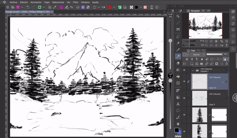
Now, you have to select the folder and lower the opacity to a level that does not disturb the sketch and allows you to paint on other layers without problems.
Now, to apply the color of the sky, the easiest way is to use gradients. To create one is simple:
➀ We will go to the gradients icon found in the toolbar.
➁ In the subtools window we will choose a default gradient. If we hold it down (or right-click on it for PC) a floating menu will appear.
➂ In this menu we will choose the option «Duplicate subtool».
➃ A window will appear where we can choose the name of this new gradient.
To change the color of the gradient, we must first choose it from the color wheel (1) and then click on the small icons above the gradient preview in the «Tool Properties» window (2). And so on with each one.
To delete a section of the gradient, we must open the gradient menu (symbol “+”) and choose the option: Advanced settings > Delete.
Once created, to apply it you have to choose a starting point and move the second point in the desired direction. All this on a new layer below the sketch.
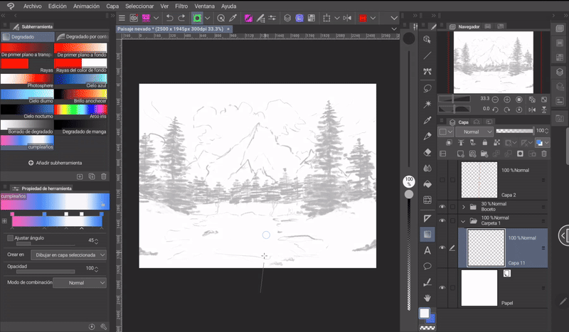
Okay, let's move on to the next point.
(C) The mountains
As for the mountains, first, let's start by understanding that rocks are in themselves a geometric shape, they can be rectangles or triangles grouped together. Once their shape is determined, we erode the edges making them irregular.
The second step is to generate the volume; imagine it as a cube, one side of the face will give better light than the other. To give the mountain a three-dimensional shape, it must be divided in two in a non-linear way, with a certain curvature, and a series of cracks must be made on both faces that will follow the direction of the curvatures. Finally, we decide the direction of the light.
- SNOWY MOUNTAINS -
To add the color we take three shades, the base color, the light and the shadow. With the light color we paint triangular and irregular shapes in the direction of the slope of the mountain. For the shadows we have to make the same shapes with the shade of the shadow in the areas opposite to the light, thus simulating two sides of a mountain.
To paint the base of the mountains I use the «Selection» tool in its «Lasso» variant. I mark the contour of the mountains carefully.
Note: To exit the Selection mode you can click on the first option in the floating menu or in the desktop version with the shortcut «Ctrl plus D.
Now, I select the base color and fill the selection quickly and easily using the paint bucket found in the selection tool flyout menu (2).
Using a hard brush stroke I better marked the irregularities of the mountain crust.
Using a textured brush like the Gouache brushes, I painted the relief of the mountain. This has to be done, as explained at the beginning, in two parts, one facing the light and the other in shadow. These reliefs are not uniform, they leave small, empty spaces in various places.
I painted all these effects on a new layer above the base color. In order to stay within the structure, it is recommended to use the function «Adjust to layer below» which is found in the layer window menu.
To simulate the snow on the mountain, I painted some pure white spots on the sides of the mountain facing the light. The colors in this area should be saturated because the snow reflects a lot of light.
Using the same Gouache brush and selecting the color of the snow, use some lines in the shadow area to touch the mountain slope.
I blurred these lines with the “Color Blend” brush found in the “Blend” section of the toolbar. All this in order to begin to blend the mountains with the background.
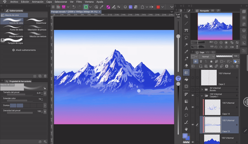
- THE ATMOSPHERE -
Another element that we must take into consideration is that in landscapes (although also with any background), the objects that are in the farthest part will have a color or colors that correspond to the atmosphere.
Atmospheric perspective indicates how an object moves away from the viewer, as it moves away we see this object with reduced clarity, value and saturation. Distant objects seem to have a cooler temperature. The colors in the foreground are saturated or dark, while those that remain in the background lose saturation and become lighter and begin to blur with the environment. For this reason the mountains in the background blend beautifully with the sky.
Another effect of the atmosphere is the fog that covers distant elements, such as mountains, trees, buildings, etc. The color of this fog must match the tone of the sky.
The simulation of this depth effect is done with the «Soft Airbrush» brush and selecting the unsaturated color of the snow. I painted the mountainside without marking the color too much, then blurred it a little with the «Blur» brush. Finally, I lowered the opacity of the layer a little.
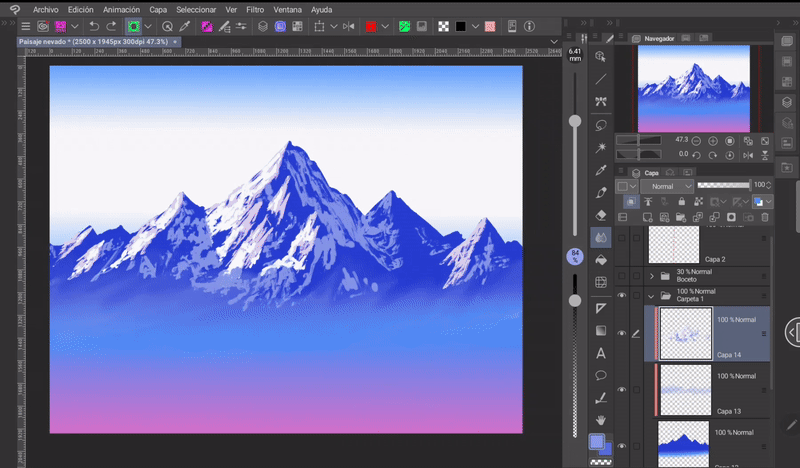
I have to say that at this point I decided to change the background color and the base color of the mountain to another shade of blue. The result is as follows:
(D) The pines
To paint the pine trees, use the following specialized brush that you download from the Clip Studio Assets materials.
I used it this way: First I set the brush to a size corresponding to the depth level. Then I painted the pine trees following the sketch. I erased the parts that were sticking out from the root, so the base would be even on each one.
Note: Another method is to place the different images that can be extracted from the brush on a separate layer, and then select each one individually and duplicate and position it manually with the «Transform» tool. This method gives you more control over the elements.
- ATMOSPHERIC PERSPECTIVE -
Atmospheric perspective indicates how an object moves away from the viewer; as it moves away, the object is seen with reduced clarity, value, and saturation. Therefore, the color of the pine trees in the foreground should be saturated and dark, while those in the background will lose saturation, resulting in a clear view with reduced values.
The brush I used to make these pine trees will paint each one of them black regardless of the color I have selected, but to change them to another color you have to activate the option «Lock transparent brushes» in the layer where they are and then paint over them.
Finally, to apply the typical haze of distant elements we will use the same airbrush method explained before.
With the pines in the middle plane it is the same, except that with these I created a new layer to which I activated the function «Attached to lower layer» so I could paint on them without going beyond the contour of the same. With a blue-grey color I painted on the branches to simulate snow on them.
To paint snow on the branches of the pines we must consider the following:
➀ The snow accumulates in clumps on the branches,
➁ There is a greater amount of snow in the areas that form a «V» type joint.
➂ Due to gravity and the weight of the accumulated snow, it is inevitable that the branch forms a curvature that points towards the ground.
- BRANCHES -
On snow-covered moors it is normal to find branches of plants that have perished due to the cold of the snow. It is a small detail, but adding them adds realism to the scene.
Keep in mind that the branches will also be covered with a little snow.
(E) The snow
Painting snow is very simple, to do so you have to take into account two points:
➀ The first point to take into consideration is the texture, the best way to paint snow is with a textured brush like a Gouache style brush, but you can also make reliefs between one color and another with any other brush.
To simulate this texture you have to make strokes following a diagonal or horizontal direction. In addition, placing small points of light in the shadow simulates snowflakes. But this only happens between color changes, the rest of the snow has a flat texture.
A couple of tools we can use to enhance the texture of diagonal or horizontal brush strokes are:
(A) Liquify: This is located in the Tools window.
(B) Fingertip: Located in the Tools window > Blend > Fingertip.
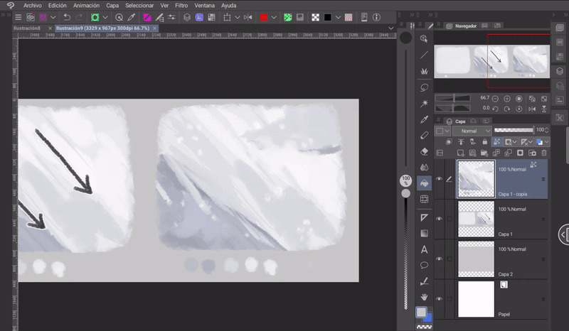
➁ Snow is not always white and grey. It absorbs the colours around it. For example, to paint this snow I used a blue colour, which is the dominant colour in the general illustration, and this with respect to the shadow, and for the snow illuminated by sunlight I used pure white.
It should be noted that if you plan to have snow illuminated by the sun in large quantities, it is not advisable to use pure white. If this colour is used in excess it can burn the image, thus giving an unpleasant sensation.
At this point I added some rocks in the snow. These rocks follow the logic of the closer they are, the bigger they are. Also, these rocks, being sunken in the snow, should have areas covered by it.
(F) The clouds
To paint any cloud, let's look at an example: We can simplify the shape of the clouds with a series of circles piled up against each other, but not all of them should be the same size, some huge, others small. Let the contrast of shapes be visible. After the shape, we paint the base color.
Then we will choose the direction of the light, in this case, the light comes from above, so the lower part will be dark, and successively as we go up the colors will become light. Finally, we gently highlight with colors the shape of the circles we made at the beginning, but these have to be in some parts showing a fusion between two or more adjacent circles.
To paint clouds more easily, we can always use a specific brush. In my case, I usually use this one when painting clouds:
Note: The clouds of this winter season are simpler and with few well-marked shadows.
(G) Reflections in the water
In my illustration I placed a small lake (which is filled with white so far) that I want to reflect part of the mountain and the sky. Reflections in a specific area are easy, let's see how:
➀ You have to group all the elements you want to reflect in a single layer. Then you have to merge them, to do this we hold down the folder (right click if you are working on a PC), a menu will appear where the option we need will be «Merge selected layers».
Note: I recommend keeping a copy of the folder to be able to continue working on the layers.
➁ The layer that will be created must be inverted vertically. Using the «Transform (CTRL plus T)» tool. The option to invert is found in the «Tool Properties» window once the transform tool is active.
➂ The next step is to hold down the «CTRL» key while selecting the thumbnail of the layer where the lake is painted (you need to have the desired area completely painted in some color). This will select the outline of the lake.
If you are using the tablet version of the program, the «CTRL» key will be found in the «Keyboard Edge» panel.
➃ After the selection is established, we deactivate the «CTRL» key.
➄ Now, we will select the inverted layer (1).
➅ Finally, we activate the «Layer Mask» function (2) in the «Layer» window menu.
Done, now we have the reflection only in the selected area.
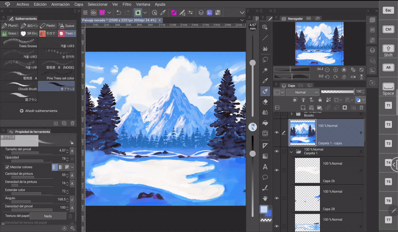
In a layer above I marked the depth of the edge of the lake following the edge of the lake with a dark blue color.
Finally, with the «Liquify» tool we will make ripples from left to right. This helps to simulate the undulation of water.
- TEXTURE -
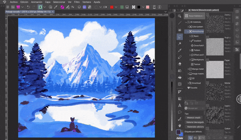
I really like adding textures, and this one is no exception. To do so I do the following:
➀ I go to the following path: Material> Monochromatic pattern> Texture.
➁ Once there I drag the texture that I like the most.
➂ Now, in the «Layer properties» window in the «Effects» section and activate the «Overlay texture» option.
➃ Finally, I modulate its intensity, this is done with the «Strength» sliding bar.
- RESULT -
2. Luminous landscape
Now let's learn more concepts about snow through another example with a different state of the day.
(A) Sketch - Composition
- RULE OF THIRDS -
The rule of thirds is based on the golden rule, the golden ratio, but it is easier to use. This rule states that regardless of the size of the canvas we can divide it into two thirds of the vertical and horizontal; these intersections create four points, and it is more pleasant to place our focal point at these points.
This type of composition will help me determine the best position for the tree and which points it is best to place the steps so that they look better aesthetically.
(B) The sky
I start by setting the base colors with the selection tool as I did in the previous landscape. In this case, I didn't make the sky with the gradient tool, but I just painted the whole layer.
Use a hard brush to paint the darkest part and then blend it with the «Color Blending» brush.
(C) The snow
To mark the texture I used a dark blue color and a brush with Gouache texture, giving diagonal brush strokes, especially on the edges.
Once again, using the «Color Blending» brush, I blended the shadow.
- SNOWFLAKES -
Snowflakes have the characteristic of being able to shine, this is because they are geometric structures that reflect the light that hits them. This is why they are more visible in bright environments than in dark ones. Let's see how to do it.
First I use the «Spray» brush found in the section: Brush > Airbrush. I paint over the snow with this in the same color as the snow on a new layer.
Now, I change the blending mode of this layer from «Normal» to «Add (glow)».
The next step is to duplicate the layer by holding it down and then choosing the corresponding option «Duplicate layer» from the menu.
Finally, I applied a Gaussian blur to the duplicated layer. To do this, go to the following path: Filter > Blur > Gaussian Blur. And move it below the original. Done.
(D) The trees
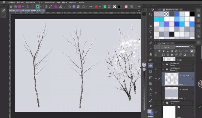
Adding snow to trees is easy, you first need to establish the shape of the trunk and the corresponding branches. When doing so we must remember that these structures are not straight, but curved. If making these types of shapes is difficult you can always resort to the assets of Clip Studio Assets.
For example, the trees below are made thanks to this brush:
The second step is to add the snow, and when doing so we must take the following considerations into account:
➀ The snow mostly accumulates at the joints of the branches (those that form a «V»).
➁ The trunks acquire a whitish tiger-like color due to the snow.
➂ The snow accumulates at the base of the trunk forming clumps that rest on the base of the trunk, but the degree of accumulation goes hand in hand with the amount of snow in the scene.
To paint the snow on the trunk, just choose the corresponding color and create a new layer on top. To paint the accumulated snow, any textured brush is fine, but I used this one:
- CONTRAST -
For this type of scene with bright and clear skies, a light-dark contrast is essential. In this type of contrast, luminosity is lost when black is added, and lightness is gained when white is added. The best example is the contrast between black and white, although we can achieve the same with other color combinations.
This is why the tree, despite being far away, is a dark color and does not blend with the color of the sky as in the previous example.
(E) Projected shadow
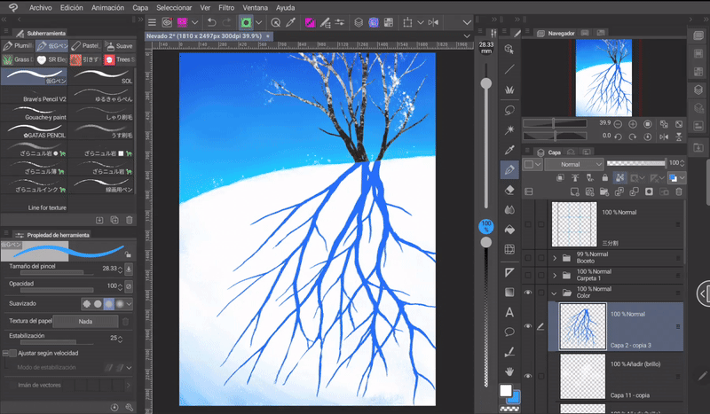
In landscapes we constantly see how its shadow is projected and this being a tree directly exposed to the sun without any obstacles, it is logical that it has a projection behind it. To create a projected shadow you have to do the following:
➀ Duplicate the tree layer.
➁ Activate the «Transform» tool. This can be done with «CTRL plus T» or in the following path: Edit > Transform.
➂ Once the previous tool is activated, in the «Tool Properties» window there are two options: «Flip horizontally» and «Flip vertically». These are the options that allow us to reflect the shadow of the tree. The icons clearly show what type of rotation each one does.
➃ You have to make sure that the base of the shadow matches the base of the original tree.
To better fit the shadow to the perspective of the hill, you can use the different transformation tools found in the "Tool Properties" window when the transform function is active. Another option would be to activate these options from the path: Edit > Transform > Choose from the available options.
You need to lock the mirrored layer with «Lock Transparent Pixels» and start painting with a brush. The color I will use for the shadow will be blue.
So that the color does not remain static throughout all the branches, what I will do is create a gradient using a light blue tone at the tip of the branches that I will then blur with the «Color Blend» tool.
- LIGHT EDGE -
Last but not least, there is an ambient effect that will give a plus to landscapes, that is, the sun's rays. When the light hits the skin or any other object, a saturated light edge is generated between the shadow and the light. To achieve this effect, do the following:
➀ You have to click on the «CTRL» key while clicking on the layer thumbnail, this allows you to quickly select what it contains.
➁ Once you have selected the content of the layer, go to the fourth option of the floating menu of the selection tool, which is called «Expand selected area». If you are using the tablet version, for this point you must deactivate the «CTRL» key from the side shortcut panel.
➂ In the window that will open we can choose a range in pixels that allows us to expand the border of the selection, in my case I chose 1px.
After clicking accept we can see how the selection range increased without losing its shape.
➃ Now, we need to create a layer below the shadow. Using the selection, I will paint on the new layer with a pink color using the snow brush I showed earlier.
I use a pink tone because it is a color that goes very well with blue and also, I am looking for a fantasy effect.
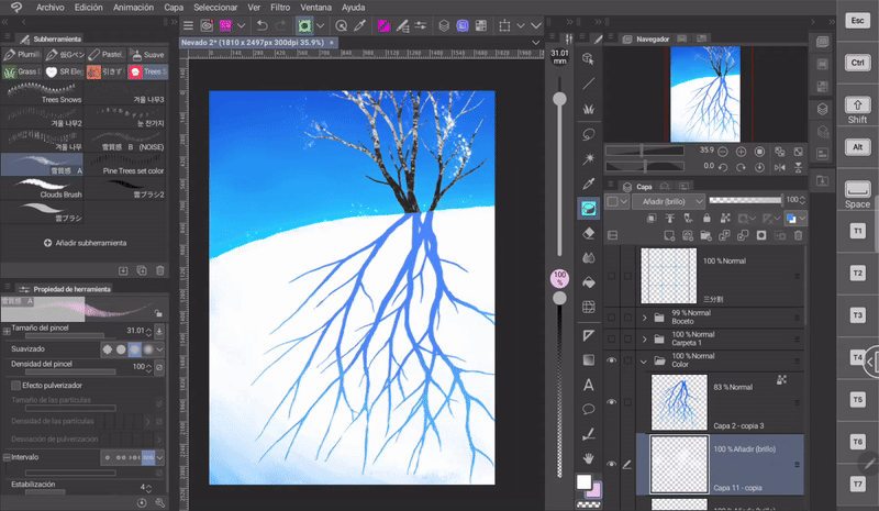
After the above, it is time to merge both layers and lower their opacity a little and apply a Gaussian blur.
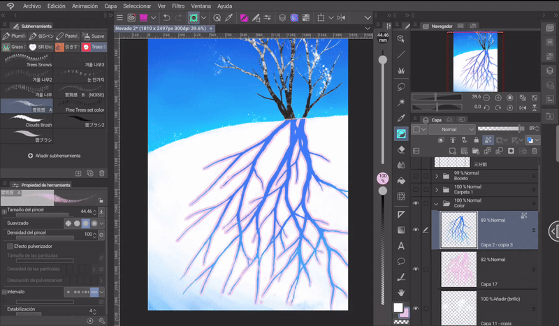
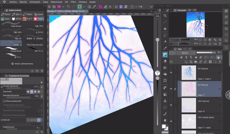
Using the snow brush I outline the edges with pink and to erase some areas I use the same brush, but keeping the transparency selected on the color wheel. Also, using the same technique, but with a splatter brush we can erase the tips of the branches.
- FOOTPRINTS -
For the footprints, as a first step, paint the oval shapes with a dark color.
There is one very important fact to remember: Footprints have a certain perspective. The closest ones will be large and will gradually fade away, becoming smaller the further away they are from the foreground. To improve the perspective we can use the selection and transformation tools.
In the section "Mode" in the "Tool Properties" window we will find "Free Transformation" with which we can adjust the perspective of what is selected.
Another point to consider when painting footprints is the details. The footprints that are closer to the foreground will have a defined shape and greater detail, but the further away they are, the more these qualities are lost and the more blurred they become.
To mark the depth of the footprints, I advise not using very saturated colors; shades that tend toward gray look good. Regarding the question of depth, two concepts must be taken into account:
➀ When we step on the snow, it does not disappear, but rather it moves to the sides, forming an accumulation of snow on the sides of the footprint.
➁ To create the illusion of depth, I do it in the following way. The side where the light hits directly will have an illuminated edge and the opposite side will have a shadow.
- RESULT -
3. Use assets - Stormy landscape
In the Clip Studio Assets gallery you can find a wide range of materials that you can download for free or for a fee. These materials can be a great help in speeding up the work process. In this section I will show you how I made a winter landscape using Assets materials.
- STORMY WINTER PASSAGE -
For this landscape I started by painting the background. As I explained in a previous section, stormy winter landscapes are usually filled with grey tones. I also painted a small hill where the trees will grow.
The brush I will use will be this one:
It is a brush that has a wide variety of snow-covered trees:
- DEPTH -
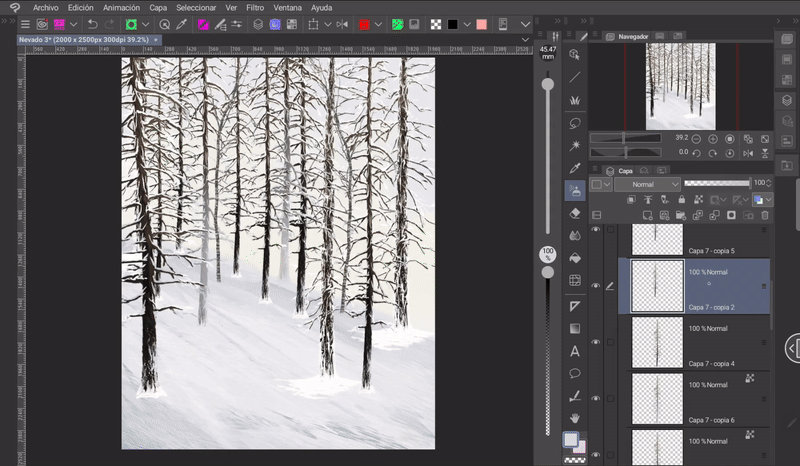
I placed each tree on an individual layer, this allows me to modify each element more easily. The composition is as follows:
➀ The trees are arranged in such a way that they look like they are behind each other. At this point it is important to avoid the root of one tree being aligned with the root of another.
- ATMOSPHERE -
To indicate how an object moves away from another and at the same time blends into the background, we will use haze. To apply the typical haze of distant elements I did the following:
➀ First I blocked the transparent pixels with the corresponding function.
➁ Now, using the «Soft Airbrush» brush and selecting the color of the snow, paint each tree on its respective layer. The ones that are further away will be almost whitened, their silhouette will be barely perceptible and as they get closer to the foreground they become detailed and less foggy.
- RAYS OF LIGHT -
To simulate rays of light passing through the trees, paint diagonal lines on a new layer above the snow and below the trees that simulate following the direction of the light with a yellow, almost white color. I changed the blending mode of this layer from «Normal» to «Add». And finally, I blurred the edges of the rays a little. Done.
- RESULT -
- BLIZZARD -
We can also find brushes that simulate falling snow. For example:
Farewell
I hope that what you see here helps you to make your own snowy landscapes. It would be very helpful if you share it and give me a like. Thanks for coming here! See you another time! (⌒‿⌒)
Bye bye.
Learn more about me at:






Comment