
Presentation
Hello! Welcome. On this occasion we will explore together the use of color to bring beautiful landscapes to life. They can be landscapes attached to reality with classic colors or landscapes with unconventional atmospheres that provide a perspective of a fantastic world. To achieve all this we will go back to the already classic color theory, but of course, with some tips to make it easier. I hope it is useful. Without anything else to say…
Let's begin!!
1. The basics of color
In order to choose colors from the color wheel, we must know certain fundamental concepts about color.
(A) Properties of color
Each color is made up of these three characteristics in different degrees. If we combine these characteristics in different degrees we obtain bright, neon, muted and dim tones, among others.
TONE: The tone is what we call the colors: Red, green, blue, etc. These are the first ones we select on the color wheel.
BRIGHTNESS: Brightness is the ratio of white or black levels that degrade a color. The higher the percentage of white, the lighter and brighter it will be, while the higher the percentage of black, the darker it will be.
SATURATION: Saturation is the degree of purity of a color, it defines its intensity. It is determined by the amount of gray it contains; the more gray, the lower its saturation and the less gray, the more saturated it will be.
(B) Color classification
Colors can be classified as cool and warm, this classification is based on color psychology according to what they transmit to people. The reason they are known by that name is because they are visually associated with a low or high temperature.
- WARM COLORS -
These colors transmit sensations of high temperatures. Warm colors are those that range from red to yellow. These colors transmit to the viewer the sensations of enthusiasm, passion, joy, love, energy, warmth, etc. They can also represent a time of year, for example: autumn.
- COLD COLORS -
In contrast, we have cold colors. These colors transmit sensations of low temperatures. They are those that range from blue to green along with purple. Blue is the color that is most closely related to cold tones, which, if present in other tones, helps to make it feel colder. The more blue a color has, the colder it will be.
Cold colors are the tones of winter, of the night, of the seas, lakes, tranquility, calm, solitude, serenity, sadness, the night, winter, etc.
(C) Color harmonies
We tend to expect to find a series of combinations in nature and in illustrations that we innately like more than others. In this way, when a multitude of similar colors appear in the scene, we will feel more comfortable than when there is a confusing mixture of several disparate colors. For this reason, it is good to know color harmonies; by using them correctly, we can create palettes that give credibility to our illustrations.
- ANALOGUES -
Analogous harmony is formed by the implementation of colors that are close on the chromatic circle. Because of their proximity, they combine well with each other. Like blue, violet, and pink, which are sequentially found near each other on the circle.
- COMPLEMENTARY -
Complementary colors are those that are opposite on the color wheel, this combination creates a contrast. This harmony can be used to contrast the figure with the background, also to contrast opposing ideas.
NOTE: It doesn't have to be the exact opposite, it can also be a color close to the opposite.
- TRIAD -
To create a harmonic triad, three equidistant colors are used. As you can see in the illustration below, yellow, red, and blue are three colors apart from each other.
NOTE: As with the previous example, this is just an example, it doesn't need to be an exact calculation.
(D) Color contrast
Contrast works as an element of composition that helps to highlight one element from among all the others. This is known as visual hierarchy. Contrast also serves to delimit the form, but to understand this better let's look at an example.
First, if we convert an illustration to grayscale we should be able to distinguish the form. This means that our values are well selected.
TIP: One way to keep an eye on our value selection process is to create a new layer above the others which we will paint black and also change the blending mode of this layer to: Saturation.
With this method we can activate and deactivate the layer at any time.
There are different types of contrasts that we can create using color. Knowing them will help us know which colors will be best to complete our palette.
- LIGHT-DARK CONTRAST -
In this type of contrast, luminosity is lost when black is added, and clarity is gained when white is added. The best example is the contrast between black and white, although we can achieve the same with other color combinations.
- TEMPERATURE CONTRAST -
Warm colors surrounded by cool colors will be perceived as warmer, while likewise, a cool color surrounded by warm colors will feel cooler.
This type of contrast is very typical in landscapes. Normally, the distant part of the landscape is cold because it blends in with the atmosphere, but if you want to bring the focus of attention to this area you can break the rule and use warm colours in areas that would normally be cold, as in the following example.
(E) Color palette
Once we know the above concepts we can start creating our own palettes. To create color palettes I follow the following advice:
In principle we need three colors: (1) the base color, (2) the light and (3) the shadow. As an addition, to enrich the composition a color for the reflections.
✗ The normal thing would be to think of a light color for the light and a dark one within the same range of luminosity and saturation of the base color, but this will result in a dull and uninteresting composition like the following one.
✓ But if now instead of looking for light in the same range of tone we move to other adjacent or complementary tones we get vivid and interesting colors.
Tip: For the lights we can use warm tones, while for the shadows we can use cold tones.
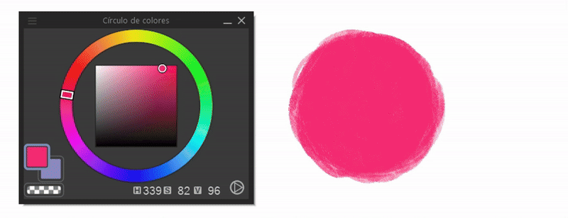
For example: Start by taking a saturated pink color (1), now it is the turn of the shadow; in this case the closest cold color (adjacent) is blue (2), take a blue in the same level of saturation and luminosity as with the pink. Now with the light I chose a complementary color (opposite) to blue within the warm tones, which in this case would be yellow (3) and as with the others within the same saturation and luminosity values (but this is optional). Finally, for the highlights I use a luminous color adjacent to the shadow (4).
Now let's look at these steps in a small example of a landscape.
➀ Think about what effect I want to achieve, an effect of contrast and harmony. If I want a contrast I choose to use a harmonious triad or complementary triad, while a harmonious composition with fewer color changes would be a palette of adjacent colors.
➁ The second and most important step is to choose a main color, the one from which all colors will be derived regardless of which color harmony we choose.
If we have a landscape in broad daylight we will use a blue color for the sky, this can be any color.
Now it's time for the grass, which would be green, but what green should we use? That is the question. Let's look at some guidelines for choosing the color.
► Saturated tones: If we want our palette to be composed of saturated (bright) colors, we must restrict the selection of colors in the square or triangle of the color at the top. The more there are in the upper area, the more saturated they will be.
Important: To achieve a good harmony of saturated tones avoid grays, excessive white and black.
► You have to think in terms of the main color, in this case blue. So, we will move on the color wheel to a position close to blue or one that complements it. I chose a yellow close to green that is not too saturated. This process is more trial and error. You have to be patient.
NOTE: Not all colors have to be supersaturated, unless you want to give an extremely powerful effect.
► Shadows: We will move diagonally towards the dark tones and analogously towards another color. You can do both movements or just one. In this case I moved to the right to a green tone and then to a less saturated color within the color square. As a guide we can use the logic of cool colors.
To improve the depth of an illustration I have learned that what is dark has to be darker, by this I mean that we must not overdo it, we must not be afraid to use deeper tones, but of course, without reaching total darkness.
With this we achieve greater contrast as explained before. In order to avoid resorting to dim tones within the same value of the base color we must move to adjacent tones. In this case, instead of choosing a darker green for the shadow of the grass, I choose to move to an adjacent cool tone that I can use as a shadow.
Following this same process, you can get shadows of any color. One option is to go as far away as you want, but always within the logic of color harmonies. As you can see, the shadows don't have to be exactly dark.
► Light: With the lights we will use warm and saturated colors. We do not necessarily need to use white, in fact, in many circumstances it is advisable not to use it excessively.
For the grass in this landscape I will use a yellowish color that tends to the base green of the lawn.
► The color white: The color white is dangerous, it is a color that burns the image. It is because of this characteristic that it is not advisable to use it excessively, specifically, it is recommended for details or to balance with black.
In landscapes, the whitest thing we usually find are the clouds, but the truth is that they are not white. They absorb the colors of the atmosphere, that is why if the sky is blue, the clouds are blue or colors that harmonize with the main color.
In some cases where we want to add white to the clouds, we will do this in specific areas where the light hits directly, so we must keep in mind the source of the light.
For the shadows, we look for a less saturated color than the base color or another in contrast on the diagonal. As you can see, the shadows turn a little to the main color, in this case blue.
► The atmosphere: It is important to remember that colors, no matter how varied, must be linked to a main color. If the predominant color in a landscape is blue, the others will dance around it, and if it is a dark blue like that of the night, they will follow the same logic.
The same thing happens with supersaturated color combinations, because in the end, no matter what shade it is, it does not escape the logic of color theory. As long as you follow analogous, complementary, triad schemes, among others, everything will look good.
TIP: As a final point, I recommend practicing with color combinations from other more experienced users that we can find on the Internet. By working with them we will begin to find patterns between the color combinations and when we finally assimilate them, it will be time to make our own.
2. Color in landscapes
Now let's see how to apply the acquired knowledge in a landscape. We will see how to apply color following the tricks of landscape composition.
► The sky
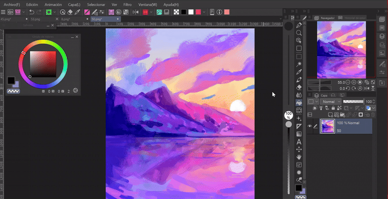
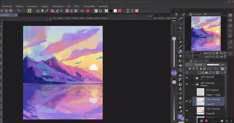
Once we have our sketch done we can start giving color to the illustration. In the landscapes I start by painting the sky.
The magic of painting a beautiful sky is the gradients. The trick to get a realistic sky is to divide it into three sections, or two if there is not much light in the scene. In the first section, the top one, will be the darkest (1), the middle will be the medium tone (2) and finally the light color (3).
Depending on the time of day, the colors that dominate the scene will be different.
► Dawn: At dawn you can see the typical blue color of the sky combined with warm colors: pink and yellow.
► Midday: During the afternoon you get a more saturated blue than the one found at dawn, here there is not much variation between blue and other colors.
► Sunset: At dusk the sky changes to an orange one combined with a blue that tends to orange. Pink colors can also be included.
► Dusk: At dusk a deep blue with little luminosity dominates.
These are color schemes for realistic atmospheres, but if we want something fantastic we can always resort to unconventional colors.
► The plans
The planes help to build the elements of the illustration in order of importance. The differences in size, color and texture of the planes give the sensation of depth and distance. It is important to take into account on which plane of depth the focus of attention will be drawn, so that in this way the previous and subsequent planes will guide you to it.
This is why we must manage levels of detail, the elements close to us should be more detailed, while those behind our focus of interest should consecutively lose detail. Otherwise, if we draw everything in detail it will be exhausting for the viewer to look at.
The planes are divided into: Foreground (1), middle ground (2) and background (3).
The planes also apply to color, closer elements will have warmer/more saturated colors and farther elements, colder/unsaturated**; this is due to the atmosphere. Although sometimes for artistic reasons we can break this scheme and invert it as explained before.
► To the atmosphere
Another element that we must take into consideration is that in landscapes (although also with any background), the objects that are in the farthest part will have a color or colors that correspond to the atmosphere.
Atmospheric perspective indicates how an object moves away from the viewer, as it moves away we see this object with reduced clarity, value and saturation. Distant objects seem to have a cooler temperature. The foreground colors are very saturated or dark, while those that remain in the background lose saturation and become lighter and begin to get lost in the environment. For this reason the mountains in the background blend beautifully with the sky.
Another effect of the atmosphere is the fog that covers distant elements, such as mountains, trees, etc. The color of this fog must be in accordance with the atmosphere.
► Base colors
The colors of the elements of the illustration should follow the regime of the dominant color, blue in this case.
► The mountains
As for the mountains, first, we start by understanding that rocks are in themselves a geometric shape, they can be rectangles or triangles grouped together. Once we have their shape, we erode the edges making them irregular.
The second step is to generate the volume; imagine it as a cube, one side of the face will give better light than the other. To give the mountain a three-dimensional shape, it must be divided in two in a non-linear way, with a certain curvature, and a series of cracks must be made on both faces that will follow the direction of the curvatures. Finally, we decide the direction of the light.
To add the color we take three shades, the base color, the light and the shadow. With the light color we paint triangular and irregular shapes in the direction of the slope of the mountain and, on the contrary, we have to make the same shapes with the shadow, thus simulating the two sides of a mountain.
Mountains are not main elements, unless they are really main elements, so they do not need to have great details. This is for one reason: the planes.
In my case, I made a lot of stains trying to simulate the relief of the rock formations of a mountain.
Here is another example of mountains.
► The grass
The grass is easy, we will establish a base color, now with a dark color we will create some spots that will be the shadows. These should not be uniform; always consider the direction of the light.
To simulate grass, you have to create small protuberances of plants and grass following the patches on the ground.
► The clouds
We can simplify the shape of the clouds with a series of circles piled up against each other, but not all of the same size, some huge, others small. Let the contrast of shapes be visible. After the shape, we paint the base color.
Then we will choose the direction of the light, in this case, the light comes from above, so the lower part of the cloud will be darker, and successively upwards the colors will become lighter. Finally, we gently highlight with colors the shape of the circles we made at the beginning, but these have to be in some parts showing a fusion between two or more adjacent circles.
Depending on the level of detail you want, you can put more emphasis on the texture, thus improving the definition of the details. In the case of this illustration, they are flat like a complete mass.
Here is another example of clouds.
Clouds take on the color of the atmosphere, they will borrow colors from the sky, so they should be painted with a similar color scheme.
► Water
Just like in the sky, water has three colors: a dark color, a base color, and a light color. The further away the water is, the more it will get lost in the color of the sky.
- REFLECTION ON WATER -
Reflections are easy, you have to group all the elements you want to reflect in a single layer. Now you have to duplicate it and invert it vertically. We will lower the opacity of this layer as much as necessary. Finally, with the liquefy tool we will make ripples from left to right.
Here is another example of water.
► Rays of light
Last but not least, there is an ambient effect that will give a plus to landscapes, that is, the sun's rays. When the light hits the skin or any other object, a saturated light edge is generated between the shadow and the light. To achieve this effect we will use various light combination modes such as: overlay, add.
The colors that dominate these edges are orange and yellow.
Note: This edge is only shown with direct light.
These borders are usually applied in reflected shadows, but they can also be used in more creative ways, it depends on creativity and personal taste.
► Details
Finally, this is something more personal, the level of rendering will depend on each one. For my part and as you can see, details up to realism are not very common in me, at least for now.
► Tools to improve color
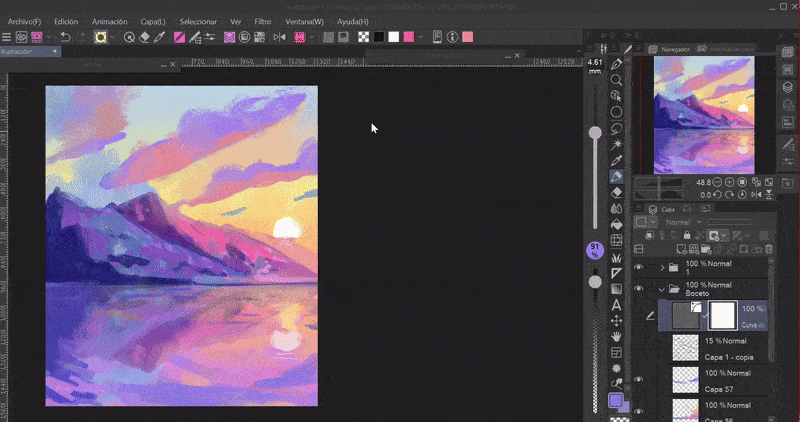
Choosing colors is more of an art than a science, so if our color palettes are too unsaturated or saturated we can fix it using some of the program's tools. The functions are located in the following path: Layer > New tonal correction layer.
- TONE CURVE -
In the interface we find that the left side controls the light and the right the darkness.
At each end of the curve there are two points, the first point is the brightness (top right), if we drag it down it will begin to darken. The point at the bottom left is the darkness, if we drag it up it will begin to lighten.
By playing with the parameters we can modify the luminosity of our composition. If we want it to only apply to one layer, what we will do is attach the correction layer to the lower layer. By clicking on any interval of the central line new points will be created that will allow us to precisely control the color parameters.
- COLOR BALANCE -
This tool is intuitive and very easy to use. In addition, you can maintain the luminosity, which the previous ones do not.
In color balance, in the sliding bars we find the colors cyan, magenta and yellow with their respective opposites on the other side, red, green and blue.
As for the postponement balance section, we have the option to control the shadows, midtones and highlights. Maintain luminosity, maintains the light of the illustration if it is left activated.
With these tools it is very easy to improve intensity, luminosity, saturation, brightness and everything that involves color correction.
Essential tools to enhance colors.
Farewell
I know I'm not the best artist, but I hope that what I've seen in this tutorial is helpful. I'm still learning, but despite that, I want to be able to share something new with you that will also help you.
It would be a great help if you share it and give me a like. Thanks for getting here! See you later!
Learn more about me at:
Users who liked this post


Comment