🌼 Let's paint flowers in the traditional style
Presentation
Hello! Welcome back. It's me again (⌒‿⌒). In this TIPS I'll show you the process I follow to paint some flowers as if they were handmade; from the structure to the color. I hope you find it useful. Without further ado...
Let's get started!! (o・ω・o)
1. Tools
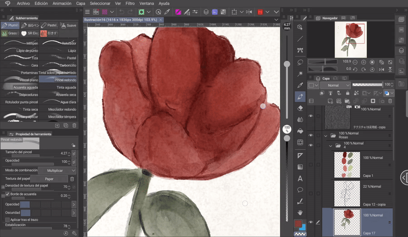
To make these flowers I used the watercolor brushes that come pre-set in the program. I generally like these a lot, but you can also use any textured brush that emulates traditional materials (chalk, charcoal, wax, pastel, etc.).
I have all the default brushes in one folder, but if you haven't modified the default workspace yet, then you'll find these brushes in a folder called «Watercolor».
Sketch: For the sketch I recommend using a pencil textured brush. In my case I will use the default brush.
Eraser: One of the best ways to erase is by using transparency. In the section where the primary and secondary color boxes are located, we also find transparency. When we select it, the brush we are using will behave like an eraser. This is ideal for not losing the texture.
It will retain all the handling characteristics of the brush.
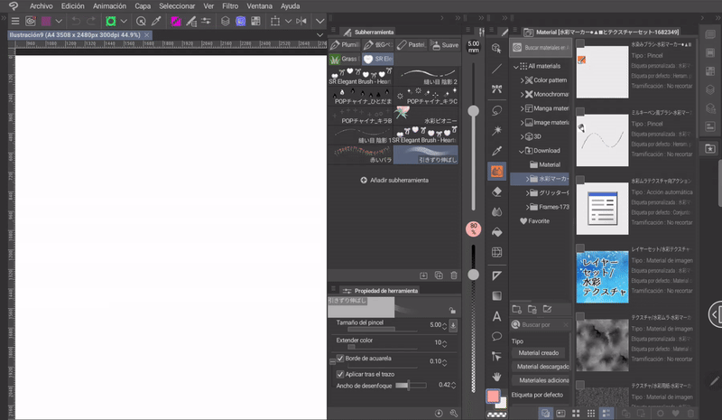
I also used a well-known set of brushes and textures that can be downloaded from CLIP STUDIO ASSETS, I leave the link to the material below:
I'm sure many of you already know how to add materials, but it never hurts to give a little explanation for new users.
To add brushes, do the following:
➀ Image materials, brushes, or anything else that is downloaded will appear in the «Downloads» folder in the «Materials» window. If you expand the folder, a series of folders will appear that separate each of the downloaded materials.
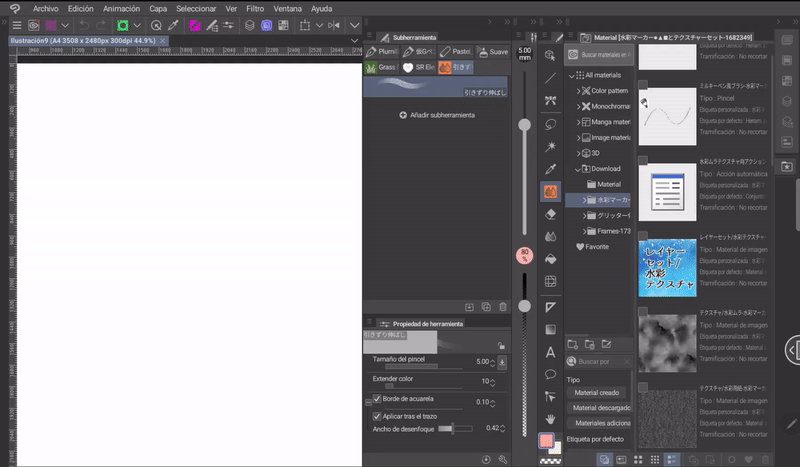
➁ If it is a brush, it must be dragged to the «Subtool» window in the brushes category.
➂ If we want to create a new brush folder in the «Subtool», window, what we will do is drag a brush to the top bar of the window where the categories are grouped.
To add multiple brushes at once you need to select them by clicking on the check icon at the top left of each one, and drag it into the window just as explained before.
2. Paper texture
To add more realism to the homemade effect, it is a good option to add texture to the paper. Doing so is easy, let's see how:
➀ You have to go to the downloads folder, specifically the folder where the material that was downloaded in the previous section is stored.
➁ Once there, we will drag the texture that is included with the brushes to the canvas.
If you do not like this texture, you can find others in the following path: Material> Monochromatic pattern> Texture.
➂ In the «Layer Properties» window we will go to the «Effects» section and activate the «Overlay texture» option.
➃ With this we already have the effect, but the white color may sometimes not be what we are looking for, so, to change the background color we will create a new layer below the texture and change the color to a light one using the paint bucket.
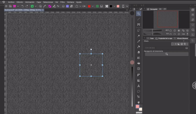
➄ With this the texture has become more visible; we can modulate its intensity, this is done with the sliding bar of «Strength» in the «Layer Properties» window.
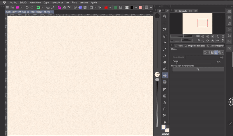
Done, we now have the texture of the paper:
As an extra we can paint the edges with the soft airbrush with a color a little darker than the background and blur it a little with the «Color Blend» tool.
3. Some types of flowers
We'll start with a simple explanation of a couple of basic principles of watercolor brush handling.
Watercolor brushes are the ones that have the most curiosities regarding their use, but if you use another type of brush that imitates a real one you don't have to worry, its use is simple. So, if you're going to use another type of brush, I advise you to pay attention to opacity, pressure and blending.
- PRINCIPLES OF WATERCOLOR -
There are a few points to consider when using watercolor, let's see:
➀ TRANSPARENCY: One of the outstanding features of these brushes is that when we pass one brush stroke over another, the color will intensify. Just like a layer of paint that is superimposed on another.
Important: Everything we paint without removing the pencil from the screen, no matter how many times we pass over the same spot, will remain with the same opacity.
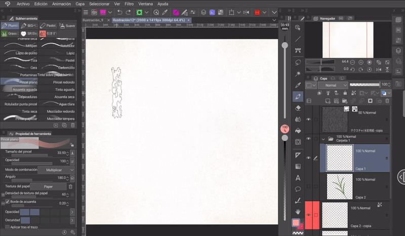
➁ COLOR MIXING: There are two ways to mix colors. The first is to use the «Texture Blending» tool that comes by default in the program. The second is to use the blending brushes that are included in the watercolor brush set downloaded above.
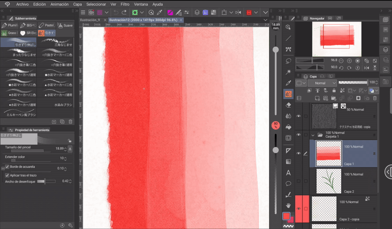
➂ PRESSURE: Another characteristic is the use of pressure, the more pressure we apply when painting, the color will be intense and when the pressure is decreased the color will become lighter.
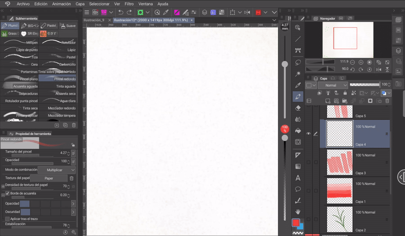
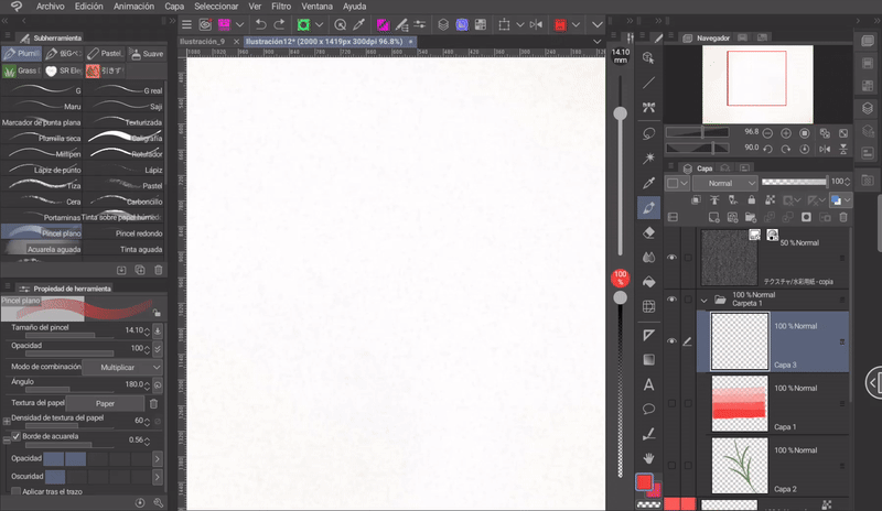
➃ WATERCOLOR BORDER: Watercolor brushes have the watercolor border option enabled by default, so when painting we will see a border.
Using the edge settings found in the «Tool Properties» window we can modify the opacity, size and darkness.
(A) Hydrangea
Now let's start with the process to paint a hydrangea:
- STRUCTURE -
Hydrangeas have two structures as their base: The flowers and the general shape. To create the flowers we will follow the following steps:
➀ We will make a circle that we will divide vertically and horizontally forming a cross.
➁ We will draw a small circle at the central intersection of the cross.
➂ Finally, we draw a domed petal using each of the four lines as a base.
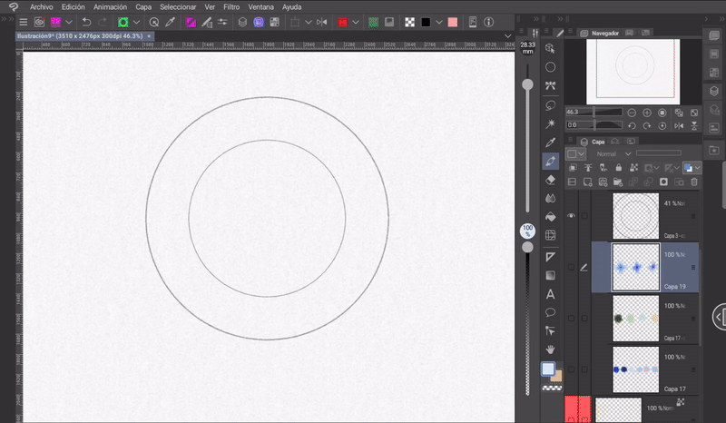
For the general structure, two circles will be used, the second one will be inside the first and should be smaller. This structure will help us to know where and up to what limits to place the flowers. To place the flowers, we will start from the center and work towards the periphery.
The flowers should be placed in different positions.
- PAINTING -
We already know what the structure is, now let's transfer this knowledge to watercolor, let's see how:
The way I painted them was the following: Knowing the structure we can apply it without the guide lines. Taking advantage of the transparency quality of these brushes I started painting from the center to the edge, making a gradient, so that the area closest to the center of the petal is darker than the end of the leaf.
Now, mix the colors of each petal with the following brush, which is within the set of downloaded brushes.
Note: I will refer to this brush when I want to mix the colors.
Note: It is important to work in layers. For example, for this flower I did the following: in one layer I painted the central circle, in another the petals, in another the highlights, in another the touches of other colors and finally one for the details. When I have everything right, I merge them.
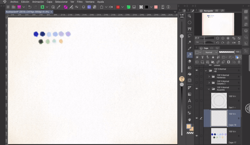
To lighten the colors of the edge of the petals, on a new layer with a blue color very close to white I painted the edges with the default brush «Watery ink».
Finally, I outlined some parts of the petals' edges with a deep blue color. To make this hydrangea, we will only need to paint three different flowers, the rest will be done with a trick that I will explain shortly.
BACKGROUND: We will place the flowers on a background, for which we will paint a gradient like the following using the circle of the structure as a support.
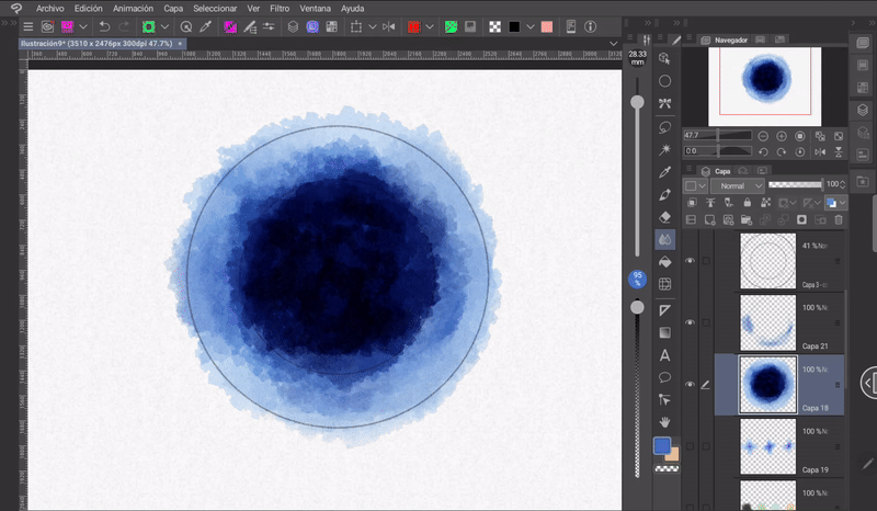
➀ With the default brush «Splash» and a somewhat light blue color we will start by lightly painting the outer circle, then we will paint a small inner circle darker than the previous one and finally we will fill the inner circle with deep blue that we will achieve by going over the area several times with the same brush.
➁ Now, with the «Gaussian Blur» tool found in the following path: Effect > Blur > Gaussian Blur. We will apply a blur, between 20 and 30%.
FLOWERS:
➀ Moving on, we'll move the flower layer above the background (all the flowers should be on the same layer).
➁ Using the Lasso selection tool and the Transform tool, we'll arrange the three flowers into a triangle-shaped structure without any of them covering the other.
➂ We'll scale this new structure to a size that seems appropriate.
➃ Finally, we'll duplicate the layer several times and place them at different angles so that the circle is filled in a way that's not as saturated as seen in the following GIF.
The transform tool can be found in the shortcut that is in the top menu for the tablet version as in my case, or in the following path: Edit > Transform. Its keyboard shortcut is «CTRL plus T».
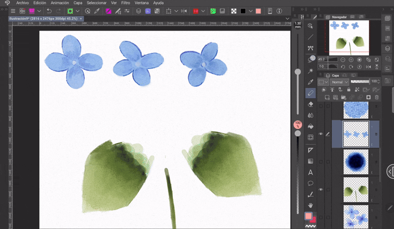
➄ Next, we will select layer by layer and with the «Mesh Transformation» tool we will change the perspective of some flowers a little, especially those on the edge. With this we avoid the composition looking flat. This tool is located in: Edit > Transform > Mesh Transformation.
The tool has a series of nodes that we can move, and when we do so it stretches and reorders the perspective of the image.
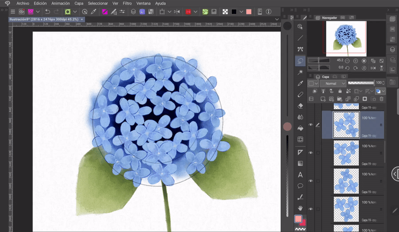
➅ We will group the previously created layers into one using the function «Merge with lower layer», an option found in the top menu of the «Layer» window.
➆ Now that we have the layer, we will duplicate it and move it below the original. Then we will rotate it with «Transform» as shown in the GIF.
➇ If there are many empty spaces, they must be filled with more flowers in a layer below the others.
To duplicate a layer, we can hold down on it (in the case of the desktop version, this will be done with the right click), a menu will appear where we will find the option «Duplicate layer». The keyboard shortcut to do this is «CTRL plus C» to copy and «CTRL plus V» to paste.
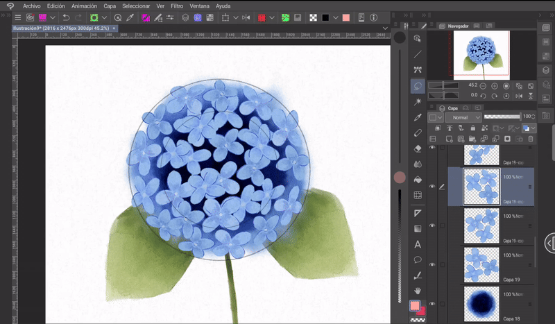
The structure is already starting to take shape, but it still doesn't have enough depth. To give it some depth, we'll do the following:
➀ We'll select the layer that we duplicated and rotated.
➁ We'll go to the following path: Layer > New correction layer > Tone curve.
➂ The adjustments window will open, in which we'll lower the luminosity a little.
Done, now you can see a difference between the flowers in the foreground and those in the background, since those in the second layer are a little darker.
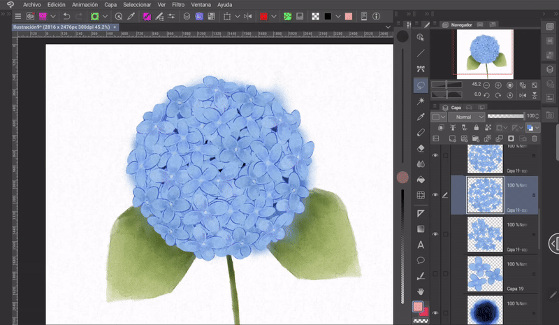
For this next step, we will position ourselves on the background layer and with the soft eraser we will erase the outline of the layer that protrudes from the edge of the flowers. This is done in order to obtain a cleaner result.
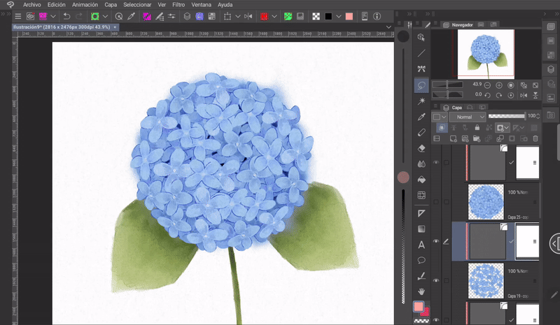
Finally, the color of the flowers in general is very dark, to lighten them we will do the following:
➀ We select the upper layer of the flowers.
➁ We will go to the following path: Layer > New correction layer > Tone curve.
➂ In the window that will open we will adjust the curve so that the color is lightened a little.
In the tone curve you can create as many nodes as needed. I recommend moving the center node up to lighten and down to darken; from the result of this first movement, create others and move them a little, testing which adjustment looks best.
To complete the flower we will have to paint the stem and some leaves. I will use the same technique as at the beginning, first I painted the area close to the main branch darker and gradually faded the color to a light green. This creates a shadow for what is under the main branch, this part is a deeper green.
Finally, with this same shade of green I outlined some parts of the contour of the leaves and with a white that is close to pure I drew a shine in the middle of both petals to act as the separation that exists in this type of flower.
Finally, to highlight the colors I played with the settings of the «Color Balance» tool found in the following path: Layer > New correction layer > Color balance.
- Result -
(B) Leaves
Another component of flowers are the stems and their leaves. The painting process is simple; first, you have to understand that leaves are not straight, they have curves, we will use these curves by marking them with a single line to give the shape to any leaf:
➀ The structure of the leaf consists of a curved line as a base to which we will later mark the volume of the leaf on each side.
➁ On this structure you have to mark the final shape of the leaf as seen in the following image. Here you have to keep in mind an important point, the leaves grow from the stem, in this area the leaf will have a wide base that will gradually begin to shrink ending in a point. Practically all leaves end in a point.
Following this structure we can create different types of leaves, some narrower than others, longer, among others.
The leaves are usually on the stem, branches or near the root.
COLOR: Colors are applied relative to the light source. Normally, the base of leaves and the beginning of a stem are dark, which gradually fades in intensity until it reaches a light tone. To prevent the colors of the leaves from looking flat, I recommend using gradients, placing a dark green at the base and gradually fading it to a greenish yellow, for example.
Another thing to consider is depth, with which we know which objects are in front of others. The leaves and stems in the foreground will be more expensive than those in the second, and those in the second will be lighter than those in the background.
(C) Rose
Roses have different stages, let's see how to draw and paint some of them.
- SEMI-OPEN ROSE -
To paint this type of roses we will use a cylinder, from this base we will sketch the direction of the petals. When painting the petals we must take into account two points:
➀ The petals are not all on the same level. This means that there is a first plane, a middle plane and a final plane, the petals must be painted on these three levels. In conclusion, one petal must overlap another.
➁ The petals are not flat, as they separate from the others, they begin to undulate from the edges, so this undulation must be represented on the edge of each one.
▪ PAINTING: To add color, start by lowering the opacity of the sketch layer and setting the color palette.
Now, using the «Lasso Selection» tool, on a new layer above, outline the flower and with the default «Round» brush, paint a light color in a single stroke over the selection. This is to have a uniform color.
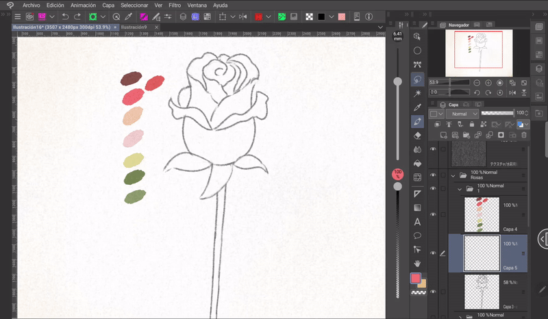
With the same round brush and playing with transparency I began adding shadows and lights.
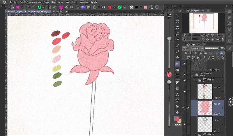
The logic of shadows on roses consists in understanding that the folds that are in opposition to the light source will be dark, and also, between the lines that separate one petal from another there will be a small occlusion of light, so these areas will be darker.
With the colors already established, the next step is rendering. What I do in this step is to mark and define the edges between one area and another.
For the colors of the green leaves and the stem, the same process is followed. First, we start by placing the base colors and then defining the lights and shadows.
In this case I will use a gradient, the colors that are closer to the rose will be darker and will gradually become lighter.
With the blending brush I will soften the color transition.
Finally, with the white color and a hard brush, put some glitter on the petals and leaves.
- RESULT -
- BUD -
A rosebud is very easy to make. We only need the structure of a triangle with a semicircular base, from which we can mark the folds of some petals, but since it is still in its early stages there will not be many folds to mark.
▪ PAINTING: With the sketch, we will create a layer on top where we will mark the lights and shadows.
Going over some areas with the same color, I darken the base a little.
With the blending brush I blend the spots a little.
Now, with the «Dry watercolor» brush and a dark color, I outlined the contour of the petals and a little of the spots.
Finally, I paint the stem in a medium-tone green that I gradually fade away and I also outline the edge with a darker green, and I also mark the shadows better.
- RESULT -
- SIDE VIEW -
For the side view of a rose we will go from a triangle to an oval structure with a division in the center. From this shape we must mark the petals, each one following the same direction.
As with the previous rose, start by applying a base colour and then, on a new layer, paint spots that mark the shadows. Remember that the shadow areas are usually found between the folds of the petals and where the light does not shine directly.
As is customary with every rose so far, I'm going to outline the contour with the dry brush and a darker color.
Finally, I paint the stem with a medium green that I gradually fade in some areas, also painting the highlights with a light green and blending with the blending brush. Finally, I outline some parts of the edge of the stem.
- RESULT -
- FRONT -
One way to draw open roses is to do it in layers. We start with a larger circle that will contain all the petals, then, from the center, we will draw small moons. One hugging the other. The first ones will be small and as they fill the circle they become more elongated.
▪ PAINTING: Regarding the color, the central petals should be dark and gradually fade to a light shade.
We will pile petals on top of petals, but leaving some empty space, this will give it a casual effect.
The edges of the last circles of the petals will have to be blurred a little with the blending brush.
Now all that's left to do is render; by this I mean marking the contours between colors and shapes. Also, it will depend on the detail and style, some works are more detailed than others, resulting in different impressions.
- RESULT -
With these roses we can create beautiful compositions between flowers and leaves.
(D) Sunflower
The scheme to paint a sunflower in front view is very interesting, let's see that we will need two circles (1), one smaller than the first. Once aligned we will mark a cross and two diagonals (2). In each diagonal we will paint a petal (3) and then in each space we will paint the others (4). Important, the petals should not be the same, they should have different textures (5).
▪ PAINT: I will start by choosing an orange color close to white.
I paint the petals evenly with the round brush, but not all of them, just eight of them, the first ones drawn in the diagram (3); a first cross and two diagonals as seen in the following GIF.
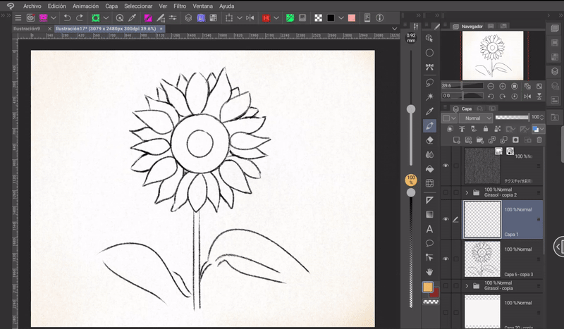
Now, on a layer above, I will paint the same petals with a slightly darker color, but leaving some small central lines unpainted. As you can see in the image. This is done so that they look like sparkles.
This step is done on a new layer in case you need to erase the color to better mark the lines; if you do erase something, this should not affect the main color of the lower layer.
At this point I felt the color was too strong, so I decided to lower the opacity of this layer.
It's time to paint the center of the sunflower. The secret of this area is to apply the colors in circles. First, the outer circle, this will be dark, the next one will be a dark brown tone, then another with a lighter tone until reaching the central circle that will be painted a very dark brown.
To make the texture of the seeds I used the triangle brush included in the downloaded set and the splatter brush (but these textures are seen in the result, in this part I didn't add them yet).
I recommend looking at several references to better understand the shape.
Now comes an important step:
➀ First, we will group the two layers created from the petals. We will hold down this layer, a menu will appear where the option that allows us to duplicate the layer is located.
➁ We will move the duplicated layer below the original.
➂ Now, using the «Transform» tool, we will rotate the layer so that it covers the empty spaces between the petals of the original layer, as seen in the GIF.
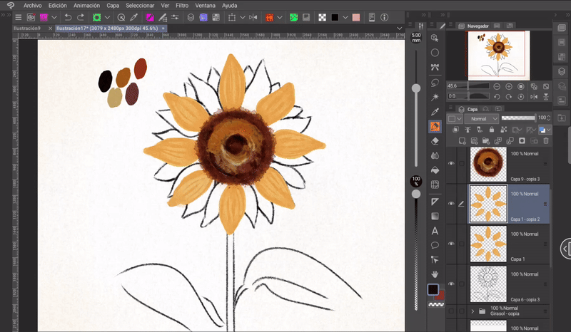
➃ We will select the layer that we duplicated.
➄ We will go to the following path: Layer > New correction layer > Hue/Saturation/Lightness.
➅ In the settings, you have to move the «Hue» and «Lightness» options a little. We will move the settings to the left, this will make the color of this layer darker a little.
➆ After accepting, we will go to the «Layer» window menu and «Adjust to layer below» the layer that was created with the settings of the «Tonal correction» layer. This is done so that the settings of this layer are only applied to the duplicated layer and not to the entire canvas.
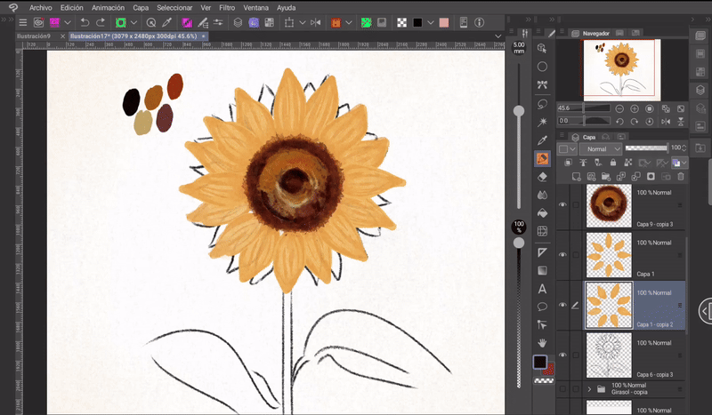
Now, with an orange I will outline the edge of the petals of the original layer so that a greater contrast between each petal is achieved.
As a finishing touch to the petals:
➀ I will create a new layer above the petal layers.
➁ I will change the blending mode of this layer from «Normal» to «Add».
➂ Using a soft watercolor brush I will paint with small touches the center of each one having selected the same color as the petals.
In this way, a soft light is added to the petals.
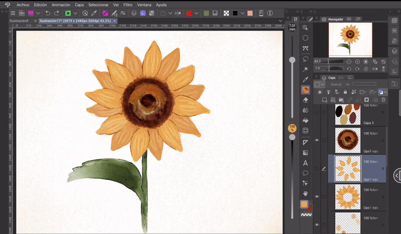
For the stem, it is the same process as in the previous ones. I mark the lights and shadows, blur and finally delimit parts of the contour with a darker color.
Extra: If some petals are deformed like mine, you can modify them with the mesh tool. This tool is located in: Edit > Transform > Mesh Transform.
In the end I lightened the colors in general, it seemed to me that the colors were very opaque and I could detail the edges and shadows better.
- RESULT -
More than watercolor, it looks like it was painted with pencils, right?
I have a good or bad habit of going over a point many times and in doing so I start to lose the texture of the brush, so to avoid this happening to you, loosen your hand, use loose brush strokes and don't look for perfection that probably doesn't exist.
(E) Cherry blossom
Painting a cherry tree with spots is a quick and easy process. Let's see how:
Let's start by making a sketch of the branches and trunk. Remember, these are not straight and other branches grow from them. To make them look better, I recommend using references as a guide.
Now we need to fill in and mark the outline of the trunk and branches. In my case I used the **«Watery ink» brush and a dark brown colour, a colour that I will later lighten with layers of tonal correction.
Using the Splash brush and a light pink tone, on a new layer above I paint small spots covering part of the branches. In the brush settings I increased the intensity and particle level for greater comfort.
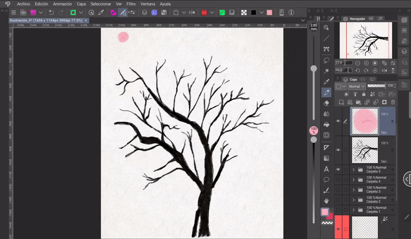
Now, on a layer below the trunk I paint large spots with the **«Round» brush. This is in order to fill in some empty spaces left by the previous process, but not all of them.
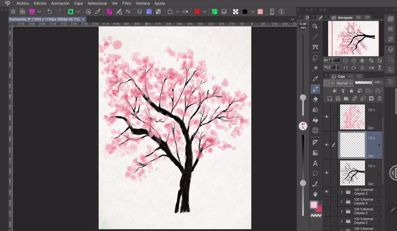
With a dark pink, I mark other spots on a top coat, but not too many.
With a light brown color I paint the left half of the tree trunk and I blur it a little, this in order to paint the lights, lights that help me to mark the volume. I paint the left side because my light source is in that direction.
Using the Lasso tool, I mark some light areas on the trunk, areas that I want to make lighter. Now, go to: Layer > New correction layer > Tone curve. I play with the settings to obtain a light and warm tone.
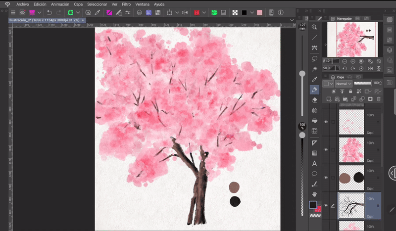
As a next step, I put all the layers inside a folder, then, I open a «Color Balance» layer from: Layer > New correction layer > Color balance. I play with the settings until I get a warm result. Once this is done, I adjust this new layer to the folder so that it only affects the tree and not the entire canvas, I do this with «Adjust to layer below», which is found in the layer window.
Finally, I paint small spots on the outside of the structure to simulate leaves falling off the tree.
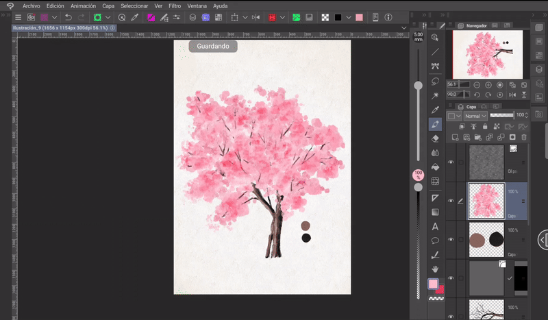
- RESULT -
Easy, right?
(F) Small flowers
Flowers come in different shapes and sizes, but there is one thing that most of them have in common: their structure. When a flower is born and begins to open, it does so by drawing the structure of a cone.
So, to draw flowers at different angles, you have to learn to visualize cones. For example, in the following image we have a circle divided by a cross, this would be the view of a cone from above, from which, by rotating it in space, we obtain different views from different angles.
From this structure the petals are drawn, taking into account that their birth originates in the central vertex of the cone.
Once we understand the general structure, we can draw many types of flowers following the same principle.
With the small flowers you can create various compositions, such as:
Everything shown below I did only with the default brush «Watery brush».
- BOUQUET OF FLOWERS -
I will start by painting the stems and some branches.
Then I added the flowers and some buds.
And finally some sheets that will help me fill in some empty spaces.
- RESULT -
Here is another example. As such it is not a composition, but is made up of various small flowers.
▪ The process is the same: First the branches.
Next I add the little flowers.
Finally, the leaves.
- RESULT -
4. Flower brush
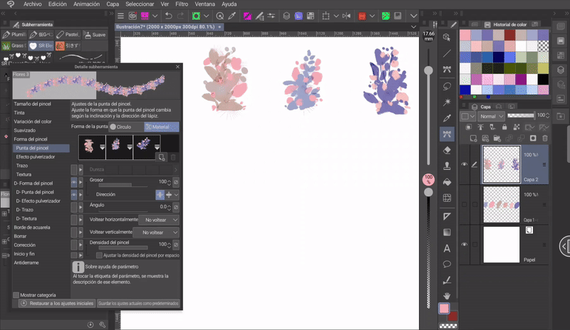
Now I'll show you how to use our flower images to create a brush, so it'll be easier to use them in other illustrations.
First you need to register each one as a material, so you'll select the flower with the «Selection» tool. Then, you'll go to: Edit > Register material > Image.
A window will appear where we will enter the name of the material, its location within the program and, most importantly, we must check the box “Use as brush tip shape”. Once we have everything ready, we click OK.
Now we will go to the «Decoration» brushes that are built into the program by default. We will choose the «Button» brush and we will duplicate it by right-clicking on it. A menu will appear where we will mark the option: «Duplicate subtool».
A window will appear where you can modify the name, icon and other options, but in this case only the name is necessary.
Once the new brush has been created, we will go to the wrench-shaped icon (1) located at the bottom right of the “Tool Properties” window. A new window will open in which we must go to: “Brush tip” (2). Once there, we must press the arrow in the image shown at the top (3).**
The search engine will open, here we choose the material that we registered previously and when finished we click on accept and close the previous window. Ready.
The created materials are easily found with the label «Created material».
By doing the above we would already have our brush, but if we want it to have a combination of different flowers, what we will have to do is add new materials. To do this we will click on the leaf icon found at the bottom right, once again the search engine will open where we will add the material. We can add many images to the same brush.
In the category «Stroke» (1) we will find the options that allow us to change the order of the strokes (images) (2).
- EXAMPLE -
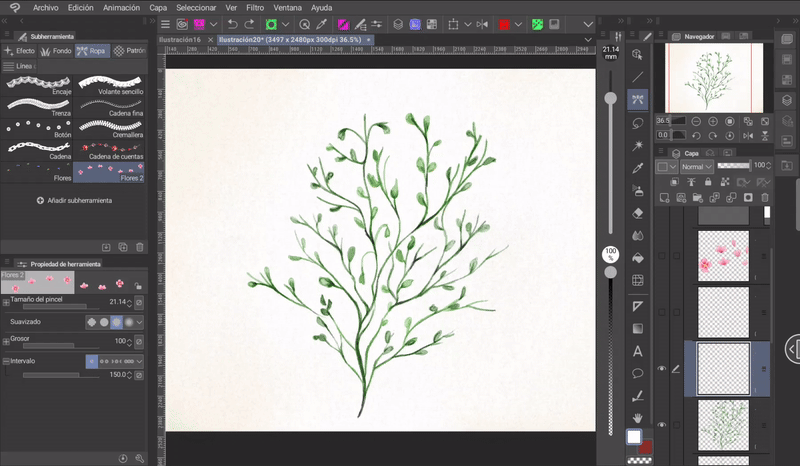
INTERVAL: In this same section we will find the «Interval» adjustment, here we can manage the space between images. This adjustment is ideal to achieve the effect of a vine.
In this example, I used the images of three bushes and in the settings I set the interval to 25, which resulted in:
The results for this type of brush look better if more than three images are used and they should not be at the same angle. Many combinations are possible, just experiment.
Farewell
I hope that what you see here helps you to make your own homemade flowers. It would be very helpful if you share it and give me a like. Thanks for coming here! See you another time!
Bye bye.
Learn more about me at:


Comment