
Presentation
Hello everyone. Thanks for being here once again. This new year I will start doing something I really like: Painting landscapes. In this tutorial I will show the concepts I know about how to paint the sky; skies that are essential for landscapes or backgrounds. Without further ado…
Let's get started!! (o・ω・o)
1. The sky
In open environments we find that the colours of the sky will greatly influence the other elements in the composition. It must be remembered that colours, no matter how varied they are, must be linked to a main colour. If the predominant colour in a landscape is blue, the others will dance around it, and if it is a dark blue like that of the night, these will follow the same logic.
✦ Color and elements
ATMOSPHERE: The magic of painting a beautiful sky is gradients. The trick to getting a realistic sky is to divide it into three sections no matter what time of day it is, or two if there isn't much light in the scene. The first section, the top one, will be the darkest, then a medium tone will follow, and finally a light tone. This happens because when sunlight travels through the sky, it passes through the elements of the atmosphere, which refracts that traveling light, causing it to disperse, losing intensity, in other words, saturation. These gradients can be smooth, but they can also have textures.
Here are some photos I took where we can see the gradients I'm referring to, but in a couple of real situations. Of course, it's best to see it for yourself, because when taking photos, you lose a few to many details.
Depending on the time of day, the colors that dominate the scene will be different.
► Dawn: At dawn, unsaturated blue tones can be seen at the top, consequently fading into warm colors: pink and/or yellow.
► Midday: During the afternoon, a more saturated blue is achieved than that found at dawn, here there is not much variation between blue and other colors.
► First phase of sunset: In the first phases, we can find orange, yellowish or even pink tones accompanied by blue tones that lean towards gray.
► Sunset: At sunset the sky changes to an orange color combined with a blue that begins to darken. Pink, purple and orange colors can also be included.
► Dusk: At dusk a deep blue dominates.
► First phase of dawn: In the first phase of transition between night and dawn we find the same saturated orange/pink tones as in a sunset and that as the minutes pass will degrade to soft tones.
► Stormy days: Days with rain or snow storms have the peculiarity of having a sky with unsaturated colors with a strong tendency to gray.
► Fantasy: On sunny days we can use unconventional colors within warm tones to exemplify an atmosphere of fantasy or hope and in night or stormy atmospheres, cold tones.
- THE SUN, THE MOON AND THE STARS -
When the sun rises and begins to rise as the hours pass until it declines to set on the horizon opposite its rise, we can include the figure of the sun in scenes during dawn, midday or dusk. In addition, the lighting of the clouds can be determined in relation to the position of the sun. For example, during dawn and dusk the lower area of the clouds is illuminated and the rest is in shadow, while throughout midday and afternoon the sun will be above the clouds, which will illuminate this upper area of them.
The moon, on the other hand, is an element that can be used as a narrative resource or as a light source in the scene, illuminating the clouds depending on the position in which it is found.
Nights can be accompanied by stars. The visibility of stars in the sky goes hand in hand with the light in the surroundings. For example, in cities, overexposure to artificial light prevents the visibility of stars. They illuminate the sky. In addition, during the first rays of the sun at dawn, the stars are still visible, and the same happens with the last rays of the sun at sunset.
✦ Color harmonies
We tend to expect to find a series of combinations in nature and in illustrations that we innately like more than others. In this way, when a multitude of similar colors appear in the scene, we will feel more comfortable than when there is a confusing mixture of several disparate colors. For this reason, it is good to know the color harmonies, they will allow us to know which colors to choose to create the atmosphere of the celestial vault.
- ANALOGUES -
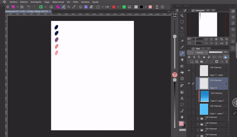
Analogous harmony is formed by the implementation of colors that are close in the chromatic circle. Because of their proximity, they combine well with each other. Like blue, violet and pink, which are sequentially close to each other in the chromatic circle.
- COMPLEMENTARY -
Complementary colors are those that are opposite on the color wheel, this combination creates a contrast. This harmony can be used to contrast the figure with the background, also to contrast opposing ideas and in fantasy landscapes.
NOTE: It doesn't have to be the exact opposite, it can also be a color close to the opposite.
- TRIAD -
To create a harmonic triad, three equidistant colors are used. As you can see in the illustration below, yellow, red, and blue are three colors apart from each other.
NOTE: As with the previous example, this is just an example, it doesn't need to be an exact calculation.
If you want to know other tips I have about color in landscapes, I invite you to visit this tutorial:
✦ The sky in different climates
WINTER: Another important point to consider is the change in color with respect to the weather. In winter, we have two faces: First, sunny days with saturated colors and clear skies. This environment evokes days of fun, warmth, and innocence.
At this time of year the clouds are not as deep, they are lighter.
Second: On stormy days, the sky turns shades of grey, due to the loss of the sun. Environments like these can bring us sadness, calm, longing, etc. Due to the fog generated, distant elements begin to merge with the sky. These scenes can be painted with cool colours that tend towards grey.
FOGGY DAYS: Fog occurs in the mornings or in places with water such as rivers, mountainsides, etc. Fog forms when the air becomes saturated with water vapor, which can occur through cooling, the addition of moisture, or mixing with another air mass. In these environments, the colors of the sky are unsaturated and once again tend toward gray.
SUNNY SEASON: During this time, saturated and lively colors predominate. The sun shines, transmitting feelings of joy. These are times full of new life. At high latitudes and on clear days, we will find that the skies have more vivid and intense colors.
RAINY AND CLOUDY SEASON: Finally, in climates like these, unsaturated, gray or cold-colored tones prevail. These environments can reflect sadness, calm, contemplation, loneliness, among others. Another characteristic is the grouping of clouds, one on top of the other.
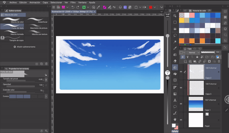
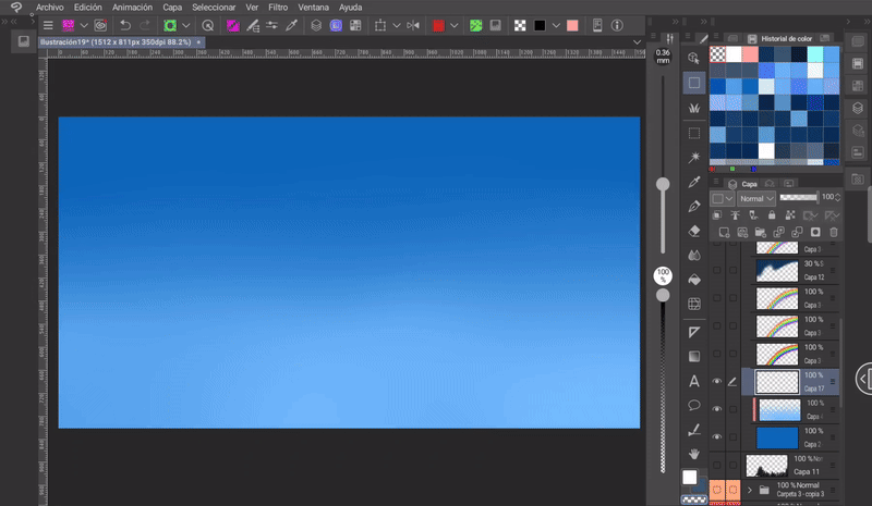
✦ Tool: Gradient and Blending Brushes
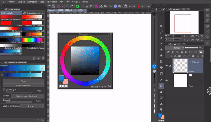
An easy way to apply sky gradients in Clip Studio Paint is to use the gradient tool. This tool is located in the Tools window. Its symbol is a square with a gradient.
- CREATE A GRADIENT -
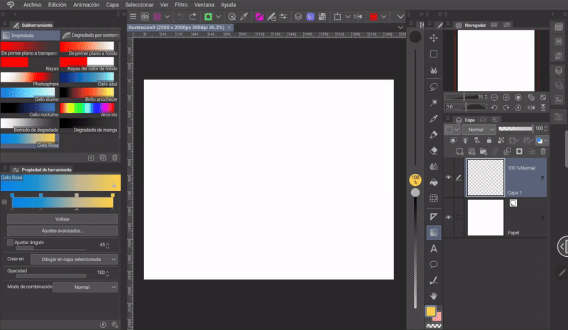
In the «Subtool» window we find a series of predetermined gradients. But, to create our own we must do the following:
➀ We must choose a predetermined gradient, in my case I chose «Blue sky».
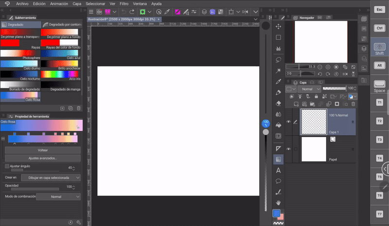
➁ Then, we must click on the «Duplicate subtool» icon in the lower area of the window.
A window will appear where you can set the name of the new gradient.
Now, in the "Tool Properties" window, we find the gradient settings. To change the color, we must pay attention to the nodes below the preview.
With these nodes we can:
1. Modulate the amount of each color with the arrows in the lower area.
2. Create new nodes along the entire bar by clicking anywhere along the bottom line (where the mobility arrows are).
3. Delete nodes. To delete any section of the display, you must display the gradient menu (symbol “+”) and choose the option: Advanced settings > Choose the node > Delete.
To change the gradient colors you have to:
➀ First we have to choose the color from the color wheel.
➁ Then, we have to click on the nodes as shown in the following GIF. And so on with each one.
We can apply the gradient at any angle.
TIP: If you want to obtain a perfectly vertical or horizontal gradient, you have to keep the «SHIFT» key activated while applying it. In the version of the program for Tablet or cell phone you can activate this key from the side key panel.
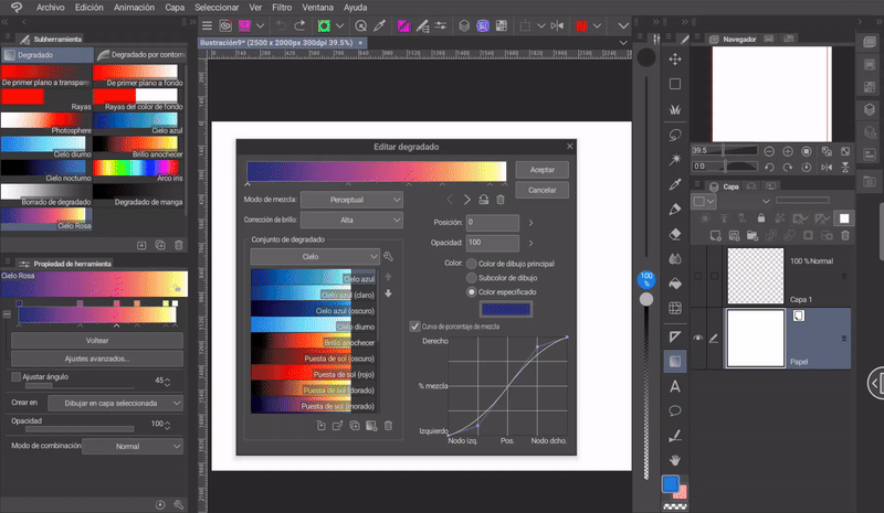
- ADD DOWNLOADED GRADIENTS -
We can download gradients to color the sky from the Clip Studio ASSETS material library. To add them, do the following:
➀ You have to access the «Advanced settings» option. Once there, you will see the following window.
NOTE: In this window, you can also reverse the order of the gradients, delete them, and change opacity settings or color and blend settings.
In the section "Gradient Sets" you will find a list where you can switch between folders containing gradient sets. By default, the program has a folder of gradients for the sky.
➁ Now, we will click on the wrench that is located next to the list of gradients.
➂ In the menu we will choose the option "Add gradient set".**
➃ A window will open where the downloaded sets will be found. You must select one or more and then click OK. Ready.
To choose a gradient you must double-click on it, but this will overwrite the base gradient, replacing it with the chosen one. In this case, I recommend creating a gradient that is only used as a base for the others.
In Clip Studio ASSETS we can find an endless number of gradients for the sky such as this one:
If we have difficulties finding gradients among so many materials, we have a shortcut within the program itself. This shortcut is found within the window «Add gradient set», which was seen in the previous steps. Here, apart from finding the downloaded gradients, we have the option «Search for gradient sets in ASSETS».
Clicking on it will take us to the gradients category within ASSETS. Here, gradients will appear to give color to various environments such as: The sky, skin, eyes, among others.
- BLENDING BRUSHES -
If you don't like smooth gradients and want your sky to have texture, what you can do is use the blending brushes, let's see how:
➀ We will choose any textured brush that we like and manually paint the different steps of the gradient.
➁ Now we have to go to the blending brushes found in: Tools > Blending. Here are a series of brushes that help with blending, but you have to know their characteristics to determine which ones are most useful to us
● Color Blending and Blur: These brushes give diffuse results and cause textures to be lost. If used excessively they leave an unpleasant result, but they are good for softening edges.
● Fingertip: This simulates how paint runs when stretched.
● Paint, wet and texture mixer: These three will maintain the texture and add it if it doesn't have it. You have to test which one works best for your particular case.
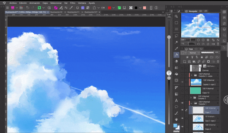
2. The clouds
Another inseparable element of the skies are the clouds, those masses of water or ice suspended in the atmosphere. Let's see how to make them.
To paint the clouds we can do it with any brush we like, but in the ASSETS library we can find brushes specifically created for this. The brushes I will use to paint the different types of clouds will be these:
✦ Types of clouds
First, you need to know that there are three types of clouds, these are:
● CIRRUS (HIGH CLOUDS): They form at altitudes of 6000 meters. In the drawing, this is translated as translucent spots that are found in the upper part of the sky. They do not have hard edges and do not require the volume that shadows give them.
To paint them, we can use a brush with a diffuse texture, which we will lower the opacity to 50% or less. We will make small brush strokes without marking the brush so much in the direction in which the cloud will point (these clouds are usually used to direct the gaze towards a specific point where attention is to be focused). To blur the edges, we can use the «Fingertip» and «Blur» tools.
● STRATUS (MIDDLE CLOUDS): They form between 2 and 8 kilometres high. These clouds are no longer as diffuse, they have more defined shapes, but they are still nebulous.
And they can have more or less shadows.
The trick to painting these clouds is to paint with some kind of brush that has texture and erase the excess with the same brush using the «Transparency» option. And we can also lower the opacity of the layer.
As with cirrus clouds, these have diffuse and elongated tips, to achieve this, a good method is to use the «Fingertip» tool.
● CUMULUS (LOW CLOUDS): They form at altitudes of less than 2000 meters. These clouds are the most complex because they can take many shapes and have a more defined volume. Shapes can range from mountains to, of course, if we get creative, people, objects or animals.
Here is another photograph that exemplifies the structure of the clouds in the sky.
We can simplify the shape of these clouds with a series of circles piled up against each other, but not all of them should be the same size, some large, others small. Let the contrast of shapes be visible.
In order to add color to clouds, you have to understand volume. To do this, you have to go back to the theory of light and shadow. This theory shows us the typical sphere with its direct light, its shadow and the reflected light. This same structure is followed for the general cumulus. The lights are placed depending on the direction of the sun.
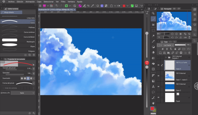
- STEP BY STEP -
Now let's look at the steps I follow to paint these clusters:
➀ I start by painting the entire shape of the cluster with a medium color.
➁ Then, I outline the light areas.
➂ With a darker tone than the base color, I mark the shadows. I do all this quickly and carelessly, the details will come later.
➃ Once the lights and shadows have been established with their respective colors, I begin to outline the shapes. In some areas I mix the colors, I make the transitions between lights and shadows better. I mark the details, I better mark the shadows. The beauty of the clouds is that cotton texture. We can achieve this effect by superimposing small circles on top of each other between the limits of the colors.
Another important point is the shape of the base, when we see it we find it flat.
After rendering we will have it, but another effect that clouds usually present is that, being gases, they disperse. To achieve this dispersion effect, I use «Fingertip», with it I draw lines that simulate clouds that move with the wind, as if they were torn from the cumulus.
These lines should only be drawn from one side of the cloud and not the other, and they should all be pointing in the same direction.
Finally, with the «Blur» tool with its density at 50% I blur some edges and the center of the cumulus. Ready, now we have a cloud cluster.
Finally, we have an effect that we can apply or not, it is optional. But it should be noted that it looks good on sunny days. This effect consists of a luminous aura at the edge of the clouds. To achieve this, we must:
➀ Create a layer below the cloud and set the blending mode to «Normal» to «Add (brightness)».
➁ Now, with the soft airbrush and low density, we will paint along the edge of the cloud.
➂ Finally, we must lower the opacity of the layer to a level that is comfortable for us.
➃ If there is any area that is brighter than another, we can blur it with the blurring brush. Ready.
- RESULT -
With these three cloud models we can give a composition depth.
✦ The color
Clouds take on the color of the atmosphere, they will borrow colors from the sky, so they should be painted with a similar color scheme.
Colorful Clouds
Iridescent clouds form when sunlight is diffracted as it hits cloud particles. This phenomenon occurs when thin clouds are beneath thicker clouds.
Blue clouds
Clouds can appear blue when there is no direct sunlight shining on them, so they reflect the color of the sky.
Red, orange or yellow clouds
Clouds can take on these colors when the sun is close to the horizon, as sunlight disperses in the atmosphere. For example, during sunrise and sunset the light will come from below, so the clouds will be illuminated at the bottom and the top will be in shadow. You have to think of clouds in terms of boxes, when we place a cloud in perspective it is like moving a box at some kind of angle.
Gray clouds
Gray clouds form when water droplets are large and the sun's rays bounce off them. These clouds are heavy, without much light in them. This is why they are very present in rainy seasons.
One more thing, in windy seasons the clouds are more dispersed, without many reliefs, just like in the image on the right. In the first pack of cloud brushes that I recommended there is a brush that will help you paint this type easily.
White clouds
White clouds are formed when water droplets are small and allow the sun's rays to disperse in their different wavelengths. This is why we find this color at the edges of clouds, in cirrus and stratus clouds.
✦ Composition in the sky
Elements of the sky can also help us tell stories, through the rules of composition, as well as making the illustration more attractive. Let's look at some aspects:
- FRAME -
If the main object is far away, it is recommended to complement it. Framing consists of placing our object of interest and then surrounding it with elements that focus the viewer's gaze on that point, for example, these clouds, due to their curvature, seem to point to the center, to the sun. And that is precisely another point, draw the clouds following curves.
- DIAGONAL -
Diagonals represent strength and movement. Anything strategically placed can serve to guide the eye; for example, the smoke trails left behind by airplanes flying across the sky.
- PERSPECTIVE -
There are many types of perspective with different vanishing points, but in this case I will only talk about one in particular. This type of perspective makes compositions with clouds no longer so flat.
Clouds should be thought of as boxes with one side illuminated and the other in shadow. In this perspective, the lower layer is hidden from the sun. The clouds should be painted following the shape of the boxes. Remember to keep the base flat, because clouds always have a flat base even if we don't see it.
Another point to consider is that nearby clouds will be large and will cover a large area of the foreground and will have much more detail, while the further away they are from this plane they will become small and blurry. They will group together near the vanishing point as if they were attracted to it.
Another important consideration is that clouds in perspective cast a shadow on the ground or elements below and between them. Considering this point will add greater depth to the illustration.
3. Let's paint some celestial phenomena
In this last section I present the process I follow to paint some natural phenomena that we can see in the sky.
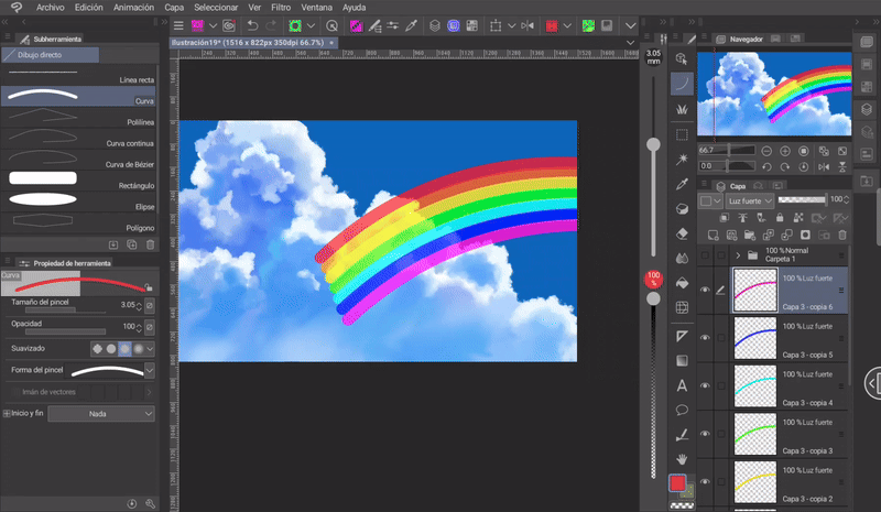
✦ Rainbow
A rainbow is an optical and meteorological phenomenon that occurs when sunlight is separated into its colors when passing through water droplets, such as when it rains or drizzles. For this reason, rainbows can be accompanied by clouds and/or somewhat dull environments. Let's see how to do it:
➀ To start, we will create a layer for which we must set the blending mode to «Hard Light».
➁ Then we choose a red tone in the color wheel (1) and the Curve tool found in: Tools > Figure (2)> Curve (3).
➂ We set the width of the line to whatever we like, and then create a curved line.
➃ We will duplicate the layer with «CTRL plus C» and «CTRL plus V» (in the Tablet version we can do this by holding down the layer, in the menu that will appear we choose the option «Duplicate layer»).
➄ Now, with the copy selected, we will go to: Edit > Tonal correction > Hue/ Luminosity / Saturation.
➅ We will move the tone bar to the right until the red color changes to the next hue. The colors of the rainbow are: Red, orange, yellow, green, indigo, blue and violet (they are presented in this order, but if we have a secondary rainbow above the first, those of this second will be inverted, first violet, blue, indigo, etc.).
Steps 4, 5 and 6 will be repeated for each color until all 7 are completed.
➆ We will merge all the color curves into a single layer using the «Merge with lower layer» function.
➇ We will apply a Gaussian blur to this layer. The blur is found in: Filter > Blur > Gaussian Blur. The blur level is up to each person, but in my case I set it to 70.
IMPORTANT: With the transform tool in its various variations we can adapt the rainbow to different perspectives. The complete list of transformation tools can be found in: Edit > Transform.
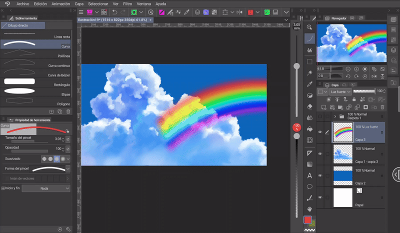
➈ Once again we will use the Hue/Lightness/Saturation tool to lower or increase the luminosity and saturation of the colors. Because, as you can see, the colors resulting from the previous steps are very saturated.
➉ After applying the blur some colors are lost, to fix this we create a new layer that we set to the «Hard Light» mode, now, with the airbrush with the hardness at minimum we paint the color that was lost.
Now let's look at some other aspects of rainbows to make them more realistic and credible.
➀ Rainbows don't have very vibrant colors, they are usually muted. To achieve this effect we simply have to lower the opacity of the layer as much as we find convincing (although of course, we can always take some creative liberty).
➁ The inner area of the rainbow and the entire part of the sky contained within it presents a more vibrant light, while the outer area presents a darker one.
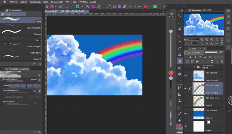
To achieve this you have to:
➀ Create a new layer with the blending mode set to «Multiply» or «Overlay Color».
➁ Using the airbrush, paint the entire outer area of the rainbow with a dark blue tone.
➂ Lower the opacity as much as you like. Not too much, not too little.
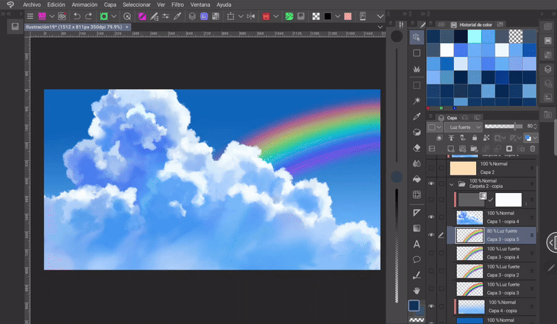
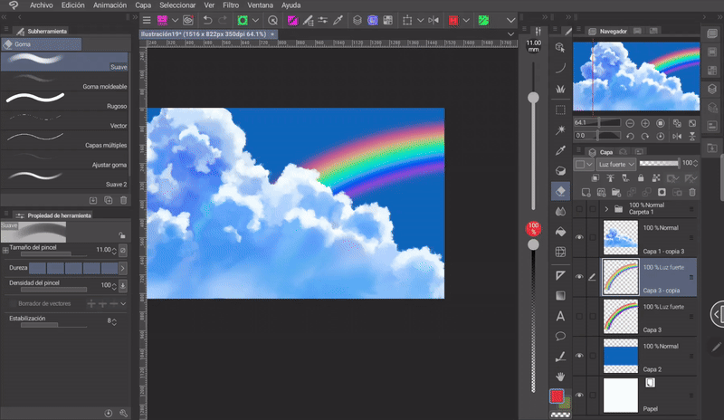
Done, we now have a rainbow.
On the other hand, this is a somewhat fanciful rainbow because it is in a very bright environment, which is not the case in reality; in a more real environment the colors of the sky would be dull and the clouds gray.
CIRCLE AND SEMICIRCLE: If we want the shape of a perfect circle or semicircle, we can get it with the elliptical circle shape tool. The process is the same: First, we create a red circle, followed by its duplicate. Now we have to make it a little smaller than the previous one and that's it, and all that's left is to apply the color change as explained before.
TIP: To get perfect circles, you have to keep the «SHIFT» key on your keyboard active. The same thing works with the ellipse shape tool.
MATERIAL: It is always good to understand and learn how things are done and then move on to what is comfortable. In this case, the practical thing is to download a brush from the materials library or use the one that comes by default in the program.
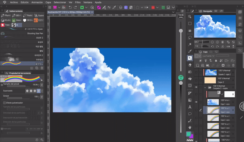
FIGURE RULER: To make more precise shapes with the brush I recommend using the rulers. For example, if I go to: Tools > Ruler > Figure Ruler > Ellipse, and apply it to the center of the canvas and then paint with the brush, I can get a perfect circle or semicircle. Easy, right?
NOTE: To deactivate or delete the ruler, right-click on the icon on the layer thumbnail and select the corresponding option from the menu. If you are working on the tablet or mobile version, hold down the option.
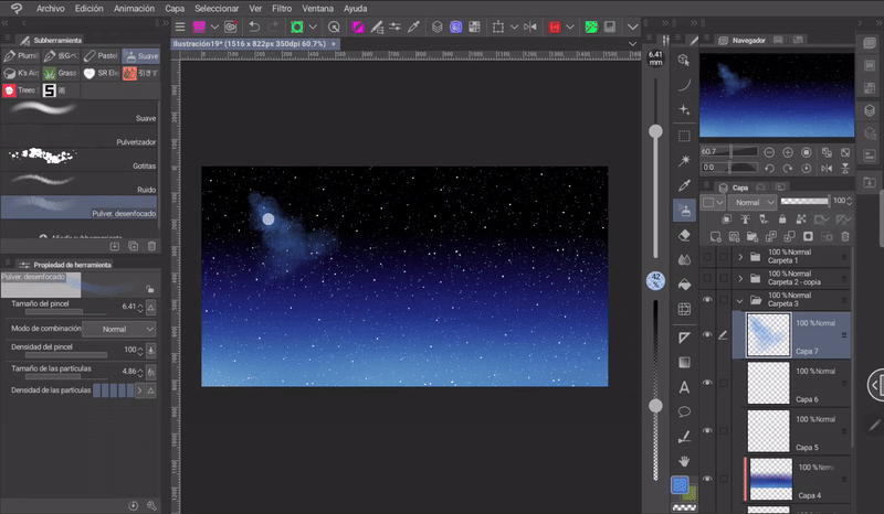
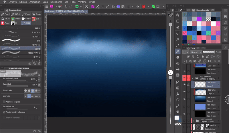
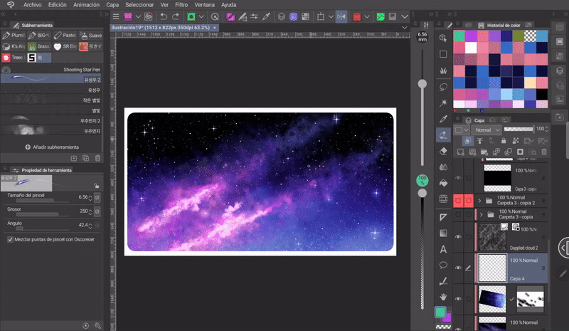
✦ Starry night
Starry skies are relatively easy, let's see how:
➀ As with all skies we start with a gradient, in this case, the gradient consists of blue tones and black.
➁ The second step is to select the color and with the brush «Airbrush > Sprayer» in a variable size between small and medium we paint random dots throughout the sky. You have to notice the variation of the dots and the opacity, some have to be more tenuous than others. This will simulate the stars. This is how easy it is to get a starry sky.
Another important fact is that the stars can be of different colors, which will make the scene brighter. Typical sea colors are pink, turquoise, white, red or green.
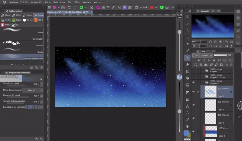
- GALAXY -
Now let's see how to paint a galaxy. In the clearest skies it is possible to see the arm of the Milky Way in which we live. The visible colors of this arm have a brownish hue, but we can give ourselves creative liberties.
➀ First, take the brush «Airbrush > Spray Blur» and increase the particle density to the maximum. Then, paint two parallel curved lines that simulate cumulus clouds. Painting these spirals is like painting cirrus clouds.
➁ Then, with the «Blur» tool, blur the structure.
➂ Using a pink color, I create another misty structure in the final area of the cluster in the same way as in the previous one. I repeat this same process with a lighter tone in the area below the previous one. This will simulate star dust. In this part, I played with the blending modes to obtain a shiny effect.
To outline the clouds, I use the same brush with transparency activated. This allows me to erase areas without losing the texture.
Once I finished the shape I decided to change the colors, for this I used the «Color Balance» tool. This tool is located in: Layer > New Tonal Correction Layer > Color Balance.
➃ In the tools window we find a folder where there are a series of brushes to add effects. In the «Effects» folder there is a star brush, this brush was the one I used to paint some stars a little bigger than the previous ones.
➄ On a new layer I set the blending mode to «Overlay», with the soft airbrush I painted a small shine on the stars that I placed in the previous step. The shade I used for these shines was turquoise.
Finally, place some stars, indigo and roses.
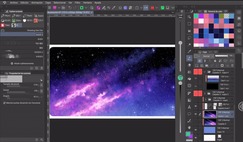
Done. I don't really paint this type of skies very often, but I liked the result.
✦ Materials
There are still more celestial phenomena that we can do for our skies, but since it can sometimes be difficult to draw them or we simply want to save time on repetitive processes, we can always turn to the Clip Studio ASSETS library of materials. In it we will find an endless number of brushes, image materials, automatic actions, among others. Let's see some examples:
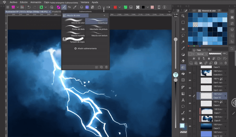
- LIGHTNING -
The following brush and others of this type make it easier for us to paint the convulsive structure of lightning. But, although it makes some steps easier, there is still work to do in between. The steps I followed to paint this lightning bolt were:
➀ Set the background gradient, for cloudy skies these are tones with little luminosity.
➁ The sky will be filled with clouds with dark or grayish tones.
➂ The clouds in the area where the lightning bolt is to be born should have a glow. This is because the lightning produced illuminates the surrounding clouds. That is why that area will have light-colored clouds.
Using the following brush and pure white, I painted one of the lightning bolts that the brush has configured. Then I erased the parts that seemed excessive. Now, to paint the lightning bolt's brightness you have to:
➀ Duplicate the lightning bolt layer (with «CTRL plus C» and «CTRL plus V» (in the tablet version we can do this by holding down the layer, in the menu that appears we choose the option «Duplicate layer»)).
➁ Move the duplicated layer below the original.
➂ Apply a Gaussian blur. The blur is found in: Filter > Blur > Gaussian Blur. The level of blur is up to each person.
➃ Activate «Lock transparent pixels» in the layer.
➄ Paint the glow of the ray with a color that matches the background. In my case I chose indigo, but pink is also a good choice.
➅ Finally, set the copy's blending mode to **«Add (glow)» mode.
Once I have the lightning rendered, I go back to the clouds, giving them a defined shape and marking the lights and shadows where appropriate. Points to consider:
● Clouds above the lightning bolt will be dark.
>> ● Clouds between the middle length of the lightning bolt will be illuminated.
>> ● Clouds at the end of the lightning bolt will be in shadow again.
If I notice that there are areas that should have a little more lighting, I paint them on a new layer with the «Soft Airbrush» and the blending mode on «Add (glow)».
List.
- COMETS -
To add some comets I used the following brush.
By default the comets of this brush have the glow of a preset color, to change it I did it from the tool: Hue / Luminosity / Saturation.
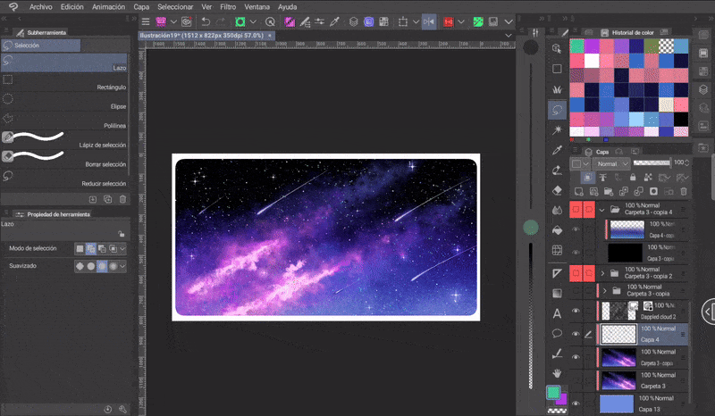
There we go, now we have a comet shower.
- SUN RAYS -
In this other illustrative photograph that I took of the sun we can see that it is not simply a white dot in the sky, but rather an illuminated sphere that, when photographed, the camera captures a kind of luminous geometric shapes diagonally to it. These glows are the energy emitted by the sun in the form of electromagnetic waves visible to the human eye.
To add a sun with these characteristics I will use the following material, which contains two types of materials, a pair of images with the brightness of the sun and two other brushes to paint the brightness.
What I do to merge this material is:
➀ Using a hard brush and pure white, I paint a circle, which will be the base of the sun.
➁ Now, I will drag the image material that corresponds to the rays onto the canvas and merge the size with respect to my base sun. This layer should have the blending mode set to «Add (shine)».
➂ Here, we need to lower the opacity of the layer as much as we like.
➃ To add the diagonal highlights, follow the same principle: In a new layer, paint the highlights and then change the blending mode as mentioned before.
-RESULT -
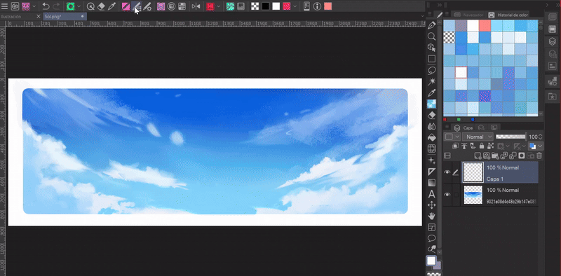
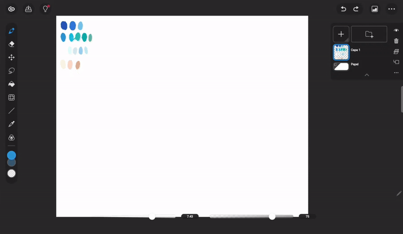
4. Let's paint a beach - Easy mode
Finally, let's see an example of a beach landscape, but I'll paint this one in simple mode. For those who don't know, the version for tablets and smartphones has a simple version of the interface, this interface is designed to optimize the workspace for small devices. If you want to know more about this mode, I invite you to visit the following official post:
Well, let's get started...
First, to enter «Simple Mode» from «Desktop Mode» you have to go to the icon with the Clip Studio logo, there you will find the option «Switch to Simple Mode».
The layout of the tools is very simple, on the left is the toolbar, filters, effects and the color wheel; on the right are the layers and their settings, and finally at the bottom the opacity and size slider. Once in the interface I started painting the background.
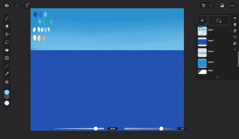
- THE SKY -
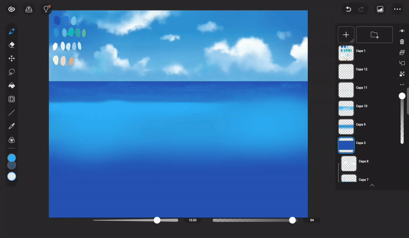
➀ With the paint bucket I set the background color to a blue tone.
➁ Now, with the «Filled rectangle» of the «Shape tool», I delimited the area that will correspond to the sea, this in a new layer with a deep blue tone.
➂ In a new layer I painted the gradient manually. I paint and then blur it with «Color blend» and «Smudge» (These tools are found in the category: Brushes > Blend.
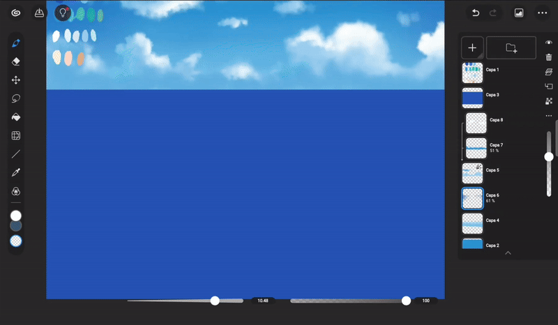
- CLOUDS -
To paint the clouds I used a default brush found in: Brush > Decoration > Cloud. This brush has the right texture for this type of elements, it gives the illusion of sponginess. The steps for the clouds are the same as in the previous explanations: Light direction, base color, shadows and highlights.
«Lock transparent pixels» will help us paint the lights and shadows on the base color without having to go outside of it.
- THE SEA -
A concept about the sea that we have to consider when painting it is that the furthest area, the one that seems to touch the sky, is a darker color than the rest, which is why:
➀ I will paint a strip of a light tone with the airbrush at maximum opacity and then blur it with «Blur» in some areas. This strip should mark the distance from the dark tone (far away) and the rest.
➁ Within the decoration brushes there is another default brush called «Ground». With this brush and the same color you used for the stripe, paint on a new layer over the darkest area, with quick brush strokes from left to right. This is to simulate the shine of the water surface in the distance. The brush size should be small.
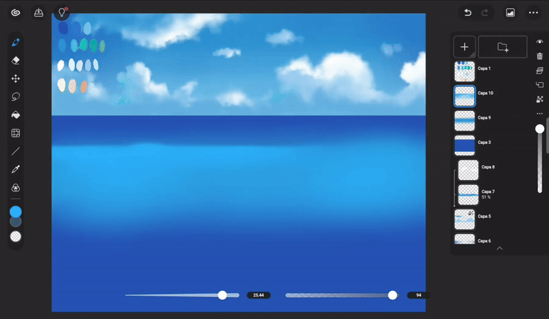
➂ The edge of the sea should be soft and get lost in the sky due to the distance, to achieve this I used the Gaussian blur filter. This filter is located in the left sidebar at the bottom. When using it, it asks us if we want to apply it to all layers or just to the current one (layer where the deep blue rectangle was painted in the first step), in this case it will only be used on the current one. In the list of effects that will appear in the lower right area, you must choose «Gaussian Blur» and set the level of blur.
➃ Using a blue slightly lighter than the stripe and the blur brush with low opacity, I painted small lines along the stripe to simulate the light from the movement of the water.

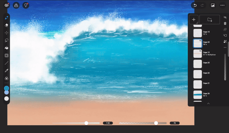
- WAVE -
➀ Using a light blue tone, I painted the shape of a wave approaching the coast. The color of the sea turns that shade due to the large amount of light it receives. The lower part of this wave should be painted with a darker tone to simulate the shadow.
➁ To paint the foam of the waves I used the same brush as the clouds and the white color. The way to paint them is like a cloud, they have to look fluffy.
➂ Below the foam you have to paint some small lines that follow the shape of the wave in the same way as was done with the airbrush in the previous step, this simulates the movement of the water.
➃ Using the airbrush and a darker shade, on the layer above the wave structure, paint the shadow of the foam on the water. This shadow is located along the edge of the foam.
- SAND AND FOAM -
The sand is very simple, you just have to paint it a peach color, which you have to mix and blend with the sea.
For the water foam that reaches the sand, use the «Ground» brush once again with a shade that is lighter than the sand.
- ASSETS BRUSHES -
To simulate the foam that appears on the sand, download a special brush. To download brushes from this interface is as simple as:
➀ Go to: Brush > Download > Add recommended brushes.
➁ This will take us to the window where there will be some material recommendations, but we can search for others from «Search for other brushes» at the end of the recommendations.
➂ Once downloaded it will be found in the «Download» folder.
Once the shape is marked with the brush, I use the tool: Transform > Free Transform, to fit it to a better perspective. Finally, below this foam, I have to paint the shadow that is generated in the sand when it comes into contact with the water. I did this with a darker tone than the sand and the airbrush brush. Finally, I improve some details.
Farewell
I hope that what you see here helps you paint your own landscapes with beautiful skies. It would be very helpful if you give me a thumbs up. Thanks for coming here! See you another time! (⌒‿⌒)
Bye bye.
Learn more about me at:
Users who liked this post


Comment