10+1 Tips & Tricks for Making 3D-like Game Logos & More🪄
Video version:
This tutorial is intended for users who already have some basic understanding of vector and text layers, masks, filling a selection, etc.
Text version:
Hello!
I’m .avi. I work as a professional game illustrator and creating comics and webtoons is my hobby.
Since I design game logos of all kinds at my job often, I wanted to share some tips to keep in mind while creating your logo to make it memorable and easy to read, as well as practical tricks to speed up your work in Clip Studio Paint.
The logo I’m using as an example is actually my webtoon’s logo, but the principles are applicable to all kinds of products.
1. Know your game
Sum up the main features and themes of the game or comic and pick elements you may want to include in the logo.
It helps to make a moodboard. In my case the car makes the main element. I also wanted to hint at the setting in snowy mountains and add one of the animals to liven it up. I picked the duck because it was the weirdest.
Make some concepts just by doodling. Since the webtoon is mostly a comedy, I aimed for a lively cartoonish logo, slightly on the wacky side, vaguely based on retro travel stickers.
2. Take your time picking the right fonts
I often spend up to a whole day searching for the right fonts for each logo I make. Browse websites like Dafont and download everything that catches your eye.
That way you can be sure you picked the best fonts possible for your logo!
💡Quick tip #1: Add fonts💡
You can easily add fonts you’ve downloaded into CSP without installing them by opening the font list and clicking Add from files.
Removing fonts is done in File > Manage fonts (where you can also add fonts).
💡Quick tip #2: Font categories💡
CSP allows you to organize fonts into categories by clicking the gear icon in the font list. This way you won’t have to go through all fonts when you want a specific type.
By selecting a category from the dropdown menu only the specified group of fonts is displayed in the font list.
💡Quick tip #3: Scroll through fonts💡
You can quickly go through the font list by hovering the cursor over the font selection menu and scrolling.
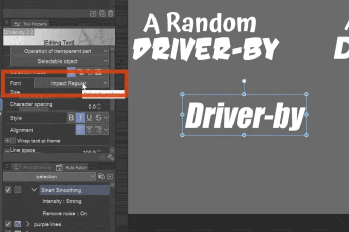
3. Combine fonts
If your logo is made up of two or more words, don’t stick to one font – a logo is visually much more interesting if you combine two fonts together!
And not just fonts, try combining uppercase and lowercase for each word.
Try to find two fonts with similar proportions.
If you can’t, you can “fix” one of the fonts by switching to the Operation Object tool and adding bold, italic, changing spacing or transforming the text with scale and skew!
Vary the size of each part of the logo to make interesting compositions white keeping the whole shape as compact as possible.
The main word should be the biggest, while articles and prepositions can be relatively small.
💡Quick tip #4: Transform text💡
With the Operation tool, in addition to transforming text with handles, you can scale text in the Sub Tool Detail palette in Font tab > Scale, Horizontal and Vertical ratio, and rotate and skew text in the Transformation settings tab.
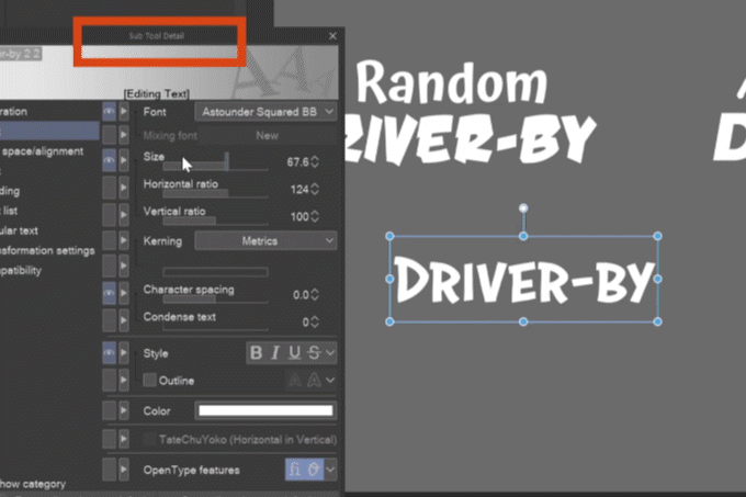
💡Quick tip #5: Circular text💡
By checking Circular text in the tab of the same name in the Sub Tool Detail palette, the text’s baseline changes to a circle. Using the handles you can change the size of the circle and move the text around it.
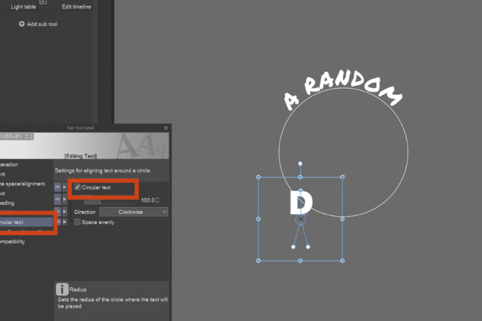
It’s perfect for stamp-like logos, coins or any arching text:
Official tutorial on text settings:
4. Dynamic shapes
Apart from rotating and skewing you can use various deformation tools to add dynamic feeling to your text, but first you need to rasterize it.
Because artifacts inevitably come with transformation of a raster layer, I recommend working with at least 4 times bigger canvas size than the planned output size.
This way the artifacts will be less noticeable and more easily fixed.
Also, keep the original text layer as backup and rasterize a duplicate, on which you apply the transformations.
💡Quick tip #6: Keep sharp with vector💡
If you are only going to use free transform, you can keep the sharpness by making a black duplicate of the layer, going to Layer > Convert layer and in Type choose Vector layer.
This will give you vector outlines that will keep edges sharp if you transform it together with the raster fill layer.
It works well with round bubbly fonts, with sharp shapes the corners may end up rounded.
🪄 Distort filters
Try various deforming filters in Filters > Distort to achieve dynamic shapes of the text. Except the panorama filter, all of them can produce interesting results.

🪄Liquify tool
You can also use the Liquify tool to distort the text, but it may take some time to process if your canvas is really big.
💡Quick tip #7: Smooth jagged edges💡
If you get jagged edges after deforming the raster layer, you can try smoothing them by applying Gaussian blur at the strength where you don’t see the jaggs anymore:
… Followed by Unsharp mask with increased radius.
I recommend setting an auto action for this process.
5. Add 3D feeling to the text
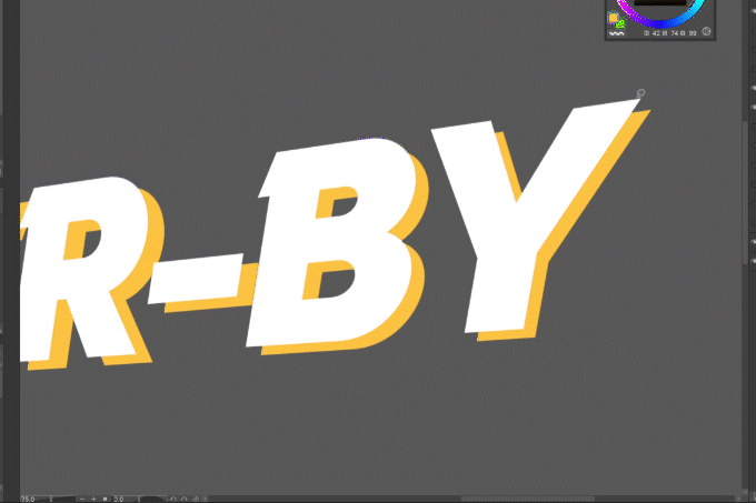
By making a raster duplicate below the raster text layer, scaling it down and/or moving it to the side you can easily add a drop shadow below the text:
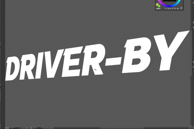
By drawing connections between the two layers you can give the text a 3D look!
🪄Blur filters for 3D look
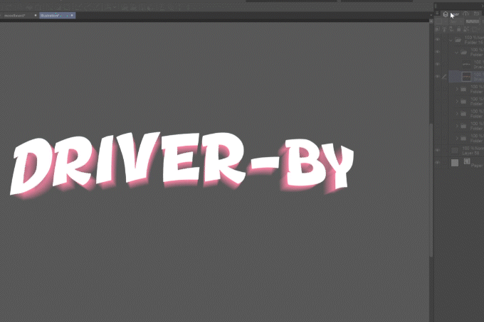
Another fun alternative is to play around with Motion, Radial and Spin blur filters.
Try various settings and positions of the red center mark in Radial and Spin blur.
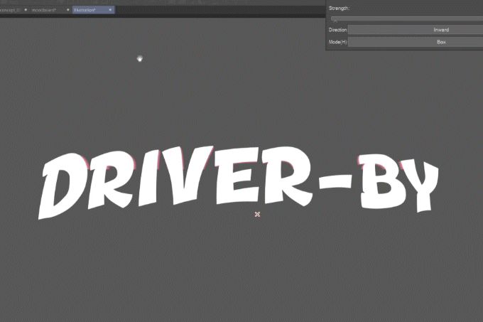
The filter will give you a transparent layer, but don’t worry! Just duplicate and merge down the blurred layer several times until the transparent parts turn opaque.
6. Border and emboss
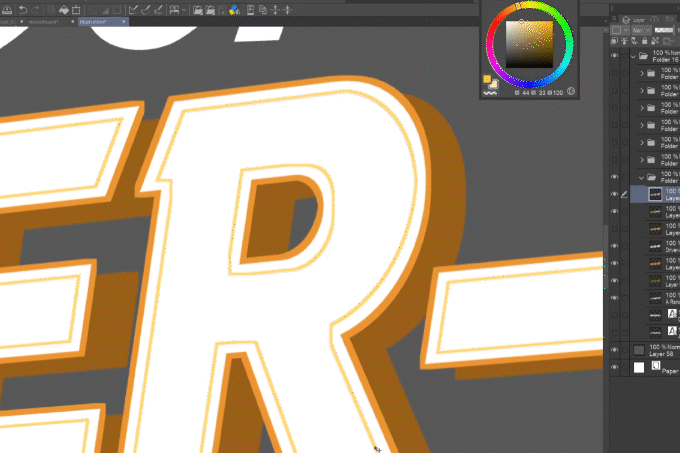
There are several ways to add borders and inner and outer emboss to your text.
🪄 Border effect
You can use the Border effect in Layer property palette:
🪄Emboss with selection expanding or shrinking
… Or by using selection:
1 . Ctrl-click the layer icon to make a selection of it.
2 . Click Select > Expand or Shrink selected area and play with different amounts.
3 . Fill the modified selection on a new layer.
💡Quick tip #8: Auto actions💡
Set auto actions for expanding and shrinking selections to speed up workflow!
Official tutorial on auto actions:
If you make more different layers with this method, you can slightly move them to give the text an embossed 3D feel!
7. Use clipping layers and masks
While you can color the text shape layers directly, I recommend using layers clipped on the shape layers or making layer groups with masks of the text shapes.
Draw gradients, patterns and such on new layers over the whole canvas and the clipping layer or mask will keep the shape.
Official tutorial on clipping layers:
Why?
What if the client changed the name to A Random Digger-by?
You would have to redraw the whole Driver-by text…
But with clipped layers you can just change the shape layer to which all colors are clipped, and with masked groups the mask, and only minor adjustments should be necessary.
8. Readability of text always first
If you make a cool shiny metallic text but the words remain unreadable, then it can’t function as a logo…
You can keep checking the readability, as well as composition, by opening a new window of the document and sizing it down:
💡Quick tip #9: Duplicate window💡
Open a duplicate window of your canvas in Window > Canvas > New window.
💡Tricks to keep text readable 💡(applicable to latin alphabet)
Keep the color and shape compact, gradients and texture should follow the line of the text.
🍊 Fun fact #1
People read not by letters, but by recognizing the shapes of words.
In lowercase text, keep the parts of the letters that go below and above the main line clear.
🍊 Fun fact #2
The eye follows the baseline, meaning the lower half of the letters is more important than the upper, in both lower and uppercase text.
For us that means that even with jumpy letters we need to keep their baseline on a defined curve.
Also, when using gradients, it’s better to make the bottom part more contrasting, for example a text in a dark outline should have the lighter gradient part at the bottom.
9. Add extra elements, but keep them simple
A text-only logo works too, but adding relevant elements will take it to another level!
In the first version of the logo I went too far with the details I wanted to include in the logo that it ended up just like a travel sticker.
I kept simplifying it until I ended up with only the silhouettes of the car, followed by the duck and squirrel, passing in front of the full moon (I guess everybody gets the reference :D ). The snowy mountains got reduced to a few simplified snowflakes. The wacky mood is kept by the comic speedlines and 4-pointed stars.
10. Use vector or balloon layers and layer effects whenever possible
The logo may need to be adjusted or even upscaled later on. You can save yourself some time by using vectors wherever you can. While keeping the text editable after deforming it is impossible, you can use vectors for other elements.
🪄 Vector layers for lineart
Draw lineart on vector layers:
🪄 Balloon tool for vector shapes with fill
For shapes you can use the Balloon tool, which can have both border and fill. I used it for the shape of the moon.
Official tutorial on Balloon tools, but it can be basically used as you know from Inkscape or Illustrator (pre-defined shapes and curved paths):
🪄 Border effect for outlines of balloon or raster layers
Similarly, you can use Border effect in the Layer property palette for adding outlines of elements:
11. Make sure the logo works on all kinds of backgrounds
If you make a light logo and it ends up being used on a white background, it loses its impact…
Make extra background layers, like solid black, white and grey to test the logo readability on them:
A good way to make your logo universal is to make a light text with a dark outline or on a dark element like wood plank or stone, and vice versa.
In my logo I used a teal glow around the light parts to make sure they glow even on white background:
Conclusion
Thanks for reading and have a lot of fun creating logos of your works or products!
🌟⭐✨ If you enjoyed this tip, it will make me happy if you give a like so that I know I’m doing things right, eventually leave a comment on where I could improve :) ✨⭐🌟


Comment