
This tutorial will show how to create and illustrate a creature in its natural habitat. In this way, not only the character design is presented, but also the space where he lives. This is intended to achieve a more credible and complete design.
Develop the idea
First of all, it is important to know what we want to illustrate. In this case, the intention is to design and draw a fictional creature. Once determined, it is time to try different ideas until you find the right one.
There are many ways to get ideas; from taking three random words and developing them in an illustration (for example: frog, bug, water); Get inspiration through photos, music, videos or search for a theme we want to explore. To get this idea, it was clear that we wanted to paint a beast with submersible skin and a water bottom.
It is advisable to be clear about the idea of the character before illustrating it, a phrase to describe it may be enough. The more we understand him and his world, the more details and history we can implement in the work.
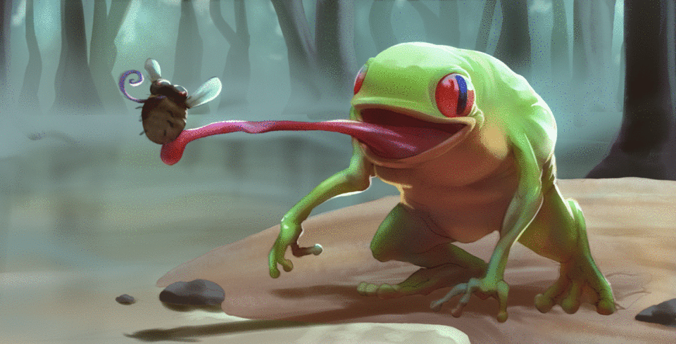
Once what we want to represent is established, it is time to make simple sketches that develop the idea. It is not time to detail or stop to perfect, the intention is simply to find the best composition to express what you want to tell. In this illustration, the idea is to clearly show the design of the creature while hunting its food.
Start illustrating
When the ideal sketch is already selected, it is time to clean it up. This means detailing more precisely what happens in the image. The clearer and more established it is in the early stages, the easier it will be to move forward in the following stages.
To do this, we will create a new layer above our sketch. This is achieved by clicking on the leaf-shaped icon located in the menu that shows the layers.
Next, we lower the opacity to the sketch layer. To do this, you have to slide the top bar until the number on the right indicates 50. This means that now the sketch layer has a 50% opacity. It is advisable to create a new layer filled with white and place it below all layers to act as a flat background color.
Now, in the layer above the sketch layer, it is time to draw a more definite version of it. As this will be the basis of our paint, it is advisable to use a brush that does not have 100% opacity so that the strokes are softer and faded. In this demonstration the brush included in the program named "Oil paint wet brush" was used.
Fill with chiaroscuro
There are many ways to progress an illustration, here we will show how to do it by first setting the main lights and shadows of the image before the color. To do this, we will select the background layer and the gradient tool of the program. We will take a light gray and a darker shade.
We will apply the gradient on the layer as we see more convenient, taking into account the lightest point of our image and the darkest.
Now we will fill each element of the image with shades of gray as we have done with the background. We will create a new folder below that of the clean sketch and inside we will create a new layer.
To create a new layer, click on the folder icon.
We will use this layer to fill the frog, we use a brush with 100% opacity and a solid color that stands out on the bottom to make sure that we are filling the entire silhouette.
The next step is to block the transparency pixels of the layer where we have colored the frog. This means that the layer will only allow us to draw where there was already established paint, in other words, we will not be able to draw outside the frog's silhouette. To do this, we will have to have the layer selected and click on the icon with a padlock and a square located in the menu.
Once the layer is with the transparency blocked, it is a matter of applying the gradient tool and a brush of preference to paint the frog with gray tones.
We will repeat this process, creating a layer for each new element within the folder, until the whole image is colored with these symbolic monochromatic tones of light and shadow in the illustration.
Add shadows
It is time to add the shadows. We will create a new layer above the layer corresponding to the element we are going to shade. In this case, we will shade the frog, so we will create a shadow layer above the frog's layer. To make the work more efficient, we will use the function of adjusting to the lower layer. This function allows you to draw on a new layer only where there is paint on the lower layer. Thus, we can draw the shadow without worrying about getting out of the element we are shading. To activate it, we will have to select the shadow layer and click on the icon with two ovals to the left of the menu.
Clip Paint Studio layers allow you to choose different combination modes between them. The mode we will use to shade is the "multiplication", since it obscures the color of the layers with which it interacts. This is achieved by selecting the shadow layer, clicking on the button where it says "normal" or the arrow that indicates downwards and choosing the "multiplication" option.
Finally, we take our preference brush (in this case the default "Oil paint wet brush") and an intermediate gray shade to paint the shadow. It is important to consider the direction of the light when setting the shadow. For example, if the light comes from above, the shadow will be placed down; if the light comes from the right, the shadow will be placed on the left, etc.
We repeat this process until all the elements are shaded. It is advisable to keep the layers with consistent names and divide them into folders when they are too many, since a well-ordered file means greater work efficiency. In this case, a layer is created with the name of each element (Ex: Frog) that houses all the layers referring to it.
Add color
Once the shadows are set, it is time to add color to the image. To do this, we create a layer between the shadow layer and the gray base color layer that we created in the third step of the tutorial. This layer, like the shadow layer, will have the function of adjusting to the lower layer activated. We will paint here the colors we want for the design.
Gradually and repeating this process, each element of the image is colored. It is advisable not to use very saturated tones at the beginning to help maintain a harmony between them.
Now that the image has color, it is appropriate to adjust the shadows so that it has harmony with the rest of the image. To do this, we will go to the shadow layer, we will use the function of blocking the transparency pixels and we will color the shadow with an orange tone.
Add light
To add light, we create a new layer above the shadow layer (also with the function of adjusting to the lower layer). We put the layer with the fusion mode "vivid light" at 75% opacity and apply with a light blue brushstrokes that indicate the light in the element.
We move forward with all the elements until the light is present in the relevant parts of the image. As a rule, when the light is cold the shadow is warm and vice versa. That is why in this case we have an orange shadow and a blue light.
Emphasize the color
Up to this point we have established the basic colors of the image, light and shadow. The initial range is little saturated, in this step we will gradually add saturation until we find a more vivid result.
We create a layer above the light with the fusion mode in "superimpose". Thanks to this we can add saturation to the area we want. For example, if we want to add a more intense green to the frog's back, we will choose a light green taking into account the base color of the element and apply it with a brush on the layer.
Thus, little by little and with multiple layers with overlapping function and different opacities, we increase the saturation and color to our liking. This is where a good organization of layers and folders demonstrates its usefulness.
Due to the slippery nature of the frog's skin, we add strong white glitters that imply its amphibian texture.
Define the background
It is time to define the background, it is good that all parts of the illustration go forward in tandem. Since all the elements interact with each other when they are present in the same space. In this way, implementing the character in the background is simpler, since everything evolves naturally together.
We create a layer below all the elements that go above the background. We paint the details we want. In this illustration, we paint more trees in the background.
A little light is also added to the water and sand. For the earth, it is advisable to use a brush with dot texture to emulate the soil material. This, for example, would be a good option.
To avoid that the trees in the background occupy too much attention of the spectator and taking into account that they are in the distance. We create another layer above the trees and add fog with an airbrush with the bluish color of the stage. We also add the brown of the trees reflected in the water.
Render the main character
Once we have completed the previous steps, we will have completed the perfect basis of our illustration. From now on, we could unify all the layers (it is recommended that, if we do, we create a new version of the file in order to keep one with all the layers divided).
We create a layer above all and start painting with our preference brush. This step is the most difficult to execute with a beginner level, since it requires mastery of the brush and basic artistic principles such as color theory.
Even so, there is an equally applicable advice at any artistic level: Painting without fear, nothing happens to apply the wrong color or not to find the exact range of shadow we want with the first brush. The advantage of digital is the ability to correct these actions without spoiling the canvas. Trial and error and intuition are good and advisable practices to explore the potential of enlightenment. It is important not to get frustrated and continue trying until you get the desired result.
In this illustration, we begin by adding clear brushstrokes that indicate where the light would impact the characters.
Then, more saturated and colorful tones are added with the airbrush tool and the brush. As in the mentality of the "emphasize color" step, the intensity of the colors is progressively constructed. In this way, the balance between them is better controlled.
With time and dedication, the details of the figure are detailed with the brush. It is advisable to focus the detail on the most important aspect of the character, as a rule it is usually the face of this. We use the zoom that allows the program to be performed on the image to give the strokes more accurately.
In this part of the process there are no shortcuts, just continue painting until the figure is fully rendered. Patience and effort are key to an optimal result.
Render the fund
First, the background colors are modified to make it darker and more saturated. To achieve this, the "Hue / Saturation / Brightness" correction function is used until the desired result is obtained. To access this function, you must go to the menu at the top of the application in "Edit> Tone Correction> Hue / Saturation / Brightness" or press "Ctrl + U" on the keyboard.
After this, as in the previous step, it is a matter of painting and gradually adding color and detail. In this illustration, we modify the size of the fund to correct the perspective. We use the "Transformation" tool for this. This is accessed with the commands "Ctrl + Shift + T" or in the menu above in "Edit> Transform> Free Transformation".
The brushes recommended for this are: the airbrush, the preferred brush and a granulated brush (like the one used for sand) in the areas where we want to give it texture (in this case they are used for dust spots in the air). The shadows and lights of the frog are also repainted in the process to maintain consistency with the background.
One tip to implement some elements of the image with the rest is to take colors from one element and add it subtly to the edge of the other. This, in theory, is due to the reflection of light in one object over another. For example, take the reddish tone of the frog's tongue and put it on the bottom edge of the fly.
Render the secondary character
This step can be done at the same time as the rendering of the main character. However, for this tutorial, his explanation is divided to teach how to paint his fur. Since, the fly has a different texture than the frog and therefore requires a different process.
The first thing is to define the silhouette of the character, erasing any line that stands out impertinently in the figure. Therefore, the legs of one of the sides are removed, it is easier to add them as details at the end than to take them into account in this part of the process.
With the airbrush and the brush the colors within the character are blurred. Thus defining the lilac tube and the black eyes of the fly. For wings, the wings of insects in real life are taken into account, which have transparency due to their material. This effect is achieved either by erasing the inside of the wing carefully or using a brush with the blue color of the bottom inside them.
For the effect of the body's coat to work, it is advisable to blur the colors following a light to dark striped pattern. Start at the top with a lighter brown tone, descend to a lighter one and so repeatedly until you reach the end. It also helps to create the same effect, but much more subtle, from right to left. This is done to emulate how shadow and light work and interact in the hair.
To add the texture of hair on the fly, it is advisable to use specialized brushes for this. In this illustration, we use the following:
Final details
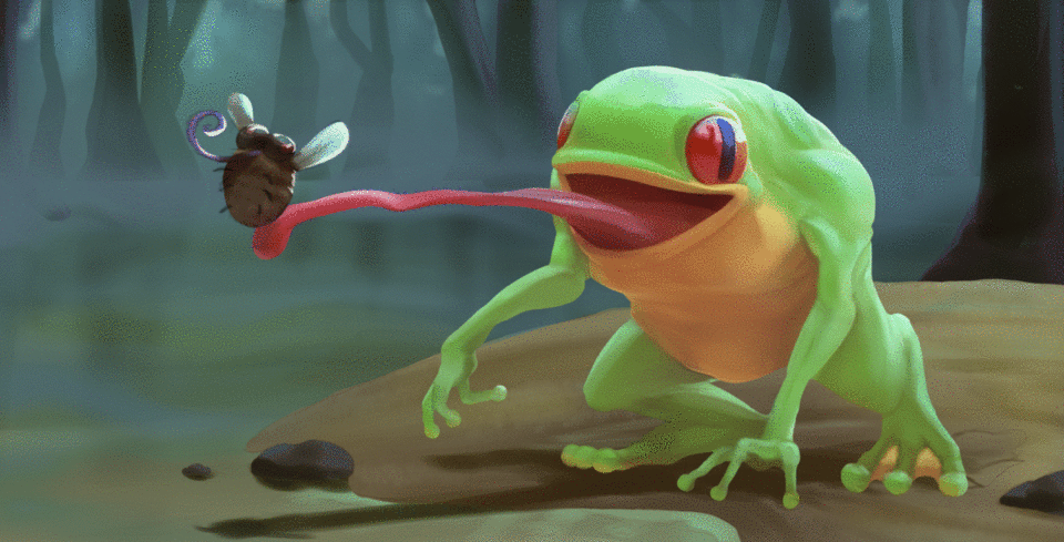
It is the last phase of the illustration, only the final details remain to be completed. One recommendation is to let the drawing rest for a day or two, so it returns to it with a renewed vision and recharged energy. This can produce improvements and new decisions in the direction of the work. In this case, for example, when retaking the illustration it is decided to make the background more blue and saturated.
The details that are added in this step are: the legs and eyes of the fly; blur the background to give it a more distant appearance. To achieve this effect, the part of the image that we want to blur is selected and the Gaussian blur tool is used. It is accessed in the top menu "Filter> Blur> Gaussian Blur".
To make the design more interesting, sharp teeth were added to the beast's mouth. Circular spots were also drawn, creating a new layer with the multiplication blending mode and a dark green hue.
Effects were implemented on the image that give action to the work. How to paint the saliva on the frog's tongue and wings fluttering the fly. This is achieved by duplicating the wings, rotating them ("Edit> Transform> Rotate") and putting them in a motion blur filter ("Filter> Blur> Motion Blur").
To intensify the brightness of the characters, we create a layer with the blending mode in "Overexpose (brightness)" at 35% opacity. With care and using the airbrush, we review the desired areas with a light blue to give them the effect.
It is important to flip the image at least once during the process to make sure everything is in order. We can find this function in "Edit> Rotate / invert canvas> Flip horizontally". In case we find an error, it is a matter of painting until we solve it.
Once everything is resolved, we turn the canvas back to its initial position and edit the image to our liking to give the desired result. It is easy to get lost in this part of the process for not knowing when to leave a work as finished. Once our advances cease to have a positive effect on the work, it is better to end it.
In this illustration, the tones and saturation of the colors are corrected, detail is added to the nearest tree and the texture of the sand is reviewed. This concludes the work.
Users who liked this post


Comment