
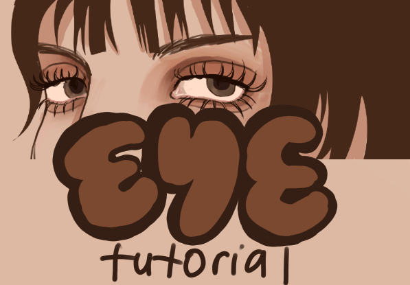
Introduction:
Eyes. Some say that they’re the windows to the soul, and one could see why. They’re possibly the most striking feature of the human face, and the one that we are innately drawn to direct our attention to. Eyes say it all- they are the chief feature in communication and can help us distinguish the full range of emotion. It’s no wonder that eyes of a great importance in art, and how their depiction and variation is often central to distinguishing unique styles.
But MAN they’re a pain! The face already holds a jumble of complex features: getting one of the most complex organs in the human body correct is just another challenge. Due to how attention and importance the mind pays to the eye, it is exceedingly easy to mess up, as just a few things being a liiiitle off can turn an attempt at an eye into a stiff globe, unconvincing and just plain not very nice to look at. Even cartoony eyes aren’t free from these issues, as they have their own rules to follow and must also struggle with style, trying to catch the viewer with something unique.
Well the cure to inconsistency is practice! A lot of it. Which we’re gonna have to do. But we’re not alone in this endeavor to get better at drawing eyes. We’ve got a group to help us along the way!
Meet Irene and Ivan! (and someone suspicious in the corner...) Turns out, they're eyes haven't been drawn in yet, so they’ve volunteered to be the blank canvases in which we can practice our many orbs.
...These two could really use some help. They don't have this any more figured out than we do.
I seperated our course into four sections, where we’ll be drawing four types of eyes: realistic, semi-realistic, stylized, and cartoony. We’ll also look into the many concepts that help make up the process of constructing these eyes. Understanding the “theory” behind the process will make it easier to remember how to construct an eye instead of just repeatedly drawing them without a goal. Hopefully those three enjoy our creations, because that’s all they’re getting.
This tutorial was made with and intended for use with the Clip Studio Paint program, although the lessons and could mostly apply to other programs. Don’t worry, all the brushes used in this course come default with Clip Studio (some of these brushes have been newly added, so make sure your version of CSP is up to date), so nothing is locked behind a paywall. Now enough hoopla, lets begin!
REALISM:
It’s best to start with realism, as it is the foundation of the art process. Even “unrealistic” styles still borrow information from real life, and thus know how to bend the rules in an appealing manner. So let’s jump in to the raw anatomy present in the human eye: no dissection required.
Anatomy:
Base anatomy of eye diagram: In the biggest of simplifications, the eye is a sphere (get ready to hear that word a lot) with other elements laid on top or enveloping it. On the outside:
Sclera: The white outer layer of the eye (the “blank space”). It merges with the cornea.
Pupil: The central black opening where light passes to enter the eye. It can expand and contract based on light level.
Iris: The “curtain” surrounding the pupil. Can come in many different colors.
Lacrimal caruncle: A small pink nub at the inner end of the eye. It covers sweat glands.
Tear ducts: Almost miniscule holes near the caruncle. This is where, well, tears come from.
Upper and lower eyelids: The folds of skin they surround the eye. They can contract and cover the eyelid to restrain vision, and periodically blink to restore moisture.
Eyelashes: Tiny bits of hair growing from the end of the eyelids. Intended to keep particles out, but often stylized.
Waterlines: The areas between the eyelashes and the eye on the eyelid. Usually pinker and wetter than the rest of the eyelid.
There’s a lot more going on inside the eye, but you usually aren’t going to be drawing the inner workings depicted here. The main takeaway from this side view is that the cornea covers the center of the eye in a clear half sphere, while the iris and the pupil sit behind. This is a good thing to remember when drawing eyes not from the front, as it means that you may not be drawing the pupil in the center, but a little back.
To draw the eye from different angles, you just need to draw it how it is: a sphere. While you probably won’t be drawing the entire sphere of an eye in your final work, it's still useful to place the eye onto a sphere in the sketching phase to figure out how it should look like.
Dividing the sphere in halves should also help with centering the eye. Whether you want to pupil, the tear duct location, or something else, to be the very center of the sphere is entirely up to you and how you style your eyes. Experiment yourself to figure out what simplifications will help you in construction.
Eye types:
Of course, drawing the same eye over and over again for different characters wouldn’t be very realistic, would it? Eyes can be a distinguishing feature in a person’s face and come in a great amount of varieties. They can exhibit age, race, facial structure, even personality, and a slew of other things. It’s impossible to attempt to categorize the many types of eyes, so these next points are but barebones, meant to be something you can expand upon with your personal research.
General shape (round, almond, oval, rectangle)
Eyes are restrained to the sphere that constructs them, but they can still have quite a bit of variety in their shape. From being very almond-like to being much more open and round, they vary a lot.
Eyelid (monolid, hooded, double lid)
Everyone has eyelids, but some are more obvious than others. Some people have monolids, where their top eyelid doesn’t contain a crease, making it look like there is no separate lid. Some people fold the top layer of skin themselves to make a sort of fake double lid.
Angle (upturned, downturned)
The angle of the eyes itself can vary too, as the tilt of the eye can have its own range, being slanted either way.
Eyelid amount (up, low, hood)
Some people have both lids equally prominent on the face. For others, the lower lid is larger and occupies more of the eye cavity, while for others its the top lid. For some, the fold of their lids isn’t as prominent, as instead their eye is slightly further behind in the head, resulting in the eye cavity showing a deep crease instead of the eye protruding.
Eyelashes, wrinkles, eye color, deformities
There’s many more variations that can occur, from makeup or hair density affecting how thick eyelashes can be, to age deepening the folds of the eyelids or drooping the whole lid, to even rare genetic variations that affect the color of the iris separately (heterochromia iridis) or change the shape of the pupil itself (pupil coloboma).
See, there sure are a lot of different eyes, and it's impossible for any single work to cover everything you should know. It’s important, not just for eyes, that you study from life as much as possible to learn about these variations. Not only will it help you develop your own style, it will also help you to steer away from the common fault of stereotyping. Lookin at real people will help you see through silly preconceptions (“all women have thicker eyelashes than men”, “all asian people have slanted eyes with monolids”, etc) and depict people more accurately, respectfully, and interestingly.
That sure was a lot. So let’s get to drawing some eyes for those two, ok? I’ll show you the process for how I personally did it, but in the end, it’s all up to you!
Realism Step-by-step:
First, I drew the sketch in a reddish brown color, and laid down some flat colors in a layer underneath it, with just a simple "Milli Pen" brush. I start laying down some basic shading there too, which is a simple “warm light, cool shadow” situation. Be sure to vary hues in your shading to keep it from becoming gray and dull.
One tip for now is that you probably don’t want to use pure white for your sclera. Well, maybe you do. I’m not your boss. Due to natural lighting and being shaded by the eyelids, the sclera are rarely ever really white. By making the sclera a more subdued color, like a light beige or blue, you can use lighter colors to really stand out, reserving white for highlights and such.
Next, I merged the sketch layer and the color layer and just start roughly blending and working everything together. The “Gouache” brush has a nice texture, which is useful for rendering organic materials like skin. A tip I like to keep in mind is to keep my brush big, and then gradually make it smaller. It’s tempting to try and get a certain small detail down first by minimizing you brush, but it could quickly make the rest of your rendering look unbalanced. Keep it big so you can focus on the big picture and make sure every section of your work is being treated equally.
Now REALLY rendering and detailing a piece is a pain. It is usually the longest part of any artistic process, and there’s not really any shortcuts to it. You just have to go at it, having a clear picture of what you want the final thing to look like in your mind. Even when drawing photorealism, a person’s style and vision is going to affect the drawing and make it uniquely theirs. There is no one way to tackle this meaty step, and how you want your final product to look like depends on you. Personally, I like keeping even my final details rough, not overblending them. I used the “Thin Gouache Brush” to add some final highlights, like the brighter whites reflections in the irises.
Ssh, I’ll let you in on a secret. I actually changed the entire shape of Irene’s eye over there in between steps, using a non-default brush! But look, this brush is free, and you can get it yourself too! Celsys runs a nice service called Clip Studio Assets, where users can upload and download custom brushes. There are loads of free brushes available, all you need to do is log in with your Clip Studio Account and start browsing. This specific brush is “Liquify Brush” by user “JFranDraws”. It can help to shift parts of your art just a bit, without angular effects like the residue sometimes left with the “Transform” function.
Well look at those lookers! But we’re far from done! Now we can start to look at different ways to interpret these basic realistic shapes, to do way more.
SEMIREALISM:
Semi-realistic eyes usually follow the same general rules and shapes of realistic eyes, just simplifying a little bit, omitting tiny realistic details and putting more attention into other elements like the iris and eyelashes to make it a bit more fun. This is just the beginning of the long quest in stylization to exaggerate certain parts of the eye for an appealing effect.
Usually semi-realistic eyes are a bit larger than realistically possible, or at least the iris and pupil are larger. The lines used to draw the eye are more distinct, and eyelashes may also be made larger. More detail is put into the iris now, although it may not necessarily be realistic detail, but instead more fantastical effects and shines. Stuff like the lacrimal caruncle or the waterline are rarely drawn, or likely only implied with the placing of other elements.
The general shapes used to categorize realistic eyes are also probably exaggerated: almond eyes are more almond-y, you know. It’s the pushing of the lines and forms of the eye that make it pop out more than a realistic eye, but still more restrained than a cartoony one. These eyes wouldn’t appear on a real person, but you can probably envision in your mind the somewhat-realistic face that these would appear on.
Semi-realistic eyes usually still make sense as being placed on a sphere, so using a sphere to construct them from different angles should work too, just like how we did them for the realistic eyes.
Since the elements of the eye have been simplified, we can now look into ways to really help the eye express itself: emotions! The eye is very telling of a person’s emotional state, and the way that it moves can help us determine a lot from just a glance.
Emoting:
The most obvious movements in an eye are:
The position of the eyelids: Are they squinting or crying? The eyelids are more closed, concealing more of the eye. Are they very surprised? The eyelids open wide and show more of the sclera. In fits of extreme emotion, the folds in the eyelids are often stressed. For stylization’s sake they can also “tilt” somewhat to show anger, delight, etc.
The size of the iris and pupil: Realistically, pupils only change size via changes in light; They expand to absorb more light and shrink when there is enough light. However, for whatever reason, humans have also somewhat associated large pupils with gentleness/cuteness and small pupils with shock/anger, so you can play around with that. Realistically, the size of the iris never changes, but aesthetically, you can also play with that.
The shape of the eyebrows. Eyebrows can move quite a lot already, and their movement is exaggerated in semi realism. Happy? The eyebrows usually arch in a semicircle. Upset of stressed? The angle down to the inner side of the eye. Sad? They do the reverse with the other end of the eye.
The formation of wrinkles: In semi realism, wrinkles are not usually drawn as much (the simpler the art style, the more we associate wrinkles with age, even though realistically everyone has them) but they are often shown in very extreme emotions. The folds of the eyelids become stronger, the creases under the eyebrow deepen, the skin around the ends of the eye scrunch up, and so on.
Once again, I can’t tell you exactly how you want to emote your eyes. Everybody reacts a little differently anyway, so it would be silly to expect only one way for an emotion to be displayed through the eyes. Once again, real life is your friend, so look at real references of peopling displaying emotions so you can get and idea of how you want to summarize.
Placement:
We haven’t seen yet how to “fit” the eye onto a face. With the eyes being a little simpler now, here’s some guiding diagrams of common tips and ratios to keep in mind when drawing the eye with the rest of the face, with some help from Ivan.
Conveniently, eyes are around one eye apart from each other! Ain’t that neat. As for how far they are from the edge of the head, they’re usually around ⅓-½ an eye length apart, although this can vary a lot in real life, sometimes even getting to one eye length apart for very wide set people. Vertically the outer corners of the eyes are closely aligned with the edges of the noses and somewhat with the corners of the mouth. Comparing to the entire height of the face, eyes are roughly halfway between the face, although they as well can vary slightly depending on the person.
In a horizontal view, the placement of the eyes can be tricky. Usually, the eye is a little more than one eye length away from the farthest point of the profille (usually the tip of the nose) and anywhere from 4 to 6 eye length away from the ears/the general center of the head (keep in mind “eye lengths” in this profile view means the length of the eye viewed from the side, not like earlier, from the front).
In the end, these proportion tips can still be tricky and clunky without a lot of practice. Once again, it is better to start drawing from real life reference before jumping directly into the shortcuts.
Alright, let me show you how I tackled a set of semi-realistic eyes!
Semi-realism Step-by-Step:
Just like in the realistic set, I made a lineart layer to draw a sketch of the eyes, and set some rough colors in a layer underneath, using the “Oil Flat Brush” The “Oil Flat Brush” is textured too, but not as much as the “Gouache” brush, which I like, as I want to make this look a little more clean and digital. brush. I generally made the lines thicker and simpler, and made the colors more saturated. I merged the two layers.
This explanation is shorter than the others because I feel like the process I did was already very close to the process for the realistic eyes. I started rendering, but not to the same level of detail as the realistic eyes. I wanted to keep the shading a little blended, but still mostly blockey. I also added some brighter highlights on the skin using an additional “Add” layer and a dark orange brown color. The shading on the inside of the eye is simple, and the spherical nature isn’t as implied in the sclera as it is in the skin. I added a bit more color and detail in the iris, but again keeping it blocky. I added color in a sort of “U” shape on the iris, while changing the hue quite a bit, as the highlights are warmer and the shadows cooler. I added simple white highlights and, while unrealistic, a little bit of reflection of the iris color within the pupil, because I thought it looked nice.
That was a nice variation from realism! But that’s only the start of the style that Irene and Ivan are going to find themselves the recipient in. Get ready.
STYLIZATION:
Here’s where things start getting a little crazy. When dealing with stylized eyes, like those in anime or manga, you find that you will likely have to break many of the rules and structure used with more realistic styles. At the same time, even these styles must have their own rules, otherwise our suspension of disbelief breaks and these unnatural eyes looks even more unnatural (not in the fun way, in the uncanny-valley-yuck way). So let’s crack into several ways to make your weird eyes a little more pleasant.
One of the biggest struggles with these sorts of eyes is that they really just don’t make sense in a 3D space. Instead of being restricted like the semi-realistic eyes onto being made up of an upper and lower lid line, many of these eyes don’t follow the logic of the two lids and seem to have miscellaneous lines. Many break far away from the realistic almond shape of most eyes. Many also omit a lot more details, as even the folds of the lids may not be apparent. But maybe the biggest concern with these eyes is that they don’t make sense when placed onto a sphere. Thus, it becomes much more difficult to make them fit onto the face or to show them in different perspectives.
While there are many ways to tackle these eyes and their issues, I would like to introduce my view. Instead of viewing eyes as “something made up of and/or placed onto a sphere”, maybe we should look at these as “something made up with a series of 2D strokes”. Let me explain.
Using Strokes:
If you simplified drawing the outline of a basic eye (not including the pupil/iris), you could probably do it in two lines: one for the upper lid, and one for the lower lid. Well, while a lot of stylized don’t look like a realistic eye at all, they too are made up of their own set of lines, which may be made up of more “strokes” than a regular eye.
Now, if you look back at the realistic eye, try redrawing it without using just two lines for the lids. If you get creative, you realize that different sorts of strokes can be made to represent its general shape. The number of strokes and the specific choice placement of them is what is really inspiring these stylized depictions, as these stroke combinations are then exaggerated and allowed to break away from the sphere. With the same eye, you can achieve a whole set of exaggerations.
I made a chart with some very simple examples of commons eyes you might see in this style, and the amount of strokes it takes to make them. This is but a tiny selection of the things you can do, and there’s no need to draw a certain type of eye in one specific stroke or way. Look to artists that you like, figure out what elements of their eyes you enjoy, and try to bring that into your own eyes. Just be sure not to just stare at all their art for hours and not get anything done. Not like I do that or anything.
Now, there’s still the problem of making these eyes work in different angles. Well, if a sphere doesn’t make a lot of sense here, why not try using a plane?
Stylized Eyes from an Angle:
Placing the eye centrally onto a simple grid, you can then manipulate the grid in perspective, which in turn gives you a sort of guideline as to how to draw the eye at that angle. Of course the transformation itself is never enough; it will likely make your eye look flat, so use it as a base that you can draw over. Remember, although these sort of eyes might not make sense on a sphere, you can still imply curvature and a 3D sense without doing too much.
Pro tip: Go to the menus “Edit” then “Transform” to get a lot of options for how to manipulate your grid. “Free Transform” and “Perspective” will probably help you out the most here. Just drag the points to transform the grid however you wish.
Using this grid, you can place it onto a face, like on Irene here (the size and placement will be dependent on your style) and then work out different angles via this transformation. This is very helpful when trying to draw a stylized face from different perspectives. The profile view of these sort of eyes is also tricky, since you may not always be able to rely on the sort of half-crescent shape. The grid may be able to help you here, in that you can look at just the end “half” of the grid (because from the side you see exactly half of the eye) and approximate what the side view of the eye should like in that style. Tinker around to see what fits.
Man, that was a lot about lines and grids! It can take a long time for your eyes to look coherent and appealing, but again, constant practice and observation will get you there. So let’s draw a set of stylish eyes! Those two are getting impatient.
Stylization Step-by-Step:
These eyes can be drawn in any method, but I think that it is beneficial to draw lineart and carefully clip and coordinate your color to speed things up. I prepared a sketch layer, and then made a vector layer on top to ink it. I used the “Mapping Pen” brush with some stabilization (because my hands are shaky) to make some nice, thin lines.
Not sure about CSP vector layers? Try them out for your lineart! A cool thing about them is that you can modify lines after you draw them, either by moving their control points, or pinching and shifting whole lines. Once you learn it, it can be a great timesaver.
I makes three layers for individual bases colors: one each for the skin, the sclera, and the iris. At this point I hadn’t drawn the pupil, because I’d paint it later in the coloring stage. I prepared an empty multiply layer for all those colored layer, clipping them so that the layer effect wouldn’t extend outside of the base color it is designated to.
Now onto coloring. On the irises’ multiply layer, I made a simple gradient using the Gradient tool and a grayish purple color. On the skin’s multiply layer, I used the “Opaque Watercolor” brush and lightly blending in a light pinkish color. This brush is nice because the lighter you press, the more the color blends.
For the sclera I did the same with a purplish color, but with a twist. I alphalocked the layer to make sure I only drew over what had already been painted, and used a lighter red color near the edges of shadow. This is a nice effect to show the strength of light and the translucency of an object like skin, an effect called subsurface scattering. Try it out sometime.
I went back to the multiply layer on the irises and rendered more with a darker purple. With this style, you can get fanciful with how the irises and pupils look; I made Irene’s iris have a bubbly sort of effect, and made Ivan’s iris more angular. I also deepened the color on the skin.
Now here’s where things get fun- and shiny. A huge part of this style is highlights in the eye and how to make them interesting. Using an “Add” layer and a deep blue/orange respectively, I added some more effects to brighten up the lower half of the eye. There's really so many ways to do this, so just have a blast with it. I also added a bit of a light purple color near the top of the iris too, to act as a subtle reflection.
The last step is basically as many highlights and subtle details you wish. I went back to the lineart layer and alphalocked it so I could slightly change the ends of the eyelashes to a lighter color (so It could blend more with the skin). With another “Add” layer, I added highlights to the skin with dark orange and bright white dots in the iris. For fun, I also extended Irene’s eyelashes with white. It’s unrealistic, but hey, I think it looks nice.
That was a whole lot of style theory! But can we push it even further...
CARTOONY:
This is it. The final frontier. Where you can say “screw the rules, the only law is to have a good time”. With eyes as extreme as these, you aren’t really limited by anything, so time to let your mind loose.
These sort of eyes don't care about anatomy. They don't care about making sense on a human face, or if they're even attached to a human at all. Aliens don't care about your rules. They don't carea about making sense in three dimensions, as a lot just care about looking as interesting as possible in a superflat, 2D sense.
Shapes:
A ton of these sort of eyes can be made just by tweaking around some super basic shapes. Simple, right? Just by the way it's orientated, a half circle can convey a lot of emotion, for example. I won’t sit here and tell you what shapes convey what emotions/personality/etc, because that sort of symbology is super variable to everyone, and in the end only you know how certain shapes and patterns speak to you.
Variation Ideas:
Once you've reached this point of stylizing, you're likely less concerned about making your eyes sensible in a 3D space and more just making them as unique and striking as possible. Since you've already seen some ideas for the entire form of the eye, here are some possible ways you could spice up the inside of it!
You should play around with as many elements as you can: light, color, proportions, ratios of one part to another, pupil vs. iris, silhouette, etc. I'm probably not even listing half of them. Whatever appeals to you in the rawest sense of aesthetic is what you should shoot for to make your eyes extremely bold. Go nuts, really, now you have no chance.
What I'm showing here is but scratching the surface of what you could do with this style. Promise me you'll go forth and do something far more interesting than this, but let me at least give you a taste of these sort of eyes. Irene and Ivan might not care for them, but maybe someone else will...
Cartoony Step-by-step:
I make a simple, fun sketch of the eyes, and added color underneath, both using the basic "G pen" brush. I also alphalocked the lines to make them more colorful, as I wanted the general colorscheme to be pink-and-purplelish. I ended up merging these layers later, because I would be doing so many effects over both the lines and the base colors that it would just be simpler to merge everything into one layer. But I'm also quite lazy, so if you're making complicated eyes, please make some nice layer folders. Be neat, not like me.
I made a "Multiply" layer over everything and made a simple shading gradient over the eyes. Then I made an "Add" layer above everything and used a bunch of brushes from the "Decoration" panel. I just wanted to have a bunch of fun shapes present in the base of the irises. These included some heart, cherry petal, and bloodstain brushes. There's a lot of fun effect brushes both in the program and available to download in CSP Assets, so be sure to try them out.
I made another multiply layer,and used "Select Color Gamut" in the "Select" panel to select only the base skin colors, so that the multiply effect would not extend beyond the skin. I used a bright pink shade for the lighter shadows and a darker purple color for the deeper shadows. You can see a bit of a saturated edge there too.
Now here is possibly the most important step: the shinies. I wanted to make something fun and cute, so I tried to add as many effects possible on the skin, eyelashes, and eye itself. I made several "Add Glow" layers above everything and used a ton of different colors, all using "G pen". Circles, triangles, stars, I just made a whole bunch of shapes in a whole bunch of ways, trying to vary the size of these highlights to keep them interesting.
Wanna make your own glow effects? It's simple, just draw what you want to glow-ify, duplicate it and change the copy's color, and blur the colored copy. What order you put the layers, their colors, and what layer effects you use can all affect how your glow looks, so now more than ever; Go ham!
CONCLUSION:
Well I think that's the most I've ever written about a single body part. While those three marvel at the selection of eyes at their disposal, you can get started with improving your own eyes. Remember: real life references are your friend, practice is key, and always aim to have fun drawing your many, many, many eyes. So go forth, and thank you for making it to the end of my awfully long tutorial!
Users who liked this post


Comment