
Welcome to “Monochrome Tutorial - Basic Tips and Tricks”. In this tutorial we will look at some of the methods I’ve used when creating monochromatic illustrations.
I will show you some basics of monochromatic work in Clip Studio Paint, but keep in mind that these are guidelines and you have many other methods you can try out!
I hope by the end of the list you have a better idea of how monochromatic themes work, as well as more tricks in producing such pieces. Let’s get started!
1. BASE LINES
Once you have your concept fleshed out in a sketch, the next step is to ink it. This will give you a base for a much clearer conception of your piece, and from here you'll consider the next steps in your design. What designs/details appeal to you? This can be anywhere from the simple lines produced, playing with line weights, varying shades and depth, to even using textures and patterns to add that extra little of flair to your artwork.
One tool setting has helped me immensely with my linework and has shortened clean up time when I illustrate. Both brush and layer options - vector.
Vector layers and vector eraser provide a quick method of keeping things tidy in an efficient amount of time. To start working with vector layers:
Hover on the second bottom left icon that says New Vector Layer. Begin your line work as you would. If you run into an issue and wish to only erase a small section:
Click your eraser, select vector, then click the second tab at the top to look at the advanced settings. Here, find the vector eraser section. You'll want to have the middle option selected (the one that looks like a T). Run your eraser over the section you want to erase, and it should remove only that piece!
2. LIGHT SOURCE AND SHADOWS
2. Before anything else, it's a good rule of thumb to consider where your light source is. This is one of many things that will determine a piece with more depth to it, as opposed to a 2D monochrome work. Keep in mind too what mood you may want for your piece, as it will more than likely affect the lighting and shadows as well.
(Also, always consider reference images! They are your friend and will give you a better perspective on how lighting works! Especially when it concerns anything like soft textures, patterns, and even metallic textures!)
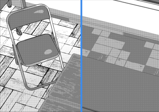
3. DESATURATED PALETTE
3. Monochromatic palettes have a slight difference compared to full color palettes, as they are desaturated. There are two methods I take when considering a palette - I will either work on a scale between black and white and gauge what appeals to me most - OR - if I have a reference image to that which I'm drawing, I will desaturate the source and eyedrop the colors from it for my palette.
To desaturate an image in Clip Studio, click Edit > Tonal Correction > Hue/Saturation/Luminosity... and drag the saturation section to -100.
4. HIGHLIGHTS
4. Highlights usually are the lighting on various materials, whether it be hair or metals. There is also a possibility of highlights coming from something like reflected light in water, and so forth. Generally they will follow the same direction as the light source, and rarely may reflect on other sides of a figure/object depending on the depth and intensity of light and shadow.
5. BACKGROUNDS
5. Backgrounds add further depth to an image, and personally I feel is up to your discretion if you feel they will add to your piece. Due to the difference in color palette and how desaturated/potentially muddy it may look, I will suggest varying light intensities between layers, to prevent mistakes of making the image look noisy or unreadable. Sometimes, complex backgrounds are not needed.
Thank you for reading. I hope this gave you a better understanding on how to begin creating monochrome illustrations/designs. Never be afraid to experiment!
Cheers, and may the monochromatic be with you!
Users who liked this post


Comment