
Hello and welcome.
In this tutorial I will show you the technique and the steps to follow to make a pet portrait from a photograph
Tools and workspace
We will use a 1080x1024 px format with 72dpi resolution,
Note: I usually leave the color of the paper in a light gray, it reduces the brightness towards the view.
You can also opt for a larger file that will allow us more detail, with a resolution of 300 dpi and taking care that the largest measure of height or width is around 4000px.
The windows that we will use can be found in the [Window] menu and you can drag and drop them wherever is most comfortable for you.
In addition to the [Canvas] and [Layer] window we will use:
1 [Tool]
2 [Subview]
3 [Command bar]
4 [Color history]
5 [Color slider]
6 [Color circle]
7 [Tool Properties]
You will find more information in the video version of this tutorial.
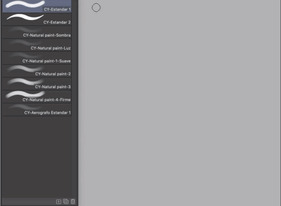
You can download my collection of brushes for this type of painting.
The brush properties that we will use the most will be:
Opacity
Brush density
Size
Paint mix
Photography
You can follow this tutorial with this image and later practice with your pet and that of your friends.
Down in the [Subview] window we click on the import button and open the file that we will use.
First strokes
The first thing when working from a photograph is to consider the size of our paper and the height and width proportions of our portrait.
We make some marks to define an approximate height.
Secondly, it is the line of balance or action, which tells us what path the different masses that make up our model take.
The third element to be traced is the main masses, we can mark these with geometric or abstract figures that enclose them.
Using trial and error, we correct these elements until they are closest to our model, always with simple figures, without any details
It is easier to see small proportion errors if we rotate the view of the canvas and the photograph from time to time.
Sketch
We lower the opacity of our first strokes layer and create a new layer for the sketch.
If we have made our scheme carefully, the drawing of the forms will be relatively simple.
We draw the general shapes and silhouettes.
Note: I recommend that you follow the evolution of the painting on the canvas and also in the [Layer] window.
He drew
We hide the first strokes layer, lower the opacity of the sketch layer, and create a new layer.
This time we draw the details more precisely, we can raise the level of detail as much as we want. Over time we will find the exact point that is useful to us for this type of painting. It is recommended to close the contour of our figure well.
Base paint
Base color
We hide the draft layer and create a layer below the drawing layer
With automatic selection we select the area outside our drawing, then we select reverse.
In the [Subview] window with the dropper activated we choose a dark color that is inside the model.
With the paint pot we paint on the selection
First lights
We select a color close to white and not too bright inside our model, then we gently paint on the base color the areas corresponding to the lights, we will not detail at all and we will equally paint the most and least bright areas
Base modeling
This time we will use the eyedropper to choose midtones between light and shadow and we are creating soft gradients that give the feeling of volume.
We carefully follow the shapes that the photo dictates, let's imagine that we shape a clay.
Shades, light and shadow
To make the base of our paint ready, we are going to add three layers, one for color shades, one for general shades and one for general highlights.
With the control key pressed we click on the base color thumbnail,
We can add a layer in multiply mode and paint with a slightly dark color to accentuate the shadow areas.
We add a second layer in add shine mode and paint with a slightly light color to accentuate the light areas.
We add a third layer in color mode and with the dropper in the [Subview] window we select and paint with the color of the ears, the door and the wall.
All colors are involved with each other and are reflected, the white is very noticeable.
Blacks and contrasts
We are going to add some contrast.
So far we have painted on the layer below the drawing, now we create a layer on top.
It is time to give strength to the painting with the black colors and the darkest shades.
Detail painting
First detail-filler paint
We have a complete base to paint, we put all the layers of paint together.
To apply the paint, in addition to selecting the color directly in the photo, we will give that color more or less light or saturation in the color managers and combine the colors with each other when necessary, it can be directly on the character or creating small temporary color palettes.
Second detail- Contour painting.
This time we work all the external contour of our character.
We add higher contrast with brighter, darker colors in more precise areas and define internal contours, in areas such as the eyes and ears.
Background paint
We create a new layer below the colored ones.
We select some colors from the background of the photo and mix them in a casual and very soft way.
This stage will be trial and error to see what we like.
Note: I chose a simple colored background, but if you wish you can paint the elements of your photographs.
Correction layers
We add two correction layers, go to the menu [Layer] / [New correction layer] and choose.
1 [Hue / Saturation / Lightness]
In this we slightly move the saturation and the luminosity.
Note: Each painting will need different parameters when editing these layers.
2 [Correction of levels]
The level correction layer consists of three handles, the first for shadows, the last for highlights, and the midtones in the center.
By clicking on the thumbnail of the correction layer we can edit it again, if we want we can also modify its opacity
Final details
Third detail- end
On top of the whole set we add a new layer this will be for the final painting, I recommend you choose the most important areas to give you all the detail you want, and in the peripheral areas only small details "here and there" commonly with that is enough to make it look attractive and balanced.
To finish, add a new layer in overlay mode and paint it a light pink color, this unifies the lights, we lower the opacity to 14% and voila
I can only thank you for following this tutorial, I hope you liked it and it will be useful for you.
A final tip, practice a lot and have some patience, you can leave me your questions and comments,
You can take a look at my other tutorials and my networks, until next time.
Users who liked this post


Comment