
Introduction
Lineless art can seem daunting if you’re unfamiliar with it. With no lineart, it’s hard to keep your colors cleanly separated and visually distinct enough to make sense to the viewer. So in this tutorial, I’ll be using Clip Studio Paint to share some tips I’ve learned to better define your lineless art and make it stand out.
Sketching and Color Blocking
Lineless starts with a sketch just like any other art. Just sketch as you normally would! Use your favorite brush and draw something you'll have fun working on. I'll be drawing a character I've created by the name of Reese.
I use two sketch layers: one for construction, and a second for detail. There's no limit to how many sketch layers you can use, however, and you should sketch in the way you're most comfortable with.
After finishing your sketch, rather than a lineart layer, you will start with color blocking. Color blocking is the process of laying down flat colors, just as you would for a lined piece, but without any lineart. The edges of your colors will be right against each other.
I’m going to create one layer for each color on my character. This will make them easier to edit and, later on, easier to shade. Make sure to keep all of your color layers for a character inside of a folder! Folders are great for keeping track of layers, among other things.
To block out my colors, I keep the sketch at full opacity, and create my color layers above the sketch. This way, it becomes easier to cleanly follow the lines of your sketch without too much clean-up afterwards.
Hide or lower the opacity of your color layers as you go, so that you can see your sketch underneath, and check every so often with your colors at full opacity and your sketch off to ensure your color blocking looks nice and clean.
For example, here, I've lowered the opacity of my character's skin and hair to see the sketch underneath and be able to draw the goggles.
Remember, your sketch will not be visible in the final piece, so don’t worry if your color blocking doesn’t follow it exactly! If you like how the shapes are looking, go with it, regardless of how closely it matches the sketch.
Once you’re done with your color blocking, you can hide the sketch for now, and touch up anything that looks messy with it turned off.
Here's my finished color blocking. Onto the first tip!
Value
In art, value is how light or dark a color is. Value is important in all works of art, but especially so in lineless art, where your values are a key factor in distinguishing your shapes from one another.
When the values of your colors are too close together, they may appear very similar to the eye, and look monotonous. If your colors are seeming to blend together from a distance, your values may be too close.
To check your values, your image needs to be viewed in greyscale. Inside of your folder, above your color layers, we’ll be creating a correction layer.
 1\. First, select your folder. This will make sure your correction layer is created above all of

      your color layers inside of the folder. If you already know how to use clipping layers, you

      can also create the correction layer above the folder and clip it to the folder itself.
 2\. In the very top bar menu of CSP, click on LAYER, and then select NEW CORRECTION

      LAYER → HUE/SATURATION/LUMINOSITY.
 3\. In the window that pops up, bring the Saturation slider all the way down to -100, and click

      "Okay".
This will add a correction layer over your colors to make them appear greyscale. With your colors in greyscale, it will show only your values with no hue or saturation, making it easy to see which shapes are too close in value.
TIP: This layer can easily be toggled on and off to check values as needed! It will not permanently change your colors, so no need to worry.
With this correction layer on, I can see that many of my values are very close, which could be why it looks monotonous. The hair and skin are almost the same value, as well as the skin and poncho fringe.
I'll start by making the hair a darker value. To do this, I’ll first select the layer I’ve colored the hair on. Then, I’ll lock the transparent pixels for this layer.
In your layers window, click the icon that looks like a small lock with a checkerboard. With this on, you can edit the contents of a layer without affecting the general shape.
With the hair layer still selected and the correction layer off, I'll use the Eyedropper tool to select the current hair color. Use your color wheel to select a color that’s a slightly different value than before - I'll be using a darker pink - and use a large brush to fill in your new color over the existing shape.
Repeat this process with your other shapes, lightening or darkening certain colors so that there are no shapes touching each other with values that are too similar. Be sure to toggle your correction layer on and off to check your values as you go.
Use your discretion when it comes to colors. If two of your colors look too similar despite being different values, use a different shade. If you’re drawing fanart, it’s okay to match the colors of the design. Your eyes are your best tool, and value isn't the only way to make your lineless art stand out.
Here's my character's adjusted values, and what it looks like in color.
Shading
Shading is another great way to make your lineless art stand out. This won’t be a full shading tutorial, but I’ll go over some shading basics, and some tips on areas to shade that will really help separate shapes in your lineless character art.
The first step is to establish a light source. This will dictate where the shading and highlights will go on your drawing. There are many types of light sources that could come from many directions, but for this drawing, I’ll be using a direct light source coming from the glove of my character. Since I'm doing simpler shading, I’m not going to get into reflected light or secondary sources of light.
To make sure I remember to follow where my light source is, I find it easiest to just draw it in! Since mine is coming from the glove, it’s already there, but for an unshown light source you can create a temporary layer and draw a small circle to represent your light source.
With all of the colors on different layers, shading will be easier. Pick a layer to start with and create a new layer above it for the shadow. I’ll start with the bottom layer and work my way up.
Select your new layer and clip it to your color layer by clicking the icon in the layers window that appears as two overlapping squares (one solid, one transparent with a dotted line.) It will read "Clip to layer below" when you hover your cursor over it. This tool works similar to the pixel lock, but with multiple layers: anything drawn on the new layer will only appear on the shape of the layer it is clipped to.
TIP: Your clipping layer can be changed to any blending mode, so feel free to shade in a way you’re comfortable with! I’ll be using darken for this tutorial.
When doing shadows, I use the eyedropper to select my base color, and use the color wheel to get a color that is darker and a slightly different hue. For example, when shading yellows, I'll shift the shadow's hue into the oranges or reds. This will make colors look more interesting and stop them from looking muddy.
Sometimes your environment will affect the color of your shadows as well - a forest background might make a character look good with green-tinted shadows.
Shading is a great way to get shapes to stand out and separate them by placing shadowed spots against un-shadowed ones. Places of overlap will often create shadow, such as the head shadowing the neck, or larger clothing hems shadowing the shape under it.
You can always use more than one layer per shape for shadow as well! More values of shadow will create greater depth in your piece and better separate shapes. Things like ears and noses are great for deeper shadows, as well as clothing folds and, in the case of ¾ views, the back arm and leg of a character.
Highlights can be good for helping shapes stand out as well, alongside adding volume to a piece. Softer highlights look nice on skin, while brighter and more defined highlights will look nicer in the eyes and hair. Make sure your highlights are on the side of the shape closer to the light source, opposite your shading.
Remember to keep values in mind while shading. If the hair is darker than the skin, but you shade the skin with a value that’s too close to the hair, they may start to blend together. In this case, you can alter your shade colors if the change isn’t too drastic, or you can try to alter your base color values slightly to adjust for shading.
Here's my character all shaded. It's time for some finishing touches.
Lines
Despite the name, lineless art isn't entirely devoid of lines! It doesn’t have distinctive lineart, but lines can be incorporated into the drawing to really make it stand out.
For the lines, I’ll create a layer at the top of the folder (above all of the color and shadow layers, but below the corrections layer.) This will be easier than changing layers, and make it easier to edit your lines. You can use whatever brush you normally like for the lines - I’ll be using the same brush I used for my color blocking in a smaller size.
There are three things to keep in mind when adding lines to lineless art.
1. You aren’t lining your entire drawing. Lines should be used minimally where they will have the most effect. Facial features are a good place to use lines to better define them from the skin. Lines are also good to define shapes in the hair or details on clothing.
2. Colorful lines will look better than stark black ones. Use colors a couple shades darker than the color your line is over. If it’s easier, you can draw your lines in black first, and lock your layer as we did before to color them in after.
3. Try to refrain from using lines on the outside edges of your drawing! In very certain cases they may look okay, but in general, they make a drawing look too much liked a lined drawing, taking away from the illusion of lineless art.
Lines are great for separating shapes as well as adding intricate details that may not convey as well through color blocking, such as clothing folds and loose strands of hair. Don’t go overboard, but don’t be afraid to use them in your lineless art!
Texture (Mini Section)
I wanted to at least mention texture before wrapping up! It's by no means necessary to incorporate, but it can help polish and define your lineless art if you choose to include it.
For this tutorial, I've been using a rough-edged brush that comes preset in CSP. What i've been drawing has one constant texture, but using different textured brushes for things like hair, clothing, or fur for animals is great for making shapes stand out!
Clip Studio Paint has a lot of textured brushes built in, but there are also a ton of user-uploaded textured brushes on Clip Studio Assets! You can access this through the Clip Studio startup window, on the left-hand side under "Service". User-created brushes are easy to download and a lot of fun to incorporate into your art, so give it a try!
Conclusion
For this tutorial, I've drawn a character, but all of the tips here will apply to lineless background art as well! Nicely defined values are really great for making the many individual elements of backgrounds stand out, shading will really give backgrounds a feeling of depth, and lines are especially good for helping smaller details and foreground elements pop.
I've used these tips to make a very simple circular background for my character.
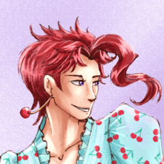
And here’s the finished drawing! This piece has come a long way from the original color blocking. Adjustments and finishing touches can take a while, but it’s always satisfying to see the end result!
I hope these tips have helped you in your creation of lineless art. Have fun drawing, everyone!
Users who liked this post


Comment