
⊹ INTRODUCTION ⊹
We all know that coloring itself is already time-consuming, and now you have to color your comics in the fastest way possible, which can be up to 15 to 40 panels per episode depending on the individual.
We only have 24 hours a day, a life to deal with, and now we need to meet our own personal comic deadline? That is a whole new level of challenge.
In this tutorial, I will try my best to walk you through my own personal experience and process on how I color my comics efficiently after consistently drawing them for over 3 years. Please do keep in mind that I will be focusing in more character coloring than background coloring as that can be its own topic for another tutorial.
⊹ IMPORTANCE OF CHARACTER DESIGN ⊹
We all love those flashy, intriguing, epic designs we see in games, am I right? But designing such complex character designs and putting them in a comic is not recommended.
This is because this will cause you to take up more time and effort to draw and paint those details. Imagine you add a complicated necklace with tons of colors to a character and you need at least, let's say, 10 minutes to draw that necklace. It might seem not much but imagining drawing this character over and over again for your entire comic, adding 10 more minutes each time you draw this character, you could be drawing or painting something else if this necklace is not even part of the character design.
I'm not saying that you cannot add any complicated design that might symbolize or represent the character. You have to work smart not hard. So maybe, instead of a colorful necklace, you can give this character a simpler necklace design, it is best to stick to ONE eye-catching color that complements the colors of your character. This is to draw your readers' attention in a more straightforward way.
Remember, readers may come because of the art but most of them stay for the story.
Below are my original characters, Chris, Jay, Kaze and Sou.
I try to stick to 3 to 5 main colors for them, and no too complicated designs.
In comics, you want the readers to remember your character, so the least complicated yet memorable designs are more important than adding those small complicated unnecessary details. Be wise when choosing your color palettes, it is best to not have more than 5 different colors on your character. This is also to save up more time when coloring your characters in your comic.
So after you layout your character designs, you can now place these colors into a color sheet which you can later use to color pick whenever you want to color your comic.
You can also add these colors as Color Sets in CSP to increase your efficiency when coloring comics
Another great tip is to open Windows > Subview and import the image file of your character sheets so you can view them in a sub window for reference whenever you color your comics. You can also color pick them when opening up the images in this sub view.
⊹ HELPFUL TOOLS AND TIPS ⊹
📁 ORGANIZE YOUR FOLDERS AND LAYERS 📁
It is great to organize your layers and folders when coloring.
For me personally, I like to separate the components when I color.
By components, I mean by :
➤ Characters / Subjects (which can be broken down into smaller parts)
  - Skin

  - Hair

  - Face

  - Clothes

  - Accessories

  - etc.
➤ Backgrounds:
  - Foreground

  - Middleground

  - Background
Since there will be so many pages you need to work on, creating these layers can be exhausting.
What I do is, I will draw all the frame borders on top of my sketches in the same layer using the Frame Border tool.
Next, I will add all those layers/folders inside this frame border folder.
The reason I use vector layer for lineart has number of reasons and I will explain one of them later in this tutorial as it involves in coloring.
🛠️ USE AUTO ACTION FOR REPEATING PROCESS 🛠️
You might think, creating these layers for each of your comic pages might be troublesome and tiring, this is where Auto Action comes in.
If you don't know about Auto Action, it is basically a tool that enables you to record your actions in CSP and you can later "Play" them so that CSP can redo all your recorded actions. So if all these creating, naming folders and layers actions are recorded, we can just hit on "Play" button and CSP will do its magic.
You can get this Auto Action here.
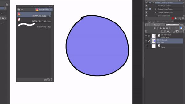
✎ Painting Subtool Based on Vector Layer ✎
Why my lineart is a vector layer? There are many reason, and one of them being that I could use this one helpful subtool that is shared on Clip Studio Asset.
By setting your lineart layer as Reference layer, you can use this and fill in color in just seconds without bleeding out of your lineart!
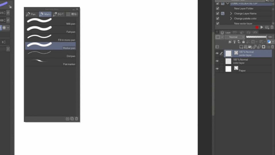
You can also erase with a similar subtool too!
⊹ BASIC GUIDE TO COLOR YOUR COMIC QUICKLY ⊹
This is not a "you-must-do-this" "you-must-do-that" type of list, everyone has their own unique process and method to color their comics. This is just a basic guideline for you to follow and it is best for beginners or someone who never color their comic before.
The basic steps when coloring your comics (assuming you already have a lineart):
1. Determine your main subjects and background
2. Put down flat colors
3. Add shadows
4. Add light
5. (optional) Post-processing and touch-ups
In this section, I will be using two of my OCs, Jay and D and draw one of my comic pages as examples. They are actually the same person, think of them as different personas of the same person.
Their designs are pretty simple, they are as follows:
✦Determining your subject and background ✦
This is one of the comic pages I drew, this page is pretty simple as you can tell straight away the main subjects and the background (well it is basically nothing haha)
Once I determined the subject, I will paint them in one solid color, most of the time I use grey to act as a solid base so I can clip layers on top of it later when I color the "components" (skin, hair, clothes, etc).
✦ Flat Colors ✦
Now we have the base down, we can now fill in the flat colors!
For me, I prefer to color the skin, hair, clothes, flowers, plants each in different layers and clip them on top of this silhouette grey base layer.
This makes the process easier to keep track of them when I need to do changes.
If you feel fancy and wanted to make your comic a bit more decent-looking, you can add more colors by airbrushing to create a gradient in each of the "components". Though I suggest keeping it 3 colors at maximum (dark, middle, light).
✦ Add Shadows ✦
There are two ways webcomic artists love to use when it comes to adding shadows.
1. One color shading with the use of Multiply Blending mode (or any other modes that works)
2. Color shading based on the "component"'s color
MULTIPLY SHADING METHOD
One of the good reasons why we used this method is because it is simple and fast yet still decent looking for almost every type of coloring style,
Just like its name, we can shade most of the things using one Multiply layer with one shade of color (most of the time). Though, you can totally use other blending modes like Color Burn, Linear Burn, etc with more shades of color.
It is good to choose your shading color low in saturation, in other words, muted colors. Here are some examples of shades of color you can use.
If you are still stuck on how to pick nice multiply shading colors, this color palette asset might be able to help you,
Do keep in mind that different shading color provides different kinds of moods.
Blue might represent cold, dark, depressing atmosphere, while yellow gives a more uplifting, happy, warm atmosphere.
Here are some good examples of different shading colors applied to the flat colors we just saw in the previous section. Observe the difference in terms of mood and atmosphere each shade gives to the panels.
You may adjust the opacity of the multiply layer to achieve your desired results.
COLOR SHADING METHOD
This method takes a bit more effort, as each color will need one or two more shades. This is where the importance of character designs comes in. If your character has a lot colors and you decided to use this color shading method, it is going to take up a lot of time just to get shading down.
This method is really pretty to the eyes, so if you want to give more life to your comic, and your characters' designs are simple enough for you to put in a bit more effort, there is no harm to use this coloring method.
One way to speed up the process is to actually follow what I mentioned in the previous section, organize your color palettes in Color Sets or putting them in the Sub View so you could color pick them quickly,
I do recommend having at most 3 color shades for one "component".
✦ Add Lighting ✦
Now we have the shadows down, we want to have some light.
Since we already put down the shadows and shade according to the light source, I hope I can assume that you already have a good picture on how the light is going to place in your panels.
You can probably tell it is going to be another tiring process to put down the highlights. Here is one quick way to do it, though it is not elegant, it works decently.
First, select the shading layer, we want to get the selection of the areas you colored in this layer. To do this, go to Layers > Selection from Layer > Create Selection.
You can later see your colored areas are selected. Once you do this, Reverse the selection layer, so the areas outside your shading are selected. Go to Select > Invert selected area.
This is where we are going to put in our highlights. You can fill the entire selected layer or use the good old airbrush to highlight.
If you choose the multiply shading method to shade your panels, adding lights quite important to give your panels more depth, for color shading on the other hand, it is really up to you.
You can use different types of blending modes for highlights, the most common ones are Add(Glow), Add, Screen, Glow Dodge, Color Dodge, Linear Light etc.
Picking colors for highlights is much more flexible as the colors can be both saturated or muted. Exactly like adding the shading color, the color of your highlights gives different moods too. Observe the below examples:
✦ Post-Processing and Touch Ups ✦
This step is totally optional but if you find your panels seem to feel out of place or are not blending well, there is no harm to do some quick post-processing and minor touch-ups.
One way to blend your panels is to overlay them with one color shade. You can use the blending mode Overlay, Screen, Lighten, Darken or Soft Light to do this. This is to give the overall look and feel of your panels more blended together.
Look how the panels look so much more pleasing to eyes now!
If you are feeling fancy, you can also make use of Gradient Maps! Simply right-click on your top layer and choose New Correction Layer > Gradient Map.
Try out any of the blending modes or just don't use any modes to see which fits best!
⊹ MORE EXAMPLES ⊹
This is another quick walkthrough on a darker and cinematic setting in a comic, so you guys can have more insights on how these steps will look when put together.
✦ FLAT COLORS ✦
✦ SHADOWS ✦
✦LIGHTING ✦
✦ POST - PROCESSING ✦
CONCLUSION
That's all for now! Hope you find this tutorial helpful to you to color your comic fast. Thank you for reading!
Users who liked this post


Comment