
Introduction
Hey-hey and welcome to my new article from April 2021! This time this is a special TIPS of the Month guide on the “How to Draw Landscapes” topic. As always, you are free to read this article or watch the video guide with my explanations, real-time process and subtitles! ^-^ Moreover, the video guide lets you see the non-stop process of drawing and examining every single action of mine. Only when my explanation takes less time than the actual process I am talking about the video is expedited. I did my best to make this video comfortable and easy to understand since I myself belong to the people who better assimilate new information through videos and practical real-time examples. So, despite what you chose, let us begin! ^-^
Today I am going to tell you how to draw such landscapes:
Before we start, I would like to mention that we are going to use Blender, a 3D modelling software, to help us to create such a beautiful anime-like scenery. Do not be afraid – we are not going to do anything complicated there, and it will take only 10-15 minutes to do everything we need from it. After that we will switch to Clip Studio Paint. Blender is a 100% free software, so you do not have to buy anything and can just download it from the official website.
The reasons I use Blender as a supporting software for my works:
1. Allows you to create a main though still complex basement for your artwork fast;
2. The created elements will 100% be with the perfect ratio, perspective, etc.;
3. Things like the camera angle, the shape, etc. can be edited almost instantly with no need to redraw or correct multiple elements;
The Blender Stage
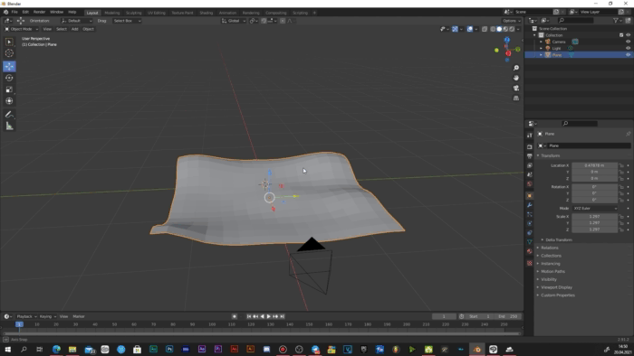
1.1 Shaping a plane
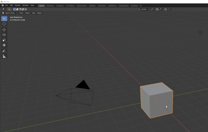
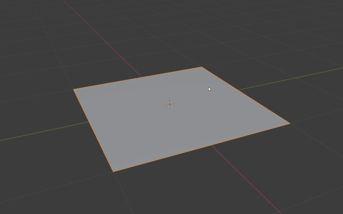
Once you have installed Blender and created a new General project file, delete the default cube (experienced Blender users are probably like: “ah, here we go again…”). Now add a Plane:
Then press on Tab on your keyboard to enter the Edit mode Right click on the plane Subdivide. Repeat the subdividing 3 or 4 times. In this way we create more subdivisions of our plane so we could transform and bend it properly.
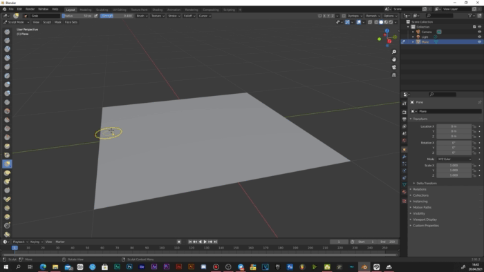
Now switch to the Sculpt mode in the top left corner of Blender and pick the Grab brush. Now simply start bending the plane in a way it would look like hills (you are free to pick other brushes and morph the plane in any way if you are drawing, for example, mountains or cliffs, however, right now we are going to create a grass field with Blender, so take that into account).
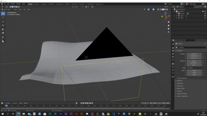
Once you are done with the shape (or at least satisfied with the main form – you can still return to shaping later), grab the camera object that is flying above your plane and locate it in the way it would grab only the part of the plane you would like to use in your artwork. You can check what exactly the camera sees by pressing “0” on your NumPad. You can also teleport the camera to your current point of view with the CTRL + Alt + 0 combination.
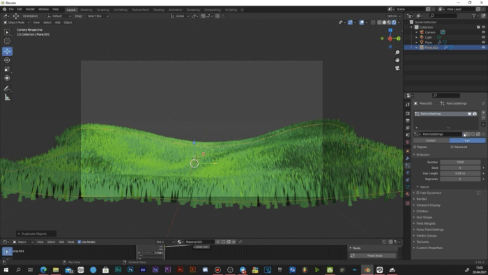
1.2 Creating a grass field
Are the shape and the camera ready? Great. Now go to the Particle Properties window and add a new particle system and switch its mode to “Hair”. You should now see plenty of long strings raising from your plane. Now go to the Render Properties window and open the Hair subwindow. There you should switch the Hair Shape Type property from “Strand” to “Strip”.
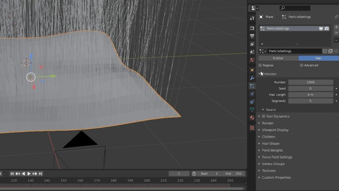
After that you can return to the Particle Settings and adjust your grass. First of all decrease the length and increase the number of blades – the exact numbers of these parameters are up to you. Also, in the same Particle Settings window find the Children subwindow and switch the preference to “Simple”. This will make the blades spread more chaotic and thus more natural.
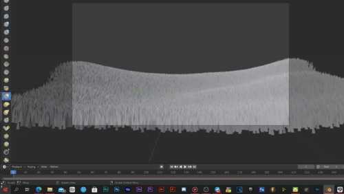
After playing with the grass’ parameters a bit I returned to the camera and edited its position slightly. This also included scaling the plane (in the Object Mode) and changing its shape a bit more (in the Sculpt Mode – all the modes can be switched in the same top left corner).
There is also a hint that may make your shaping process easier: in the bottom of the Blender interface you can see a timeline. If you click on the very left icon on it you will open a list of modes. Click on “3D Viewport”. With this you open a second editing window, and now you can drag and shape the plane from different angles in the bottom window while examining the changes from the camera’s perspective in the top window.
1.3 Texturing the grass
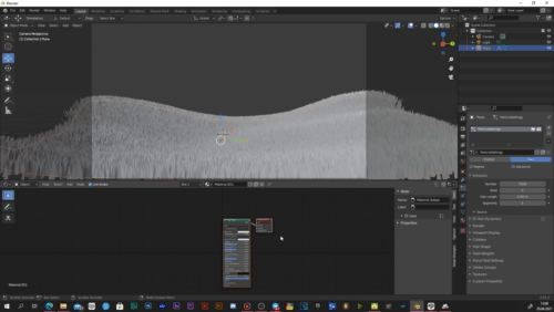
Click on the same left icon where you opened the 3D Viewport and switch it to Shader Editor. Then press on the “New” button in the middle of your screen.
In the appeared dark grey field find the appeared windows (nodes) that are connected by a line and delete the big one. Press Shift + A and via search find the “Emission” node. Link its Emission point to the Surface on the small window we left.
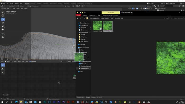
Now you will need a grass texture. I created one myself and, as you may have noticed, it kind of reminds of a grass but does not really look like an accurate texture. The thing is, we don’t really need a texture that would perfectly resemble grass. We only need the one that would imitate it and have a similar color pattern. I made mine in a minute or two, so even if you have no experience in creating textures, you can made one like this for sure. You can also download mine from Clip Studio Assets:
Once you have a texture, drag it near the nodes we have just linked. Then link the Color point of the appeared window with the Color of the Emission node and switch the preview mode of the project to the Viewport Shading in the top right corner of the workspace. You should now be able to see the applied texture.
Now duplicate the plane we have and leave the copy on the same spot, go to the Particle Settings. Press on the icons with number “2” as you can see here:
In this way we separate our new plane from the original and can edit it. Now decrease the number of blades to somewhere between 100 and 200 and increase the height. That is how you can make the grass look more natural by creating an effect of random blades’ length. You can also play with the other shape preferences to find the best option for you.
1.3.5 (Optional)
However, I found my grass texture a bit boring, so I came back to it and added some random yellow dots. Once again, it might not look like something that would suit there, but in Blender it will create a completely different effect.
In Blender I replaced the old texture with the new one and some of the blades became yellow creating an effect of a field of yellow flowers. This is an excellent diversity to our artwork.
1.4 Rendering and exporting
We are proceeding to our final stage where we are going to export the image and start working in Clip Studio Paint, so this is your last chance to edit your plane – to bend it, to edit the grass and position the camera. If you are ready, open the Output Properties. Here you can adjust the properties of the image that we will use as the basement of our landscape. I entered the 4K resolution and switched the color depth to 16. The compression level is up to you.
And the most important part – go to the Render window, open the Film subwindow and check the “Transparent” option so we could export a transparent PNG image with no grey “sky” over the grass.
Now click on the Render palette in the top menu and press “Render Image”. You should now receive the shot of your grass with transparent background – export it to any convenient folder as a PNG file.
And we have finally finished the Blender part of our work. It might look like this part is more complicated and longer that I promised, but I just tried to explain everything as detailed as possible so the Blender newbies would have no troubles in process. If you try repeating this stage yourself, it will actually take 10-15 minutes – just 15 minutes to prepare a basement of an artwork is a great deal, right?
The Clip Studio Paint Stage
And we are finally here, in a comfortable and familiar environment! ^-^
2.1 Importing the image
Create a new canvas of similar to your grass image ratio. You may use a higher resolution (I created a file with 5000x3000 pixels), and don’t worry about the pixelization – go ahead and scale the grass to the borders of the canvas. Rasterize the image.
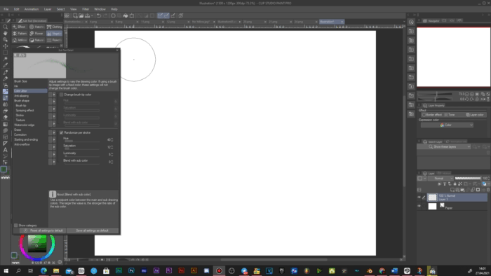
You will definitely not be happy about the pixels and the blurry look of your grass, but there is nothing to worry about since we are going to use one of my favorite Clip Studio functions – the Smart Smoothing. It is located in the Edit menu. Open it and you will see the following window:
The purpose of the Smart Smoothing feature is to reduce the unwanted consequences of image scaling by smoothing it and removing the noise. And though I do use it in the way it is meant to be used, I also find it an interesting instrument that can give your image or any other element a special artistic effect. To see what I mean, set the intensity of the effect to Strong and check the Remove Noise option, then turn the preview on. Depending on your device, it may take several seconds for the effect to appear, but you will definitely notice the difference, especially on the farther blades where the pattern becomes motley.
Here is a direct comparison of the original image and the smoothed one.
We have not just removed the unnatural sharpness of the model and got rid of the pixelization and noise, but also made it look like it was painted with oil. I love this effect and I often use it in my works.
The blades that are close to the camera may look quite the same, but we will cover them in the next stage anyway, so they are not really necessary.
On a new lowest empty layer add a gradient that would imitate the sunset. You can pick the colors yourself or download some sets from the Assets. Right now we only need a simple direction of where the sun is located, so no need in overdoing here.
2.2 Drawing the grass
Probably the most interesting part is starting: we are going to improve our basement grass and make it look more artistic and beautiful. And the following brush pack will help us a lot with this: 草葉ブラシ (ID: 1701591)
Though you are free to use any custom grass and foliage brushes you like. Pick some dark green shade and add some big grass blades to the bottom corners of the canvas. This technique has several purposes:
1. To cover the basement blades of the model;
2. To emphasize the perspective;
3. To create the composition vignette;
4. To make the grass look more organic.
You can change the shades in process slightly or use the Color Jitter in the brushes’ preferences so every stroke would give you a different shade and tone of green.
The activated Color Jitter with randomization per stroke example:
After that create several layers below that grass and start adding smaller blades combining the brushes from the pack (draw with the colors picked from the modelled grass on the places where you draw so the stylized grass would match the main one). The farther you go from the camera, the smaller the plants should be and the lower layers you should pick so the elements would cover each other properly. You can also add some small details like flowers or bushes to make your work look more interesting. The stage of simple drawing is probably the simplest though one of the longest ones. The hardest thing is to stick to the perspective and sizes.
When you are done, duplicate the layer with the modelled grass and place it below the original. Switch the layer’s blending mode to Add (Glow).
Now go to Edit --> Transform --> Mesh Transformation… and bend the Add (Glow) grass so there would be a thin glowing line above the normal grass (mostly near where the sun is located – the farther it is from the sun the less we should see the glowing line). Such a strong glow may not be something you can always see in real life, but in such artworks it is a great decision to:
1. Make the grass and the horizon more organic;
2. Improve the border and transfer from the grass to the sky;
3. Emphasize the power and the angle of the light source.
Then I added a temporary sun with an Add (Glow) layer and Color Dodge layer [for the wide glowing]. They were made with yellow and orange/reddish gradients accordingly. I will change them later but I needed to check how the current composition was going to look like with the visible light source.
Now we are going to add some volume to our field. If you were following my steps and now you have several layers with decorative grass you made with brushes, duplicate the two closest to the camera layers (with the big grass in the corners and the closest grass behind it). Place the copies below the original layers and switch the blending mode to Screen (or Color Dodge if you need a brighter and more saturated effect).
And now, just like with the contour light on the horizon, use the Mesh Transformation tool and bend the Screen layers slightly to the center. The effect you should receive looks like that:
So, you should bend the right part of the grass slightly to the left and the left part – slightly to the right, if you placed your sun in the center of the artwork just like me. This technique is a small cheating if you are chasing the overall impression instead of a crazy detailing. And remember: only add this effect to the closest grass layers. If you try to do the same for every single grass layer you have you will receive a mashed disaster.
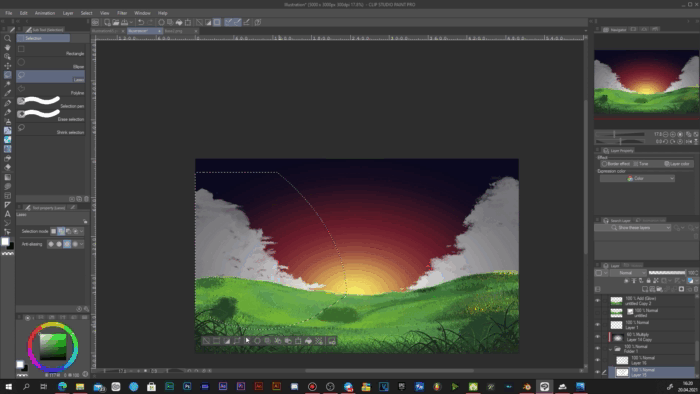
2.3 Adding the clouds
There are several packs of brushes I use for drawing clouds:
1. Cloud Brushes (ID: 1705014)
2. 雲を描くブラシセット (ID: 1723992)
3. 火炎影ブラシ / Flame Silhouette Brush (ID: 1750282)
Yes, the fire brushes on the list is not a mistake: the blurring brushes from this pack can actually be quite useful for clouds as well.
All of them are quite complex and all you need to do is to draw a main shape of your clouds.
The way I do shadowing is simple: create a Multiply layer above the clouds main shape and turn the Clip to Layer Below mode on. Pick a grey shade. Using lasso choose and erase the areas where the light should be. Do this not only on the main borders of the clouds, but also within them, creating more clouds within this area.
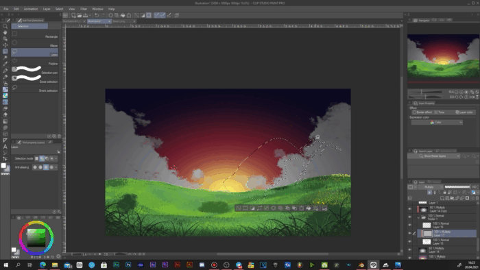
After that blur the erased areas so the transfer from light to shadows looks natural and repeats the clouds’ texture.

Then create another Multiply layer with Clip to Layer Below (above the already existent Multiply layer for clouds) and draw more concentrated shadows according to the shapes of the clouds you received. You can use the same shade as for the previous filled layer.
I recommend putting all the clouds related layers (the base shape and both Multiply layers) to one folder. Then create one more Multiply layer and add a black inverted gradient (goes stronger towards the edges of the canvas). You can set this gradient’s opacity to 50-70%. In this way we improve the sensation of the clouds’ volume.
Another great hint on how to emphasize the volumetric of the clouds and make the sky feel more like a part of the work and the world we build is adding one more gradient. To be more specific, create a layer with Screen blending mode and place it above the clouds but below the ground layers.
Pick some really bright blueish, almost white shade and with the Foreground to Transparent gradient tool (the standard gradient with one shade that fades to transparency), add the ending of this gradient from the ground to the sky.
This is the atmosphere concentration; you can also notice such an effect in real life when you are looking at distant objects. That is why using it helps to emphasize the atmospheric perspective and the fact that the hills and the clouds are on completely different distances from each other and the camera. But be attentive: the effect should really be barely noticeable, so if it looks more like a mist rather than normal concentration of the air particles, you might want to remake the gradient or lower its opacity.
However, adding it only creates the separation of the sky and the ground. To keep everything organic, create the second Screen layer and place it over everything but the light source (if you have already created one). Pick the standard airbrush and with light pressures add the same effect along the horizon. The brush should be big enough to cover about 30% of both the ground and the sky.
The gray clouds do not look really suitable, so we need to change their gamut. Since we are drawing a sunset/sunrise, we will switch the colors accordingly. And this can be done really fast. First of all, I duplicated the clouds related layers and turned off the visibility of the originals. Then I merged the copies so all the clouds elements would now be on the same layer.
Then simply open the Edit window --> Tonal Correction --> Gradient Map… This feature allows you to swap the whole gamut to a different one in an instance! Since I used quite typical for the anime landscape colors of the sky, the default “Sunset (purple)” gradient map from the default Sky library worked really well for me… with some slight editing. Double click on the chosen gradient map and you will be able to customize it – drag the shades on the colorful slider and the object you are editing will change the balance of the according shades.
You can also delete the unnecessary shades as I did with the brightest one. You can create your own maps or find more in the Assets – it is up to you and your composition.
When you are satisfied with the new gradient map, duplicate the clouds you received and switch the blending mode of the lower copy to Add (Glow) and drag it out of the folder and place it below it.
Once again go to Edit --> Transform --> Mesh Transformation… and drag the points until you can see a solid contour near the clouds that becomes wider as it comes closer to the sun. Just like with the grass and the horizon, I recommend leaving the outer points of the Mesh on their places and bend the clouds with the inner ones only.

This is probably the fastest way to add the contour light to the clouds.
2.4 Stylization and detailing
The main elements are ready – now is the time to make it all look beautiful, organic and professional.
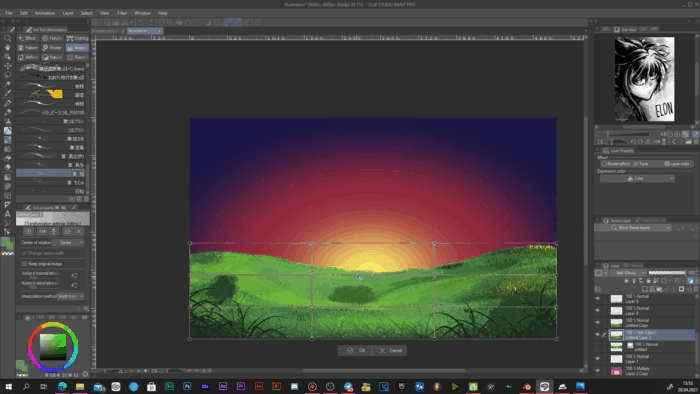
First, let us add a vignette. And to place it perfectly in the center of the canvas, drag the Guide Rulers out of the side rulers that you can see at the edges of the workspace, go to the Object window, click on the rulers and enter the coordinates of the middle pixels of your canvas. The perfect center is where the lines cross.

Now add the black vignette to a new Normal layer (it should be on the top of your layers list). Depending on the amount of black color on the layer, you may decrease the opacity.
After that I replaced the temporary sky with the main one (basically, the only thing I did was removing the layer and creating the same gradient but with the blue and pink parts of it, leaving the red, orange and yellow shades to the sun that we will add next). I also made a copy of the new sky gradient and set the blending mode of the layer to Multiply since I found the colors I picked too bright.
Create a new Add (Glow) layer above everything but the vignette and place there a small round gradient of orange color – this is our sun. Erase the lower half of the sun with the soft eraser but so it would still cover the grass a bit. Above the sun add a Screen layer with a wide gradient of red color and set the opacity to about 20-25%. I recommend making the Screen gradient oval and almost reaching the borders of the canvas in width. The height should cover 30 to 50 percent.
After adding those light source layers the oversaturated grass became rather irritating, so I switched to it and its color balance. This time I was mostly using Edit --> Tonal Correction --> Hue/Saturation/Luminosity menu, and I started with editing the basement (modelled) grass. The parameters I chose were +30 to the Hue, -40 to the Saturation and -30 to the Luminosity. This made the grass far less saturated (which saved my and your eyes), added a slight blueish shade and made it more well-balanced to the sky and the sun in terms of luminosity.
Before:
After:
The parameters for the rest of the grass layers were mostly the same to keep everything balanced, though I decided to lower them in all three scrolls for the second closest grass.
This is not something you should follow blindfold. I decided to leave this spot more green rather than blue due to the hills shape: as you can see, the ground near the camera is quite smooth and flat, and then we have hills with a rather sharp raise. This element combined with the angle of the sun would definitely lead to a long shadow casting from hills, and the green grass near the camera helps to show where this shadow ends.
Now let’s return to the light source. Create another Add (Glow) layer above the sun, pick some orangish shade and add the biggest gradient that even goes beyond the artwork.
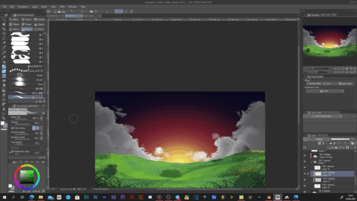
Now let’s decorate the sky itself. Using this amazing night sky brush (Galaxy Brush (ID: 1758879)) add the stars on another Normal layer below the clouds. Spread them chaotically and don’t be afraid to leave some empty space between the clusters.
Take the giant smooth eraser and, putting the center of the brush on the sun, start erasing the stars with separate pressings. The eraser should be large and cover most of the canvas or go beyond it. In this way we create a fading effect for the stars, and make them start to appear on the darker part of the sky only. After that you may also decrease the radius of the eraser and make several random pressings on the stars to create small inner fades.
After that duplicate the layer and set the copy to Screen blending mode. Blur it with the Gaussian blur function (if you are using similar resolution of the canvas as me then set the blur to 10-15). Set the opacity of the Normal and the Screen stars to 70 and 40 accordingly (you may change it a bit to your taste).
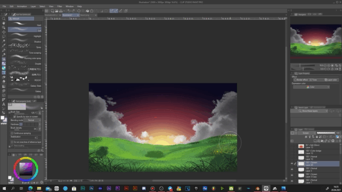
Then I made some slight corrections: I removed some of the bushes, worked with the grass brushes a bit and made the only bush I left more volumetric (by simply drawing with the textured leaf brush on the bush’s Screen and Multiply layers). All these actions are simple and most of them only involves the same actions and techniques we already used today – there is nothing to be specified nor emphasized, just look at your artwork and think what elements look wrong, unnecessary or incomplete and correct that using the knowledge you received today.
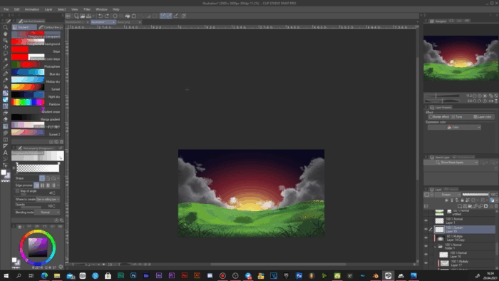
After some corrections I switched back to the stylizing. And I clearly saw that despite grass blades are various and were placed well, the overall field was still giving a monotonous feelings. So I decided to diversify it by adding some fireflies. I downloaded this pattern with glowing particles (蛍(緑) (ID: 1451072)) which is, actually, an official Clip Studio material, and placed it over the grass layers. Then I scaled it until the particles’ size were satisfying for me and rasterized the layer.
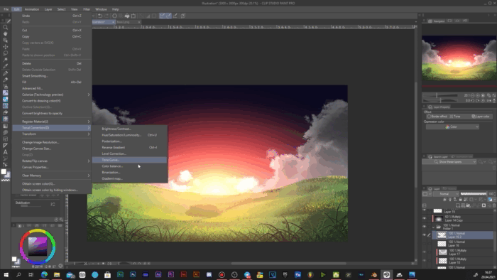
But the pattern has a black background, so we need to remove it first. Go to Edit --> Tonal Correction --> Reverse Gradient. With this the background becomes white.
Then we can remove it completely with an amazing feature: Edit --> Convert brightness to opacity.
When you activate this function, every single pixel on a raster layer becomes transparent depending on their brightness. The brighter the pixel, the more transparent it becomes. In our case this means that we receive the needed particles on a completely transparent background. But be attentive: this feature removes colors and leaves greyscale only.
Then we only need to reverse the gradient of the layer once again, so the particles won't be black.
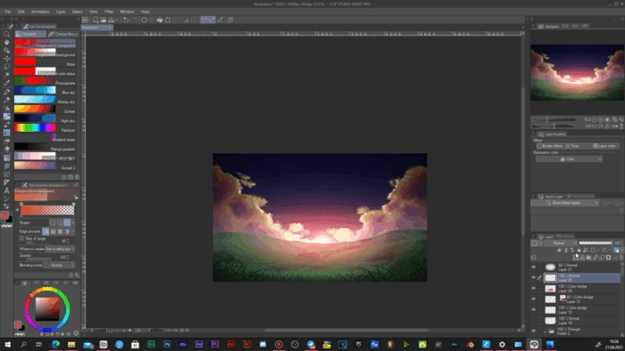
The particles became white, so I returned their greenish yellow shade using the Layer color feature.
After that I deleted the unnecessary parts (since there were too many of them) and moved the remaining fireflies to the bottom corners of the canvas. I duplicated the layer with the particles, switched it to Color dodge and blurred a bit with Gaussian blur. You can play with the particle’s opacity if they seem too bright to you.
The last thing I added was noise. You can use any noise pattern you prefer, but if you haven’t used it before, I recommend you to start doing it from now on since this seemingly invisible effect does numerous things for your artwork and improves it in many aspects. And Clip Studio does have some noise to offer. Go to your local materials (where all your textures, images, models, etc. are located) and open Monochromatic pattern --> Texture folder. Find there a texture called “Noise type” and drag it onto your canvas. Place it on the very top.
If the noise is too big, scale it down and rasterize. Switch the blending mode of the layer to Overlay and blend it with Gaussian blur (just 2 or 3 levels out of 200 is enough).
2.5 Post-correction and evolution
Adding the noise is the last stage in my method of drawing anime-like landscapes. However, you can always return to it and change or add anything you want. Especially now, if you were following my guide step by step with no pauses – take some rest and return to the artwork later, with clean mind and rested eyes.
And when you get used to the process and techniques used here, you can adapt them, change to your like, modify in a way they work better, bring better results and feel more comfortable to you. But even using my methods only, you can already draw such beautiful landscapes (and not only sunset/sunrise kind of scenes – change of the sun position and the time of day is probably one of the easiest things here).
The total amount of time I spent on this artwork is 2 hours and 35 minutes including modelling and multiple mid-progress reasonings. With additional composition elements and new techniques you will be able to create stunning landscapes in no time.
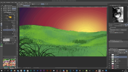
The result of the work:
Conclusion
As always, I do hope my tips were interesting and, what is more important, useful. Thanks to the TIPS of the Month contest, I develop, improve myself as an artist, so despite the contest results, I will be returning to it whenever I have something to tell and share with the community. I wish good luck to all the participants!
Thank you for your time, and I wish you great inspiration! ^-^
Users who liked this post


Comment