
Introduction
Hey-hey, everybody! I am glad to be a part of TIPS of the Month contest held by Celsys once again, and I am more than happy to share more of my knowledge of Clip Studio Paint and different art tricks.
Presentation
This month I chose the Lineless Art theme. Those who follow my social media and art-related pages and subscribed to my channel for Russian speaking audience know that my style itself includes no line art at all. But in terms of my regular artworks, this is rather a stylizing decision and I have just few other reasons to proceed this way.
So I am not going to simply tell you about how I usually draw since there will be no really useful nor new information to most of you. Instead, today I am going to share one interesting tip that might be useful for both artists and those who do not or cannot usually draw on an advanced level or in the usual way – designers, beginners, etc.
During this guide we are going to review a couple of options of Clip Studio Paint that allow you to create such and similar designs and artworks:
This one was inspired by one Ukrainian electro-folk (or folktronica) group, which is why the nightingale is the key element of the work – it is the symbol of Ukraine and the symbol of Freedom (which is the name of the artwork).
Step 1 – The preparation
This method is valuable to novices since it basically skips the stages of sketch and, of course, gets rids of line art. And while those stages are quite important since they help you to get used to the workflow and to learn much different important stuff, with this tip I want to help the newbies to understand that those stages are not essential and that you can create masterpieces with just inspiration and basic knowledge of composition. And more experienced artists might find out about useful tricks that could help them to optimize their process of work.
So, what do we need to proceed and make the graffiti/ink artwork? First of all, you need your own key element – an animal, an object, or even a set of different elements. As I have mentioned above, “Freedom” was inspired by a group and their particular song, the staging of which was set with red, black, and white colors. That is how I came up with the idea of the graffiti-style nightingale – a combination of the bird of freedom and the art style of rebellion.
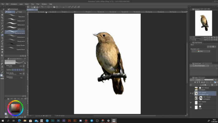
Once you have found your inspiration and decided what result you would like to reach, find or make a nice image of your key object. It is preferable to use images of a high resolution (nearly as high as your canvas or even higher), though it is not necessary. As an example, here is the image I used:
Step 2 – The work with the image
Place your image on the canvas. Depending on the resolution and the amount of noise on it, you might want to use the Smart Smoothing feature (especially if you have enlarged the image).
The Smart Smoothing helps to remove the noise and minimize the pixelization of low-res images.
After that, cut out the elements from the image that you do not need.
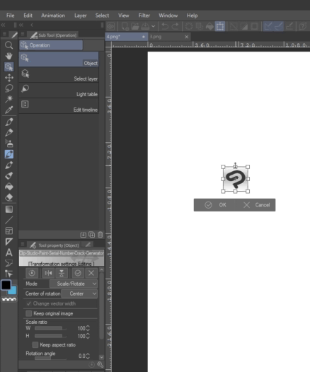
You may also use the Guide Rulers to place your image right in the center of the canvas (which is 100% optional): simply drag them out of the side rulers that you can see at the edges of the workspace, go to the Object window, click on the violet ruler and enter the coordinates of the middle pixels of your canvas.
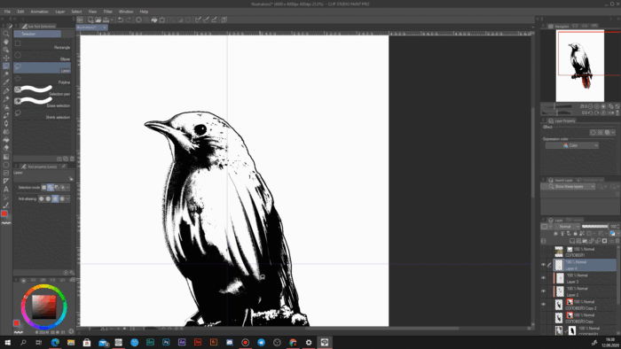
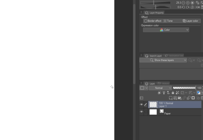
And now we are at the final stage of the basic preparations. Pick the layer with your key image, go to the Layer Property Window and change the Expression color to Monochrome. Now simply drag the Color and Alpha threshold sliders so your image looks good and distinguishable. You may also activate the edge for now if you cannot see the borders properly or simply change the color of the background to any but white and black.
Step 3 – The graffiti effect
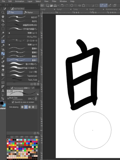
Create a new layer and pick any spray-like brush that resembles the graffiti effect most to you. If you are not sure which one to pick or you are new to Clip Studio and have not downloaded anything from Clip Studio Assets yet, you can pick the standard tone scrapping just like me. You a free to customize it, but make sure not to go too far.
Now just start spreading the spray using solid black and white colors. But don’t make ALL the borders between black and white smooth. Just like with realistic shadows, simply imagine your light source position and spread the shadows accordingly. Here is an example from my process: I made the shadow on the belly to appear smoothly since the belly itself is roundish and the small feathers make the border even wider; while the wing is a separate element with several big feathers, so I leave more sharp edges on it.
Generally, you can use 3-5 layers for black and white spraying (after all, you cannot make just 2 and let one spray color always cover another) in order to create a more natural graffiti spraying effect.
Also, you are free to add more new white and black elements yourself if you feel like the simple switch to the Monochrome mode did not do all the job. Correct the image according to your imaginable light source like I did here with the wing or the feet.
After that, add spray to these elements as well, but don’t forget to leave some of the elements sharp (in order to understand which ones should be sharp or smooth imagine the real bird – most of its body is smooth and fluffy due to the small feathers, while the feet, the beak and the branch are rather rough – use your own key object as your guide).
Don’t be afraid to go beyond the initial borders. Graffiti is the art style that knows no borders, so you should not be afraid of them too. Moreover, it will only emphasize the style we are going to reach.
[EXAMPLES FROM THE FINISHED WORK FOR CLEARER UNDERSTANDING]
Step 4 – The Stylization
Once you are satisfied with the look of your basement, it is time to add some stylish look to our work! ^-^
For such artworks, I prefer the Selective Color method – when there is a certain element of a certain color in a monochrome composition. And since the song I was inspired by used black, white and red, I decided to proceed with the same gamut. And so I added additional feathers of red color and “blurred” them with the same spray.
Now, before we leave the key object and proceed further, let us add the cherry on the cake. Create a new layer and, picking the same colors you used, add some smudges with the regular G-Pen – do it randomly (however, you may stick to the 2:1 ratio – add one big or small smudge here and two different smudges there, it’s a great proportion when working with many small elements).
Step 5 – The Background
Now we are entering the endgame of our work. It might seem a bit random, but I really think that graffiti and traditional Japanese ink style have great potential if they are combined. So, I used the Ink pen brushes set (墨筆) by ぱーらめんと (1564809) to make my work even better.
And after several concepts I came up with an interesting idea – since I am implementing the Japanese traditional art, then let it be some phrase in Japanese! And it was obvious what to choose – the idea of the whole artwork is freedom, so I wrote this word in Japanese (using the ZinHenaKokuryu font) and placed the text in the way that it would look like the nightingale is sitting on it instead of the branch.
Now I only needed to make it look more ink-like. And to do it in an accurate way, I duplicated the text layer and converted the copy into a vector layer.
Now go to your ink brush (if you have downloaded the ones I recommended) and open the Sub Tool Detailed window. Go to the Brush Shape page and press “Add to presets” to register the texture in the brush shape presets.
Now get back to your vector layer and select the Object tool. In its Tool Property window switch the Brush Shape to the one we have just registered. Now the contour of our text will change to the ink-like. Keep both the vector and the regular text layers visible. You can adjust the size, shape and other properties of this contour in the same Object tool properties or the Correct Line palette (the lowest tool of Clip Studio Paint with default workspace).
More examples
And now we are done!
I understand that a couple of steps might have been slightly more complicated than I was describing at the beginning, but I needed to describe everything in detail so you would have everything prepared by the time you start the next work (like registering the brush shape – you won’t need to do it again next time, at least not the same shape).
And here is a couple of other works of mine made with exactly the same method:
Conclusion
Of course, I hope that the tip was helpful because it is meant not just to tell of how to draw a graffiti, but how to make a beautiful lineless composition with just little amount of pure drawing. You can use the first two steps of the guide to prepare a basement in just 10-12 minutes and then take a different way and create something of your own. Or you can follow all of my steps improving something to your like.
Each time I participate in this contest I feel a thrilling joy, so I want to thank everybody for the possibility to experience this again and again! ^-^
And if you would like my Clip Studio Paint guides and my artworks, you can buy the license to the program or the subscription via my referral link:
Patreon:
So, thank you for your time, and I wish you a great inspiration!
Users who liked this post


Comment