
Introduction
Hey-hey! ^-^ My name is Oleksii, more known as AloneFlaver. I am a Ukrainian artist who has been creating TIPS for the Clip Studio Paint community for years, and I am back with another guide after an almost two-year-long break. This time I welcome you with a TIPS of the Month contest article on the “Art with Photos” topic. Please enjoy this guide in either text or the attached video version with my narration (subtitles are included — please turn them on in the video’s settings for convenience).
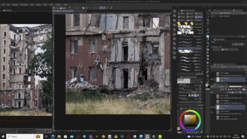
The photo
So, today we are creating an artwork with a photo I made myself. At first, I wasn’t sure which one to choose. But then I scrolled down to this image I made in the summer of 2023… This is a governmental building in the center of my city. Mykolaiv, Ukraine. It was destroyed due to a missile attack a year prior. A horrible night with many souls lost. I am sorry this is such a moody pick. I understand that my decision might influence my chances in the contest in a very negative way. But I just felt that this is the photo I really wanted to choose and spread. Something I really wanted to work on.
And so I turned this photo into this art. It was somewhat painful to work on, with many thoughts constantly rushing through my mind. But I finished it. And today, you will learn how, and how you yourselves can create something similar. I was aiming for a somewhat anime-like style of background.
By the way, my very first TIPS guide also included some photo-using and matte painting techniques. They were not used during the current process, but you might find them useful in combination with the ones we are going to study today.
And today we are using the photo itself as a basement, and we’ll apply the necessary details and changes to turn it from something real into something artistic. So, let’s begin!
NB: I will be using the EX version of Clip Studio Paint as it has one specific feature that will assist us greatly in the process. The guide is still valid for all users, though.
Initial effects
IMPORTANT: I am not going to move, alter or remove any big or significant elements of the photo. There will be noticeable changes, but the main geometry and composition will be the same. So please, if you need to move, cut or distort something in your photo, do this PRIOR to this stage. Thank you! ^-^
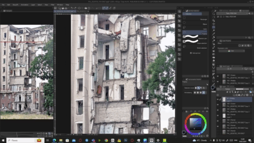
I was pursuing the idea of an “anime-like background”, so I immediately started with actions that would give the photo the look I aimed for. Now let’s learn how to do this in practice! Import the photo you have into Clip Studio Paint.
Base of the artwork
Make three copies of your initial layer with the photo, so you would have 4 layers in total. Hide the lowest one. The hidden layer is a back-up in case you want to start something over or if you made a mistake only the original image could resolve.
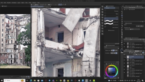
Now hide the top two visible layers, so only the third one remains visible.
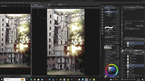
We need this done to see the effect we are to apply to the layer. Open the Edit tab and find the Smart Smoothing feature.
The feature itself is meant to smooth the artifacts and imperfections in upscaled low-res images. But I discovered that, if used right, it can provide a distinct painting-ish effect, similar to artistic filters. So I’ve been using it in some of my works ever since.
In the appeared window you will need to mark the Remove noise option (it will process additional cleaning of your image from noise and the smallest details), and set the strength of the effect to Strong. With such preferences, the image’s textures and elements will go farther from real and look more like a painting. Check out this “before and after” comparison:
Line art done in minute
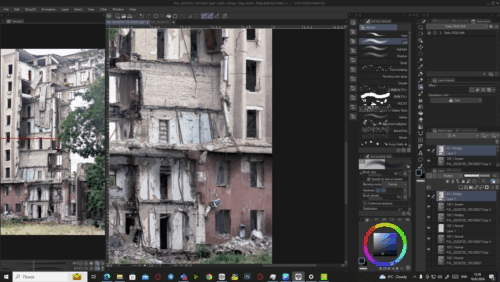
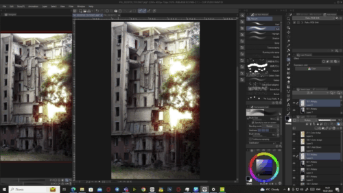
Now you can unhide the second layer, the one that’s right above the one we’ve just smoothed. As I mentioned at the beginning of the guide, we are using the EX version of Clip Studio Paint, and now we are going to use its unique feature. Even if you are using a default layout of the interface, you will find it above the layer list, in the Layer Property window. Click on the Extract line icon while the recently unhidden layer is chosen.
This feature analyzes the layer and turns it into a monochrome image with all contour lines extracted. To put it simply, it turns any image and even object layer into their line art versions.
But it’s very unlikely that you will receive a perfect result right away. Once you’ve activated the feature, new sliders and buttons will appear under it. Go back to them and set the Accuracy to the Highest preset. Next you should play with the Black fill, Line width, and Edge threshold sliders. Their parameters really depend on your photo: its resolution, contrast, brightness, amount of complex and small elements, etc. For images like mine (resolution is 2268 x 4032), you can put the Black fill to 20, Line width to 0 and Edge threshold to 100, or similar ones. These numbers felt optimal for my needs in this particular work.
The Black fill slider regulates the amount and scale of zones filled with black (zones that were shadowy in the original photo will go black first). The Line width controls how thick all of the lines will be. And the Edge threshold slider basically regulates how “clean” your image will be from the smallest lines and textures.
Extract line also has several other features, but they are not relevant for us in this type of work.
And now that our layer looks much cleaner now and even somewhat resembles a manga page, let me answer your question: “What are we even doing this for?”
Since we are aiming for a style similar to anime backgrounds, I determined several key factors that would emphasize the necessary feeling from the piece. Smart smoothing helped us achieve one of them. And these lines will create an effect of an artwork that was created more traditionally, with line art that was then coloured in. Additionally, these lines will move us even farther from the realistic look of the image.
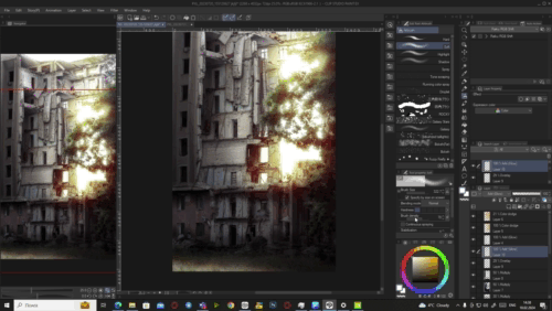
To see the effect I am talking about, set the layer preference to Multiply to remove the white solid.
We used the original photo for line extraction and not the smoothed one to receive the most accurate lines possible. The lines from the smoothed photo wouldn’t be precise enough to keep the aimed effect. However, if they appear too harsh and strict to your eye (or if there are too many black “dots” left across the canvas), you can additionally use Smart smoothing on the line layer with intensity set to Weak, which I did for this one.
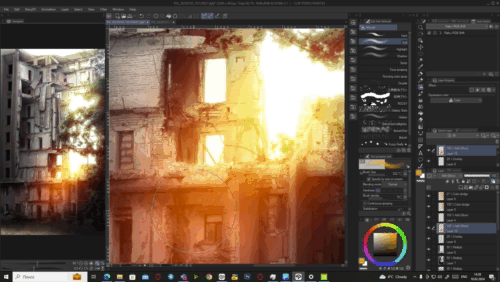
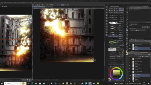
Atmospheric haziness
And now the third one of the basic effects. Anyone would find the current look of the image too messy and contrasting, so we need to compensate for that.
If you ever paid attention to backgrounds in anime, most of them have this light haziness, which is especially noticeable in edges between contrasting objects (like buildings and sky). This tiny detail is crucial as it unites all of the objects in the frame under one compositional atmospheric accent, it helps the creator to show the interconnection of everything and the presence of all elements in one world.
To add this atmospheric haziness, unhide the top layer and switch its layer preference to Screen (this will let the two other layers we’ve just completed be visible through the top one and will compensate the levels of the image). Next, go to Filter → Blur → Gaussian blur… The intensity of blur you need to set now depends on your canvas’s resolution. Mine, once again, was 2268 x 4032. And the intensity of 12 was just fine for me.
And now we have this result with a direct comparison on an example of the leaves:
Manual edit
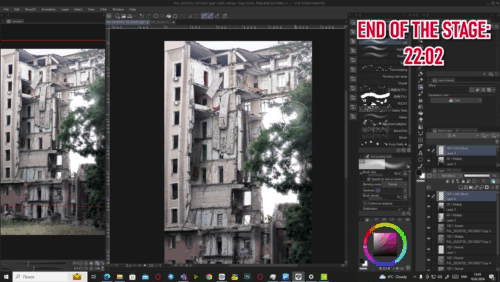
And with this, basic preparations are complete! We are now ready to proceed to manual work with the image! Manual work is different in each separate case. Sometimes you should do things you did not in the previous project, and vice versa. You should not be afraid if something is missing in your photo that is present in mine. Feel free to edit those things in a way similar to how I edit those present in mine.
Grass
The grass near the building was still giving away this “real photo vibe”, so I needed to alter it. No complicated techniques or in-depth knowledge of Clip Studio Paint are required. Disable the two correction layers (the Screen and Multiply ones), and create a new layer above the one that’s left visible.
In this new layer, you need to paint over a new grass. Just pick any grass brush you have in your possession, be it a default one, a brush you found in Clip Studio ASSETS, or the one you made yourself. My preference is usually the default Grassland brush available for all CSP users. It is a simple tile of grass blades that gives a pleasant effect.
Now all you need to do is to constantly pick shades from the original grass and draw the new one in the new empty layer.
You don’t need to constantly switch layers in order to get a new shade of grass. Just make sure your Eyedropper is set to Obtain display color preference and it will grab any shade on the canvas even if you are currently on an empty layer.
Keep spreading the new grass until it more or less covers all of the original grass. When you feel like you’ve added enough, you can also use Smart smoothing on the new grass so it looks more in line with the rest of the image. But it depends on the grass brush you’ve chosen. If you proceed with the one I used, I recommend using Smart smoothing with Strong intensity, as the texture of this brush is rather rough and has many small strokes in its core. When there are lots of them in one place, they may appear way too sharp if not smoothed.
That will be the base for our grass. We will apply some additional changes to it later, but it can be left as is for now.
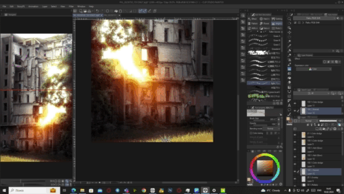
Textures reworked
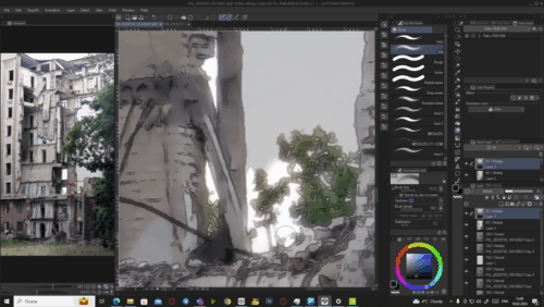
Next, we need to take a look at the textures of the objects in the frame. Remember: we need to move from realism and reach a semi-realistic effect that would let us use the final art in animation or as a cover, for example. The way the textures in your photos are presented can give away a lot of unneeded things.
Unhide all of the layers we’ve edited and set the Eyedropper to Pick up color from layer so it would only grab shades from the layer you are currently on.
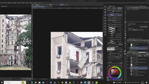
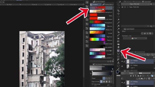
Choose the Normal layer with the photo that we smoothed in the beginning. You should take a thorough look at the whole image and see where the textures still look too realistic. Pick a textured brush that you like the most — preferably the one that can imitate oil brush strokes, but complex enough to see the “brush imperfections”. These are the ones I chose (appreciation to their authors, たま★にゃん and gyuukotu respectively):
As you can see, they’re a bit unusual.
The point is to paint over the existing image where necessary. You can literally go wild here and choose the brush you like. Draw with big and small strokes alike. Don’t be afraid. Just pick a shade from the place you are about to paint over and do your thing. Your goal is to add a slight imitation of the actual painting to the image. Your target is textures that seem overly realistic.
While you are doing this, you can also emphasize contact shadows between objects. Anime style tends to be more dramatic and contrast, so don’t hesitate to add these aspects to your work. You can even choose shades different from those present on the canvas, and take colours for shadows that are darker than the actual shadow from the photo.
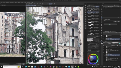
These are the main tips for this stage. If you’d like to see every stroke I made during it, please watch the video version of the guide, it features a speedpaint part of this stage. And for my readers, please take a look at the screenshots of before and after the painting stage.
I didn’t apply big strokes as the composition features way too many smallest details like wires, debris, cracks, stone blocks, etc. So I mostly concentrated on each object’s texture and contact shadows.
A couple more hints on this stage:
1. If there is a long object like pillars, walls, etc., add a chiaroscuro gradient to it. To put it simply, add a gradient with shadow that very smoothly goes into a lighter shade. It will add volume to the object.
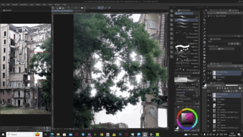
2. Leaves customization is up to you. I did not change the trees in any way here, their base will remain the same up until the very end. You can always use texture brushes like with the grass in the previous stage, but it is up to you.
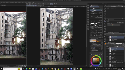
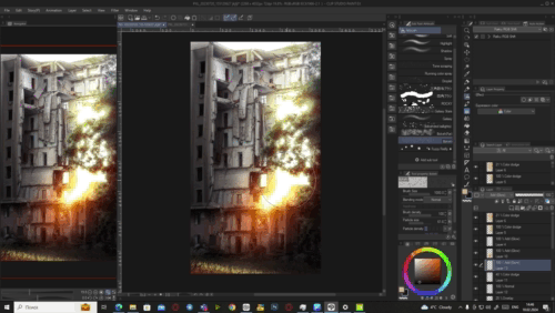
Geometry shadows
Now we are finally at the stages that are, perhaps, the most striking in terms of visual changes. The stages that are key to anime background vibes, stylization and overall composition mood creation. Shadow and light. We are starting with the former.
This stage is relatively simple. The most difficult about it is deciding the light source(s) position and angle. Once done, you create a new layer with Multiply preference and place it above all else.
Now you have two options: the first one is to choose a relatively bright shade for your shadows. The closer the shade you choose to pure white, the less visible it is in a Multiply layer. While pure black would simply act as a normal paint and would overlap your image, it won’t do — so you need something in-between.
The other option is to lower your layer’s Opacity and proceed with any shade you want: from pure black to something really close to white. I prefer this since it gives me an option to easily regulate the shadow’s intensity if needed, and leaves a bigger chunk of the colour palette for my usage.
So I was using a deep dark and desaturated blue shade with a layer of 60% Opacity.
Now your friends are the regular Soft airbrush and the Polyline Selection instrument. If you want to add a giant shadow that covers most of your composition, just increase the size of the brush and add it. And if you need to cover smaller separate elements in the same shadow, you can either increase the Hardness of the airbrush in its parameters or choose a sharper brush.
But sometimes the geometry of the elements in your composition might overlap itself or other elements. In such cases use the Selection. I prefer the mentioned Polyline Selection, but, honestly, feel free to use any of the available ones. Just make sure to properly outline the geometry and then add shadows within the selected area so they feel natural in the frame.
Now start spreading shadow across the place until you are satisfied~
Before showing the progress so far, I want to specify one thing. In the next step, I am going to apply something that will improve the feeling of depth and volume of the composition a bit. However, I strongly recommend to consider cutting out the sky into a separate layer before proceeding. I am NOT going to do this for this image, as the leaves in the foreground are too complex for manual work here, and selecting every single pixel of sky between them is not proficient. So I am going to bypass this with a trick. But if your image actually has a “cutable” sky, please do this for your own convenience. Don’t hide it, just leave it be on a separate layer.
And now, to this trick I mentioned. Let’s create one more Multiply layer on top, put it to about 30% of Opacity and fill in with a gradient. The gradient should consist of the same dark blue shade in the bottom, and gradually go into transparency on the way up. To find the necessary gradient, go to the Gradient tab and choose the Foreground to transparent variant. Now you simply need to change your main colour for the gradient to change as well.
Add this gradient to the whole image, no exceptions.
Now if you cut the sky out into a separate layer, simply place the gradient below it. But if you, just like in my case, have too many elements that didn’t let you cut the sky, you will need to clean up the sky’s zone with an eraser or transparent brush manually.
Light source and effects
And now it’s time to proceed with light! Since we are looking at a light passing through the hole in the building, I decided that making it a sunset composition would be the right choice. And if you make sunset a key light source of your composition, it normally should be a really bright and vibrant part of the image. Looking at sunset (or any strong light) makes you see darker objects less clear, and makes camera lenses change their exposure so the light doesn’t fill out the whole frame (camera makes the scene much darker to keep everything more or less visible). My example below shows this in practice. I made two photos, in one I focused the camera on the sun in the finished version of my artwork, and in the other I focused it on the darker part of the frame, the monitor’s leg that was not lit. The effect on the right is what I was aiming for while creating the piece.
Create a new layer at the top of your list and give it Add (Glow) preference. Next, you need to pick a bright shade similar to the one of your sky. Mine was of a convenient bright colour close to white, so white is the colour I chose. If your sky is of a blue, or orange, or any other shade, you should stick to its palette. Remember that in this composition when we are facing the sun, and the rest of the sky is mostly closed by objects and vegetation, you don’t really need much details like clouds. You may even change your sky’s colour to white like mine, as with the exposure focused on darker elements, the camera tries to amplify the information it receives and, thus, improve the details seen in the darker areas. Which results in brighter areas like sky being lightened up to a state they might just turn blinding white.
Now go around your sky area and start filling it with a soft airbrush. Specifically, go slightly beyond the borders of the objects it touches to imitate the leak of light. This will tie the objects together with additional atmospheric volume. Also leave some dotted light spots among the leaves, to emphasize the light rays that go through the empty parts between them.
Now that the base for our light is here, let’s glow it up. Literally. Create a new Colour Dodge layer and choose a shade that will represent your light source’s main colour. I chose an orange one.
Now start spreading giant light gradients with the same airbrush across the same area where your sky is visible. But this time let them go deep into the objects surrounding the area. Make the brush large enough to cover the area with just several strokes. Use light touches, don’t make the light too intense. It should be a nice and light gradient from the center of the sky and a bit into the elements it is surrounding.
Now create another Colour dodge layer and repeat the process, but scale the brush up even more and let the light cover the surrounding objects even farther. But this time put the layer’s Opacity to lower values, like I set mine to 21%. This is a supporting layer that emphasizes the light we already have and improves its connection with all other elements.
Back to shadow
Now we need to adjust the contrast of the shadows to the strength of the light. Create a new Multiply layer and put it below the three light-related layers we have. Choose the same dark blue (or your according) shade that we used for the previous shadows. Put the layer’s Opacity to 50% and, with a big enough airbrush, start covering the areas in soft yet vast shadows according to their geometry.
The most important thing now is to emphasize the areas that, logically, should be the darkest. And to also improve the contrast with the light source.
You can use more than one new Multiply layer here, as I also created another one with the same parameters and used it on the zones that are the farthest or the most hidden from the sun.
Don’t forget about the trees this time. Add slight touches of shadows to their clusters of leaves. This will amplify the effect of artistic work and move the impression from it closer to anime-like examples.
The part of the grass closer to the building was also covered in shadow by me, as this is the angle where it should be cast.
But light is still there… Within us
But then there’s this tragic hole… It reminded me that not all of the grass should be covered in shadow, as not all of the building’s parts are present. So I removed the shadow from the corner opposite to the light source. Then I created a layer with Overlay preference, and with the same orange shade, I added soft strokes between the light and dark areas of the grass. An effect known as chromatic fringe — the saturated colourful line on the edge between light and shadow.
It is really subtle, as the layer’s Opacity should be set to lower numbers, but it has its effect. It is completely optional, though, and is more of a stylistic choice.
Now back to the sun. We need one more thing to complete its core. Create another Add (Glow) layer and pick a big airbrush. Of approximately the same radius as the radius of the current light around your sun. And make a stroke that starts at the center of your sun’s position and goes towards the ground at an angle you want to set (I chose something close to 45°). Use a colour closer to red or orange if you are proceeding with a gamut similar to mine.
Now decrease the size of the brush by about 30-50% and pick a shade closer to yellow. Then repeat the stroke at the same position and angle, but with the smaller brush and changed colour (make it slightly shorter). Once done, decrease the size even more and make the colour brighter, about halfway to white, and add another stroke that is also a bit shorter. And finally, decrease the brush once again and take the pure white colour. Add the final white small stroke at the sun’s core. This will create a volumetric ray and the sun itself. We needed to start at red shades at the bigger scale and go to brighter yellow and white colours, as this is how the colour decrease works in real life: the farther from the light source, the more the shade of the light will move around the palette until it dissolves. A nice colour theory tip you should note.
In the same way you can add small rays beaming through the leaves. But its optional and I don’t recommend making them too visible.
The new grass
Looking at the whole piece I noticed it still feels a bit flat. So to improve this aspect I turned to a quite simple but effective technique. I added a layered grass to the corner opposite to the light source. That’s a popular compositional technique and is one easy to use.
For preparations, I created a Colour dodge layer and, yes, with the same airbrush covered the grass that is in the sun with light. This is not THE technique I mentioned, but this action alone already makes all look richer and makes the lightened grass look more in match with the rest of the composition.
Next, create a new Normal layer and place it below the Colour dodge one we’ve just worked with. The layered grass technique is honestly very simple. All you need is to choose a textured grass brush (one, two or several — doesn’t matter) and start adding layers of grass one onto the other. Start with the brighter shade. Make sure to choose the colours that match the gamut of the artwork. Remember that we are creating a “foreground” of the grass, so the texture should be bigger than the grass you already have from the photo (if any). When you’ve added the first portion of the bright grass, choose a darker shade that is close enough to the previous colour, and make the texture of the brush a bit bigger. Repeat the process. Then again and again, constantly making the texture bigger and the colour darker. Four to five layers should suffice. The layer of the grass that is closest to the camera should be the darkest and contain the biggest grass texture.
The grass brush I used is called 稲科ブラシ and was made by 彁. It is a part of their set you can check out here:
Please see the process in the attached GIFs or the video version of the guide if you need visual support to the description.
Last touches
The work is almost done, we only need to bring a bit more details to finish the stylization. Since I was considering lenses and exposure before, I also decided to add the slightest bokeh effect around the light areas. I used a Bokeh (Far) brush from the Bokeh Brush Set (Bokehブラシセット) by chudyshoujo:
All I did was put some big bokeh particles on a separate Add (Glow) layer. I used white as the main colour for them, but you can also pick the same shade you used for the light and rays. You are free to regulate this layer’s opacity.
Then I created another Add (Glow) layer and picked the default Running color spray brush with particles, you can find it in the Airbrush set of brushes, it is also pre-installed for every Clip Studio Paint user. I went around the spots of the light leakages and added the particles. This is a pure artistic choice, no lens imitation or something like that. Speaking of them physically, they could be dust particles or flying bugs. But, honestly, all I myself can feel in them is… souls.
But, anyway, even speaking compositionally, they add volume and depth to the space in your work, so consider adding them or other small chaotic elements like falling leaves or raindrops. It is better to change the particle size a couple of times while adding them for a more natural feeling of the presence of this element in the frame — to emphasize the difference in their size and distance from the “camera”.
OPTIONAL: Noise implementation
Adding noise is not a must. It is essential in some specific cases like when you are trying to reach a very concrete effect or style, but unless that’s your goal from the beginning, it is up to you whether or not to add it. I prefer my works with a slight noise, so I added it. Usually, I use a set of pre-made images containing noise texture, I have both monochrome and colour variants, but upon applying them I didn’t like the look they brought in this case. So I went and created another version of noise with Clip Studio Paint’s built-in instrument. And I will teach you how to create any kind of noise you might need!
Create a new layer above all the other ones. Then go to Filter → Render → Perlin noise.
The layer will be filled with a noise pattern, but we need to adjust it. With the window appeared in front of you, you can create all kinds of noises. I won’t inspect all possible variants of usage and will only concentrate on what is needed currently. But you are free to play with the sliders as you please to reach the effect necessary for your unique cases.
The initial pattern won’t represent a camera noise.
We need to adjust it. The first three sliders (Scale, Amplitude and Attenuation) will suffice for now. The first one regulates the size of the noise clusters. For a resolution close to mine (2268 x 4032) I recommend setting this parameter to 2.0. Depending on your resolution, you may choose numbers from 1.0 to 3.0, this is my recommended scale.
The Amplitude and Attenuation are more about the range of shades represented in the noise, and contrast between them. This is a more subjective part, but I like the looks the noise gets with Amplitude at 2.0 and Attenuation at 0.03. A set of parameters for a contrast noise.
After that simply switch the layer’s preference to Overlay and lower the Opacity. The Opacity level I set for the noise layer varies from 10 to 25 depending on how it behaves in each artwork. For this one, I stopped at 15. You can go back and re-create the noise pattern as many times as you like. You can even make it colourful if you apply a rainbow/coloured gradient map to it (Edit → Tonal Correction → Gradient map), but I did not do it this time, so only verbal advice for now.
After that… take a rest for about an hour. Let your eyes relax and “forget” the canvas. So you can return to it and criticize with a fresh gaze. Take a look at the whole piece and make sure to bring final corrections: clean some messy strokes, adjust some correction layers, etc. Clean it up, so to speak.
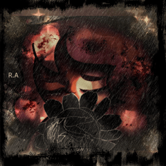
The Hope
It was a… complicated experience working with this photo. But I tried to make this guide as light in terms of mood as possible. Yes, this picture… Its soul, its core is what my family has to deal with every day here, and we are not in the worst position possible as of now.
But, you know, when I showed this work to my father who is currently protecting us all at the frontline, he said that what he sees in this work is hope. His words really fell into my heart. And I felt that too, thanks to him. So, to honour my father, I called this artwork “The Hope”.
Please, be safe. Be creative. And remain people. I hope my artwork and my guide will inspire you to create something beautiful and peaceful.
Thank you for your time, and I wish you great inspiration!
Users who liked this post


Comment