
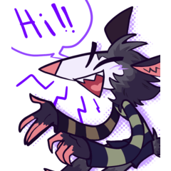
Hello! Welcome to this tutorial on how to draw Chibis in different styles.
Before we start, I would like to make a parenthesis that, although the word 'Chibi' is a concept born between manga / anime, it is not mandatory that this drawing style has a style of the same type. That is, you can adapt your own drawing styles, be it cartoon or any other, to create a Chibi.
With this in mind, let's start with the basics!
Proportions
What makes a Chibi, a Chibi, is its proportion. It does not matter so much the style of eyes, or hair or how simplified or detailed it may be, but the proportion with which it is drawn.
There are Chibis with 2, 3 or up to 4 heads. My recommendation is to go for the proportions of 2 and 3 heads for a "more Chibi" effect but it is at the end to consider your needs.
It is even possible to create a 1 and 1/2 head chibi. It is personally one of my favorites, but it is not recommended to use it if you plan to draw a character with detailed clothes, unless you plan to simplify the design.
Sometimes it can be a bit annoying having to draw the circles as a reference for the Chibi proportions, and that is why in case this step bothers you a bit like me, I recommend another technique that I use: lower limit .
It is only necessary that you draw your circle to start the head, and from there, draw a small line below that will serve as a reference for the 'height' of your Chibi, as follows.
Next, draw the base of the body taking into account the limit that you drew.
And ready! This technique is especially effective in maintaining the proportion of smaller Chibis, like the 1 and 1/2 head, or 2 head chibis that I mentioned earlier, and it helps by skipping a couple of steps to save time.
Preferably, practice the first technique a bit to familiarize yourself with the proportions that you will handle with the Chibis, and once you are comfortable with it, you can move on to the second technique by having developed a sense of these proportions a bit.
Bodies
Chibis also have a wide variety of bodies to explore. The fun part about Chibis is how having the same proportion, you can change the style so much just because of the body type you are assigned.
For example, the more stuffed or elongated type. Don't be afraid to experiment! Play with proportions and body styles to find the type that you like the most.
For my part, I prefer to use elongated styles with the higher proportion Chibis like the 3-headed ones, and fuller styles with the lower proportion Chibis.
Some examples of different shapes for a 2-headed Chibi.
To describe the body types a bit:
A. Square / cylindrical shape, without neck, gives Chibis a lot of volume and is a good option to accentuate cuteness in a Chibi.
B. Keeping the square / cylindrical shape a bit, but reducing the width of the limbs and torso a bit for a more balanced appearance.
C. Rounder shapes, accentuating the shape of the legs. It is useful for drawing female characters, or with typically female characteristics.
D. Of the thinnest and most elongated type of bodies. In a way, it's like drawing a bit of real proportions, but adapting it to the size of the Chibi. It does not convey much tenderness, but it can be used according to what you need.
Although the examples in the image are 2-headed, this can be applied to any Chibi ratio.
Remember these are just examples, you can experiment with your own ideas! Don't be afraid to try and maybe mix different types to find your favorite.
Notes:
In the styles of lower proportion, it is valid not to draw the neck. It is also possible to exaggerate attributes such as the thighs or hips, and simplify the feet to be only tips.
All these options accentuate the small size of the Chibi.
Given that these ways of drawing the body accentuate the perception of the small, personally I do not recommend applying these techniques (or at least not all together) in proportions of 3 heads, because once the drawing is finished, despite having started As a 3-head ratio, it may not differ as much from the other smaller types and look like a version only on a larger canvas of a smaller ratio.
Head
As for the shapes of the head, unlike the body or the eyes (which I will explain later), there is not much to choose from. This is because the simplicity of the Chibis heads is what can keep the cuteness in them and their proportions.
So, I can summarize the most common head shapes in the following.
To appreciate the shapes a little better, I opted for a 3/4 angle that shows the differences in the style of the heads.
A. Typical anime style. Chin and cheek slightly pointed.
B. Completely round shape, very suitable for cartoon type.
C. Most used form to accentuate tenderness. Round cheek and chin 'flat', without apparent shape.
It should be noted that there may be variations, or exaggerations of shapes, but the ideal is to keep a simple shape.
For example, for a character who wants to accentuate his masculine characteristics, a somewhat more square shape can be made, but keeping simplicity as much as possible.
Eyes
The eye style department is practically endless. On their own, anime / manga style eyes offer the possibility of a huge way to draw and color them to give them different appearances.
In this area, I can only advise exploring all the types of eyes you can think of, or on the other hand, using the simplest ones for faster results.
For example, dot-type eyes are very easy to make and are very effective in conjunction with simple shapes, keeping the cuteness of the Chibi!
My most common options for drawing are the first three heads in the example above. The first for the more anime-like Chibis, and the second and third for simpler and faster types, but a bit more tender.
Remember that the type of eyes can be complemented with the type of head of your choice!
Extras: Nose, Ears, Mouth, Eyebrows ...
Noses is one of the Chibi elements that can be ignored. Whether or not a Chibi has a nose really makes a difference: it can increase the degree of cuteness, but keep in mind that the mouth will have to be positioned a little higher if it is decided to omit the nose in the Chibi.
If you decide that your Chibi has a nose, you can take as an example some of the 5 types that I like to use.
As always, everything remains to experiment on different types of noses, but you cannot define them too much or it could clash with the rest of the Chibi and its aesthetics.
As for the ears, I personally like to draw them large, usually about 1/4 the size of the head. In my opinion, it makes them look a little more tender, but you can make them smaller if it suits your tastes better.
The ears can also be left undefined, as in the example in the image, or give them a little bean shape and draw snail shapes or simple shapes of a common ear.
For the mouth it is important to keep a simple shape. The contour of the lips can be drawn a little, but not too much or it could ruin the aesthetics of the rest of the face.
In the second example of lips, it is a crude representation of what could be once colored. The intensity does not have to be the same, it is only important not to exaggerate the shape of the mouth too much.
Eyebrows can give a character a ton of personality, and it's the same for Chibis.
If the particular character design has large eyebrows, it is important to keep them even in their Chibi form. Otherwise, you can choose to simply draw lines, or give them a bit of volume, like drawing ordinary eyebrows, but in small.
Like the nose, depending on how simplified the Chibi is, the presence of the eyebrows can be ignored. As an alternative to its absence, to draw expressions you can instead modify the shape of the eyes to express different emotions.
Hands
Hands can be a headache for most artists, but with Chibis it doesn't usually cause as much trouble! The good news is that you can even simplify the hand to only have 4 fingers instead of 5.
I recommend two forms of hand: the first plump, as if it had small sausage fingers; and the second, a little more natural, but keeping the fingers somewhat wide and short.
These two styles can be applied to either 4 or 5 fingers. However, for the chubby hand style, I recommend using 4 fingers primarily.
Chubby hands are a good choice for 2-head or 1 1/2 head proportions.
Hair
There is no obligation to be detailed with the hair. If you want it that way, go ahead! whatever best suits the aesthetics of the Chibi you build.
It should be noted, however, that for certain styles a more simplistic style is better. And for others, the hair detail in the Chibi may or may not be so much.
As in example 1 and 2, where it is the same base, but the hair can be detailed or simplified a bit.
While in example 3, the hair was simplified to a greater extent, to suit the simpler style of the face.
Let's start drawing!
With all the information and options above, we can now start creating our own Chibi with our preferred style.
For better guidance, I'll exemplify three different styles from start to finish!
Let us begin
Sketch
There is not much to say for the sketch phase. Fly your mind and match different shapes! Some may not go well together, but you can always try something else.
For my sketches, I went for a simple cartoon style; one stylish and energetic; and a third anime style.
Remember to use the heads technique for proportion, or in that case, the lower limit technique that I mentioned earlier.
In this case, I used that technique, as can be seen at the feet of the characters.
Lineart
Different styles mean different line needs.
I recommend thicker lines for the simplest styles, and thinner lines or worked in different widths for the more advanced styles or larger proportions.
In the lineart phase I added a few different styles of clothing. I chose a few simple options for all three examples, but if you're working on an illustration of a Chibi, you can better detail their clothes or style them to suit your style.
Color base
We color with the basic colors of the character to start.
In some styles, you can stop at this step, as they don't need too much detail, like Chibi 1 and 2 in the image.
Personally, even in the simplest styles I like to give them a few touches after the base color, which I'll show below
Shading
For Chibi 1, given his long dark hair, it is necessary to differentiate the background of the hair with the front. For that, I use a different color, in this case, blue.
In order not to leave the border, I activate the 'Fit to lower layer' mode, which you can know if it is active because the layer in which you use it will have a red line on the left once activated.
You can adjust more than one layer to the lower layer, that way, if you need to shade different shades or lights, you can do it in different layers without worrying about not exceeding the base color.
After adjusting it, I change the layer mode to 'Dodge (color)' and reduce the opacity to 25%. The degree of opacity is optional, and you can adapt it to your tastes. Similarly, the layer mode that I recommend is that for those purposes, but you can use other types of layer in different cases, such as having a different shade of hair.
In the image you can also see that in the skin layer I have an adjusted layer, with 'Multiplication' mode and 34% opacity. That layer is for the blush in which I use a pale pink. The degree of opacity you need will depend on your character's skin tone.
The following is the basic shade. A quick way to do it without having to go part by part, is to take each color layer inside a folder, and on top of that folder create a layer and activate 'Fit to lower layer'.
In this way, the shadows that we place will affect all the base colors at the same time.
The next step is to choose a color for your shadow. A basic color that I always choose is lilac. You can choose different shades and colors, but make sure it suits the type of atmosphere you hope to give your Chibi.
Activating the layer mode 'Multiplication' and lowering the opacity to 40%. The result is the one shown in the image above.
We repeat this same step for the different Chibis. In the other Chibis I will use different shades for shading so that you can see how it can change from the base colors.
Chibi 2 has a shadow with light blue tones, and Chibi 3 with orange tones.
For my part, I still prefer lilac, so I will change the color of the shadows.
If at any point in the coloring you regret the color you chose, you can change it either by playing with the shades, or, the way I use: activating 'Lock transparent pixels' and with a brush go through the layer and change it to the other color that you have chosen.
Note: It is necessary that for that you have the color layer that you want to change in a different layer from others, otherwise, passing the brush will affect other colors that you may not want to affect.
If you are going to continue working on the layer, you will need to deactivate the lock in order to continue drawing on the layer, otherwise you will not be able to create a new stroke.
The above is a simple way to have a basic shading. For more details, you can add more layers, different colors and play with brushes and opacity to have more volume.
Here Chibis 2 and 3 with one more layer of shading. The Chibi 1 was not modified to keep the style simple.
Eye Coloring
This is a mainly useful step if you have a preference for anime-style eyes. Chibis 1 and 2 do not have the type of eye to exemplify, and can stay as is.
Either way, I'll separately do a simple example from scratch:
This is one of the ways I have to color anime eyes. There are many other forms, more elaborate and many are adapted to the drawing style of the specific eye. For now, this is a simple way to achieve a cute eye.
Starting at the base of the eye. Remember that you can start with any eye style. This one in particular is my usual look for Chibis eyes.
Starting with the base colors, it is important that you separate the white color of the eye from the color of the iris. Likewise, the skin color is recommended to be in another layer.
From here on, the 'Snap to Bottom Layer' mode I mentioned in the previous section will be very much needed, so if you need it, come back to check one more time how it works.
Create a new layer and snap it to the iris color layer. With a color of your choice (I will use a slightly darker blue in this case), color around the middle of the iris.
You will change this layer to 'Multiply' mode and with the Blur tool in the 'Color Mix' section you blur the lower part of the color you just added.
You can also lower the opacity of the layer if you feel that the resulting color is too intense.
As I mentioned before, you can use another color, not necessarily a variation of your base color. The drawback with this option is that, if your character has a specific eye color, choosing a color that is very different from their base color can give a result in which it appears that your character has a different eye color than it should be. .
In one more layer surround the pupil of your lineart. In case it's not in your lineart, it doesn't make much difference: anyway in the center of your iris, draw a circle with a color in 'Multiply' mode and reduce the opacity if necessary.
In another layer, still with 'Multiply' mode, surround your previous circle and color half of the iris with the color of your choice.
Sometimes the iris of your lineart can be a little lighter than the color of your eye, if you are not using a pure black color for the line, as is my case. In those cases you can either omit drawing the pupil on the lineart, or change the color of that point just to be darker.
In case you prefer the second option, in a few sections later I will explain how to change the color of the lineart.
The next step is to erase some of that layer you just added. You can use an eraser, or for more precision, use the brush with which you drew the lineart, and press the third box that is below your two colors. This box is used to convert any brush that you are using at the moment into an eraser.
To return the brush to normal, you just have to press one of the colored boxes again.
Once you have your eraser, erase a part around your central circle.
By adding a new layer and changing the layer mode to 'Add (glow)' (although the 'Dodge (glow)' mode is also a good alternative) and lowering opacity, we will draw some highlights on the eye.
In my case, I will make arc-shaped lines at the bottom of the iris.
Then in another layer, in 'Add (brightness)' mode as well, I will draw a small circle in the lower part of the iris, and under opacity. If you want, you can also erase a little from the center with the 'Soft' eraser.
In case your pupil is in the lineart like mine, it will be necessary that this layer is not in 'Fit to lower layer' mode and instead you drag it above your lineart.
In case your lineart does not have the pupil drawn, and you have it colored with the rest in its place, then you can continue to put it as a layer adjusted to the iris.
The next and last step for the iris is the brightness of the reflection of the eye. For this step it is necessary to create a new layer above the lineart, to prevent the lineart from overlapping the gloss.
This layer can be in normal mode and 100% opacity, since the color that we will use will be pure white.
You can accommodate the brightness of the size you want and the position you prefer. You can try arranging it in different ways until you are satisfied with how it looks.
The last step is on the shadow of the white of the eye. To do this, you create a new layer, put in 'Adjust to lower layer' mode on the layer of the white of the eye, and in 'Multiply' mode, lowering opacity, you draw a color in the middle of the eye.
I recommend that it be not a straight line, but rather curved.
You can leave it like that, or create an extra layer to give it a little more volume.
Following exactly the same steps as the previous one, but with the difference that you will choose another color.
In my case, I first used lilac, so now I will use a shade of blue.
The other difference is that for this layer, we will use the Blur tool.
And this is how we get a simple and cute eye.
These same steps, applied to Chibi 3.
Lights
The lights are the reflections that can be in the chibi: in the clothes, hair, skin, etc. It can be done layer by layer for greater precision, but personally in most cases of Chibis, I do it in a single layer above all, in the same way as the shadows, since being simpler drawings, it does not involve too much effort for final details.
Clarifying that, as always, it will be up to the artist's consideration.
Adding a new layer on top of the shadow layers that we made previously, we start with the highlights that will stand out the most: in my case, some in the hair and a small detail on the nose and lip. Choose the color that best suits your character or the ambient light that you will need in your drawing. In my case, I chose a light blue.
The layer should be in 'Add (brightness)' mode and lower the opacity a bit.
We add one more layer, equally tight and in the same layer mode, but with the opacity lower than the previous one.
In this layer we will draw details such as some hair strands, reflections on the skin and clothes. If you wish, in some areas you can use the Blur tool, especially useful on clothing.
And so the chibis would be with the light details.
Color del Lineart
As a last detail, you can also change the color of the lineart. It can be a bit tedious, so I usually recommend planning from the beginning if you plan to do so.
The ideal for these cases would be that for each part of the body that you want to have a different color according to its lineart (for example, hair, skin, clothes) you would make a different layer for each one and have them all in a folder so as not to lose them too much.
If you didn't, don't worry, you can still change the color lineart, it will only be a bit more annoying to have to take care of the parts where the colors intersect.
All you have to do is do the same thing that I mentioned some sections back.
Activate 'lock transparent pixels' and you can start to "colorize" your lineart.
Another alternative is: on top of your lineart, add a layer and activate 'Fit to lower layer'. In this way, what you do in that layer will pass into your lineart and if you prefer, you can work each color in a different layer adding more layers and adjusting the lineart as you add.
Finally, the Chibis with colored lineart.
Put the finishing touches on your work, and don't forget to sign your art! ❤
Final notes
Personally, I can't decide on a particular style to draw forever, that's why I get different alternatives that I have mentioned throughout the tutorial, and there is nothing wrong with that!
If you are like me, go ahead! experiment with as many styles as you like. And if you prefer to stick with just one style to draw, I hope this tutorial has helped you find your way to your own style. ❤
Thanks so much for reading!
Users who liked this post


Comment