How to use the fill tool to color a webtoon background!
(0) - Intro
Hello!! My name is Salem and today I'm going to show you how I use Clip Studio's fill tool to color my webtoon backgrounds :)
When you're making a comic one of the most important things to do is find time savers that make your overall process easier and faster. Base colors alone can take hours upon hours to do, and if you're like me, you would rather spend that time watching paint dry (just kidding, but if you enjoy doing base colors I envy you).
A lot of comics use pre-made backgrounds, but if you have a certain art style sometimes the backgrounds won't match (or sometimes you just want to put together your own which is way more fun trust me!!).
Luckily, you can easily create backgrounds using Clip Studio with thousands of free assets on the asset store. For this tutorial, I created a simple living room using 3d objects from the Clip Studio asset store and used the convert to lines and tones feature. I actually have a YouTube tutorial on how I use 3d objects and set them up (how to get that black and white picture above) which I'll link at the end of this post! I will also link all of the assets I used at the bottom.
So let's get into it!
(1) - Brief explanation of the fill tool
When you open Clip Studio, you can access the bucket fill tool on the left hand side. When you click on it, the "sub tool" and "tool property" windows for the fill tool should pop up. (If these don't come up because your layout is different, simply click "Window" at the top, and then click on them there to show up.)
What each fill tool is and what it does:
• Refer only to editing layer > will only fill color on whatever layer is selected
• Refer other layers > will fill on multiple layers within lines
• Enclose and fill > when you circle any object, color will fill within that object
• Paint unfilled areas > fills in the gaps of any empty space your bucket tool missed filling
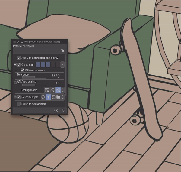
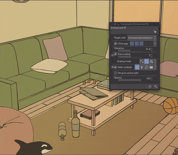
I use refer only to editing layer to begin, and then I'll only use the refer other layers and enclose and fill for my backgrounds. I will include my exact tool property settings in the gifs below so it will be easier for you to see all of the sub settings I use!
Generally, what I do is use "refer other layers" for large or shapes with hard edges, and "enclose and fill" for circular, small or more difficult shapes with a lot of tiny lines and also for shading (I'll show examples).
Now onto base colors!
(2) - Filling in base colors
I begin by loading in my line art and separating my layers into folders: one for line art and one for colors (don't judge my workspace ok I know it's messy). Set the line art folder to reference and make sure it's ABOVE the color layers.
When doing backgrounds like this, I will usually create 3 different layers for base colors:
1 for the floor, rug and wall, 2 for the biggest/centerpiece object of the room (the couch in this case) and 3, for everything else. I do it this way because having the objects I change the colors of the most is easier to do when they're in separate layers.
I'd advise to separate color layers in this order: (we will later merge them)
Top layer - all other objects or small details.
Middle layer - the centerpiece or second largest object in the room.
Bottom layer - the largest or the most difficult object to easily fill.
My process of coloring might seem a bit odd but it's what I've found works the fastest from testing out different methods.
1 - Select the floor/wall/rug layer and use the "refer only to editing layer" fill tool to fill the entire canvas with the color of the floor (you can use any color really because you can change it later). In the same layer, fill in the color of the walls and the rug.
Next, because my line art and most of my backgrounds have a lot of straight and intersecting lines, I usually use the "Refer other layers" fill tool for the majority of my base colors. This tool comes in handy for base colors because you can fill entire areas at once by clicking and also continuously fill by moving.
Here are my refer other layers fill settings for this part. The most important note is to have your refer multiple set to "Reference layer" as this allows for you to fill within the lines.
2 - Select your second color layer and use the refer other layers fill tool. With this fill tool you can drag it and it will fill continuously. I usually leave area scaling around 2, and play around with the close gap and tolerance depending on what I'm filling.

Here is an example of when you need to lower tolerance. If your entire canvas fills when you click on a small object, lower your tolerance a bit.

And just like that, we're done with the couch in 20 seconds!
3 - Now select your last layer and use the same fill tool to fill everything else with color.
I alternate between both fill tools a lot. I mentioned earlier how I use refer other layers fill for larger or more defined shapes and enclose and fill for smaller or more difficult shapes.
Here is one example of how I use both:

PRO TIP: The longest part about all of this isn't even coloring; it's picking colors. Having a color palette will speed this step up by a thousand times. If you don't know what colors you want to use, I suggest looking at some real life photos of whatever you're coloring and getting inspiration from there!
aaaand now we're done with the flats!
(4) - ~ Setting the mood ~
Now that we easily did our base colors in 10 minutes instead of 2 hours, we can happily move onto shading! But first we need to ~set the mood~.
Once you're satisfied with your colors, merge your color layers EXCEPT the floor/wall/rug layer (this will be really important for shading and make your life 100 times easier).
Usually at this point I will add an overlay depending on what time of the day it is. The color you picked for your windows will usually reflect what time of day it is. I like doing this before shading because it helps me get a sense of where to place certain shadows.
For this drawing I wanted it to have a 6 pm sunset mood so I added a gradient map by:
1 - Layer > new layer > gradient
2 - Click on the tool property settings that pops up to change the colors (or download a sky gradient asset from the CSP store) and click OK.
3 - Make sure this layer is on TOP of your line art layer, lower the opacity and set to either soft light, multiply or overlay (I'm using soft light here).
Now time to shade!
(5) - Shading
For shading, we will be using the enclose and fill tool starting with shading under objects resting on the floor. Change your enclose and fill tool from reference layer to refer all layers.
1 - Create a new layer above your floor and wall layers, lower the opacity (I set mine between 20%-30%) and set it to multiply. For the shading color, I usually just use the color of the object, but if I'm feeling lazy, I will go with a pink or purple because those always look good.
2 - Now just use the enclose and fill tool and start outlining shadows on the bottom of objects that sit on the floor. This is why not merging the floor and wall layers earlier was important because you can easily fill under objects.

Also, it's good to pay attention to where light from the windows hits and what shadows they would make. Your shading doesn't have to be perfect because 99% of the time, if you're using these in a comic, people won't pay as much attention to small details as you might think (yes I'm only saying this because mine never look good and I can feel you intensely judging my shadows right now I'm still learning ok).
3 - Once you finish the shadows of the ground objects, you can move onto shading everything else. Create a new layer ABOVE the other color layer you merged, and rinse and repeat the same steps.
Since you're applying shadows above the color layer it'll be a bit more tricky to do smaller areas with the fill tool.
Sometimes what I will do is use the fill tool then erase the parts I don't want. I actually really like this method as erasing gives the edges a softer look, but it is more time consuming. Using a regular pen tool is usually easier for details like this.

Here is my finished shaded image
(6) - Final and some bonus tips
Once you're done shading, add some lighting with a soft brush on an add layer, another layer for some gradients, highlights and bokeh effects and voila you're done! I also changed the brightness and played with some color balance settings.
Typically, I would use this for a transition image (the picture in a panel used to signify location change/establish setting) and only fill in basic colors and small shadows for actual backgrounds where characters are in the scene. But these backgrounds are great to split up to use for scenes where your characters are talking (also a HUGE time saver).
Example:
I think the most important part about making backgrounds is getting the overlay, lighting and special effects to match the style of your comic, so using the fill tool to save you loads of time on base colors is the probably the number one time saving tip imo!
Some more bonus extra tips for backgrounds:
Gaussian blur your shading for a softer effect
Add highlights on an add layer anywhere light hits and lower the opacity
Use the selection tool to select any object and add a gradient layer over it for cool effects (I used it on the mirror, bean bag, couch and window in the above picture)
Try different layer effects (My favorites are add (glow) for highlights, soft light for gradients and glow dodge for lighting)
Alpha lock your line art layer and use a soft brush with different colors on top of some lines
Play around with the saturation & luminosity of your color layers if you aren't satisfied with the colors
- Save the clip file and change the lighting and reuse! Example below of changing the lighting from morning to early evening for another living room I colored:
(7) - FIN
And that's all!
I wanted to keep it concise but I also tend to over explain sometimes, mostly because I want to make steps as easy and as clear as possible to follow. This is the first tips post I've made so I hope it was useful in any way! :) Funnily enough, finding out about this tool from a friend over a year ago is actually the reason I started using Clip Studio and I'm so glad I made the switch because this one tool alone has saved me hours of coloring.
That's all and I hope you have fun with your coloring!!<3
Here is the YouTube tutorial on how I use 3d objects to create my backgrounds!


Comment