
- Introduction -
Hello. My name is kyo :) I wanted to talk about 7 different methods and techniques I use to express light and different ways you can use light to make your art a lot more interesting. I'm no expert at lighting, but I do believe I know enough about how it works and I'd like to share that with you. This is the text version of the tutorial, but I encourage you to watch the YouTube video if you can!
I'm creating this tutorial because I believe that understanding light and how to apply it is a useful skill to add to your arsenal as an artist. Finding creative ways to employ lighting in your paintings can really take them to the next level.
Before I begin, I need to briefly explain how light works. I won’t go into too much detail about the physics of light, but I will provide a quick summary to give you some sort of basic understanding of how light works from an observational standpoint.
The simplest way to think about how light works is when you shine a light on an object, the light illuminates the planes facing the light source and anything facing away from it remains in shadow. There are many nuances to this that I will touch on later, but for now, this is the core of what you need to know.
And with that being said, let me share the 7 lighting tips and techniques I use in my art:
1. Be careful using the airbrush...
I see a lot of artists paint light exclusively using the airbrush and I personally don’t recommend doing this in most scenarios. Instead of this, I recommend you use a harder-edged brush to sort of “sculpt” light into forms. What I mean by “sculpting” with light is using more hard edges to paint light boldly. I almost always avoid using an airbrush to paint any important light source, and the reason I avoid it is because trying to paint a strong light source, such as sunlight, for example, using an airbrush will create a weak, artificial-looking light.
Now, of course, you can use an airbrush to paint soft light, if that’s your goal, but make sure you don’t paint ALL of the light in your painting using an airbrush or your painting will look very hazy and unnatural. The only case where I believe you can get away with using the airbrush exclusively is if you lasso tool select areas you want light. This will avoid the hazy look of airbrush lighting. The only time I personally use an airbrush is when I want a soft, faint bounce light or a gentle ambient light, or to create a glowing effect around a hard light.
If you’re going to use an airbrush, just remember that you should use it wisely. It's probably best to reserve its use for soft lighting and effects before you learn how to use the brush better because the airbrush is an easy brush to misuse. Try to balance soft airbrush lighting with more confident, bold lighting where you can to maximum visual contrast. Just remember that bold, confident lighting is more dynamic and attention-grabbing, and if you want to create that you’ll need a different brush for the job.
2. Use light to create vibrancy
As I mentioned in the introduction, knowing different ways to use light can be a useful skill. One way I use light is to create vibrancy in a painting. I usually use lighting as an opportunity to add extra color and brightness in areas I want to increase visual interest, or just to make the painting as a whole glow and feel more alive.
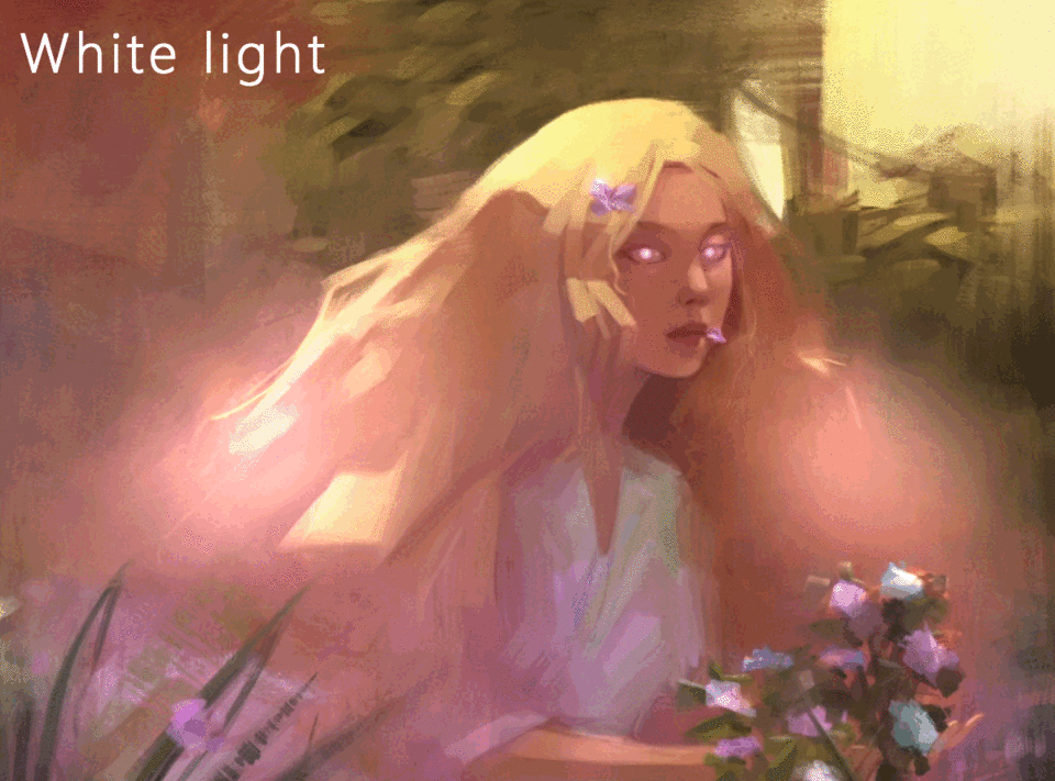
To do this, I always opt for using saturated, colorful light instead of white light. Now, this isn’t a “rule” or anything, but one thing you want to try avoiding if you don’t want bland or dull lighting is using plain white or desaturated light, because in most scenarios, using the color white for lighting will give unnatural results. White has its place, but you have to be careful when and where you use white or it will desaturate the colors underneath it, and this will do the opposite of creating vibrancy. So, if you want vibrancy, use bright, saturated colors that match your environment for your light.
3. Think in planes
When you are painting light, you should always think of the geometry of the subject you’re lighting. And by that, I mean try to imagine your subject as a series of planes. If you break a complicated subject into simple shapes, lighting it becomes much easier because all you’d need to do next is paint light onto the planes facing the light source the most.

Let’s take a human head, for example. It would be pretty difficult to imagine where the lighting should go on the head if you haven’t studied it before because there are a lot of complex details to keep in mind. So to make things easier, you would have to break this complex shape into simpler planes. One tool I recommend using to help with this is to use a model such as an Asaro head, for example. All you need to do is position a light where you want it and use it as a reference. This helps you see more clearly the planes of the head. Here's a link to this model if you'd like to try it yourself:
I know I only focused on a head as an example, but I wanted to demonstrate that this way of thinking can be applied to more than just the face, and you don’t always need a model like this. Just break up a complicated shape into simpler planes, and then lighting will become much more intuitive.
4. Play with ambient light color
In every environment, when there is a primary light source, this light usually bounces around the environment it’s in and reflects itself onto anything else in that environment. This form of indirect light is called ambient light. One way to think about this is, for example, if you were to place a white cube in a blue room, the light reflected off of the blue walls would faintly tint the cube’s shadows blue.
This concept is exactly what I am thinking about when I am painting ambient light. if I want to incorporate my subject into the environment more effectively, I select the general color of the environment and light the subject with ambient light using this color as a sort of tint. This ambient lighting can either be faint or very strong, but I always think it creates a more colorful, cohesive painting.
One thing to note is that the general color of the environment will almost always determine the color of the shadows. This is because ambient lighting is much weaker than light from a primary light source, so wherever the primary light cannot reach, ambient light fills in its place. These spots the primary or direct lighting cannot reach are usually areas in shadow. This is why if there were a white light shining on this white cube in a blue room, the side facing the light most directly will remain white, while the sides of the cube facing away from the light will be blueish in color.
5. Use secondary (or tertiary) light sources
One way I make the lighting in my art more compelling is to use more than one light source. What I usually do is add one, or sometimes two more light sources at an opposing direction of the primary light source. So if my main light source shines on the right of my subject, for example, I would place the secondary light source to the left. I do this to balance the lighting in the painting and make it more interesting. The additional light sources can either be faint and the primary light source can be the brightest, or you can make all of your lights equally bright for a more dynamic image. It’s all up to you, really. As for how I decide what color I want the second or third light sources to be, I’ll explain in a later point.
6. Exploit layer blending modes
In case you don’t know, Clip Studio Paint and other software have a selection of settings called layer blending modes. This is usually a drop-down list that can be found around your layers. What these settings do is change how the material on the selected layer is affected by layers under it. What this means for us is that we can play around with these blending modes to make light in our artwork look more colorful and vibrant. Using layer blending modes causes the colors you paint with on that layer to blend with the colors beneath it in such a way that you can’t achieve by painting light on a normal layer.
Here I have shown the layer blending modes in Clip Studio paint that cause a layer to brighten the colors beneath it. You’ll notice in playing around with them that the different modes brighten and affect the saturation of colors with varying intensity. It’s really up to you to decide which mode you want to use for any given scenario, and I suggest trying each one to see what effect it creates.
The way I use layer blending modes is by making a new layer above where you want to paint light, select a bright, saturated color, and flip through different blending modes and begin painting the light. I usually keep adjusting the mode until I like the result. I tend to use "add (glow)" and "glow dodge" more than others because I find them to be the most vibrant for the style I choose to work in, but you should experiment with them all and see what works for you.
7. Try applying color theory
This last tip sort of goes along with tips 4 and 5. This is a little more intermediate and is totally not necessary, but it’s definitely something I keep in mind a lot when deciding what colors I want to make the light in my paintings if I want the colors to work together more harmoniously. What I do is use color theory to find relationships between different colors. Now there are different types of pairings for colors, such as complementary, triadic, tetradic, etc. and I won't go into each one, but I do encourage you to look into different types and experiment with using them in your art.
You can pick a color from a color wheel of any of these different types of combinations to provide you with sort of a suggestion on what color you want your light sources to be. Now with this knowledge, you can do things such as make your primary and secondary light sources complementary to each other, or make the ambient light, background, and rim lighting on a character all have a triadic color relationship. It’s all up to you, this just gives you more possibilities to explore.
Here's an example of another painting I did where I actually used color pairings for my lighting. Someone asked me while watching me work on this painting why I decided to choose those two colors in particular for the light. The answer is because, in this example, cyan and magenta have a triadic relationship. If you look at a color wheel for triadic color combinations, you’ll see that yellow, cyan, and magenta are all part of this triad. I just chose to leave out yellow for this painting, but you can definitely incorporate all three if you think that provides a good result.
This isn’t really a rule to follow, and you can really just randomly choose whatever colors you want. But if you’re feeling stuck on what colors to choose and want a more informed decision as to what color you should make your lights, try using one of these charts. You can just google search "triadic" or "complementary color wheel." Over time you will sort of start to remember what colors are pairs, and you won’t need to consult the wheel.
Final thoughts...
What I want you to lean towards doing is making bold decisions with lighting and colors because you will end up with a much more interesting painting than one painted without lighting in mind. Always have a light source in your head and a direction you want it to shine.
And lastly, don’t be afraid to experiment or go overboard with absurd lighting. That way you can learn what works and what might not work and you can always dial back if it’s too much. Just remember to always keep the fundamentals of the physics of light in mind, and besides that, you can really do whatever you want.
With that said, thank you for viewing this tutorial. This took many hours to put together, so please leave a like if you found it helpful and don't forget to favorite it to return to it later :)
Users who liked this post


Comment