
Video
Intro
Well hello there, this is Tamil. Today I wanted to share tips and techniques to make your own personal profile picture, or it could be an avatar or a logo. Basically, anything you will put on your art account, which will make people remember you as you and nobody else. I finished a graphic design degree, so I will also share general rules for a good logo too! Let’s get started.
I loved editing the new video and really hope it will be great resources for people who are starting out! Don't hesitate to check it out before the article.
Brainstorm
At first, think about what makes you…you? If you like drawing animals for example, then maybe you can go for a cat or a dog drawing holding a paintbrush.
If your art is close to dark fantasy, then maybe it could be a skull or dragon head or a magic chest. For execution = less colorful and have harsher lines inside.
You like making pixel art? Perfect timing to draw yourself using pixels art style.
If you never used pixel art, you can always check out my pixel art video that goes over the basics for that.
My logo
It does not always have to be the same as what you draw though. Sometimes it can be just general. I never knew what I wanted to do with my art, so I just drew a pencil logo. It does not show any specific style, but it is art-related and it’s easy to recognize.
You can see a little bit of process and how I was deciding which colors I liked more and my early sketches for the logo.
Portrait
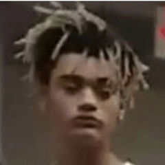
A lot of artists just paint self portrait or their OC’s portrait in their own style. A cheat code to grab attention is anything with eyes. We as humans are used to find and read eyes in our life.
If you looking for inspiration though, and you do not know how to paint cute portraits, a cool trick is to look at the twitch emotes. They are usually super small and have a clear read. There is huge variety of styles and expressions in them.
Just go to Pintrest and find moodboard for emotes! Here is one of my old ones that I made a while ago.
If you are going to paint a portrait. Make sure your lines are nice and thicc. Artists use very big lines for their characters, because they will become smaller when used. Easy way to check it is to zoom out and see if your lines are becoming too thin.
Text
If THAT does not feel like a good choice, you can always just use your name initials for the logo. It might feel a little more serious and professional if that’s what you going for. Just pick a cool font that you like and write your first letters of your full name.
I personally can’t use it because mine spells TV. Why would anyone try to commission art from a person who is a … TV ? Just a weird association. There are plenty of cool free fonts on the web though. If you want to be super safe, you can always go to google fonts. They are all completely free to use and have cool styles to them.
As a piece of advice, I see a lot of artists use cursive fonts for their art. It is not recommended. One of the big reasons is that it does not look good on small scale.
Logo Formatting
Well first of all, make sure it looks good big and small. Instagram profile picture is only 180x180 pixels big. Devianart is only 100x100 pixels.
Another thing to check are colors. It’s a big topic to explore, but generally, keep in mind print and values. Does it look good in black and white?
Is there enough contrast? If you turn my logo in black and white, it still looks pretty good. As for colors, I did not make a good choice because yellow is one of the hardest things to print. When I made my first business cards, it looked…like a rotten potato. If the yellow is becoming faded, it turnes into pretty ugly green very very quick. Think about making a sticker out of your logo, OR will it make for a cool tiny key chain? What about a shirt? This kind of thinking helped me to create my logo.
I would say keeping your values at 3: black, gray, and white is always a safe bet. You can always add more if you want to, but just be careful with it. Less is more.
( my first business card, very greenish, not great )
Ratio
Keep in mind that most social medias these days use a circle. Instagram and youtube and tik tok . Always check if your profile picture will not be cut off once it becomes a circle. That’s why I made my logo a circle from the beginning, so that way I do not have to worry about it.
Some social medias have a dark theme, like devianart. While others, do more light theme like instagram. Your profile picture should look nice on black and white at the same time. That’s why I put a ring on my own logo, so there is always black around, therefore it can look good against any color.
Keep it consistent across ALL your social media. It's very important for people to remember you by one image. Easier to find you and assosiate you with the same style/brand. I know it might be tempting to feel put different paintings on each profile picture, but it will make your audience more confused and lost at the end of the day.
Using a hard round brush with no blending could be a good idea when making profile picture. A lot of pixels get smoshed when compressed, so less transitions will make for a more clear image. So using vetor is a good idea. If you do not know how to use clip studio paint vector brushes, you can always just use zero antialliasing. It will make sure to not have any extra pixels.
Outro
This is a very different type of tutorial. I do not go into step by step and make it a brand new profile picture on purpose. I want your inner artist to figure it out and tackle it yourself. I went over my past mistakes and general rules that I WISH I knew when I was starting out.
I really hope you learned something and do not hesitate to ask questions under the video. I will try to help if I can.
my links
Users who liked this post


Comment