
Video
Digital Vs Traditional
Hello there! 🌟 This is Tamil.
Let’s talk about something that all artists have opinions on – traditional vs. digital art. Honestly, both have their strengths. When it comes to traditional sketching, there’s nothing like holding a pencil or marker in your hand. You can feel the flow of the line, and get this beautiful, natural variety in strokes that digital art just doesn’t capture quite the same. Plus, it’s way more fun sometimes! But then, there’s digital painting—the mixing of colors, the endless ability to undo, and the freedom to experiment without wasting expensive materials.
So why choose one or the other? Combine the best of both worlds.
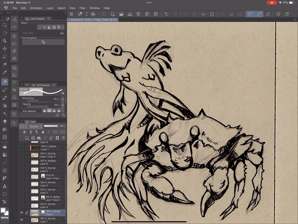
I’ll be using a sea creature sketch I did in my mid-tone sketchbook as the example. If you’re following along, you can digitize your own traditional artwork, and for that, you have two main tools: a scanner or a camera. I highly recommend a scanner. They’re easy to use, and you can find cheap options if you don’t want to break the bank. I bought one for just $20 last year, used, and it still works like a charm.
Feel free to download my sketch and follow along. It’s free for personal use :)
Scanning
Most scanners work about the same quality-wise, so don’t stress about getting the latest model. What’s the catch, then? Well, it’s mostly about size. The standard scanner is meant for A4 format paper. If you're not sure what that is, A4 is around 8.3 x 11.7 inches (or 210 x 297mm if you’re a metric fan). Anything bigger than A4 is going to be expensive, because larger scanners are industrial and expensive. Do you really need a larger one, though? For most artists (like 90% of us), no way. Unless you’re trying to make massive wall-sized prints, you’ll be fine with a regular A4 scanner.
Scanner Settings ( Super Simple )
This little guy helps allows me to borrow his scanner when I need it hehe.
Scanning, printing, digital sizing… it sounds confusing, but let’s simplify it. You’ll see something called dpi or ppi (dots per inch or pixels per inch). Every scanner can do at least 300dpi, and that’s more than enough for most images. If you don’t need billboard-quality prints, just stick with 300. It’s the magic number :)
But what does 300dpi really mean? Let me break it down: Imagine a 1-inch square. With 300dpi, there are 300 tiny dots in that square. So, for A4 size (again, roughly 8.3 x 11.7 inches)
8.3*300 ≈ 2500
11.7*300 ≈ 3500
Here is a real life example of how 1 inch looks like. ( Yes I tried my best to draw a square and failed haha ). That in total will be 300 pixels when used the proper resolution.
Clip Studio Paint has the resolution slider as well. If you ever plan on printing, keep it at 300. This only matters if you create your canvas in inches or cm. As you can see, the width and height is in pixels, so it will not affect the quality, but if you ever switch to inches, it will use the resolution number to translate to inches.
Overall, if it sounds confusing still, just keep the scanner at 300 and you will be good to go! :)
JPG vs PNG
Now, let’s talk about file formats. When you scan your artwork, your scanner will probably offer a couple of options: JPG and PNG.
Here’s the deal: JPG is lightweight, but it compresses your image a little, meaning lower quality. PNG is heavier, but it keeps the image quality intact. So, if you’re just cataloging a ton of old art, stick with JPG to save space. But if you’re scanning something you want to share or print beautifully, PNG is the way to go.
One is not better than the other. They just have different use cases! I love to export in PNG first. If I upload my art I try to use PNG to store things on the cloud, but after that I compress all my images. I have art from 10 years ago. It’s so hard to keep everything from everywhere, so I just convert to JPG later.
No scanner? No problems
It is prefer to use a scanner, but what if you don’t have a scanner lying around? No worries! There are options. Local libraries usually have printers and scanners you can use. If that’s not an option, your last resort is using a camera or your phone. But, full disclosure—I wouldn’t recommend this unless you have no other choice. The quality varies so much with lighting and how good your camera is.
If you go the phone route, here’s a pro tip: Indoor lighting is way dimmer than you think, and your phone camera won’t capture your art as well as you’d hope. There are two options for outside:
Take your photo outside on a cloudy day. Cloudy days give you this perfect soft light, nothing too harsh.
If the sun is always harsh in your place, then go on a very sunny day, but find yourself shade under a tree or a building. There should be enough bounce light to fill in the picture.
If you have to take pictures inside, then make sure you have multiple light sources. They should not be direct. And make sure there is LOTS of it. Our eyes are so good at adapting to dark environments, but cameras have lots of trouble with that.
Good camera settings is a whole separate topic that can take hours to explain if you never used a camera. A general advice would be using 35mm lens to keep less distortion. Set the F stop closer to 8 to keep everything in focus. Set the ISO as low as possible depending on the light.
Make sure the camera is parallel to your art to avoid any distortion. Seriously, check that your art isn’t at some weird angle compared to the camera. It’ll save you a lot of headaches later.
Just take a picture above the art. Make sure you are not blocking the light too! That is one of the challenges that comes with taking camera picture. A lot of times you can hang your art on the wall and take a picture that way, but it’s hard to do so outdoors.
Setting up soft light inside the room is hard without proper equipment. A strong lamp will create weird light spots in your art. You will need to use diffuse light or soft box, which can become expensive very quickly.
Importing to Clip Studio Paint
Okay, so now you’ve got your scan or photo. How do you get it into Clip Studio Paint? It’s super simple. I’m using an iPad, so here’s what you do: go to File → Create New from Photo Library and just pick the image you want.
That’s it! If you want to add the image to an existing canvas, just make sure your canvas is bigger than the scan to avoid any quality loss. For example if it is a A4 scan, then go above 2500 and 3500 just in case. You can always crop it later. You’ll thank me later when your image doesn’t turn out blurry.
Adjusting the Scan – Let’s Boost That Contrast!
Now we’ve got the art! But sometimes it might look a little flat, so let’s fix that. The first thing I always do is adjust the contrast—make sure your darks are dark and your whites are white. To keep the original intact, you can create an Adjustment Layer on top.
Usually, when it comes to contrast, I love to use Level Correction. It’s very simple to use. Go to Layer → New Correction Layer → Levels. This tool has three sliders.
The left one controls the (1)black point (the darkest part of the image), and the right one controls the (3)white point. (2) Mid point controls mid tones, but I do not use it as much. Move them until you’re satisfied with the contrast, but don’t go overboard. Going too far can result in “clipping,” which means losing some of the image detail.
In this case you can see that the black is good to go. It’s touching the wall and looks solid. Right side however, there is a lot of empty space between the last point ( red ) and the wall. That means all of that information is most likely empty. Which means we can just push the right slider to the left to adjust it.
Here is my final levels adjustment. You can do a little more and hit the black part if you really want to. It will really push the contrast, but you will start missing detail and information.
Before and after. And we did not loose any details, which is a common mistake people do. That’s why you need to look at the graph. Just boost the contrast.
It might not feel important, but small changes like this improve art by 10%. Then if we know 10 techniques like these, then we improve the art by 100% :0
The best part is using adjustable layers will allow you to keep the original in case you want to make different changes.
How to Use Scanned Art in Digital Coloring
Alright, so now your scan looks crisp. What next? Let’s talk about how to digitally color your scanned art. There are a few ways to do this, and I’ll go over a couple of methods you can choose from.
Convert Brightness to Opacity
The easiest method in Clip Studio Paint is the Convert Brightness to Opacity function. Go to Edit → Convert Brightness to Opacity. What this does is it turns the white parts of your scan transparent while keeping the dark parts opaque. This is great for ink or sketch drawings on white paper.
For my sea creature sketch (which was on mid-tone paper), it will struggle a little bit because of the paper color. It still works with a bit of tweaking. If it’s not working perfectly for you, go back to the Levels adjustment and make the whites brighter so that the tool works more effectively.
Once you’ve hit the button, you’ll see the transparent grid behind your drawing. ( if you have background color off of course )
Now, create a new layer below the lines, and you can start coloring behind them. It’s basically magic! This is ideal for comic art or any inked drawings you want to color digitally.
Extract Lines With Simple Mode
Simple mode is a great way to quickly draw in Clip Studio Paint. I have made an article on how to use it before:
To switch to simple mode go to the window and go to switch to simple mode. ( for tablet versions )
In here we can add from images to layer.
After layer is imported you will be asked if you want to extract line. You can click yes for this step.
It will automatically import with the filter and give the extract line effect. This will allow us to modify it if we want to. What if you want to apply it later?
On the left side you can find effects panel. There will be extract line inside. It is available with the latest versions of Clip Studio Paint, so if you can’t find it, you might need to update it.
Multiply Mode – The Old-School Trick
There is another way to color underneath ink artwork. It’s an old-school method for adding color to your line art. It’s awesome to use it if you are using a program you are unfamiliar with.
Do the same process as you did before with contrast levels. This time you might need to clip it more and make it even more harsh. Afterwords, push the layer on the top and set your scanned art layer to Multiply mode. Multiply keeps the black lines and removes the white background.
Playing with Stylistic Choices
Now, if you’re like me and love experimenting with different styles, this part’s for you. I personally love using halftone filters on my scanned sketches. It gives a cool, vintage feel. To do this, go to the Layer Property tab and click the halftone button (it’s the second one).
You can adjust the size of the dots by changing the frequency slider. I like to go for bigger dots, especially for a bold, graphic look. The shading will translate into smaller dots, and thick black lines will get big dots, which creates a really interesting texture.
Because we used pencil and it had some sketchy parts to it, it makes amazing patters and variety with size of the dots. You can use the same technique as before to colorize it. Make a layer below and draw. You can use the brightness to opacity or multiply blending option as well :)
What brushes to use?
In my final illustration I just used water color brushes. Sometimes settings it to multiply or overlay blending modes. Watercolor brushes are great because they will not let you color with perfect digital colors. A lot of times it will preserve the texture of the paper and add a traditional flare to your artwork.
Final Result
And there you have it—the final product! After blending traditional sketching with digital coloring, I’ve completed my sea creature painting, and I’m really happy with the result. I added colors and a white outline to the final result. I just used a simple ink brush and tried to keep it light.
By starting with pencil and ink on mid-tone paper, I was able to keep the raw, tactile feel of traditional art while using Clip Studio Paint to enhance it digitally. This approach gives you flexibility and freedom to experiment with colors and effects without losing the charm of your original hand-drawn work.
So, whether you’re a digital artist looking to incorporate more traditional elements or a traditional artist ready to dip your toes into the digital world, combining these techniques opens up endless possibilities. Try it for yourself, and don’t be afraid to explore!
If you want to see more and check out my art, here are my link :)
Users who liked this post


Comment