
Defining a gradient map
A gradient is, in its simplest form, a blended transition from one colour to another, such as the one below from black to white.
Gradients are not limited to two colours, and you can have dozens of subtle changes in colour throughout a single gradient bar. All of these colours will gradually blend into one another.
A gradient map is when a gradient is layered on top of a drawing, in doing so preserving the subject of the drawing, while changing its colours. Gradient maps replace your colours with those of the gradient - each value of your drawing will correspond to a specific shade of the gradient.
Now that we know what gradients and gradient maps are, we can move on to learning how to create them.
Making a gradient map
Let’s go through the creation of a gradient map in steps.
1-How to open the gradient menu
There are three ways you can open the gradient menu:
Option A - correction layer
Click on [Layer]> [Correction Layer]> [Gradient Map]
This is the most straightforward method. Its main benefit is that it adds the gradient map as a new layer on top of your existing ones. This allows you to interact with the gradient after having applied it; for example, to lower its opacity or change its layer mode.
Option B - tonal correction
Click on [Edit]> [Tonal correction]> [Gradient map]
This will allow you to apply the gradient as you would from the correction layer. It is the advised method if you want to quickly change the colour of a certain layer, and are sure of the result.
Keep in mind that if you apply the gradient map from here, you will not be able to remove it afterward, save with the undo tool (ctrl+z) if it's the last action on the drawing.
The gradient map is applied like a filter, such as a blur, and thereafter cannot be removed.
Option C - tool bar
Click on the symbol of the gradient from the tool bar. Once you’re in the gradient tool menu, look for the wrench icon on the bottom right corner of the [tool property] box. Another menu will pop up. Click on [advanced settings] and the gradient menu will open up.
(This option, however, does not apply the gradient as a gradient 'map' but just as a simple gradient - so I won't be going into much depth on it. Still, you can edit and create your gradient maps from here too.)
Whichever option you chose, you will now have opened the gradient menu. Let’s see how to navigate its features.
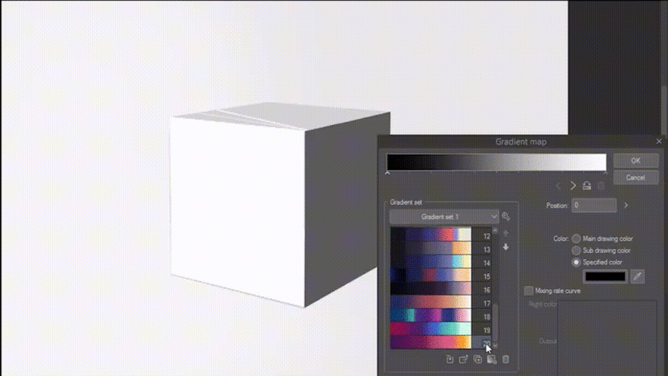
2- How to create a new gradient map
Below I've annotated the gradient map dialog box . Each number refers to one or more features, and I will be mentioning them in this section, so that it's easier to follow along.
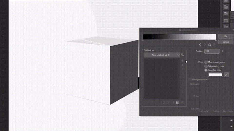
To begin with, we should create a new gradient set. Think of this as a collection of gradient maps.
Click on the wrench icon (1), and navigate the drop down menu to the first heading: ‘Create new set’.
Choose a name for your gradient set.
(You will be able to edit this name later on, from the same drop down menu you created the set, by clicking on ‘settings of set’. )
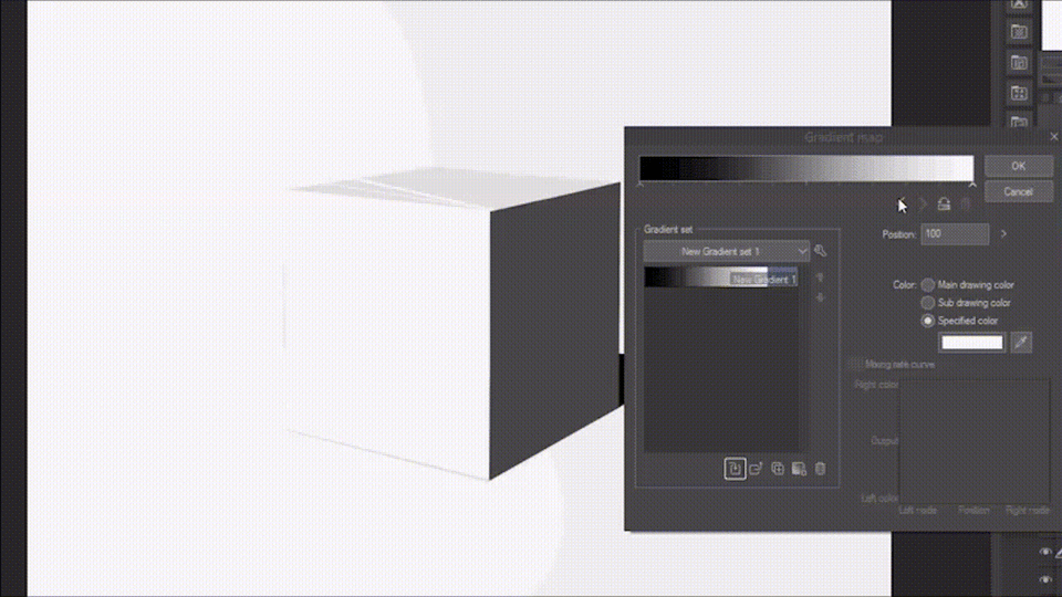
To add a new gradient map within this set, click on the wrench icon (1) again, and scroll down to 'Add Gradient'.
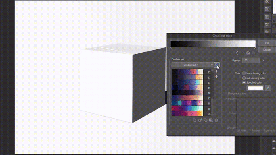
There is also another way to create a new gradient map (shown below).
Click on the gradient icon (2) at the bottom of the set. This option will add your current gradient bar (3) as a new gradient map .
To modify this new gradient map, you will mostly be working with nodes. Nodes (4) are the small arrow-like symbols at the bottom of your gradient bar (3).
To add a node, tap on any point of the gradient bar. You can then move these nodes around the bar. To delete them, drag them up or down.
There are manual movement settings for nodes, placed below the gradient bar to the right. These are labelled (5) in the annotated menu.
The two large sideways arrows allow you to select, respectively, a node to the right/left of your currently selected node.
The icon next to the arrows inverts your gradient, moving the colour at the left corner to the right, and vice versa.
The bin icon will delete the selected node.
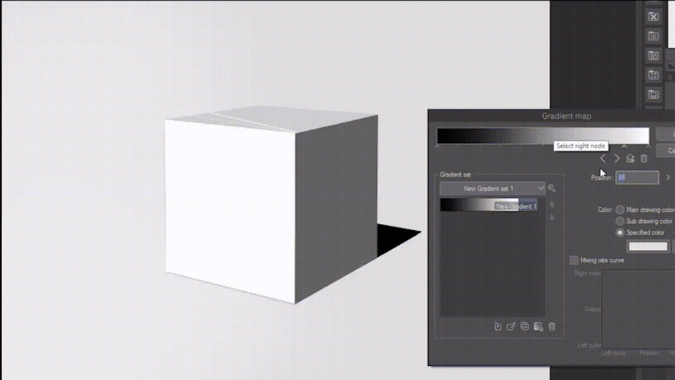
Once you have selected a node, you can choose the new colour added in the section numbered (6). The program is automatically set to ‘Specified colour’. To change that colour, click on the rectangle below the writing to pick whichever colour you like.
On that note, there are a few things worth considering when choosing your colour combinations.
3- How to choose colours for a gradient map
All colours are made up of three parts: hue, saturation and value/ brightness. This is known formally as the HSV, or HSB colour scale, which is also what is used to provide a numerical value of your colours.
Here I will be using the HSV model (in Clip studio it is represented as a square), but most of these tips could be applied to the HSL model as well (represented as a triangle).
Let’s examine each of these parts and how they affect a gradient map.
Firstly, hues are the various colours. Red, yellow, green are all differing hues.
Saturation is the intensity of a colour. The less saturated a colour is, the more grey and muted it appears.
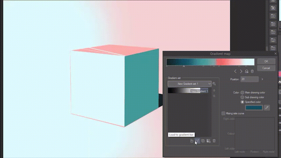
Below, I've composed a gradient map where only the saturation changes, and I've applied it to a simple drawing of a cube.
You may notice that the most saturated value (the cube's shadow) appears considerably darker than the grey around it. This is because more vivid colours, being more saturated colours, have a stronger impact on your sight.
When creating a gradient map, you could place the most saturated hues in the points of focus of the gradient, for instance, if you want your gradient to be luminous in the highlights area, place the most saturated colours to the right.
Lastly, value, which can also be called brightness, refers to how light or dark a certain colour is.
When creating a gradient map, you'll want to vary these three qualities of your chosen colours, in order to maximise contrast or minimise it, depending on what kind of gradient you're creating. I recommend trying out various combinations of colours, with different values, hues, and saturations, as well as observing those created by others, and where their colours are placed in the HSV scale.
Beside hue, saturation and value, you could also think about how your hues interact together. Here is a visual guide on colour schemes.
(From left to right: Monochromatic, Complementary, Split Complementary
Analogous, Triad, Tetradic)
You may use this as a baseline for your own colour combinations, but don't feel too restrained by it; unusual combinations of colours can make for amazing gradient maps.
4- How to apply a gradient map
Once you have chosen your colours, you might have realised the gradient map in the gradient set menu has remained unchanged.
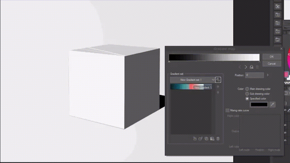
Click on the 'replace gradient' button to overwrite the blank gradient with the one displayed on your gradient bar.
If you’re happy with your gradient map, you can now click on ‘ok’. This will close the dialog box and apply your gradient map on top of your currently selected layer.
As a side note, make sure that whenever you’re done editing or creating a gradient map, you click on ‘ok’, even if you do not intend on using the gradient map right now.
If you do not, your changes and new gradients will not be saved.
5- How to import a gradient map
Making a gradient map is not the only option you have if you want to use the gradient map feature.
In Clip Studio Paint, you can easily access hundreds of custom-made gradient sets, through Clip Studio Assets.
Once you’ve opened Assets, navigate to the search bar and click on Detail > Gradient (or gradient set). Once you’ve scrolled through the options and downloaded a gradient set, you will find it in your materials folder, under the heading 'downloads'.
However, you cannot interact with your new gradient set from this menu.
In order to import the downloaded gradients, return to the gradient map dialog box. Click on the wrench icon, then on the heading 'Add Gradient Set' and find the downloaded gradient set in the menu that pops up. Click on 'ok', and it will be immediately added to your gradient sets.
6- How to share a gradient map on Assets
In case you're interested in how to post your own gradient maps on Assets, this section will explain the process.
Firstly, you will need to turn your gradient set into a material. Click on the wrench icon from the gradient menu, and click on 'Register set as material...'
From there, a new tab will open up, where you can modify and edit your gradient set.
(1) - tap here to change the name of your gradient set.
(2) - this folder icon will let you browse through your device for an image you can use as cover art (make sure that you create your cover in png, or jpg format).
(3) - navigate this section to choose where your gradient set material will be saved.
(4) - click here to add a new tags. Adding tags will make it easier to find your gradient set among your other materials.
When you've finished on this tab, click 'ok' and your gradient set will be saved as a material.
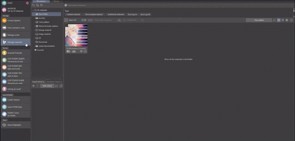
To post it on Assets, you will need to open Clip Studio - as in, the general programme which can be seen below. In the left bar, find the section on 'Manage Materials' and click on it.
Find your gradient set, then click on the arrow in the bottom right corner, and click on 'Manage Materials...' in the drop down menu that appears.
There, click on 'Publish to Assets'.
As can be seen above, this will open a new window, where you can add a description, a visual example, and make some final edits.
In the upper right corner, you can see two buttons, the blue one says 'proceed to set content information'. This will move you to another page, where you can set whether your material is paid content or not, and agree to the terms of service.
The green button, on which is written 'save temporarily' will do just that, and allow you to save your changes and work on the material later on.
If you've clicked on the blue button and have finished settling the last details, the page will let you go to your Uploads, where this new material is stored. Just click on where 'Uploads' is highlighted in blue.
Click on 'Operation' > 'Preview and Post'. Here you can view how your Assets page will look like. If you're okay with it, click on 'Publish' outside of the red area.
The white icon with dots next to it will allow you to 'Edit', 'Return to the Uploads page', 'Download' and 'Delete' your material.
Using a gradient map
There are several ways you may use a gradient map, and all of them relate in some way to the colours of a drawing.
To colour from greyscale
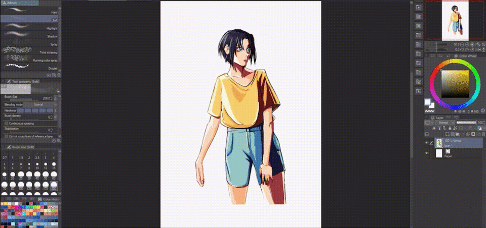
Greyscale is a technique where you colour your drawing in shades of grey, and add the colours after. Gradient maps tailored specifically to the subject you're drawing, are one way you can add colour to a greyscale painting.
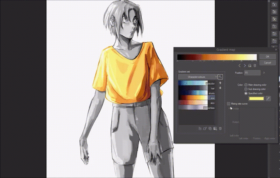
To start with, make sure each part of your drawing is cleanly separated on their respective layers. For example, here I’ve rendered a character in greyscale, and divided the layers into, from top to bottom: hair, skin, eyes, shirt, shorts.
With each part of the drawing on a new layer, you can open up the gradient map menu, and apply a colouring gradient on top.
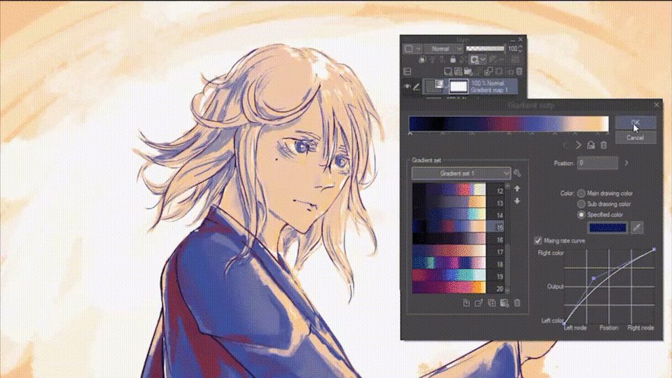
There is a feature in the gradient menu, that will allow you to make slight changes to each of your gradient map's selected colours. This is the mixing rate curve.
As showcased below, add or delete points to move the curve. The closer to the right upper corner the curve is, the more accentuated the colour on the right will be. If you move the curve lower, your selected node (indicated on the axes as 'Left node') will be emphasised.
If you’ve used tonal correction, there’s nothing else to do. However, if you’re using correction layers, make sure to clip them to their respective layers, by clicking on the icon in the layer menu - you will find the clipping icon situated to the left of the reference layer icon.
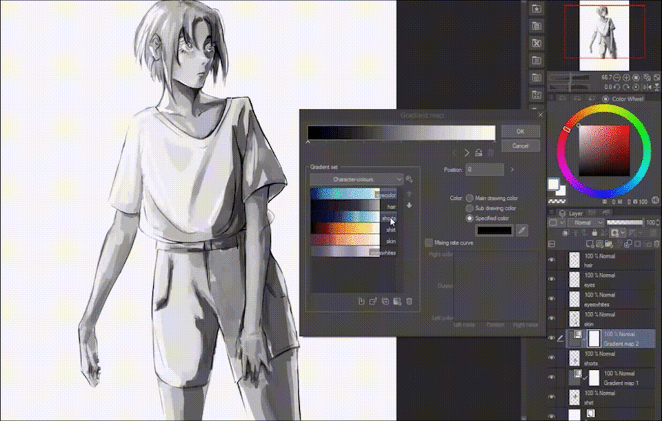
Once you’ve done this for every layer of the drawing, you may feel as if your layers' bar is a bit cluttered. To clean it up, leave only the layers of the character visible; you can do that by clicking on the eye icon to make the background transparent - it should now appear as a grey checkered pattern behind the character.
Go to Layer > Merge visible layers.
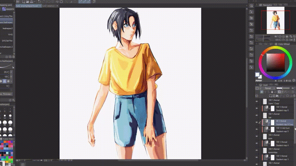
Note that you could also do this to merge the single parts of your drawing.
Celshading tip
Below, I’ve placed the same drawing side by side with a cel-shaded version. As you can see, when gradient maps are applied to the painterly/ watercolour style, the variety of colours they can provide is greater than with celshading.
That is because I’ve only used 4 shades of grey to render the cel-shaded version.
When painting, blending the colours will naturally provide a greater variety of values, enabling the gradient map to be used to its full capacity. Since you don't usually blend cel-shading, that does not happen there.
The cel-shaded version still looks pretty good, but in case you want to add just a bit more colour to it, you can add another clipped layer in between your base layer, and the gradient map, and use the airbrush to spray a bright colour on top of the lighted areas. This can also help unify the different gradient maps used to colour the greyscale.
In this case I've set the clipped layer to 'Overlay' mode, and lowered the opacity to make the lighting more subtle.
To enhance a coloured drawing
Another common use of gradient maps, is for colour adjustment.
Gradient maps can really help a coloured drawing stand out, thanks to their ability to add saturated, bright and contrasting hues on top of existing colours. This can both enhance and alter them.
It’s recommended you use the gradient maps as correction layers when enhancing the colours of a drawing, since they allow you to experiment further.
With correction layers, you can lower the opacity of the gradient map, and make the change in colour more subtle and nuanced.
Or, you can achieve a wide variety of results by changing the layer mode of the correction layer.
Generally,
Darken/ Multiply/ Colour Burn/ Linear Burn layers will use your gradient map to darken your drawing, and accentuate contrast to differing degrees.
Lighten/ Overlay/ Soft Light/ Linear Light, and any of the Glow, Add or Colour Dodge modes, will lighten your drawing, and in some cases, add a glowing effect to it.
(from left to right: Original, Normal, Multiply,
Linear Light, Soft Light, Overlay)
Colour mode tip
Most gradient maps will end up slightly changing the way your values are spread, and thanks to that they can be used to make colour adjustments to your drawing at the same time at which changing its colours.
However, if you want to preserve the overall values of your drawing, you can either keep the opacity low, or use the 'Colour' layer mode.
This mode will apply the gradient map's colours on top of your drawing like a coloured filter, leaving the original drawing's values unchanged.
Thanks
Thank you for reading this far.
Below, I’ve compiled all the gradient maps used in this tutorial, as well as a few more that I’ve created. Feel free to use them.
Users who liked this post


Comment