Elemental associations about ruins
Definition of Ruins
Ruins refer to the remains of buildings after they have been abandoned.
However, as long as you draw a building and make it old, does it conform to the audience's reverie about ruins?
So, I'll take this question as a starting point and make two points.
┗ The charm of ruins lies in the [environment] it builds
I think the charm of ruins lies in the [environment] it creates.
No matter how mysterious, beautiful, or depressing,
It must make people feel the [sense of space] on the screen.
⭐【The ruins should be a space with unique charm】
This point of view mainly affects how the painter chooses [composition].
One way of expressing a sense of space is that you can choose to draw a distant view and let the character look at this grand scene.
Characters can also be immersed in the scene.
If you just paint a wall with an old-fashioned effect, or a corner, even if you use a lot of objects to help enrich the picture, it will not be able to well reflect that the character is in the ruins. (The character may just be in a run-down environment)
Like the example picture, the scenery shown in this picture may not make people think "this is the ruins".
It might just be a corner of an old house. There is no human care, but there is still the possibility of "people living here".
There are many elements that could appear in ruins, such as broken windows, moldy walls, and standing water. But still can not make people very sure that this is the ruins.
I personally think that a suitable composition should at least show three sides at a time, and draw the [depth of the scene] in the sense of space.
Trying to give the floor or ceiling enough weight in the frame may work well.
As for the example of [More Sides], it is recommended to use a search engine to search for "Abandoned Spaces" with the keyword. Those real photos can make you feel the so-called "sense of space" in a deeper and better way.
┗ Characterized by 【It is no longer used by people】or 【It is no longer usable by people】
What is the difference between ruins and old buildings?
In the picture below, can it be said to be a ruin or a relic?
Basically, I don't think it can be influenced by [the style of the building].
Because in some fantasy works, these retro buildings may still be used by characters.
The ruins are characterized by
[it is no longer used] or [it is no longer usable]
For example, this example can make people feel that the room is "no longer used" because the furniture has been emptied.
A lot of ruin scenes are characterized by the fact that there is almost no furniture in the empty room.
After all, people have moved away.
But just drawing it like this, it doesn't feel effective enough on the screen, so we have to try to imagine what kind of house [cannot be used by people].
No one wants to live in a house with ripped off wallpaper + swathes of peeling paint,
The more inhospitable it is, the more it will look like ruins.
In addition, on the point of "no longer used by people",
If there is a [road] that allows people to pass through in your picture composition, you can try to add some [obstacles].
Because the road is blocked, it means the space is isolated, which is what the ruins need to feel.
There is usually no grass on the roads that people come and go, so you can use more plants to block traffic.
Destroying, cracking, or collapsing roads is also a way to add to the sense of "abandoned place".
Of course, choosing large objects such as stones and stone pillars to directly block the road also feels isolated from the world.
(Would you believe me if I said there were zombies behind the rocks? (¬‿¬))
Related applications are
Iron gates locked with chains,
Abandoned, rusted cars in the middle of the road,
All are elements that impede passage.
Elements that can be used in the ruins
Cracks, holes, standing water, dust, mold, rust, paint peeling,
Just think about it, there are many elements that can be used,
So I will pick the elements that I find interesting.
┗ Inclined
I think tilting is a tool that works well but is easily overlooked.
Of course, I would like to propose that it is not only used for the inclination of large buildings,
I think the dumping of the ornaments is also very important.
For example, there is a chair in the room, you can also push it down, or the whole [turn over],
Maybe get a different look.
Try tipping over what you thought was standing!
┗ light
The charm of ruins lies in the isolated space,
Light is an important element that connects and separates the inside and the outside.
To add detail to the picture, the way to increase the contrast of light and dark is very suitable for ruins.
┗ Plants
In addition to the commonly used climbing vines for decoration,
Concrete or brick floors are likely to be raised by plant roots.
Make the ground more undulating.
┗ Storytelling
After all, it is a place that has been used before.
Some traces of the user's existence can be left on the screen.
E.g:
a single shoe
It can be imagined that the owner of the shoe may have left in such a hurry that only one pair of shoes is left.
Swing with broken rope
A broken thing makes people realize that it must have been used when it was intact.
┗ Street Graffiti
There are rare elements in the ruins that must rely on human beings to appear.
The less graffiti appears in places where graffiti usually does not appear, the more miraculous it is.
Recommended functions when drawing ruins with CLIP
⭐1.
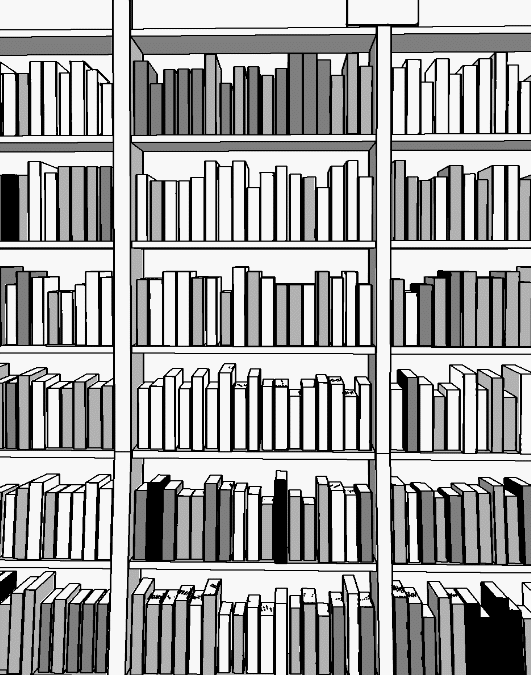
Bookcases, especially those made of composite wood, will collapse to the middle due to the weight of the book over time.
It can be done quickly with the skew tool.

⭐2
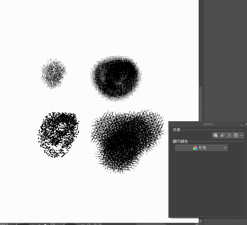
When you are adding dirt or mold to walls or objects, consider giving it a try
[Watercolor border] of the layer properties panel border effect

⭐3
When you're trying to create a peeling paint effect for a wall, but you can't draw the right shape.
1. Open a new layer
2. Top list Filter => Paint => Berlin Noise
You can get a layer that looks like a cloud material.
3. Next
Top List Layer => New Tone Compensation Layer => Tone Separation
The pattern just now will turn into a color block.
The number of color grades depends on personal preference.
4. Auto Select (Magic Wand)
Tool Properties Panel Seek Adjacent Elements Unchecked
Select the block you want on the screen, you can get a selection range of special shapes
5. Open a new layer and fill in the color.
Paste the produced pattern to the place you need, deform it, and you're done.
end
Because I'm talking about something that is biased towards theory,
So please let me explain it in black and white!! (My color sense is really bad)
Hope this article helps you~
also,
If you want to thank me, please follow my IG, because I don't have a lot of followers. 😂
thanks!
----
Material Annotation
*In order to facilitate the writing of the article and the examples that need to be produced, I used the 3D model materials listed below and purchased from CLIP STUDIO ASSETS.


Comment