
Introduction
Hi! Are you a complete beginner who’s overwhelmed by all the blending modes csp offers and can’t figure out how to actually use them in your illustrations? It’s only valid to be. After years of doing digital art, I’ve figured out how to use them productively, so, to make your work easier, here’s the ultimate guide on how to use blending modes to bring your illustrations to life!!
So….. What are blending modes?
Blending Modes decide how your layer will interact with the layers below it. They can be used for many things, like adding lighting, changing the mood/atmosphere or adding stylistic filters. At first glance, they can seem extremely intimidating.
In this tutorial I’ll be going over each blending mode and explaining how you can use them in your illustrations for final touches. We’ll start with understanding how different modes work. If you find theory intimidating (like me), feel free to skip the introduction to modes and instead start with Lighting and then go back to the Modes. In my experience, it’s better to start with smaller direct uses than get into understanding the mechanics behind each blending mode.
First, I’ll be going over all the different blending modes and ways you can use them to add finishing touches to your artwork. Then we’ll move on to using them to show different times of the day, which can enhance simple illustrations too.
Modes
Csp offers a total of 26 blending modes. I have divided these into five sections for ease of understanding. When starting out, you can add final touches using just Multiply or Linear Burn for shadows, Add or Color Dodge for highlights and Overlay for effects. That said, it’s always a good idea to play around with and understand all the blending modes so you can figure out what works the best for you and the kind of illustrations that you want to make.
For all the Blending Modes, I’ve added one common illustration and one image as an example showing how the colors will blend.
For Shadows
Blending modes under shadow make the illustration’s colors darker in comparison to the original colors. I’ve added an illustration example along with all of these with some light airbrushed colors for warmer tones on the skin and a darker color for the hair.
𝘿𝘼𝙍𝙆𝙀𝙉
The Darken mode compares the colors of the blending layer and the base layers and keeps the darker colors. Personally, I feel it’s useful when coloring translucent objects. Darken completely disregards white, since all colors are darker than white.
In the first example, you’ll see that two completely saturated colors blend together to give black. Also, in the second example, you’ll notice how there’s no visible change, this is because the values for the shading are very close to the original values, so there’s no change.
Here are a few examples of how you can use Darken to 'spice up' your work. Using Darken for tinted glasses helps give the illusion of a translucent surface without decreasing the contrast. You’ll see in the example below that Darken helps bring out the texture under the glasses and the character’s eye color.
Darken is also amazing for tinted shadows. Maybe you have a flat illustration that you want to quickly add slightly more stylised shadows to. You can easily achieve this by using a saturated colour on a layer with the blending mode set to Darken.
Finally, another quick example is for when you want to change the hue. You could add the color at low opacity, of course, but setting that layer to darken leads to a more stylised hue change with better contrast, making the colors stand out more. This can really make an initially dull illustration really unique and attention-grabbing.
There are several more ways in which you can use the Darken blending mode; these were just a few simple examples.
𝙈𝙐𝙇𝙏𝙄𝙋𝙇𝙔
Multiply mode multiplies the color, making the base color darker as a result. You can use it with different tints to add shadows or to shade an illustration, especially since it removes white and other lighter colors. It can be used in multiple ways, which I will discuss as we go forward.
Multiply is most artists’ favorite blending mode. It’s brilliant for adding shadows, adding blush, and sometimes even for adding overlays. The two images below show how this works in practice. You’ll see that unlike in Darken, since Multiply multiplies the values, you can use colors of similar brightness and still have a visible effect.
There are so many common uses of Multiply that just three examples couldn’t possibly do it justice. Here are a few personal favorites:
You can use Multiply for simple skin gradients, for shadows, or even for creating a different lighting scenario. I'll go over them in greater detail under the heading " Lighting ".
Another great use for Multiply is to set your character aside from the background. This can be done by first separating the character and background into separate layers. Now, copy the character layer and place it under the original one. Under "Filter," you’ll find "Gaussian Blur." Set the blur strength to your liking. Finally, set the layer to "Multiply" and lower the opacity according to your own preference. It’s that easy. This is especially common in comics, where you want the viewer’s attention on the character.
Lastly, you can use multiply to add texture too. In rendered illustrations, it can make your work look more realistic. To add texture, just go to "Filter" > "Render" > "Perlin Noise." Adjust the settings to your liking. Now clip the noise layer to your character illustration. This will make sure that the noise is only visible in the area that has non-transparent pixels in the base layer. Now, set the layer to multiply and adjust the opacity to your liking.
You’ll notice that often it’s better to use multiply at a lower opacity as it’s very intense.
𝙇𝙄𝙉𝙀𝘼𝙍 𝘽𝙐𝙍𝙉
Similar to Multiply, it makes the colors darker but with more saturation as compared to multiply. Linear burn is affected by the opacity of the blend layer.
Since Linear Burn gives more saturation, you’ll notice that the blended colors between the RGB circles are not completely black. Also, the colored strips are more intense than they were in Multiply or Darken.
The blush and hair are also much more intense. It’s usually better to keep the opacity low when using "Linear Burn."
Linear burn can be used to add exaggerated tinted shadows. It can be used in similar ways to Multipy, but you’d have to keep the opacity much lower in the gradients.
A very easy effect that you can do with linear burn is to just use any color of your choice for a shadow and set it to ~50% opacity. Here, I used cyan to show a shadow cast by a tree. I made this decision because the sky would be blue and the tree leaves would be green; cyan would be the best option for shade in this case, in my opinion. Then, I just used a soft brush of low opacity to erase random bits, making it look like the character is under tree shade. You could use Linear Burn similarly for a character in an aquarium.
𝘾𝙊𝙇𝙊𝙍 𝘽𝙐𝙍𝙉
Color Burn makes the colors darker while increasing contrast. It can make the colors look darker and more vivid. The saturation achieved by Color Burn is greater than that obtained by Linear Burn. Also, keep in mind that Color Burn is affected by the opacity of the blend layer.
In the image below, you’ll see that color burn leaves pure white and pure black as they are; any color on the blend layer if the base layer is black or white will not be visible. Also, you’ll see the colored lines have made the base color darker and more saturated.
In the other example, you’ll see the saturation caused by Color Burn is more than what you saw in Linear Burn.
Color Burn is a very strong blending mode, so you’ll usually find yourself using it at a lower opacity. You’ll notice the pure white isn’t affected here either, even at 100% opacity. When used to change hue, you’ll see that the contrast between the highlights and midtones is only slightly increased (when used at a lower opacity). This makes Color Burn great for a subtle hue change that isn’t too harsh on the eyes. Another use for Color Burn is similar to Multiply: you can use it to change the lighting.
Although, unlike Multiply, it looks more vibrant. With both set to 66% opacity, you’ll see Color Burn keeps the highlights very vibrant, like in the fire.
𝘿𝘼𝙍𝙆𝙀𝙍 𝘾𝙊𝙇𝙊𝙍
It compares the values and keeps the darker color. This can be used to replace all highlights with a specific color. You can directly see this in action in the image below. For the blush and shadows, there's a minimal difference as well.
Personally, I don’t find myself using Darker Color very often, but it can be used simply to add shadows to flat illustrations. In the image below, I’ve used three separate colors of varying darkness and set the layer to "Darker Color." You’ll see that the shadows on the hair are visible in the first example. In the second example, the blue is darker than the hair, so only the nearly black lineart is visible. Now, in the third image, since the blue is lighter than the hair and clothes, it ended up only covering the skin.
If you only want to change the colour of a specific set of highlights or even midtones, you can use a Darker Color.
For Highlights
Blending modes under "Highlights" are essentially just the opposite of the blending modes under "For Shadows." These blending modes either make the colors brighter or only keep the lighter tones.
𝙎𝘾𝙍𝙀𝙀𝙉
Screen is basically the opposite of Multiply, so it’ll invert the colors and multiply them into the base layer. This can be used for highlights. Black on the blend layer leads to no changes in the base colors.
You’ll see in the image below that Screen gives rise to a very soft, bright color. It could make for a really cute and colorful bokeh effect too. In the other example, you’ll see that the highlights through Screen are slightly brighter.
Screen’s intensity is much easier on the eye in comparison to the next few modes, so you can use it for subtle highlights. For soft sunlight, you could also airbrush bright colors on a blend layer set to Screen blending mode. Another use could be for slightly tinted glasses or other transparent tinted surfaces.
𝘼𝘿𝘿
Add makes the colors brighter by 'adding' the colors. It's great for adding saturated highlights. I’ll discuss ways to use it moving forward.
In the image, you’ll see how Add makes the colors much brighter; even the strips of colors seem to give the illusion of glowing. Add can be used the same way you would use Screen, but it gives more intensely bright colors.
You’ll see how the orange-red highlight in the example below blends with the colors on the base layer to look more yellow and bright; this makes Add an amazing blend mode for highlights.
Here’s a method you can use to add strong highlights, like backlight, to your illustrations. You can follow this same process but exchange "Add" with "Add (Glow)", "Color Dodge," or even "Glow Dodge."
The process is very simple. The first step is optional, but I first like to airbrush the background with a more saturated version of your highlight color (on ‘Screen’ blend mode) for an illusion of light. Next, add a layer above the character, set this layer to "Add," and clip it to the layer below. Now, put your highlights wherever you want them with a less saturated color.
You could technically stop here, but to me the light feels a little too harsh, so I’ve added a third step. To tie it together, add a new layer and set it to "Add" and with the same less saturated color, lightly go over the sharp highlights with an airbrush. Finally, with a more saturated color, increase the brush size and once again lightly go over the surrounding area. Set this layer to a lower opacity.
𝘼𝘿𝘿 (𝙂𝙇𝙊𝙒)
Add (Glow) is similar to Add, but it leads to even brighter colors. You can see it in action in the images below.
Add(Glow) can be used to add highlights and sunlight. In the tutorial that I added under "Add," the layer added under the third step can be set to "Add (Glow)."
Here’s the comparison with only the airbrush layer’s blending mode changed:
In addition, you can also blur or blend the sharp highlights a bit. The one on the left has both blending modes set to Add, while the one on the right has both set to Add (Glow) at a lower opacity and with smudged sharp highlights.
𝘾𝙊𝙇𝙊𝙍 𝘿𝙊𝘿𝙂𝙀
Color Dodge lightens the colors of the base and reduces the contrast. It’s great for highlighting focal points and increasing saturation. The midtones are saturated, and the highlights become very intense. Color Dodge is also affected by the opacity of the blend layer.
You’ll notice that Color Dodge retains the saturation of the highlights more than the previous blending modes do.
Aside from the uses I’ve mentioned for earlier modes, such as for highlights, Color Dodge makes for an amazing tool for making a certain point in your illustration a focal point.
Below, you can see how I used Color Dodge with an airbrush to make parts of the characters glow or stand out. It’s also a great tool for adding a glow to items like lightsabers or jewellery.
𝙂𝙇𝙊𝙒 𝘿𝙊𝘿𝙂𝙀
Similar to "Color Dodge," but more intense. In the highlights, you’ll see that the saturation is even stronger in Glow Dodge.
The image below compares Color Dodge (on the left) and Glow Dodge (on the right), I kept the opacity for Glow Dodge much lower to make sure the glow isn’t blinding. You can clearly see how much sharper and more intense Glow Dodge is in comparison (like the intense color in the clouds).
𝙇𝙄𝙂𝙃𝙏𝙀𝙍 𝘾𝙊𝙇𝙊𝙍
Lighter Color is very similar to "Lighen" blending mode, but it doesn’t give rise to a third color and directly replaces all the darker colors on the base layer.
In the image below, you’ll see how the colors aren’t visible over white since no color is lighter than white. Also, in the other example, you’ll see that the highlight is lighter than the hair and clothes, hence there is no change.
I usually don’t find myself using Lighter Color often, but it can be used to replace a certain set of dark colors. It can also be useful in completely flat illustrations with strong contrast.
𝙇𝙄𝙂𝙃𝙏𝙀𝙉
Similar to Darken, Lighten keeps the colors lighter than the top layers’ and replaces the darker colors. It gives rise to a third color.
In the image below, you’ll see how the background color really makes a difference. Once again, in the hair as well, since the highlight is lighter, there’s no visible difference in the color.
Lighten can be useful for subtle tinted highlights. It’s also great for showing bright screens or making other transparent surfaces more intense. For example, you could get a similar glow for the glasses through "Screen" too, but the intensity of the brightness and saturation is much lower.
You can use it to subtly change the hue of the illustration, but unlike "Darken," a hue change through "Lighten" will keep the visible brightness and contrast more or less similar.
For Colors
The blending modes under the "For Color" category are also referred to as "Contrast Blending Modes." The logic behind these is that colors darker than 50% grey will have a darkening blending mode applied (the ones discussed under "For Shadows"), and the colors lighter than 50% grey will have a brightening blending mode applied (the ones discussed under "For Highlights").
𝙊𝙑𝙀𝙍𝙇𝘼𝙔
Overlay acts like Screen in brighter areas and like Multiply in the darker areas, making the darker colors even darker and the lighter colors more light. Overlay takes the brightness of the base colours into account, unlike other blending modes under Contrast Blend Modes.
Below, you can see how overlay combines the colors together. Usually it gives a very nice saturated result (I have a strong bias for Overlay and Multiply). Overlay can be used for many things. Below, you can already see how just a gradient set to overlay can really enhance a drawing. It’s also great for lighting.
A major use for overlay is to tie together the background and the foreground. I like to do this by either using a solid fill or a gradient at a higher opacity set to overlay and then clipping it to the foreground’s layer. Then I use the same gradient for the background, but at a comparatively lower opacity. You can also add noise the way we did under "Multiply." Noise set to Overlay doesn’t darken the colors too much the way Multiply does, so it’s great for brighter illustrations.
Another great use for Overlay is to get a pop of color! or to just add colors altogether. You can airbrush a brighter and more saturated version of the base color onto the blend layer to get a nice pop of color. For coloring, just go over the areas with colors of your choice and admire the result for a few hours (I may be too biased for Overlay). Overlay can also be used to add highlights and shadows.
𝙑𝙄𝙑𝙄𝘿 𝙇𝙄𝙂𝙃𝙏
Vivid light creates an effect similar to Color Burn for colors darker than 50% gray. In contrast, it creates a Color Dodge effect for colors lighter than 50% gray. It can be used for extremely saturated highlights. Vivid light does this through changing contrast.
Below, you can see this in action. Using Vivid Light gives very bright colors. In the gradient, since there are no highlight colors, the outcome is similar to Color Dodge.
Vivid Light can be used to saturate your illustration with increased contrast. Here’s my personal method for how I would approach a desaturated illustration with Vivid Light. First, I start by increasing saturation. Often, it’s nice to use slightly more extreme colors to get a colorful result. I usually go over the colors with an airbrush. (p.s. The percentage on each step is the opacity of the blend layer.)
I then added bounce light to the hair and clothing. While this isn’t technically ‘Bounce Light’, i refer to it as such since it’s what helps tie together the brightness of the face.
Finally, I added a few more brighter and darker colour bits to increase saturation and contrast.
And.. We’re done!
𝙎𝙊𝙁𝙏 𝙇𝙄𝙂𝙃𝙏
Soft light acts as Color Dodge for lighter colors and as Color Burn for darker colors. The resulting contrast is lower in comparison. Soft light looks more organic.
You can see in the strips that the colors on the blend layer are much lighter than the original. The background is darker since otherwise the colors wouldn’t even be visible. In the second example, too, the gradient is rather subtle.
You can use Soft Light on lineart or on your entire illustration when you want a subtle and low-contrast result. This subtlety of Soft Light makes it perfect for giving the illussion of natural lighting. You could also, on the same layer, use a cooler color for the parts that aren’t in direct sunlight.
𝙃𝘼𝙍𝘿 𝙇𝙄𝙂𝙃𝙏
In Hard Light, the effect is similar to Screen for lighter colours and Multiply for darker colors. The colors on the blend layer effect the resulting colors a lot, unlike overlay. The intensity of Hard Light is high.
While the name might suggest that Hard Light is the opposite of soft light, that’s not the case. Since, Hard Light works similarly to Multiply for darker colors, you’ll notice that the contrast between the highlights and mid tones isn’t that strong.
Hard Light can be used in many ways. Its biggest advantage is that its intensity is just the right amount, making it perfect for adding sharp highlights and glows on the same layer. Below, you can see how easily you can create the illusion of what seems like a glowing screen through Hard Light. Since the contrast isn’t increased too much, the lighting doesn’t look harsh.
𝙇𝙄𝙉𝙀𝘼𝙍 𝙇𝙄𝙂𝙃𝙏
Linear light is the same as Vivid Light, but it changes the "darkness" of dark colors and the "lightness" of light colors by changing their brightness accordingly. Linear light leads to more intense and saturated highlights.
You can see in the image below how Linear Light helps increase the saturation but doesn’t affect colors with high saturation, like the yellow. In the gradient, the colors look very intense. Personally, I would recommend using Linear Light at a lower opacity.
While the results of Linear Light and Vivid Light may seem similar, you’ll notice that Linear Light has higher brightness and saturation.
Linear Light is an amazing tool to enhance the colors of a finished illustration. The step(s) are simple, just pick the color in your illustration and use the same color to lightly go over the area on the blend layer that’s set to Linear Light. You can also change this color to be warmer or cooler according to your own choice. Personally, I like my illustrations to look bright and saturated, so I changed some colors more drastically. You can play around to see what looks best to you.
𝙋𝙄𝙉 𝙇𝙄𝙂𝙃𝙏
Pin Light is a little complicated. If the blend color is darker than 50% gray, colors lighter than the blend color are replaced. Similarly, if the blend color is lighter than 50% gray, the blend color is replaced. Pin Light removes all midtones.
When used at 100% opacity, Pin Light may give a sense of lower contrast. In the gradient, when set to full opacity, the illustration starts to look a little muddled since the colors did not have heavy contrast to begin with and pin light has removed the mid tones.
Usually the first use that comes to mind for Pin Light is using it to show nighttime when there aren’t any bright light sources. You can also use Pin Light the same way you’d use soft light when adding bright but still slightly subtle organic lighting.
Pin light, when used with an illustration with more contrast, can be used to softly add tints and lights without changing the visible contrast or brightness too much. Personally, I prefer to only use Pin Light with soft brushes or gradients.
𝙃𝘼𝙍𝘿 𝙈𝙄𝙓
Hard Mix adds the RGB values of the blend color and the RGB values of the base color. As a result, the colors are either RGB, CMY, or black and white.
Too complicated? Probably. However, when used at a lower opacity, hard mix is great for relighting an image; it is frequently used to do the same in photography. This can be translated into illustrations as well.
You’ll see in the gradient how intense Hard Mix looks; it converted all the colors into magenta, red, white, and black here with a little bit of yellow. If we reduce the opacity of the blend layer, this could bring out really nice contrast.
Below, you can see how Hard Mix can be used to add very saturated lighting onto the character. Hard Mix can also be used to reduce the colors and increase the contrast. Here, I did this by copying the same illustration and setting the blend mode to Hard Mix at low opacity.
For Inversion/ Cancellation
The blending modes in "For Inversion/Cancellation," as the name suggests, have an inversion effect on the colors. These blending modes are not very commonly used in illustrations.
𝙎𝙐𝘽𝙏𝙍𝘼𝘾𝙏
It subtracts the blend color from the base color. It leads to a darker image, unlike "Difference." In subtract mode, similar colours cancel each other out, resulting in black.
This is easier to understand when you reference the RGB wheel below. Red with blue gave green, green with red gave blue, and so on. In the second example, more saturation in the red makes the illustration look more unsaturated since the colors in it are reds; removing the reds leaves it looking a little dull.
Below, you can clearly see how Subtract "subtracts" the color on the blend layer from the base layer. It is entirely up to you how you use subtraction. Subtract can also be used to remove a specific tone.
𝘿𝙄𝙁𝙁𝙀𝙍𝙀𝙉𝘾𝙀
Difference subtracts the blend color from the base color and then combines the two. Blending with white will invert the colors, and blending with black will result in no change.
When the base colour is saturated, Difference and Exclusion may appear similar. Once the saturation goes down, Difference will start to invert the colors. It will appear to be amplifying the saturation when the base color has a higher saturation.
Difference can be used to experiment with stylistic lighting. You can use it to simply add colors. Although, it’s not a blending mode most artists find themselves using.
𝙀𝙓𝘾𝙇𝙐𝙎𝙄𝙊𝙉
Exclusion works similarly to Difference but leads to lower contrast in comparison. Similar colours cancel out in exclusion, resulting in gray.
As the definition suggests, you can see how much the contrast is decreased through exclusion (unless the colors on the blend layer are highly saturated).
Once again, there aren’t many artists that use Exclusion in illustrations, but you can play around with it for very stylised results. You could also play it safe by keeping the opacity lower.
𝘿𝙄𝙑𝙄𝘿𝙀
It’s the opposite of subtract, so dark colors on the blend layer will become brighter, and brighter colors will become darker. You can use divide to remove tints that you don’t want in your illustration. Using white on the blend layer results in no change in the colors.
Depending on the saturation or brightness of the blend color, Divide can really brighten up an illustration.
Personally, I think it results in very bright colors and can be used for glows. However, at higher opacities, it may be too blinding. When used at a lower opacity, it can easily increase the contrast and brightness.
For Tonal Editing
Finally, we have the "Tonal Editing" blending modes. These essentially change the hue, saturation, and brightness of the colors. Because all of these Blending modes are simpler to understand, I haven't included any additional examples for them. Generally, it can be more flexible to adjust colors through tone curves or other options that Clip Studio Paint offers under its "Edit" sub-menu.
𝙃𝙐𝙀
Hue is rather straightforward; it’s going to change the hue while keeping the brightness and saturation constant. You can simply use Hue to change or add hues without affecting the brightness.
𝙎𝘼𝙏𝙐𝙍𝘼𝙏𝙄𝙊𝙉
Saturation determines how saturated the colors will be. The more saturated the blend color is, the more saturated the colors on the base layer will appear. Similarly, if the blend color is not saturated, the base colors will lose all saturation.
In saturation, through the RGB, you can see how black makes the colors desaturated, while saturated colors keep the saturation (since RGB are already at full saturation). In the illustration example, you can see that the red increased the saturation a lot, while a color with about 50% saturation has almost no effect.
𝘾𝙊𝙇𝙊𝙍
Similar to hue, Color will change the hue based on the blend color, but it will also change the saturation of the base colors alongside, keeping the brightness constant.
As the definition suggests, Color changes the Hue and increases the saturation. In the illustration, you’ll notice that the results are much more vibrant than what you’d get through Saturation or Hue.
𝘽𝙍𝙄𝙂𝙃𝙏𝙉𝙀𝙎𝙎
Finally, Brightness increases brightness. If the blend color is black, there will be no change. If the color is lighter than black, the brightness of the base color will be changed accordingly.
Since the background is white, the colors are completely desaturated. In the illustration, you can better see how colors of different saturation and brightness affect the illustration.
Lighting
There are a lot of ways in which you can make your work look better. Because these are dependent on your illustration and artstyle, I believe an example is a better way to help you understand how to use different blending modes together. I’m going to only discuss basic lighting scenarios that will hopefully inspire you to find different ways to use these blending modes.
𝘿𝘼𝙔𝙏𝙄𝙈𝙀
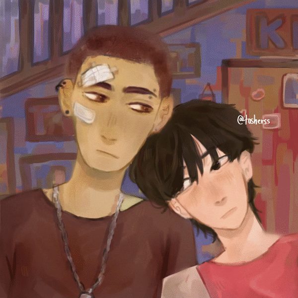
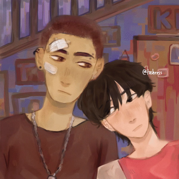
Before I proceed, I want to mention that a few of these blending modes can be interchanged with other blending modes. It really depends on what you are specifically comfortable with and what you want to do. On to the tutorial! This is the illustration we’ll be working with.
Background:
When creating any lighting scene, the first step is to ensure that the background is similarly lit.I did this by setting the layer to Color Dodge (~50% opacity) and then airbrushing the light. Further, continuing with the background, as below in the timelapse, you can make a selection to add a gradient for rays of light and set it to glow dodge at low opacity. To make it more realistic, smudge the sharp edges in random places. After that, I added some bokeh using a soft brush of low opacity, and then I used a splatter brush for specks of yellow on the same layer.
Foreground:
For the foreground, once again, on a layer set to vivid light, I airbrushed some light onto the characters. Then, on an Add (Glow) layer, I added the sharp light to the edges and then blended it with a smudge brush. Then I went over that area with a soft brush or air brush. Finally, I added some splatter on the characters on a Color Dodge layer.
Finally, with an Overlay layer, I added both the light and a little bit of blue for shadow to make the illustration look more tied together.
𝗡𝗜𝗚𝗛𝗧𝗧𝗜𝗠𝗘
(p.s. Getting perfect nighttime lighting from a brightly lit illustration can be a little hard, so usually I’d recommend approaching a nighttime illustration with that in mind and choosing colors accordingly.)
Background:
The first step for making your illustration’s colors look like nighttime is to add a Color Burn layer and set it to about 70% opacity. On this layer, go to gradient and in the presets, select "night sky." Now add a gradient. Personally, I wasn’t exactly happy with how this looked in some places, so using blue, I touched up some areas.
Foreground:
For the foreground, too, I started with the "night sky" gradient, but I set it to multiply because I didn’t want the skin to stand out. Then, on a color dodge layer, I added some very light blue-tinted light at the edges and in the eyes. On another Color Dodge layer, I airbrushed some warm tones to make the characters still stand out a little. Then, on a multiply layer set to ~90%, add your cast shadows and shadows.
Finally, to tie it all together, I used an overlay layer and added a gradient with a light and dark blue. An optional step is to add a new layer and set it to multiply. Now use a blue or a cool tone of your choice to make the warm tones cooler. Set this layer to very low opacity. Finally, I added a vignette by airbrushing the corners and setting that layer to multiply.
𝙀𝙑𝙀𝙉𝙄𝙉𝙂

For evening or sunset lighting, the goal is to bring out the warmer tones in a subtle way.
Background:
We’ll start with using Linear Burn to add light from one side, and then on the opposite side, I took a brownish color to increase the warmth and decrease the brightness there. This will make it look a little dull since linear burn is very intense. So, I used soft light to brighten up the area where the light is supposedly entering from. Both the blend layers are set to ~50% opacity. The characters aren’t interacting with the background at all, so it wouldn’t make sense to have a cast shadow there; nevertheless, I airbrushed around the edges of the characters with a dark color and set the layer to multiply. I did this to make the characters stand out and also to make sure the illustration was not too bright.
Foreground:
For the characters, I started with a Color Burn layer at 50% opacity. On this layer, I added light to the areas where the sunlight would hit, and, similar to how we approached the background, I also added a little brown in the areas that wouldn’t be getting as much light. Now to reduce the dullness and give the characters a little "glow," I used Color Dodge to light up areas around the skin. On the same layer, I also added some light, making sure the edges are soft and the light don’t look too bright. Lastly, on a multiply layer, I added cast shadows under things like hair, piercings, and the chain. I also airbrushed around the hair of the black haired character since he wouldn’t be in direct light.
To tie it all in, like before, you can add a layer and set it to overlay at low opacity. On this layer, add a gradient with colors of your choice. I used yellow for the light and a little bit of dark blue for the shadows (to reduce the warmth of the colors).
Bonus
Since we’re on the topic of light, I want to give some very basic advice on adding light. Many, if not most, objects consist of spheres, cylinders, or cubes since these are part of the primary shapes.
In spheres, light will wrap around the object; often, it’s nice to add a little bounce light to add to the realism. You can add a sharp highlight where the light hits, but try not to go too overboard with that.
In cylinders, light will never be diagonal; it will always go along the shape of the sphere. Keeping that in mind, there’s usually a streak of highlight or light parallel to a section of shadow. Highlights can be added along the rims of the top of the surface as well as the edges.
Finally, cubes are very direct. The face the light hits is the brightest, and the face away from the light is in shadow.
- My final and favourite piece of advice for shadows and cast shadows is to blur the edges slightly because things in shadow tend to blend into their surroundings more.
Bonus of bonus
Here are some more fun things you can do with just blending modes :)
𝘿𝙍𝙀𝘼𝙈𝙔 𝙁𝙄𝙇𝙏𝙀𝙍
To get this glow-y effect, the first step is to duplicate both the backgroud and the foreground. Now, go to "Filter" > " Gaussian Blur." Set the blur strength to your preferance. Now, set the layers to ~50 opacity and set the blending mode to "Lighten". Next, to make the foreground stand out more, copy the Lighten layer and place it below the base layer. Set the opacity to ~100% and change the blend mode to "Glow Dodge". After that, I just added a soft light layer on top and set it to pink. I also made the parts with the characters a darker pink. Finally, instead of keeping the noise layer to "Overlay" or "Multiply," I set it to "Hard Light" and lowered the opacity.
𝘿𝙐𝘼𝙇 𝙇𝙄𝙂𝙃𝙏𝙄𝙉𝙂
For dual light, your best friend will be the "Overlay" blending mode. You could also use "Vivid Light" or "Linear Light," if that looks better on your specific illustration. I added a red-blue gradient layer thrice here. First one is set to " Hard Light" and placed above the background at high opacity. Next, I added it above the characters at ~30% opacity. Finally, using the same colors, but with more opacity ( preferably, do a solid fill in one color and then add the gradient of the other color. This leaves less transparency). Set the layer to "Overlay", at ~20% opacity.
Similar to what I mentioned under the "Add" heading, add the harsh light in both the colors. Also, same as before, airbrush around these on a seperate "Add" or "Add(Glow)" layer. Finally, I also added a cyan overlay layer to make the colors less warm.
THANK YOU!
Thank you for your time! I hope that this was genuinely understandable and helpful.
Also, I’d like to just give a quick shoutout to all the amazing articles and YouTube videos that helped me learn how to use many of these blending modes, especially all the photography tutorials. If you’re still struggling with understanding any of these, I’ll recommend looking up tutorials for specifically that blending mode to understand it in more detail, and of course, you can message me too; I’ll try my best to help. :)
Users who liked this post


Comment