
Introduction
I want to begin by admitting that the title of this tutorial is misleading. It is not a "How to" tutorial, rather it's an article intended to inspire you to get experimental with colours :)
Selecting bold and playful colours for an illustration is the most enjoyable part of making art, especially in digital artwork. Very often when making art, we get stuck trying to use “correct” colours. Although, in my opinion, the process of making colourful illustrations doesn’t need to focus on colour theory, instead I prefer to'mess around’ and select colours based on what feels right. Of course, there are some basics that can help you find what looks right, which I will be mentioning in this tutorial! Before we begin, I would like to mention that everyone’s artstyles and techniques are different, and there is never an objective right or wrong method for making art. I am also still learning and improving, so rather than giving do’s and don'ts, my aim is to inspire you to try new ways and be more playful with colours!
This tutorial is in two parts:
The first part, “Where do I start?” deals with the basics of colours. I have done my best to keep these basics simple, so they’re easy to keep in mind. Before we move on to colours outside your comfort zone, I feel that it is essential to first learn to make the most of colours while staying close to your comfort zone. Before you start using hot pink and saturated blues, it’s important to first understand how to work with colours that you’re already used to. Simply put, in this part I will be teaching you how to start incorporating new colours into your own old pallets. When you’re comfortable with that, you’ll naturally feel more confident when using bolder colours.
The second part, "Understanding with Illustrations,” will include examples.
Where do I start?
You can’t colour without knowing where the colour should go, so the first task is to turn to every tutorial’s favourite part: shapes.
After putting down my base colour, the next step is usually adding shadows and highlights. Below, in the first sphere, I just airbrushed a darker grey in a circular stroke and then used a lighter grey for the highlight and a slight bounce light. In this tutorial, I won't explain the placement of light and shadow because that won't be our focus. Nevertheless, there are two things I want you to keep in mind when you add shadows and highlights:
1. Make sure that you keep contrast between your values. In simpler terms, make sure that your dark is dark enough and the light is light enough. I’m putting emphasis on this contrast because it’ll be important when working with colours that stand out’.
2. Try to make the lights and shadows follow the shape of the object. For example, when simplifying the shapes, I have made them more geometrical, but I have also made sure to keep the curse so the curvature of the sphere is still conveyed. (PS: You can refer to tutorials on ‘cross-contour lines’ for a more in-depth understanding of how to colour along the curvature of objects.).
For the basics on how to start playing around with colours, I’ll work with a sphere, using a limited colour palette and avoiding gradients. Although I will still be using a smudge tool :)
Bring in the colours!
When painting, my goal is to play around with the hue as much as possible. We’ll slowly progress towards incorporating hue shifts as we move forward. I’ll work with three variations of the same sphere, but with progressively bigger hue shifts.
Generally, hue is defined as "a pure pigment.” By "pure pigment," we are referring to the colour outside of its saturation and brightness. In the colour wheel, the wheel represents the hue scale, whereas the square displays the selected hue at varying saturation and brightness. The left side of the square has the hue at its lowest saturation, while the bottom has it at its lowest brightness. Hence, you can find the colour at its highest brightness and saturation at the top right.
For the first one, I kept the hue the same when selecting colours (In simple terms, I moved only inside the square). I would recommend that even when staying within the same hue, try moving around more. To maintain a brighter palette, try to avoid the left and bottom of the square. Colours towards the left are lower in saturation and can make your illustration look muted or muddy. Staying away from pure white and black will also give you the privilege to use them in places that you really want to highlight.
To compare, for the right hand side, i moved only perpendicularly from the base colour.
Let's try to move around a teensy bit more than you might originally be used to. Very often, artists might alternate between cool colours and warm colours. We’ll discuss what warm and cool colours are in detail under the next heading. For the examples below, warmer hues will be the ones towards yellow, while cooler hues will be towards blue.
In the example below, you'll see that I've used a cooler hue for the highlights and a warmer hue for the shadows. You don't have to move to extreme ends just yet; just try to get used to playing with hues.
Artists might use warm hues for highlights and cool hues for shadows, or you might just use a warm hue and a warmer hue; it's completely up to you! The important part is to try to play around on the hue scale to make the illustration look more colourful and alive.
In the second sphere, I kept the shift really mild in the second one, but you can still see the difference in the two versions (you can see them all side by side below).
For the third sphere, let's really push the hue. Here, I used pink for the highlights and a colour towards the yellow hue for the shadow. The sphere continues to look red, but more colourful than the previous versions.
As practice, you can try to incorporate hue shifts into your old artworks to try to see what looks good in your own style.
Hue Shift Example
The illustration below is a more clear example of how even slight hue shifts can make your art look more appealing, especially while colouring skin. You’ll notice that individually, most of the colours used in both illustrations are really similar, but when put together, the right side which incorporates purple and orange looks brighter.
Colour Selection Cheat-code (Colour-Mixing)
If hue shifts are daunting for you, Clip Studio Paint offers a colour mixing option. Go to Window > Colour Mixing; this will open a window. Using the 4th tool from the right, you can put down your base colour and a darker colour for the shadow. Following the previous step, pick a colour of a different hue as well. Now, using the 3rd tool from your right, go over all the colours until you get an even blob of paint. You can use this new colour for the shadow now instead of the original one.
Once you start getting comfortable with small shifts like this one, you'll hopefully start finding it easier and easier to try more extreme shifts without having to mix colours each time.
Along with hue shifts, you can also use the colour opposite to your base colour in the shadows to give it more depth. When the lighting isn't decided or you just want to 'spice things up,’ the contrasting colour is always a safe choice.
In many cases, like someone standing in sunlight, you might see blue in the shadows of their skin; here blue is the reflected light from the sky. Similarly, in many real-life cases, you'll see the colours of surrounding objects present in the shadows and bounce light. Keeping this in mind will help you not only exaggerate colours but also bring more stylised realism to your illustrations.
As you can see in the last sphere, although the colour can look harsh without any blending. In contrast, in the second sphere where its used with a round brush of low opacity, it seems to add more depth to the shadow.
Basics of Colours!
Warm and Cool
Previously we discussed "warm" and "cool" colours, but how do you determine what's warm and what's cool? Actually, the division of warm and cool is kind of arbitary; it's based on what colours "appear" to be stimulating vs. what colours "appear" as calm. A general rule of thumb is that colours like yellow and red appear warm, while colours like blue and green appear cool. Since the warmth and coolness of colours are subjective, there can't be any clear rule to determine what will look warm and what won't. You might already be familiar with "colour theory" posts where the same colour looks different based on the background; the same phenomenon can be applied to colour temperatures. Any colour can look a certain temperature based on its surroundings.
As long as you can see colours to some degree, you can just rely on what looks right to you, as an artist, when picking colours. Nevertheless, I have divided the colour wheel below into "warm" and "cool." You can refer to the same when working on your illustrations.
Bonus tip: Sunlight usually leads to warmer colours (as seen during the 'golden hour'). On the other hand, for showing nighttime, you can use cooler colours.
-
Dark and Light
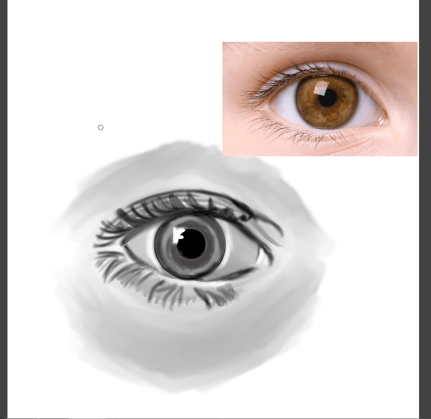
When viewing an illustration, our eyes always perceive certain colours as darker and others as lighter. This is something that is useful when you're using bold, saturated colours. To visualise this better, you can refer to the colour wheel in black and white. You'll notice that blue is much darker than yellow. Each colour has an inherent value to it, even when at its highest saturation and brightness. Before continuing, I want to mention that I am colour blind, so I might name the colours incorrectly.
In the image above, you'll see that I used yellow as a highlight and blue as a shadow for a mint green sphere. Logically, you would not use blue as the core shadow for green, but our eyes easily perceive it as a shadow. When you view the same sphere in black and white, you can see that the values look right despite the hues. In contrast, yellow in the second example doesn't register as a shadow because it is naturally a brighter colour.
You can keep these value differences in mind and use them to your advantage in illustrations. They'll help you make the elements look as bright and colourful as possible. Practicing with using obscure colours like this can help you develop a better eye for picking colours in general illustrations as well.
-
Contrast
Between the two illustrations below, which one do you think draws your attention more?
High contrast paired with hue shifts can completely change how your illustration looks. The only difference between the two illustrations is that one of them has the hue shifts we discussed earlier, along with higher contrast.
Contrast is the difference between the values of your colours. The larger this gap is, the more the colours look bold and stand out. Understanding the inherent values of colours that were discussed previously becomes essential in determining contrast. For example, the contrast between brown and the brightest blue would not compare to the contrast between yellow and brown.
Seeing in Black and White
Keeping this in mind can be really difficult, so it always helps to make a new layer and set it's blending mode to "color". Fill this new layer with pure black. Now you can easily turn this layer's visibility "on" whenever you need to check the contrast of your illustration.
Another cheat-code that you can use is a tone curve. Tone curves allow you to adjust the contrast and the brightness of an illustration. You can add tone curves through two methods in Clip Studio Paint:
For the first method, go to Edit > Tonal Correction > Tone Curve. This will open a small window where you can adjust the graph according to your own preference. Commonly, an “S” curve works for most illustrations.
You can also go to Layers > New Correction Layer > Tone Curve.
This method creates a new layer, allowing you to go back and change the curve at any point of the drawing process. It also allows you to change the opacity of the layer, so you’re able to change the strength of the filter.
Another benefit of a correction layer is that you can go to Layer > Rasterise. This will allow you to erase parts of the correction layer. I would recommend using an airbrush as an eraser to make it look more natural.
Summary of "Where do I start?"
That concludes the first part of this tutorial! Hopefully, you’ve now gained a better understanding of values and how you can make your art look less dull by changing contrast and using different hues for different parts of your illustrations.
Here’s what we learnt:
✦ How to start embracing hue shifts to help include more colours, along with how to use the colour mixing tool in CSP.
✦ Using contrasting colours to add depth to shadows.
✦ Difference between warm and cool colours.
✦ Inherent values of different colours.
✦ The importance of contrast in artworks and how to increase contrast through a tone curve.
Understanding with Illustrations
The key to using different colours is simply trial and error. Don’t be afraid to play around with odd combinations of colours because the worst-case scenario is just an illustration that looks weird. There’s absolutely nothing to lose when it comes to playing with colours in art; if anything, you just gain a better understanding of what you, as a unique individual, find more appealing.
Practical Use of Basic Concepts
The illustration above is probably one of the most colourful ones I’ve made. This makes it a great example to show how fun playing with colours can be. When looking at the same illustration in black and white (attached below), you’ll notice that the values still work. There is a clear distinction between the background values and the values used for the character.
Lets discuss some basic concepts, with reference to this illustration.
Hue Shifts/ Contrast
In this particular illustration, instead of using the contrasting colour in shadows, I used it as a highlight for the hair because red and orange both have a darker value in comparison to their opposite colour, cyan/blue. This difference in contrasting colours works in some cases, like yellow-blue, cyan-orange, and pink-mint green.
Besides using different colours for highlights or shadows, you can also use colours of similar values for hue shifts generally as well, as used in the background or in the shoes in the example added below.
Value Harmony
The background uses yellow, peach, and shades of pink. These colours all look different from one another, but somehow still work together. The reason why lies in values. The values of all these colours are similar to each other, making them look more harmonious than expected.
This harmony in values is present in the rest of the drawing as well, as seen in the sweater and jeans.
Despite the “odd” combinations of colours, when looking at the illustration, the base colour still gets correctly conveyed; the hair is still an orange-ish colour, the jeans are blue, and so on. If you apply these concepts of contrast and value, you can use any combination of colours to make illustrations. I hope that these tips will help you convey shadows and base colours accurately, but in a more playful way.
Telling a Story With the Colours
The best part about illustrations is the freedom you get when selecting colours. While you can select colours that “pop” based completely on aesthetics alone, colours can give you the opportunity to tell a story. Further, saturated colours that don’t need to be true to real life offer you the privilege to make the most of this.
Let's walk through this idea with an illustration.
Value Selection
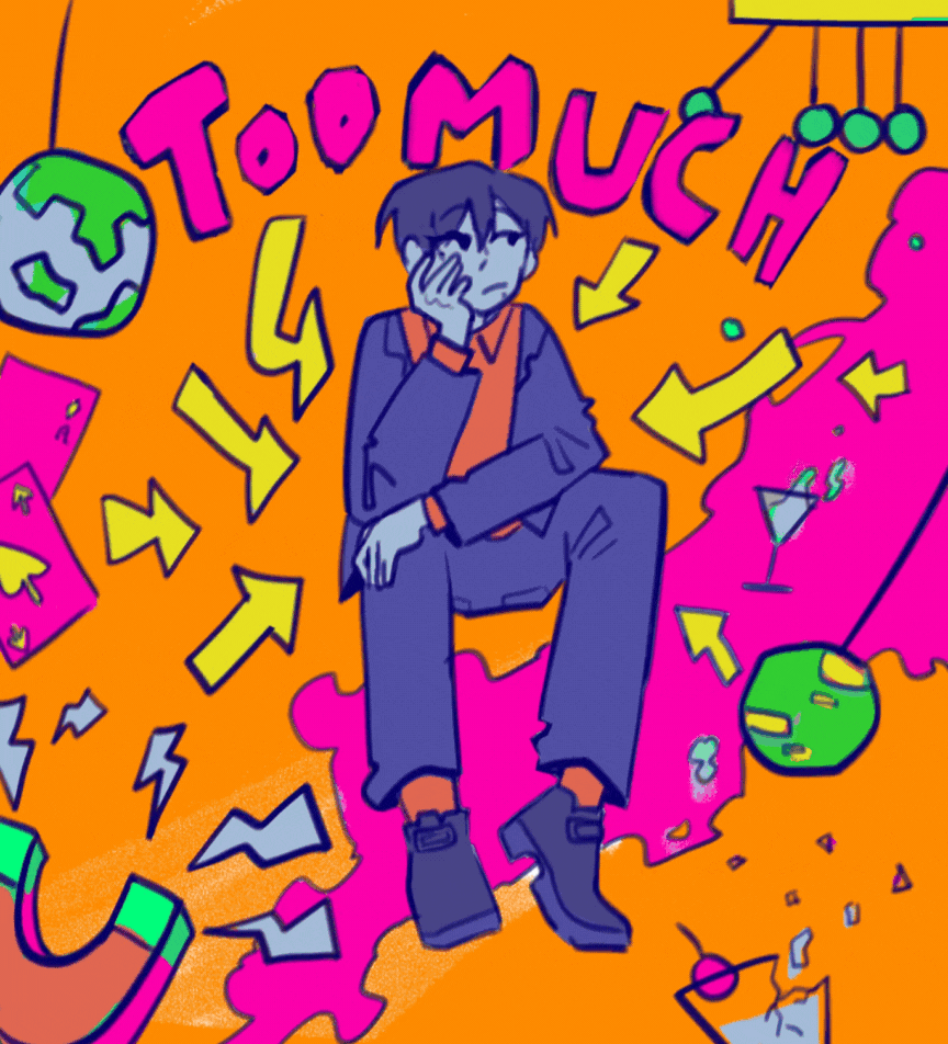
Below is an illustration that is meant to translate the feeling of being “too much." The values act as a reference for me when I start picking the colours.
You'll see that the character's values are darker to depict him as overbearing and attention-grabbling. Further, they set him apart from the background, making him the focus. To push this idea even more, I intend to make the arrows lighter, so the attention is drawn to him even more. While keeping him light-coloured on a darker background would achieve the same effect, I intentionally did not go that route. Bright colours would feel positive and convey a sense of being in the spotlight, which would be contrary to the theme.
While these intentions might get overlooked by the viewer, I believe the effort is worth it as long as you enjoy the creating process that went behind it.
Colour Selection
Each colour on the colour wheel represents different feelings. For example, blue can convey sadness or coldness, while red can convey passion and excitement. The meaning attached to these colours depends on the context as well; for example, blue in a calm ocean can show tranquilly and peace. You can easily take advantage of these meanings when working with a more playful colour palette.
For my illustration, I had two feelings I wanted to show, hence I made two variations.
In the first thumbnail, the character is red because red draws attention; it is associated with stop signs and strong feelings. In contrast, I wanted the background to be green because that conveys calm. Further, it creates a striking gap between the character and his surroundings.
The second idea I had was with the character being in blue, conveying his unhappiness, while the background is red and attention-grabbing.
Checking Values
While selecting colours, it can often help to check whether the contrast is still present. This way, you will be able to make changes early on without having to go over every colour later on.
I settled on mixing the red and blue for my work. While the red is much lighter than the intended values, it still appears distinctly between the red, keeping the focus on the character.
Colour Schemes
Colour schemes are basically combinations of colours that are likely to look good together. Referring to colour schemes can make the colour selection process faster while simultaneously making your work look more harmonious. Some of my favourite colour schemes include:
✦ Complementary: This is when you use opposite colours. I use contrasting/complementary colours in my work very often, as seen in hair or backgrounds.
✦ Triadic: This is when the colours are evenly spaced out. Triadic schemes give a broader diversity of colours while maintaining harmony.
✦ Analogous: Analogous schemes include colours that are next to each other on the colour wheel. They can seem calming and are often seen in nature as well.
For this illustration, I have vaguely used a triadic colour scheme. The goal was to keep the arrows yellow so the red and yellow together resemble road signs or caution symbols. Since the decided colours included red and blue in the foreground, along with pink and yellow in the background, I added the rest of the colours with reference to the triadic scheme.
Trial and Error!
While you can rely completely on making colour schemes, it is not guaranteed that the end product will always look as intended. The key is always trial and error. After trying multiple background colours and different colour combinations, I finally settled with colours that ignored the original background-foreground idea.
I used orange for the background, not because of any colour scheme but simply because “it looked cool.” Art is all about experimentation, so my biggest advice is to not get stuck in trying to follow pre-existing rules that came about through trial and error by other people.
Finally, when I was satisfied with how everything looked, I checked the values and was pleasantly surprised to see that the contrast was maintained perfectly.
Timelapse:
Rendering using the Colours You Selected
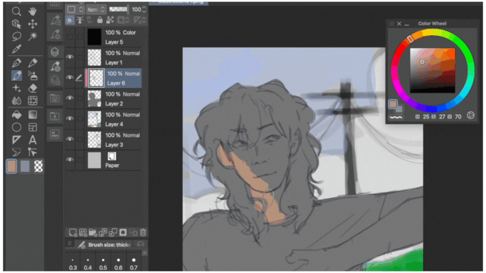
Rendering can seem a little messy when you’re using bright colours that seeming don’t mix well. This section will deal with working with different hues, through the example of pink hair! Your process will most likely be very different from mine, so I'll focus on parts that can easily translate into your process.
Let’s begin with the sketch :)
Hue selection Based on Values
For colours, I find it helpful to first do the background (which will age poorly because I ended up not using it). The background helps me decide how dark I want the foreground’s values to be.
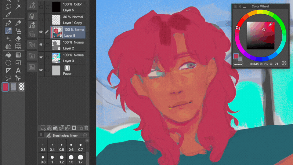
When making a rendered piece, I start by any one element of the drawing; in this case, that was the skin. First, I put down a colour that’s close to the skintone in normal lighting. For this piece, I wanted everything to be in red, pink, and purple. So, I changed the skin to red. Following this, I checked what shade of pink has a darker value than the skin to avoid a “muddy"-looking drawing.
Throughout the process, I continued checking the values in black and white to make sure that everything looks right.
(Despite the low quality of the gif, I hope the process is still understandable)
Once I have all the base colours down, I can check if the colours look good together. During this stage, I might fix the background or change some colours based on aesthetic preferences.
Selecting Colours and Blending them for Shadows and Highlights
I start with the base that we made in the beginning. Next, using a warmer hue, I added in the darker parts and the scalp.
Next, I used a mint green, which is almost opposite to pink on the colour wheel. Mint green has a lighter value and makes the highlight stand out, so it was the perfect choice.
While a cool pink could’ve been an alternative to mint green, I instead used it to add brightness to the hair. The cool tones of the pink and mint green also help in creating contrast with the dominantly warm-coloured face. I continued to render the hair by adding warmer shadows along with cooler tones for brightness.
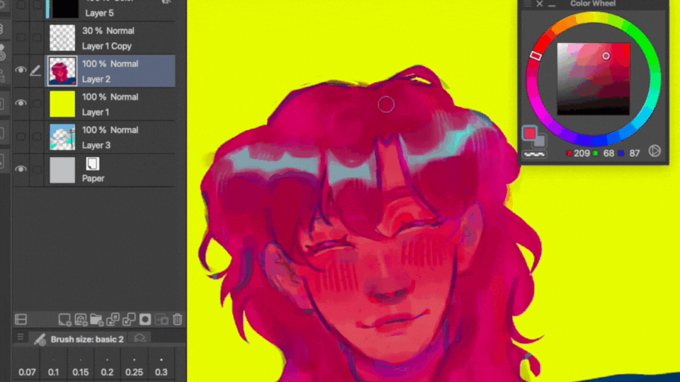
Once I had all the colours laid down, I added yellow strokes for a pop of colour.
Next, I made the illustration black and white and added contrast by using blue.
Once I made the colour layer invisible, I went over the blue colour with a warm pink to balance it out. This way, the shadows stay warm consistently while simultaneously being darker than the rest of the hair.
I also added some light purple into the shadows and used yellow in the rest of the illustration for highlights.
We Did It!
And with that, we have the final illustration! The colours used are neither completely basic nor completely out of one’s comfort zone. According to me, this is the perfect balance between the colours we generally use and bold colours.
Here’s the full timelapse:
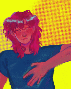
Filters and Effects
You can add effects or filters to your illustration to make it even more colourful. I will add two things you can do for final touches below!
The simplest way to add a pop of colour to your illustration is through the “overlay” blending mode. You can make a gradient with two colours, for example, blue and red. Change the blending mode of the layer to “overlay” and decrease its opacity. This will not only add colour to your illustration, but it will also make the piece look more tied together.
Another filter option is adding “tone” to your illustration. Go to Layer > New Layer > Tone. This will open a window where you can change the settings based on your canvas. The density and frequency will depend on the dimensions of your canvas.
My frequency was set to 85.0 and density to 32%. Once added, I went to Layer > Rasterize. Once my layer was no longer an object layer, I could take a small section of the layer and transform it to be bigger until I was happy with the size of the circles.
I have a longer more elaborate tutorial on different filters you can add through blending modes on CSP. You can refer to the same for more ideas :)
Conclusion
That concludes this tutorial! I hope that it will inspire you to start playing with colours more often! My main advice will always be to not be scared of making bad art :)
Thank you for your time. Let's continue on our art journey while having as much fun as possible!
Users who liked this post


Comment