
Hello everyone, in this tips of the month I will explain everything about how to create a fantasy illustration (a fantasy background to be precise, as the title says 🙂 ) from start to finish, as well as giving some tips that can apply for your own style, hope you like it 😀 .
Main characteristics of fantasy funds
Have you ever wondered what makes a fantasy background look like one? Well, if so, come with me to review some characteristics that distinguish them and how to create that mysterious atmosphere that exists in them.
To start something that I noticed in many fantasy illustrations (or that according to the search engine matched this description) used to have these elements:
-Nature: there is almost always a large number of plants that have invaded ruins of some mysterious ancient civilization, a lush and thick forest, or a wasteland full of grasses and flowers. In the few illustrations that do not contain trees, flowers or plants of some kind or that simply seem to be devoid of life, it is because they want to portray a darker fantasy or a destroyed or corrupted world is portrayed.
-Ruins of an ancient civilization or giant buildings: this element is very present in many of the fantasy illustrations, probably because we do not know what has happened there, so we associate the unknown with mystery, and likewise, mystery we associate it with magic. On the other hand, the constructions that are still inhabited or in use are usually: huge magical cities, large temples or huge monuments.
-"Magic" light: this can come from the sky or from other objects or elements, and it is not found in all the illustrations, but it is a highlight because this light is white or gold and it comes from the sky, giving the sensation of to be before something important or almost divine or pure, as well as if it comes from some character or element within the work. Likewise, if it comes from the sky and is illuminating some ruins, it can give the sensation of discovering something mysterious.
-Fantastic elements: these elements are objects or creatures that are difficult or impossible to observe in our world or everyday life. Many elements can enter into this category, from relief, a creature, architecture or others. such as the weather and surrounding objects.
Although you can include all of the elements described here in your work, it is not necessary that you do so, as one or two elements that you include can give the appearance of being fantasy related.
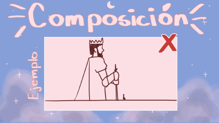
Something that usually characterizes the backgrounds (not only fantasy illustrations), is that they do not usually approach the character, since what is sought is to observe the environment or part of the environment, so even though your character may be the main focus, it must also leave space to be part of the environment.
Choose the message we want to convey
This may not be very important at first glance, or sometimes we leave it in the background and just draw for the sake of drawing, and don't get me wrong, it may be good to do this to practice or to distract ourselves, but if you do this continuously with all your illustrations, it may at some point you get to block or do not find the way in which that illustration reaches a satisfactory end. The point is that you have to find what you are drawing, why you are drawing it and “who is the drawing for”, in addition to the most important question: “what do I want to convey?”. Once you have thought about it, you should keep in mind that the message should be as short as possible, so that the message has much more strength.
How to convey our message?
Although we can say that we must master our technique in every way so that the message is clearer and more legible, we can attribute how we perceive a work to two main characteristics, and these are: composition and color.
-Composition:
Well, we will start with the "body" (to call it one way) of our illustration, since the composition is the way in which we place the objects within our canvas, that is, when we place any element within our illustration we are composing, however , that does not mean that it is a good composition, so to achieve a good composition we must know some basic rules and elements.
-CORE ITEMS:
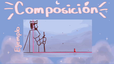
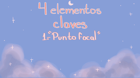
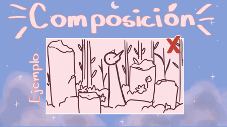
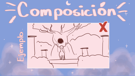
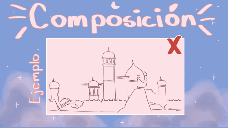
We can find 4 basic elements in all compositions (or at least in most), and these are: the focal point or center of attention, the supporting elements, negative space and the horizon line.
- The focal point refers to the element within our illustration to which we want the eyes to go, that is, the element that stars in the illustration.
-The support elements are all those elements that we use to give the image greater interest, in addition to giving greater emphasis to our center of interest because they can help us direct the viewer's gaze towards it.
-The negative space can be said to be another object or element within our image, but it is a bit different because it refers to "white" spaces or that "lack" other elements, they serve not to saturate the viewer , because if there are no "blank" spaces we will not know what we should pay attention to.
-Finally, the horizon line helps us to know the height at which we place the object and to know the height that we are seeing the scene, a high horizon line means that we are seeing from above, while a low line means that we are seeing from below (that is, we are closer to the ground), while if an object is above the horizon line it means that it is floating, but if it is within it, the object is on the ground.
-RULES OF THE COMPOSITION:
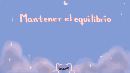
Now that we know these elements, I will present three basic rules that will help us create a good composition (although I must say that there are more than three rules, but the ones that I will present below are enough) and these are: maintain balance, create contrast and create a flow on the image.
-Keep balance: most people like to see things organized and well balanced, imbalance causes us some discomfort and this also happens with what we see, however it does not mean that all objects need to have the same size or the same way because that would make it boring, you can get balance through: contrast.
-Contrast: you can create contrast in different ways: light, shapes, size and color are the different ways to do it, for example: if you have a very large element and a very small one, you can make the small one stand out with a different color to the one in the background and to the large object that its color is in tune with that of the background, that is to create contrast while maintaining balance, the large element stands out for its size, but the small one for its color.
-Flow: as I mentioned before, the support elements serve to create a flow in the image, something similar to creating a path that the gaze must travel to reach our protagonist or to go back to reality, it also looks more elaborate although are simple strokes.
-EASY COMPOSITION GUIDES:
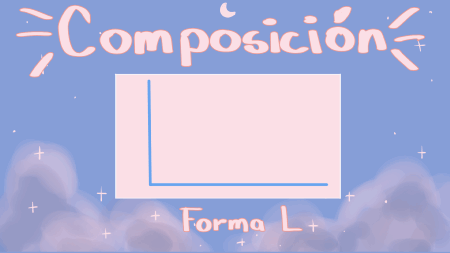
Ok, now that we've covered the basics of composition and some rules, I'm going to show you 4 easy-to-follow composition guides: L-shape, Rule of Thirds, Finding Symmetries, and the Triangle.
-L shape-
-The first one that we will see is the L shape or simply L which consists of placing a tall object and the other objects must be small and close to the ground. In this composition there is a lot of negative space that we can fill with objects in the background that look like faint silhouettes or clouds. To create a balance we can add a small element of a striking color within our selection of colors.
-Rule of Thirds-
-Rule of thirds, this is the composition guide most used by illustrators, photographers and filmmakers and consists of dividing your canvas into three columns and three rows, and placing it in the intersections that arise (you can place it only in one intersection or in several) our or our focal points. There is another guide similar to this one, but I don't know much about it so I can't explain it.
-Symmetry -
-Symmetry or looking for symmetries, in this you must divide the canvas in half (you can also do it widthwise but it is not necessary, it will depend on the illustration), also on both sides there must be similar elements with a similar size and shape. Symmetry is often used in images related to the divine, although this is not always the case.
-Triangle-
-To form a triangle-shaped composition you must draw an isosceles triangle or an equilateral triangle in the center of your canvas and place the elements following the lines of the triangle, the horizon line may or may not follow the base line of the triangle.
Finally, a piece of advice regarding the point of view we have of an object or character, when we see it from below it seems an imposing element, when we see it from the front it seems an object that is at our level, so we can say that we have it " respect" or gives that appearance, meanwhile, if you see it from above it seems defenseless, these rules are not always applied or have this meaning, since when you know them in depth and understand them you can shape them as you see fit, but it is It is important to know them in order to shape them later.
-Color
If the composition is the "body" of our image, the color is the "soul" (perhaps they are not the best analogies, sorry), since a good composition may look good without color but if you place the wrong colors it can end up give a wrong or different message than what you wanted to convey. In order to always place the colors that emphasize our message, it is necessary to know the characteristics of color, color psychology and color theory.
-COLOR CHARACTERISTICS
We must bear in mind that to apply color we must first be familiar with its characteristics just as we should be familiar with the elements of the composition and its rules, these characteristics are: hue, saturation and value.
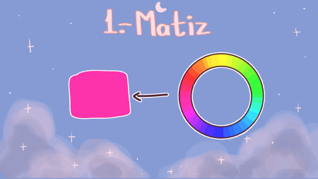
-The hue (also known as tone or tonality) is what we could call the "pure state" of color because black or white is not added and they are the colors as we see them in the rainbow. That is, by having the chromatic circle, without adding black or white, and moving through it, it is the hue or tone that we are going to obtain.
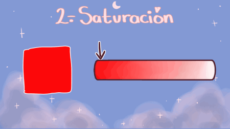
-Saturation is the intensity of the hue or tone, it could be said that when a color is very saturated it is because it is further from gray and is more intense, while if it is not very saturated it means that it is more gray (although in clip studio we can find a saturation bar with the color white instead of grey, which I find more practical).
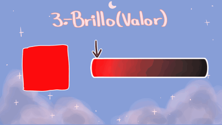
-The value or brightness is the amount of light that the color has, white and black are used to define if it has more or less light, the closer it is to white it will have more light, while the closer it is to black will have less light.
-COLOR PSYCHOLOGY
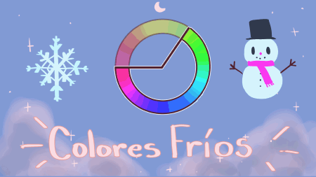
Whenever we talk about color as cartoonists the first thing we think about is color theory and how to mix colors, but color theory can fall apart if we don't know the meanings of colors first, for this reason I would like to talk first. of color psychology. Although the psychology of color is different in each country or region, it is important to know it, because observing colors and their combinations produces different sensations, color psychology is what will help us convey the idea we have in mind. As I said before, the psychology of color is different in each region of the world, so I will be talking about the meanings that we normally give to colors in the West. To begin with, colors are divided into two categories: warm colors and cool colors.
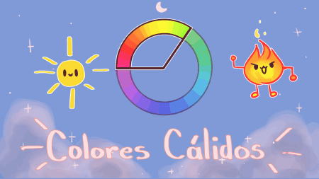
-Warm colors-
Well, let's start with the warm colors, but before that we must ask ourselves the question, why do we call them warm colors? The short answer to this is because of the sensation that seeing them causes us, but it really produces a sensation of warmth because these colors are the ones that we tend to observe most frequently in warm areas, as well as being found in objects that give us that feeling to the touch. sensation, as an example we have yellow with sunlight, red and orange with fire, and so on.
The range of warm colors usually ranges from red to yellow on the color wheel, there are other diagrams that split the color wheel in half, and other diagrams include shades of violet or green within the warm colors so I decided to go with these diagrams to display warm colors ranging from magenta to yellow-green.
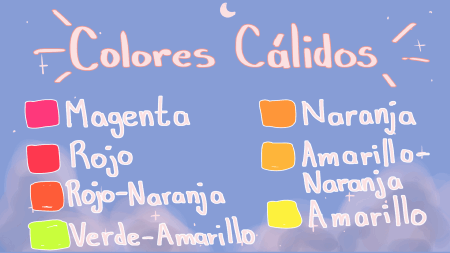
Here is a list of warm colors, to have a more exact idea of what they are:
-Magenta
-Red
-Orange Red
-Orange
-Orange yellow
-Yellow
-Green yellow
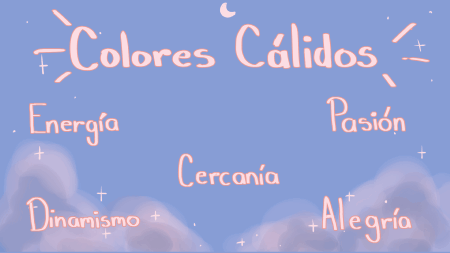
-Meaning of warm colors-
Warm colors are often associated with: energy, passion, dynamism, closeness, joy, and even love, but sometimes have negative connotations such as danger (both yellow and red are often used for warning signs). warning) or violence and blood (in the case of the color red). Here I will leave a list of what some warm colors usually represent in the West.
-Red: to begin with, red can be found in various places in nature, for example in fire and blood, so it usually gives a strong impression when we see it. It is usually associated with intense things such as: love, passion, violence, power, strength, vitality, sensuality, it tends to give a feeling of alertness. In addition, the combination of red and black has to do with aggressiveness.
-Orange: we usually associate it with: warmth, youth, friendship, exoticism and fun.
-Yellow: this color is found in sunlight, gold, but also in some poisonous animals, so we usually give it both positive and negative meanings (like all colors, it has positive and negative meanings). Its meanings range from: optimism, happiness, wealth and abundance, to eccentricity, madness, lies, bile and acid.
-Pink: this color is related to: charm, kindness, gentleness, sweetness, innocence and pure love. There is also a stereotype of pink related to the feminine.
And these are the main warm colors that they will use, there are others like brown that has to do with what is outdated, withered, autumn and homemade, or like gold or gold that has to do with wealth again, but I wanted to talk about the most common so that it would not be more confusing.
-Cold colors-
Like warm colors, cold colors are those that give us that sensation due to the places where we usually observe them, that is, in places with high humidity or with bodies of water, on cloudy days, in cold or snowy places. , etc.
-Cold colors-
Like warm colors, cold colors are those that give us that sensation due to the places where we usually observe them, that is, in places with high humidity or with bodies of water, on cloudy days, in cold or snowy places. , etc.
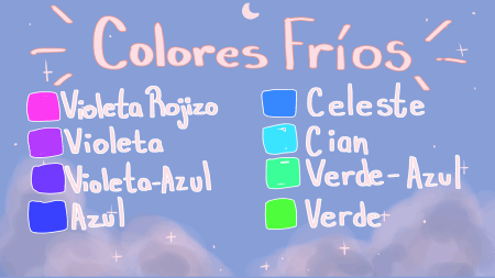
In the case of cold colors, we can say that they range from violet to green, although, as happened with warm colors, this is handled in different ways in different diagrams.
Here is a list of cool colors:
-Violet
-Blue Violet
-Blue
-Cyan
-Green
-Meaning of cold colors-
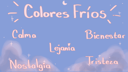
Cold colors are usually associated with the distance and the immense, probably due to the blue color that if we see well, most of the cold colors are mixtures of blue with green or violet and we usually see blue in immense objects, too. They usually convey calm and well-being, but at the same time sadness and nostalgia. Here is a list of the most used cold colors and their meanings:
-Violet or Purple: it is usually associated with fantasy (because it is a difficult color to observe and achieve in nature), the imperial (due to its scarcity in the past), mystery, spirituality, eroticism, magic and mystery.
-Blue: as I said before, blue is found in two immense and unknown elements, the sky and the sea, so in some way it seems to us a color of the immense, of the distance and the depth, like a color that transmits a certain freshness, calm and tranquility, as well as sadness and melancholy. It can also be associated with the divine and fantasy.
-Green: green is the color of nature because we find it everywhere, there are green insects, green birds, amphibians and green reptiles, but even more important than that, it is the color of plants, due to this their meanings go from: life, nature, growth, fertility, health and hope, but this is when we use it in landscapes and plants, because it also has very negative connotations such as: being a color associated with poison, corruption, bad, and just as yellow is associated with lies, these meanings still occur in specific combinations, such as combining purple and green usually gives the meaning of something poisonous, or in specific situations, such as green lighting usually give this effect that something bad is happening.
To end this section, I would like to talk about the color white and the color black and how they interact with the other colors, this applies to Western culture, I repeat again.
-Let's start with the color black, well black is the color of night and darkness, and although we call it color, it really is the absence of color. Being related to things so mysterious and that can scare us, things like emptiness and darkness, it is usually associated with death, the end, destruction, evil and mystery, it can also be associated with elegance. When we make combinations between the color black and other colors (green, avul, purple, red, etc.) these colors are usually associated with a negative meaning.
-White is the color with less negative meanings or perhaps zero. It is usually associated with perfection, purity, the divine, peace, cleanliness, surrender (because of the white flag in wars).
-THEORY OF COLOR-
Color theory is a set of various rules that serve as parameters for combining colors and creating color harmonies that work to convey our idea. There are various guides or parameters to create harmonies, but I am only going to talk about three of them, because they are the easiest to understand.
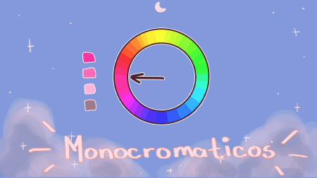
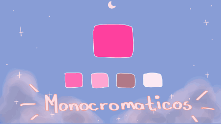
-Monochrome Harmony-
Of all the harmonies, this may be the simplest because it is a single hue to which you must modify the saturation and value to achieve a variety of tones or colors.
If you want to start making your own color palettes, I would recommend starting with this harmony, another advantage it has is that it will help you familiarize yourself with the concept of hue, saturation and value. If you use it, I recommend using the "HSV color space" tool, it is very easy to vary the saturation and value in it.
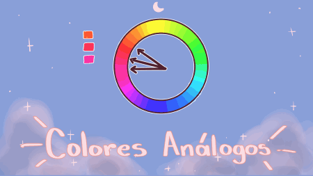
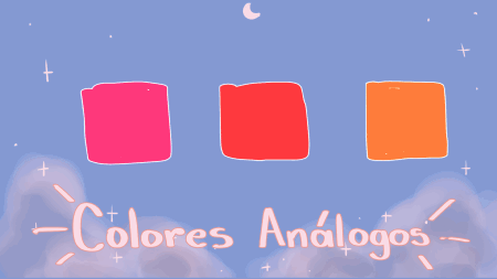
-Harmony of analogous colors-
This harmony is usually made up of three close shades, the shade that is between the other two is usually the main color of the composition, while the other two colors enrich the composition.
You could say that these harmonies are the next level of complexity when it comes to putting together color palettes. They are usually found in nature.
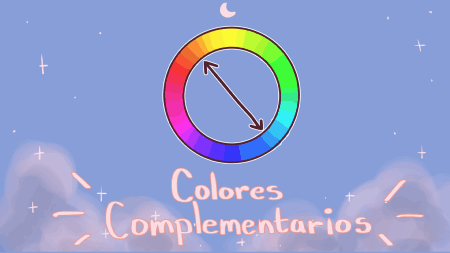
-Harmony of complementary colors-
It consists of taking two nuances that are at opposite ends of the chromatic circle. Of the three, this may be the most complex to put into practice, due to the contrast they generate, although that is also its great virtue.
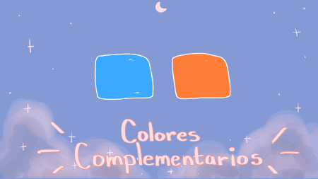
Unlike the previous ones, here I can add some very used combinations, such as orange and blue, red and green, yellow and purplish blue, perhaps due to the contrast they generate, they remain very engraved.
Procedure
Well, now that we have the basics of how to compose and color, we will see the procedure which I divide into the following steps: create the concept of the illustration, first sketch, second sketch, lineart, gray map, choice of colors , colored base, lights and shadows, details and environment. But before seeing the procedure, we will see the materials that we will use (or at least the ones that I use, you can change or vary some depending on your style).
Here I leave a video of the procedure, it's just so you can see how I did the drawing. It's not very edited because I wanted to make gifs but they were too heavy to upload, sorry for how boring it is.
Here I leave a video of the procedure, it's just so you can see how I did the drawing. It's not very edited because I wanted to make gifs but they were too heavy to upload, sorry for how boring it is.
-MATERIALS-
The software I'll be using is Clip Studio Paint, so I'm going to talk about some features and tools that might not be in other programs, so if you don't have it you'll have to adjust to the tools you have in your drawing software.
One detail that we must take into account is that I will base myself on how the program comes by default to say where each tool or sub-tool is located.
-To start we will see the layers window, where the two types of layers that we have in the program are found, as well as features and layer tools.
-As I said before, there are two types of layers that we can create: the raster layer and the vector layer. We will use the raster layer for coloring and adding shadows because it is easier to mix colors in it, while the vector layer is we will use for the lineart due to the ease with which we can modify the lines with “operation” and because of the “rubber” tool that can be modified to “vector eraser”.
-Another tool that we will use is the "Folder", this allows us to group a set of layers to have them more organized, it is really very useful since it allows us to apply effects only to the layers that are inside it or to keep our layers ordered.
-“Clip to the layer below” (literal translation by google translator :P ) is the next tool we will see, this tool is the one I usually use to put shadows and some details when I have finished with the base color of the illustration, it What it does is that when you use a layer and click on this function (“Crop to layer below”), you will only be able to see what is above the colored pixels or vectors in the layer below, that is, if you don't If something is colored below the layer you're working with this function on, then it won't be visible on the layer you're working on with “Clip to Layer Below”.
-The "Opacity" feature will be important in almost the entire drawing process, since it allows us to control the transparency of the layer, particularly useful in the application of lights and shadows.
-“Lock transparent pixels”, will help us to add some details within the same layer of the base color, without having to worry about leaving the previously colored area. This option cannot be used on vector layers.
-"Change the color of the layer" is another tool that doesn't happen much if you don't use it, we will only use it to change the color of the layer or layers of the sketch, so that it is easy for us to differentiate it from the lineart.
Now we will see the tools on the left side that we will use:
1-"Operation" in case we need to modify any vector.
2-”Selection area” to cut or modify some imperfect, or change the layer to some strokes.
3-”Eyedropper” to select colors.
4-Different brushes of our preference, to achieve different finishes we will change some configurations of our brushes.
5-"Rubber" and "Vector rubber" to erase lines.
6-"Fill" will help us to place the base color.
7-"Gradient" we will use it to create a greater atmosphere and to give brightness or shade to some elements.
8-"Figure U" if we need to make a neat figure or line but we do not have the best stroke, it is good to use this tool.
9-"Rule" the same as the previous one.
Now we will see the color tools that we have, they are on the lower left side where we can see the color wheel. Above the chromatic circle we can find something similar to a small panel with different icons, pressing each one displays a different color tool.
1-Chromatic circle: it will facilitate the creation of palettes when selecting colors, in case of using a palette of analogous or complementary colors, but if we use a monochrome palette it is better to use another tool.
2-Palette of colors: it will help us to organize the colors that we have selected for our illustration in addition to keeping them saved.
3-HSV color space: to begin with, the initials come from English and mean H is the hue, S is saturation and V means value, that is, the 3 characteristics of color. This feature is ideal if you want to make monochrome palettes because you can stay on the same hue but easily change the saturation and value.
4-Mixer of colors: as its name indicates, this function is to mix colors, for example: you have two tones that you like, but you consider that an intermediate tone between these two tones would be better for your drawing, so you can use the mixer to not do it directly on the canvas.
5-History of colors: it allows us to see all the colors that we have used from a while ago to date.
Here are the two brushes I use, the first one is usually for coloring, adding details and some effects like fog, while the bottom one is usually for lineart.
-CREATE THE CONCEPT OF ILLUSTRATION-
Well, this part is just asking yourself what you are going to draw, why and for what, you can brainstorm and make different sketches to represent what you have imagined.
-SKETCH-
-First Sketch-
Materials we will use:
-Raster layer
-Folder
-Figure U or Rule
-our brush of choice
Once we have a clear idea of what we are going to draw, we start with the first sketch, here we will add the most basic details of our image, that is, the horizon line, the composition guide and our focal point.
-First we open the raster layers that we are going to need, in my case I opened three layers.
-Now we open a folder to put them in and keep the space tidy
-We use the "figure U" tool or "a guide rule" to create our horizon line, and depending on the composition we have chosen we add the guide, in my case I chose a symmetrical composition so I added a line in the center .
-After this we will add our focal point (or our focal points), creating a geometric figure that serves as a guide for the next sketch phase, or if we are not such beginners drawing directly with our brush or pen of our choice.
-Second Sketch-
Materials we will use:
-Raster layer
-Folder
-Brush of our choice
-layer opacity
-Figure U: Ellipse
Really, this part of the process could go with the previous one and with the next one, but I usually work on the sketch in parts to add more details and have a much clearer idea of how to do the lineart. Continuing with the description of the stage, in this part we define what will be around our focal point, that is, our support elements, as well as placing some contrasts (lights and shadows) to have a clearer idea of the final image. .
-The first thing I did was add layers to sketch elements in each one to define what my final support elements would be, I tried with trees, stones and ruins until I decided on some flooded ruins with a circular altar corroded by time that I did with a sub tool "circle" of the tool "figure U", the rest I did with the lineart brush that I downloaded.
-After that, I lowered the opacity of the layer where the triangle I made before was located, I added a new raster layer to sketch, with the same brush as before, a goddess who prays or meditates, I didn't add great details anymore that he was going to do it later.
-I opened another raster layer, this time to add some shadows to imagine a little better how the drawing was going to end, besides that, I opened another layer to add lights.
-To finish I opened a new folder to organize my workspace again.
-Final sketch-
Materials we will use:
-Raster layer
-Folder
-Change layer color
-Opacity
-Figure U: Ellipse and Rectangle.
-Brush of our choice
-Select Area: Lasso
As the name says, this is the final stage of the sketch, where I finished placing the details to move on to the lineart and make it easier to do it.
-First we change the color and lower the opacity of the layers of the second sketch to differentiate them from the new layers that we will open.
-Once this is done, we open a new raster layer and use the brush of our choice to draw the details of our sketch. And if we need it, we can use the “figure u” tool, I used the sub tool: “ellipse” to draw the arc of the altar, and the sub tool: “rectangle” for the altar steps.
-If you have the same elements on both sides of the illustration, like in my case the extinguished torches on the stairs, you can use the “select area” tool to copy the elements or use the “symmetric ruler” to save work, instead In my case I used the "select area" tool to copy and paste the torches.
-LINEART-
Materials we will use:
-Vector layer
-Folder
-Figure U: Ellipse
-Brush of our choice
-Ruler: Guide
Basically, what we will do in this step is to copy what we have drawn in the previous step, drawing in one (or several) vector layers that will be located above our sketch folder.
-The first thing we will do is change the color of the layers inside the folder, for a color that we differentiate from our lineart, and we will lower the opacity so that it is easier for us to visualize our strokes.
-After that, we open a vector layer and create a new folder for the lineart, we place it above the sketch folder, and in the vector layer that we open, we start drawing our lineart with our preferred brush. Keep in mind that you can open the layers that you consider necessary to facilitate the process.
-To draw the arc, I used two circles created with the “figure U” tool and with the ellipse sub tool, to make a perfect circle with this sub tool you must press the “shift” key or check the “Aspect type” box ( I didn't know how to translate, sorry).
-In the part of the stairs I used the "ruler" tool, with the "guide" sub tool, what this sub tool does is open a different layer where it places all the guide lines (they are blue by default), for what they must return to the layer where they were drawing and once in the vector layer we pass our brush over the guide lines and go through the line with the brush.
-To draw the torches I used a reference that I saw on pinterest, and I drew a torch in a vector layer apart from all the lineart, then with the "selection area" tool I selected it, copied and pasted it, I did this three times leaving to each torch in a different layer, to later modify the size and position of each one, thus facilitating the process. Once they were in the correct position, I put all the torches together on one layer, and with the same selection tool, I selected the torches to copy and paste to another layer, then modified them to look good.
-Added some modifications to the stairs to make them look more corroded in addition to correcting some lineart details.
-All the lineart layers I saved in one folder, or well, in two folders, but then I had to save them in just one.
-MAP OF GRAYS-
Materials we will use:
-Raster layer
-Folder
-Brush of our choice
-HSV color space
-Fill out
-Lock transparent pixels
This stage is to organize the colors that I will use for the value. What I do is color in grayscale in order to observe the contrasts that will occur between values, in this way I make sure that the contrast is striking and no value of one color is confused with that of another.
-The first thing I usually do is open a raster layer and with the "fill" tool I give color to the background, in this case I colored it a dark gray because my focal point (that is, the meditating goddess) will be a dark gray. very light color (almost white).
Since we will only be moving in the grayscale, we will use the “HSV color space” tool as it is easier to control value and saturation in this tool than in the color wheel.
-Depending on how big the surface is to color, we will use the brush tool or the "fill" tool, also in some moments we will use the "eyedropper" to select colors and the color mixer to obtain some intermediate tones.
-Once I have finished placing all the colors and the contrast convinces me, in addition to placing some lights, I put all the layers that I used for the gray map in a new folder (it should be noted that the folder must be below the lineart folder ).
-CREATE THE COLOR PALETTE-
Materials we will use:
-Raster layer
-Brush of our choice
-Color Mixer
-dropper
-Color wheel
-HSV color space
-Color palette
In this part of the process we will decide the harmony of colors that we are going to use, in my case I decided to use a purplish blue monochrome palette with red in a small area to create a slightly more interesting contrast, in addition to saving a set of colors to avoid that the colors we choose are lost in the color history.
-To begin we open a new raster layer, we choose a color that we consider appropriate for an area of our illustration and that has a value similar to that of the gray color of the same area (we will do this by changing the layer to grayscale), if it is that doesn't match the value or we don't like the color, we can take another color and compare them within the layer. If we like both colors and they are close to the value, we can use the color mixer tool to get an intermediate color.
-When we have decided which colors we will use, we go to the "color palette" tool and click on an option called: "Edit color set"(1) a mini menu will appear which will have an option called: "create new set”, which we will press, it will ask us to name it (a step that we can omit) and we simply click “ok”, after that a new set of colors will appear in white (without color), to add colors we must go to the option called “Add color”(2). "Edit color set" and "Add color" we can see the icons in the image at the top being "Edit color set" number 1 and "Add color" number 2.
-BASE COLORED-
Materials we will use:
-Raster layer
-Fill out
-Color set
-Brush of our preference (with opacity at 100%)
As the name says in this section of the process we will apply the base color, we will use several layers to make it easier to apply shadows, lights and other details.
-To start (as in all the steps) we open a new layer, in this case a raster layer, and we place it where we have our lineart to occupy a "Fill" sub tool called "Enclose and fill" we go to the properties from the "Refer to several layers" sub tool and here we activate the "Layer in folder" option and it will take the lines of our lineart as a reference. (The image above shows us where the “Enclose and fill” sub tool is and where the “Layer in folder” option is located)
To select a color from our color palette, we go to: "color set" and simply select the color we need.
Once we finish placing the base color, we place the layers in a different folder than the lineart.
-LIGHTS AND SHADOWS-
Materials we will use:
-Raster layer
-Crop to layer below
-layer opacity
-Brush of our choice
-Dropper
-Color set
-We open a new raster layer, we activate the option "Clip to the layer below" (the image above shows us the icon to activate this option) and with our brush we begin to place the shadows.
-We will need to open different layers for shadows depending on how many coloring layers we have, also for some objects darker shadows will be needed, so we will constantly change the colors we are working with.
- When we finish placing the base shadows, we will reduce the opacity of the layers, with the function: "Lock transparent pixels" we will lock our coloring to place a lighter and warmer tone in some areas of our shadows with our brush with a reduced opacity. (If you don't remember which is the function to control the opacity of our layer, you will find in the upper part of the paragraph an image showing its location in the program, while in the lower part you will find an image with the function of blocking transparent pixels)
-To place the lights we will open new layers above each shadow layer and with the brush with low opacity we will paint the lights, and just like the shadow layers we will use the option "Clip to layer below" which will make to suit the base color layer, and we'll lower the opacity of our light layers as well.
-DETAILS-
Materials we will use:
-Raster layer
-Crop to layer below
-layer opacity
-Brush of our choice
The details I did in this drawing was to change the color of the lineart with a raster layer, the function: clip to the layer below and with a brush with low opacity.
I placed the raster layer above the lineart folder and activating the “Clip to layer below” function when I started coloring my coloring snapped to the lineart.
Then I placed one more layer, on top of the other layer and with the same brush I added some lights, and I lowered the opacity.
On the back of the drawing I added a bit of highlighting with the same brush and lowered the opacity, this layer should go behind almost all of the base coloring except for the background color.
Also in a different layer above the others I added some fireflies and particles that I made with the same brush, and a small glow that I made with the ellipse-shaped gradient tool.
-ATMOSPHERE-
Materials we will use:
-Degraded
-Raster layer
-Brush with very low opacity (about 10% opacity)
We open a new layer above the others, with the gradient tool we form an inverse ellipse (that is, the gradient comes from outside instead of coming from inside) with a color similar to the background but lighter and more violet, they will be colored some parts that should not be colored, to solve this, we simply erase.
finally with a new layer and the brush with 10% opacity, we put a little mist, this layer should go below the previous one.
And with this we finish, I hope it helps you and again an apology for not adding gifs and more images.
Users who liked this post


Comment