
Introducción
Mezclar colores es una actividad recurrente en la pintura, esta nos ayuda a obtener nuevos tonos al unir varios colores y crear una variedad cromática en nuestras ilustraciones.
En este tutorial te explicaré cual es mi método para mezclar colores al pintar un personaje y que herramientas utilizo para llevarlo a cabo.
Puedes continuar leyendo la versión en texto de este tutorial o puedes ver la versión en video en español de este tutorial
Conceptos básicos
Antes de empezar necesitamos conocer varios conceptos que nos ayudaran a entender mejor el uso de las herramientas.
Propiedades del color
Para entender el color de mejor manera debemos conocer las tres propiedades que componen un color.
Estas propiedades son: Tono, Luminosidad y Saturación.
Tono
El tono es básicamente un sinónimo de color, gracias a el podemos identificar cualquier color primario y toda sus combinaciones.
Luminosidad
La luminosidad es la cantidad de blanco o negro se le agrega a un color, este en conjunto a la saturación puede ayudar a obtener tonos mas suaves o intensos.
Saturación
La saturación es la forma de agregar o quitar intensidad a un color, diremos que un color no está saturado cuando este se ve gris, y está más saturado cuando el color es más intenso.
Degradado
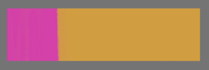
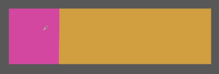
El degradado es la transición que tenemos entre dos colores o más, este es muy útil para poder seleccionar los tonos intermedios de nuestra paleta de colores.
Opacidad
En el entorno digital hay una característica conocida como opacidad, con ella podemos controlar qué tan transparente es el color que estamos utilizando. Esta característica nos ayuda a obtener colores intermedios entre dos o más colores de una forma muy rápida.
Blending Modes
Los blending modes son ajustes que se le pueden hacer a una capa para que el contenido de esta se relacione de una forma distinta al resto de capas que se encuentran por debajo.
También podemos configurar pinceles con blending modes, esto es muy util para las personas que prefieren trabajar con la menor cantidad de capas posible.
Herramientas
Color Wheel
En la rueda de color podemos seleccionar el color que deseemos y modificar sus distintas propiedades, el tono(A) lo seleccionamos girando el anillo que se encuentra al borde del color wheel. Para modificar las otras dos propiedades utilizaremos el triángulo que se encuentra en el centro, para ajustar la luminosidad(B) deslizaremos nuestro selector de forma vertical y podemos modificar la saturación(C) deslizando nuestro selector de forma horizontal.
Eyedropper
Esta herramienta nos permite seleccionar el color que deseemos de una zona especifica en nuestro canvas.
Es super util para ir tomando un color e ir mezclándolo con otros, gracias a las características de los pinceles y los blending modes de las capas.
Pincel de borde suave
Este pincel tiene un borde difuminado el cual nos ayuda a obtener un degradado entre varios colores de forma fácil y controlada.
Pincel de borde duro
Este pincel tiene un trazo sólido y ayuda mucho a definir bordes y a generar textura al momento de estar mezclando colores.
Propiedades de Herramientas
Para mezclar colores con nuestros pinceles debemos configurar algunos parámetros de sus propiedades. Esto lo hacemos desde la ventana de Tool properties, la cual podemos activar desde la Pestaña window y seleccionando la opción tool properties.
La ventana tool properties nos mostrará accesos directos a las configuraciones que tengamos elegidas y para ver todas las configuraciones disponibles debemos dar clic en el icono de la llave.
En la sección Ink encontraremos las dos secciones que nos ayudan a mezclar colores, en la parte superior encontraremos la opacidad y los blending mode, y en la parte inferior tendremos el color mixing. Divido en dos estas opciones ya que no podemos activar el blending mode del pincel y los controles avanzados de la opacidad mientras la opción de color mixing esté activa.
Mezclando con Opacidad
Para mezclar con opacidad debemos asegurarnos de que la opción de Color mixing esté deshabilitada, luego debemos activar la opción Pen pressure, esta nos ayudara a variar la opacidad dependiendo de la cantidad de presión que apliquemos a nuestra tableta.
Para mezclar colores recomiendo tener un color base y luego seleccionar el color que deseamos mezclar, seleccionaremos el color a mezclar con el cuentagotas y presionaremos levemente nuestra pluma digitalizadora contra la tableta para activar la opacidad y así obtener un nuevo color, si queremos seguir creando un degradado tomaremos ese nuevo color y volvemos a repetir los pasos
Mezclando con color mixing
Al mezclar con el color mixing tenemos menos control de los tonos pero obtenemos un variedad interesante de colores. Una de las ventajas de utilizar este método es que tenemos más parámetros para modificar y encontrar un ajuste que se acomode a nuestro flujo de trabajo, personalmente me gusta ajustar todo para que funcione con la presión de la pluma digitalizadora.
Uno de los parámetros más importantes es el mixing mode ya que este nos permite decidir de que forma se van a mezclar los colores. Ahora te explico cual es la diferencia entre las dos opciones que nos ofrece.
Standard
Esta opción solo toma en consideración los dos colores que estamos mezclando e ignora el resto de tonos al crear la mezcla.
Perceptual
El modo perceptual emula la forma en que los pigmentos se mezclan en la vida real, usando los tonos intermedios para crear la mezcla de colores.
Para pintar con este método selecciono un color base y luego el color a mezclar para empezar a mezclar, acá controlo con la presión de la pluma la cantidad de color a mezclar.
Pintando un personaje
Ahora que conocemos los conceptos básicos y como funcionan las herramientas te mostraré mi proceso para pintar un personaje
Lineart
Esta es la línea que define cada una de las partes de nuestro personaje. Me gusta empezar el proceso de pintado definiendo la línea porque me facilita el proceso de bloquear colores.
Bloque de colores
En este paso creo una capa para cada color luego activo el bloqueo de pixeles transparentes en cada capa, esto me ayuda a pintar únicamente en la capa de color y evita que me salga de las zonas que no están pintadas.
NOTA: Una forma útil de moverte entre capas mientras tienes el pincel activo es es utilizando el CTRL + SHIFT + Clic sobre una zona en el canvas y automáticamente se seleccionará la capa en donde se encuentran esos pixeles.
Agregar luces y sombras básicas
Ahora es cuando empezamos a darle un poco de volumen a nuestro personaje, con un pincel de borde suave daremos toques de luz y sombra. Para decidir que colores debo escoger para la luz y la sombra primero debo decidir de que color sera la luz y de que color es el fondo, ya que este se verá reflejado en nuestros personajes.
En este caso ya tengo el Color base (B) y la Luz (A) es será color amarillo, por lo que deslizo el selector de tono en dirección al color de la luz y y aumento un poco la saturación y la luminosidad. La sombra(C) será de un color morado, esto se debe a que el fondo es de este color y se ve reflejado en el personaje, selecciono nuevamente mi color base y deslizo el selector de tono buscando tono morado y reduzco un poco la saturación y la luminosidad.
Un error que todos cometemos al empezar es utilizar el color blanco para la luz y negro para las sombras, esto hace que se genere un enorme contraste de tonos y nuestra ilustración se verá sucia por ello. Evita utilizar el blanco y el negro puro para mezclar colores.
No hay una regla que nos indique cuanto debemos variar nuestro tono para seleccionar los colores a utilizar, pero esta es una forma que me ha funcionado y utilizo en todos mis trabajos. Para seleccionar buenos colores se requiere de experimentar y ver que le queda mejor al trabajo que estamos haciendo.
Agregando más volumen
Ahora agrego más volumen utilizando un pincel de borde duro y utilizando la mezcla con opacidad, la idea en este paso es repetir el proceso anterior, tomar los colores de luz y sombra y deslizar el selector a su respectivo tono, y de esta manera crear más luminosos para la luz y tonos más oscuros para la sombra generando más contraste entre ambos. Podemos realizar este paso las veces que creamos necesarias.
Blending modes para integrar al personaje con el fondo
Algo que me ayuda a resaltar más el personaje es utilizar los blending modes de las capas, utilizo una capa en modo Multiply para las sombras, y pinto con un pincel suave de color morado el area en el que quiero reforzar las sombras, y utilizo una capa en modo Overlay para las luces en la que pinto con color amarillo la zonas a resaltar. Si las sombras y luces quedan muy intensas puedes bajar la opacidad a variar el color con los ajustes de color para conseguir el resultado que buscamos.
Los colores a elegir dependen de la luz y la sombra que decidas utilizar.
NOTA: Te recomiendo organizar todas las capas de tu personaje en una carpeta para luego crear las capas de blending mode sobre esta carpeta y utilizando la opción clipping to layer below lograremos que las capas con blending mode solo afecten a la carpeta de personaje y no al resto de capas
Últimos detalles
Ahora podemos agregar más detalles utilizando las técnicas que hemos aprendido hasta ahora, en este caso agregué más detalles utilizando un pincel de borde duro como highlights, texturas y algunos toques de iluminación en el caparazón que ayudan a integrar aun más al personaje en el escenario y enfatizar más las sombras.
Tambien puedes pintar el lineart bloqueando los pixeles transparentes y pintando sobre la linea o utilizar una nueva capa y la opción de clipping to layer below.
En la imagen te muestro algunas zonas en las que enfatizo la luz y las sombras
Palabras finales
Mezclar colores suele ser difícil al principio pero se va haciendo más fácil mientras más lo haces.
La técnica que utilizo para pintar es simple, básicamente debes crear tonos de luz y sombra y con el cuenta gotas y un pincel con opacidad variable ir mezclando los colores, luego repetir estos pasos creando nuevas capas cada vez hasta que tengamos el resultado que buscamos.
Cuéntame en los comentarios si te pareció util el tutorial y siéntete libre de preguntar por cualquier duda que tengas con gusto intentaré responder.
Considera seguirme en las redes sociales para conocer más de mi trabajo.
¡Gracias por leer!
Users who liked this post


Comment