
YOUTUBE VIDEO LINK
Hi! in this atrticle i'm going to talk about line drawing for beginners.
We'll talk about brushes, the basic principles of line drawing and go over some exercises to improve line quality. Let's get started!
CHOICE OF BRUSH
To better convey volume and form of the drawing , it is better to use a brush with pressure sensitivity settings, that is, those that vary the thickness and opacity depending on the pressure of the pen. Using dynamic brushes you can easily accentuate areas, your lineart will look more alive. Such brushes are imitate analogue insteuments, such as actual pencils, ink and so one, which makes it easier to use for newbies.

!There are also excellent artists which use static brushes for their illustrations. Frequently they are used for drawings with stylization. But for newbies its better to use pressure sensitive brushes, to learn to feel the lines!
CLIP STUDIO PAINT offers many great built-in brushes, but you can use the ASSETS to find something else. Try different brushes and you’re sure to find something that works for you.
HOW TO IMPROVE LINE QUALITY
First of all, it is very important to choose references for your future work. The better you have an idea of what you are going to draw, the better the linework will be.
The most common mistake made by newbies is to draw "chaotic" and "hairy" lines. When you draw like that, you break the integrity of the form. Here are two exercises that can help you with this:
Draw on the canvas many dots in random spots. After this, in any order connect these dots with light and fast motions of the pen, to avoid shaky lines. Its a simple exercise, but if you repeat it regularly, you will notice that your lineart will become cleaner!

The second exercise will teach you to confidently and quickly create needed lines from the first try. Draw a short horizontal line. Then, draw the exact same line over and over, repeating the thickness and length of the first line, in such a way that the distance between the lines should remain the same. Then repeat the exercise but with vertical lines. And also with S shapes lines

Final exercise to develop muscle memory. Draw the infinity sign as fast as you can, and try to repeat the same shape again and again without lifting the pen off the drawing surface, trying to make the lines as similar to one another as possible.

It is important to remember that the main thing about lines isn't how precise they are, but to convey the dynamics. Lines not only show the contour of the shape, but also to show the volume of the object. Try to draw with confident, broad strokes. Try to use the shoulder when drawing and not just the hand. Your lines will look more solid as a result.
SOME PRINCIPLES FOR WORK WITH LINES
When drawing characters, start the lineart with the face. This way, its much easier to set the overall character of the lines, figure out the width and boldness, as the face is almost always the focal point in a drawing.
Thanks to dynamic line width variation you can differentiate shapes in a drawing.
This principle is based on that we draw the more important aspects of a drawing with thicker lines, and with thinner lines we denote less important aspects of the drawing.
The outer contour sets the overall tone, showing the silhouette of the object so it is usually drawn with a much bolder line. And the inner details are drawn much thinner. This way, the viewer seeing the object first takes in the overall silhouette, the most important part, then the large components, then the finer details and textures.

Take not that if there is one important part of the drawing, its better to reduce the detail level of the nearby objects, to avoid a busy artwork.

Objects drawn with thicker lines are interpreted by the brain as being closer to the viewport. If there are objects which are meant to be closer to the dearly respected audience, you can show it with thicker lines. This way you also prevent the linework from feeling too busy.
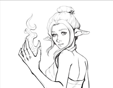
Lines can also show shading. The closer the line is to the shadow, the darker and thicker the line should be. And the parts which are closer to the light should be drawn thinner. It will add depth to the drawing and give the illusion of volume.

That’s it. I hope this simple principles are useful to you! I would also add that even professional artists don’t follow some of this guidelines given earlier. These are just initial tips. Don’t be afraid to experiment!
Users who liked this post


Comment