
How to Customize Your Workspace
The Workspace feature
What will be saved in a workspace?
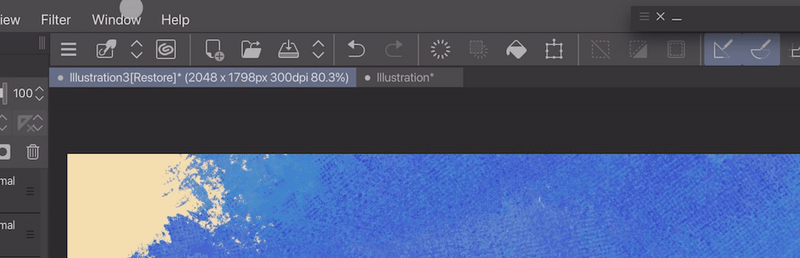
In Clip Studio Paint, a workspace is a saved configuration of your program's interface layout. It essentially captures the arrangement of your tools, palettes, menus, and preferences, allowing you to switch between different workspaces optimized for specific tasks.
Additional settings you can import
This refers to workspace import settings, which are preferences you can set when importing a workspace into Clip Studio Paint. A workspace is a file that contains the layout of your Clip Studio Paint workspace, including your brushes, tools, palettes, and other customizations.
- Your shortcut settings
- Command bar layout: The Command Bar in Clip Studio Paint is a customizable toolbar located at the top of the program's interface. It provides quick access to frequently used commands and tools, helping you streamline your workflow.
- And Preferences
Additional Workspace Features
Now I'm going to explain what each of these does:
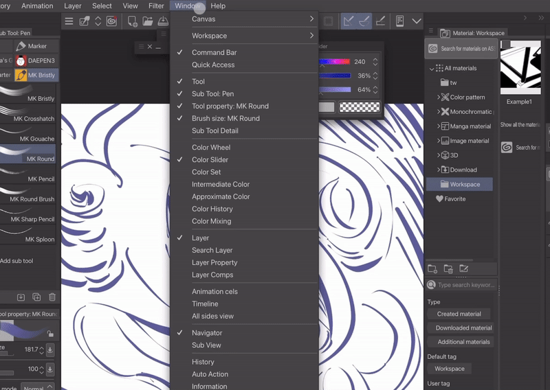
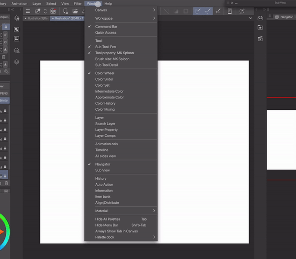
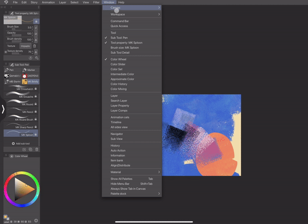
You can find this menu by going to Window → Workspace
Register Workspace:
To register the workspace of your choice that's displaying on the screen
Register Workspace as Material:
To register a workspace of your choice as a material:
- You can select the save location of your choice.
- You can also add an image for easier identification and tags for searching.
Then, you can drag it from the Materials tab or search for it using the tags you assigned.
Search for workspace material (s):
By pressing on it, this will take you to the Clip Studio Assets website and show you workspaces created by others. Here, you can find workspaces that are already customized.
Manage Workspace:
You can rename or delete workspaces
Workspace import settings:
Allow you to switch between different workspaces optimized for specific tasks, bringing your tools, palettes, menus, and preferences with you.
Restoring your Workspace (Optional):
If you want to go back to the original layout you registered, you can simply use the "Reload" option. This will reset your workspace to its starting point.
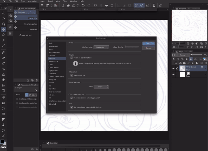
How to Customize your UI / Appearance
Click on the Clip Studio Paint icon or press cmd/ctrl K → Select Interface
Clip Studio Paint allows me to adjust the interface theme to suit my environment. In brighter settings, I might keep things light for better visibility. However, I generally prefer a slightly darker theme for better focus. The best theme depends on the situation and the type of screen you have (matte or glossy).
Lighter UI vs Darker UI
Dark UI example:

Light UI example:
Darker UI
Reduced Eye Strain:
Darker interfaces create more contrast between the UI elements and the canvas. This can be easier on your eyes, especially during long periods of use.
Improved Focus:
A darker UI reduces the overall brightness of the workspace, minimizing distractions and allowing you to focus more on your artwork.
Better Color Accuracy:
When working with darker backgrounds or using dark colors in your artwork, a darker UI can help you better judge the true values and tones of your colors.
Possible battery saving:
Dark UI can improve battery life on OLED displays, especially at high brightness.
Personal Preference:
Ultimately, the best UI theme is the one that feels most comfortable for you. If you find dark interfaces more aesthetically pleasing or simply easier on your eyes, then that's a great reason to use them.
Here are some situations where a lighter UI might be preferable:
Low-light environments:
If you're working in a dimly lit space, a lighter UI can help improve visibility.
Detailed artwork:
For very detailed work, a lighter UI might offer slightly better contrast for fine lines and brushstrokes.
Workspace's tabs & windows
You can have your tabs on the left, right, or bottom.
You can move them freely by dragging them to the middle or top of the screen.
Each tabs function explained
Each tabs with function explained and showcased what it does
Canvas:
This is your digital drawing area where you create your artwork. You can adjust the canvas size, resolution, and color profile.
Workspace:
This is the overall layout of your Clip Studio Paint interface, including all the palettes and tools. You can customize the workspace to fit your needs.
Command Bar:
This bar provides quick access to frequently used functions like file management, editing options, and view controls.
Quick Access:
This customizable tab lets you store your favorite brushes, tools, and actions for easy access.
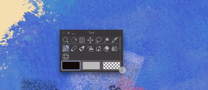
Tools:
These are the basic tools you use to draw and paint on your canvas. Examples include pen, pencil, brush, and eraser tools, etc.
Sub Tool: Operation:
Some tools have sub tools that offer variations of the main tool's function. For example, the pen tool might have sub tools for different pen types.
Tool Property:
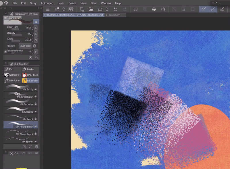
This tab lets you adjust the properties of your currently selected tool, such as size, opacity, and brush tip settings.
Object Brush Size:
This specifically refers to adjusting the size of a brush.
Sub Tool Detail: This tab provides even more detailed settings for your chosen sub tool, allowing for finer control over its behavior.
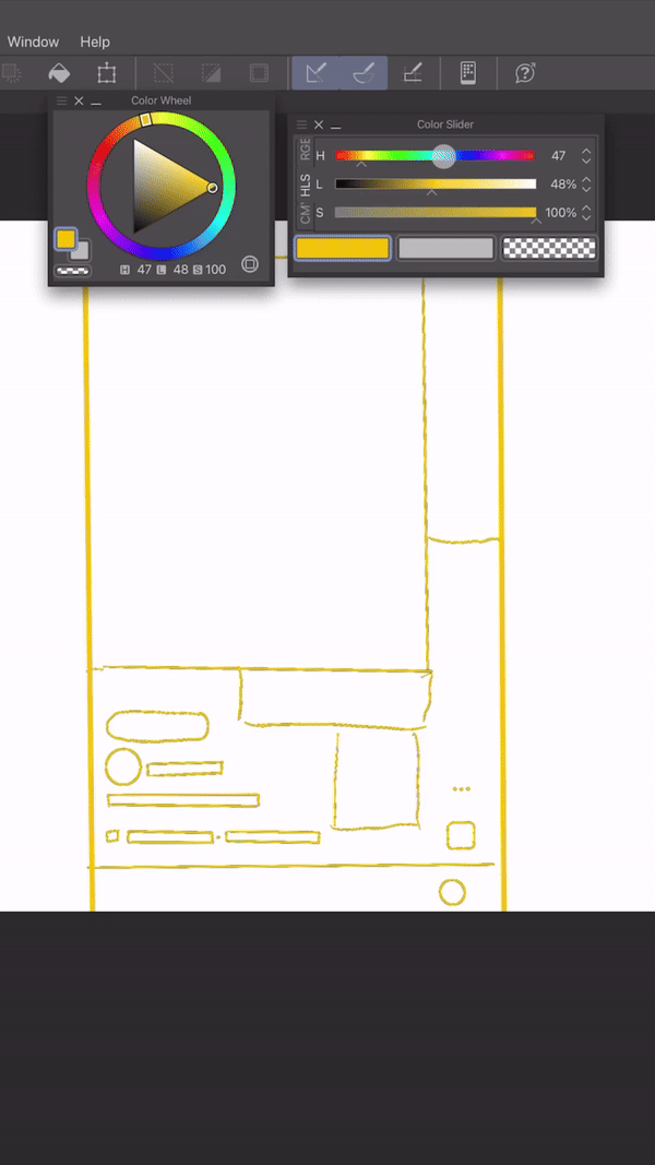
Color Tabs:
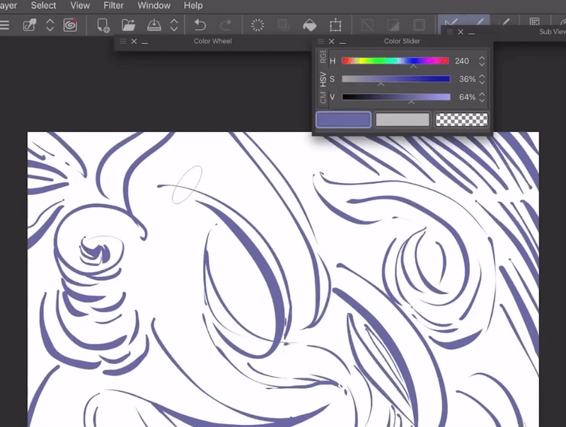
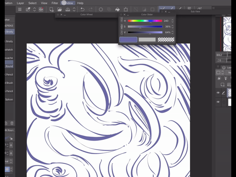
- Color Wheel:
This lets you pick colors visually by rotating a wheel and selecting hues, saturation, and brightness.
- Color Slider:
This provides sliders for adjusting Red, Green, and Blue (RGB) values to create specific colors.
- Color Set:
Here you can store and manage favorite color palettes for easy access.
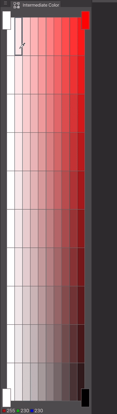
- Intermediate Color:
This helps you generate colors in between four selected colors. It’s like color mix in a way.
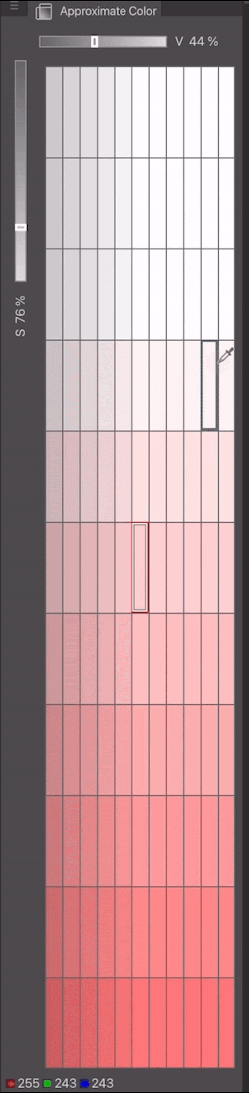
- Approximate Color:
This tab lets you create variations of your currently selected color.
- Color History:
This keeps track of recently used colors for quick selection.
- Color Mixing:
This tab allows you to mix colors digitally, similar to mixing physical paints.
Layer System:
- Layer:
Layers are transparent sheets stacked on top of each other, allowing you to build up your artwork step-by-step. You can edit and manage individual elements on separate layers. It also lets you adjust properties of individual layers, such as opacity, blending mode, and visibility.
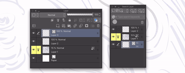
- Search Layer:
This function helps you quickly find specific layers within your project by name.
- Layer Property:
This lets you add effects and functions to layers without changing the original artwork. It's like adding filters or adjustments on a per-layer basis. Some cool things you can do include:
- Add borders, textures, or halftone effects
- Change the layer's color - Extract clean line art (EX version only)
- Limit the layer's colors
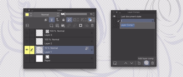
- Layer Comps (Version. 3.0):
This feature allows you to create different combinations of visible layers, like creating multiple versions of your artwork.
Animation Features:
- Animation Cells:
These are individual frames used to create animation sequences.
- Timeline:
This is where you arrange and edit your animation cells to create the timing and flow of your animation.
View Controls:
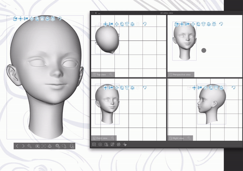
- All Sides View:
This lets you view your 3D model from all sides simultaneously.
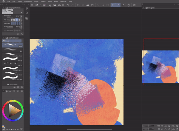
- Navigator:
This provides a miniature view of your entire canvas, allowing you to easily navigate and zoom around your artwork.
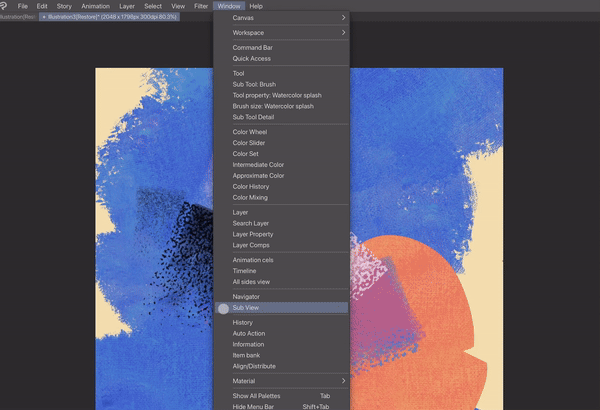
- Sub View:
It’s a mini window that lets you display reference images right next to your artwork. It helps you:
See your reference without switching windows
Pick colors directly from the reference
Zoom in and rotate the reference for better viewing
Other tabs:
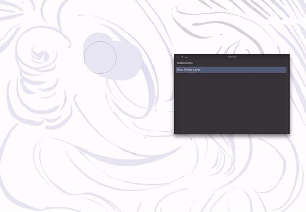
- History:
This palette shows you a history of your actions, allowing you to undo or redo steps.
- Auto Action:
Here you can record a sequence of actions to create a macro that can be replayed for repetitive tasks.
- Information:
It’s a window that shows you:
How much memory the program is using
The exact location of your cursor on the canvas (useful for precise positioning)
And your work time
- Item Bank:
This stores and manages brushes, materials, and other assets for quick reuse.
Customization Options:
- Align/Distribute:
This helps you align and distribute objects on your canvas evenly.
- Material:
This palette provides access to textures, patterns, and other visual elements you can apply to your artwork.
- Show All Palettes:
This displays all available palettes in your workspace.
- Hide Menu Bar:
This hides the menu bar at the top to give you more space to work.
- Always Show Tab in Canvas:
This keeps tabs visible within the canvas area.
- Palette Dock:
This allows you to dock palettes on the sides of the workspace for easy access.
Some productive tabs that I recommend are:
- Command bar
- Quick access
- Sub View
- Auto Action
- Item bank
Types of Workspace
Workspace for illustration
This is going to be based on my workflow and what type of tools I use the most
In illustration, the tools you will need the most in my opinion are: Color, brushes, rulers, layers and Sub View tab
I’ll use this rating to determine the need for a tab:
- 5 points (most important)
- 4 points (important)
- 3 points (somewhat important)
- 2 points (less important)
- 1 point (least important)
- 0 points (not necessary)
Tool: 2 - Less frequently used, as shortcuts are available. However, some artists without shortcut buttons need this tool. Fortunately, most tablets and iPads offer features to access shortcuts.
You can find the shortcut feature for Clip Studio Paint by dragging it out from the right side of the screen.

Sub tool: 3 - can be hidden (use a shortcut to bring it back) or left visible depending on your preference.
Tool property: 2 - Some artists may need it, depending on their specific needs, while others may rarely use it. Personally, I prefer to keep it visible on my workspace if I ever need it.
Brush size: 2 - While some artists rely solely on shortcuts, I prefer to keep the brush size tab open for better visibility. However, shortcuts are still an option for me.
Color wheel: 3 - For better color accuracy, it can be left visible, but it can also be hidden. I personally like to move it around, but recently I've found it to be inconvenient. Therefore, it should either be hidden or placed somewhere easy to access. A shortcut for it would be a bonus.
Color slider: 3 - While some artists may not use this feature, I find it very helpful because it allows me to see color values and saturation, making color selection easier. Therefore, I recommend keeping it visible and adding a shortcut for faster access.
Color set: 2 - It depends on your workflow. If you use specific colors for your art style or other needs, then it's best to keep the two color sets visible or hide them with a shortcut. Overall, for a faster workflow, I recommend using it regularly.
Intermediate Color: 1 - It's not necessary, but it can be helpful for blending and mixing colors, making it easier to find the desired shades by mixing just 4 (different) colors. So, it's either a shortcut or it can stay in the color tabs section.
Approximate Color: 1 - While not essential, this feature can be helpful for users who struggle with color selection. Consider offering it as a shortcut or keeping it within the color tab options for easy access.
Color History: 2 - This feature acts like the Color Set tab, but with some limitations. I use it sometimes, but other artists might rarely use it. Maybe a keyboard shortcut for accessing it, or just keeping it in the Color Tabs section would be better.
Layer: 3 - Because everyone has a different workflow, some artists may not need many layers, while others may require a more extensive layer setup. Therefore, consider offering two workspace options for layer usage: with shortcuts or with the panel always visible.
Search Layer: 1 - Highly specific for artists using many layers. Hide by default or add a shortcut.
Layer Property: 2 - This setting depends on your art style and needs. You can either keep it accessible in the layer tabs or assign a shortcut for quick access.
Layer Comps: 1 - For very specific needs (This feature allows you to create different combinations of visible layers, creating multiple versions of your artwork). → Leaving it with layer tabs or adding a shortcut.
Navigator: 3 - Better to leave it visible, since this allows you to view how your artwork looks.
Sub View: 4 - This is essential for me. I prefer to keep it freely accessible, not docked in a fixed location. For easy access, consider adding a shortcut, or dock it in a fixed location separate from other tabs. I typically group it with the Information tab or other infrequently used tabs.
History: 1 - This feature isn't crucial for me, but it might be helpful in rare cases. I recommend keeping it accessible in the Sub View & Information tabs.
Workspace for posting on social media
Lately, the format for social media posts (9:16) has become popular, with lots of artists posting their process on social media. However, the 9:16 format doesn't suit a normal workspace for tablets or iPads. So here's how you can customize your workspace for the social media post format!
Since recordings and screenshots will be in 9:16 format, we need to design our workspace with this aspect ratio in mind.
I would recommend bringing your tabs closer together. And depending on what you want to show, you could lay out your tabs and position them closer to a 9:16 format.
For example, you want to show the colors you choose in your painting process for your video. Just pull them closer and let those tabs stay floating. Here's an example of how it would look like with the 9:16 format.
How to Create a More Productive Workspace
Here are some tips to optimize your workspace for increased productivity:
1. Organize for Efficiency:
- Accessibility is Key:
Place frequently used items within easy reach. This can include physical tools or digital shortcuts.
- Workspaces with Purpose:
Consider creating separate workspaces within your interface for different tasks. This helps maintain focus and minimizes distractions.
2. Eliminate Time Wasters:
- Automate Repetitive Tasks:
Look for built-in features like "Auto Action" to automate repetitive actions and save time.
3. Find What You Need Quickly:
- Strategic Placement: Position frequently used tools and features in easily accessible locations.
Tip for Optimizing Your Workspace:
Start with a minimalist layout with minimal tabs open. As you work, gradually add or rearrange elements to best suit your workflow.
Additional Resources:
- Some workspaces that I recommend:
For large screen:
Minimalism workspace:
You can also customize your icons to your liking:
How I customized my workspace
My left hand is my dominant hand so my workspace is going to be customized based on that fact.
I leave my most used tabs on the left for easier access, but I prefer to hide the tabs on the left since my left hand covers the screen on that side. Hidden tabs will have shortcuts.
There are two types of tabs I'm interested in: those I can access and control with my right hand, and those that need to be visible, like the Sub View. I'll keep the Sub View on the right side.
Thanks for viewing, I hope you found something helpful!
Now that you’ve learned some Clip Studio Paint customization tips, why not put them to use? Try experimenting with what workspace works best for you! 🥰
Users who liked this post


Comment