
Intro
Hello again everyone, it's Daniel {@Ado_draw} here again with another article tutorial on the aspect or ways of using CSP Filter features, which tends to highlights methods and ways to effectively utilize the CLIP STUDIO PAINT (CSP) new (for VERSION 3.0.0 to 3.0.2) and old (VERSION 2.0.0 to 2.0.9) Filter features which is the Main focus of today's course, and the course is titled:
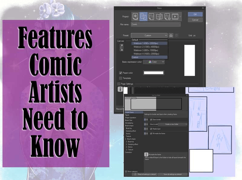
HOW TO REFINE ART YOUR PIECE USING CSP FILTER FEATURES.
🔻🔻🔻
Now, when we say filter features as does the name implies, it means redefine your work or ones work by the removing of unwanted brush strokes or adding of chromatic aberration and Retro film, or even Artistic (which can extract line art of an image).
Yes yes for sure your heard me right, if one have a proper understanding of CLIP STUDIO PAINT (CSP) filter features well, one can remove the line work of any image be it a 3d figure object converted to an image or a illustration image and use them for another illustration work or for the creation of comic, or even add primary colours distortions to one illustration and more or less Logo's.
But before we go any further, I will like to point out that this tutorial is done on a smartphone device but can be easily practice on other devices as well like say tablet, systems and more,
So with no Further Ado... let's get to see ways I use the CSP filter features to my advantage.
Note🔻I will be pointing out the CSP filter features base on the ones I find simple then move up to that of the complex or vise versa, so do note that I may not explain the filter features base on how they are arranged in the studio.
Something so important before one can be able access the filter features
The first must important thing to do before you can or even make use of the filter features is to first single you work which you can do in this to ways list;
1. Saving to device and import back to Studio.
2. Convert layer to the object.
3. Flatten image.
I have been using this two methods for a long period now and to have help make things easier for me.
🔸🔸🔸
1. Saving to device and import back to Studio.
One can start by using the CSP filter features, you firstly need to have a well rendered illustration image or even a 3d figure image; but let's first of all start with that of the illustration image.
Start by import the render image from your library storage into the CLIP STUDIO PAINT (CSP) from the shortcut mini box which can be gotten can be locate by the left side of the canvas, click on it and a dashboard with some selection options will then be displayed, select the [import from device storage] option,
🔸🔸🔸
It will take you to your storage library in your device, there locate your image, and click on it to import it to the studio.
Or one can always try out the other way to import our saved illustration image from the the file, if you don't want to make use of the shortcut box by doing the following;
Click on the [Menu bar indicated (1)]>[File selection indicated (2)]>[Import selection indicated (3)],
🔸🔸🔸
And with the above done, any image we may have selected in our library storage will then be imported into the CSP canvas as an IMAGE LAYER.
🔸🔸🔸

Onto the next,
2. Convert layer to the object.
This is method I love for turning layers into single layer, it the entire created layer into one single object layer and at your own choice you can have it keep or delete the original multiple layers. Now we can start the process by,
Click on the [Menu bar indicated (1)]>[Layer selection indicated (2)]>[convert layer indicated (3)]>[convert layer to the object indicated (4)],
After the convert layer to the object option is selected, a dashboard with the below listed selection,
Area - copy paper settings - keep original layer
Options will be displayed.
Note🔸I set the Area setting indicated as (1) to [drawing area indicated as (2)], I then disable copy paper settings while enabling the keep original layer, so as I previous mentioned above, it can help keep my multiple layers indicated as (3) will creating a single layer with all the rendering in all the multiple layers.
After I am done with the necessary adjustment, I can then click on OK, which will then Create the object layer in the [Layer setting].
🔸🔸🔸
And that is not only the good part the Object image get save in the [item bank], and to import it from the item bank on to a newly created canvas is by firstly pinning the item bank icon indicated as (1) onto the [palette bar] and click on it, a mini dashboard with plus paper icon at the bottom left will appear indicated as (2) as shown on the left image below,
Clicking on the that plus paper icon will open a new dashboard with different bank image, select the one you've save as indicated as (3), with the image we want selected, we can now click on OK to conclude it.
🔸🔸🔸
Drag the material from the item bank onto the canvas to add it to the layer.
But the image will be save as object layer, so we need turning it to raster layer, start by clicking on the merge icon,
🔸🔸🔸
merging it to the below raster layer to turn object layer to raster layer.
🔸🔸🔸
Moving on.
3. Flatten image.
This is a setting that can also help users make their art work singular layer but their is a condition, you should make use of this setting only when you don't want to make use of the original multiple layers, cause this settings merge all the multiple layers folder and all into one singular layer.
The above can be achieve for two process which is as follows;
• None transparent background
• Transparent background.
Let's take them one after the other.
• Flatten image with a white background
Take this below Female character image for example, which I created multiple layers and place them in folders indicated as (2) as is located in the [Layer setting indicated as (1)],
🔸🔸🔸
Click on the [Menu bar indicated (1)]>[Layer selection indicated (2)]>[Flatten image indicated (3)],
After selecting the [Flatten image] option, we can now see that the bother the folder and all the multiple layers as all merge into one singular layer even the blank paper layer which in this process the image is now inform of a JPEG image with background.
🔸🔸🔸
But say we don't want it to have a background and let it be inform of a PNG, that now takes us to the next process.
• Flatten image with a Transparent background.
Now in this particular aspect unlike the image given a white background, in the above mentioned it's blank paper layer was enable, in this one let's just disabled the white blank paper layer in this one as indicated (3) as located in the [Layer setting indicated as (1)],
🔸🔸🔸
Follow up by Click on the [Menu bar indicated (1)]>[Layer selection indicated (2)]>[Flatten image indicated (3)],
And with the [Flatten image] selected all layers will then become one and we will now have a PNG character layer.
🔸🔸🔸
Hence, you can use any of the above process to make your layer a singular layer, then move on to use or apply the filter features.
Filter features 1# use of the Artistic Filter
Here below is the Gif showing the drawing process and step for creating this illustration used;
🔻🔻🔻

Now after we have import the render illustration image, before we can be able to add any Filter features to the image, we first need it to be converted to a raster layer which we can do in the following two ways.
The first is by opening the [Layer] dashboard by clicking on the Layer icon indicated as (1), in it long press the imported image layer indicated as (2), a dashboard will appear with several selection options, select the one that is called Convert layer indicated as (3),
🔸🔸🔸
A new dashboard with different selection will appear, Click on the Type selection.
🔸🔸🔸
The image material layer indicated as (1) will open a new mini dashboard indicated as (2) will then see three sets of options
( Raster Layer - Vector Layer - Image material layer )Select that of the raster layer, and then click ok.
So cause we would the to be convert to raster layer select that of raster layer indicated as (3).
🔸🔸🔸
After selecting that of the raster layer indicated as (1), we can then click OK indicated as (2).
🔸🔸🔸

And with the above done, we can now applied any of the Filter features to our converted image.
The next ways I use is a suit of a cheat but easy and quick way to convert the imported image layer to a raster layer, and this process is by while on the layer dashboard, create a new raster layer above the imported image layer,
🔸🔸🔸
Then merge the newly created raster layer to the imported image layer by clicking on the Merge Icon indicated as (3) , which can be located in the Layer box indicated as (1), as shown in the above image.
Hence with the above mentioned done, it will then convert the imported image layer to a new raster layer with the imported image as indicated [2] as shown in the below image.
🔸🔸🔸

And the both above ways are the method I adjust the imported image to be suitable for adjusted and adding of filter features.
Now with the above done, at the top of the canvas on the left hand side are three bars indicated as [1] in the image below, a menu dashboard will then appear while on the menu dashboard, click on the [Filter indicated as (2)]>[effect indicated as (3)]> different selection options will be display but the one we will be working with for now is that of the [Artistic] indicated as (4), clicking on it.
🔸🔸🔸
We will then be taken to another dashboard with the following adjustable setting options;
Process - Line Thickness - Line simplicity - Line density - Line Opacity - Line anti-aliasing - Colour blending - Colour blur - Number of colours
🔸🔸🔸
Notice 🔹above the settings shown I numbered 1 to 4, To see the rest of the settings, we just need to scroll downward to be able to see the rest of the settings.
Now with this multiple selection options as a beginner one tend to get confuse on what to adjust to suit what you want, also we just need do is sets a our mind on what out come we want the image to be.
Moving on I will be showing below my own choice of settings but do note that you are free to adjust the settings to suit your style, also you are free to make use of my kind of settings as well.
• Adjustment of process option (use of color only)
At this point, we just need to decide on what we want this feature to do to the image piece.
Now say I want the lines of my image to be blurred out leaving only thing colours, click on the [Process selection option indicated as (1)] a mini dashboard where their are three sets of options available when we select it,
Such as the Color and lines, Color only and last on the list is the Lines only option as indicated in box (2) below.
🔸🔸🔸
To have the image appear without it line art is to select the [color only option] in the [Process setting] which tends to give the image it's own kind of unique expression and the color only expression can be further intensified as indicated on the image or reduce as indicated on the right image using the option called Number of colors, one can adjust it to any percentage like 5% or 20%, when it's set to 5% the number of color use reduce to only 5 colours, while when it 20% the number of colour is 20, as shown below image,
🔸🔸🔸
If we are satisfy with our adjust we can then finish by clicking on the OK icon and the image will be rendered.
🔸🔸🔸

• Lines extraction process (use of Lines only)
As the name Artistic implies, in this aspect using the option Line only in this set of filter features called Artistic, I use the Artistic to remove detail line arts of the the illustration image or a 3d figure image.
Import the image and repeat what was done above by converting the image layer to raster layer.
• Process can be use for extraction lines from illustration image
And with the above done, we can now get the line art of an illustration image using the Artistic, we need locate the Artistic Filter by clicking on the [Menu Icon indicated (1)]>[Filter indicated (2)]>[Effect indicated (3)]> in it dashboard, we will then locate the [Artistic Filter indicated (4)].
🔸🔸🔸
Then the Artistic Filter dashboard will now be displayed, click on the [process bar] and set it the Line only option, we will then notice that the colours are extracted and only the line work remained.
🔸🔸🔸
Next, we can create a new raster layer and adding in the flat colour,
One can even go further to add border line by clicking on the [Layer property] indicated as (1), enable the [border effect] indicated as (2), select the edge option, setting the [thickness of the edge] indicated as (3) and give the border line a thick dark colour as indicated (5), we can even go further by increasing the thickness of the edge to 5%, so that there is a dark line round the subject to act as the outline of the subject.
🔸🔸🔸
And there you have it, it's all finish the subject, you can add other colour to make it unique.
🔸🔸🔸
Hint🔻the above line work may seem rough but in order to get a good line art the piece need to be clear before you can get a good line extraction.

• Process can be use for extraction lines from 3d figure
Also we can remove even the line art of the 3d figure model.
Now we need firstly import the 3d figure onto the canvas from the [Material box] on the [palette bar] below the canvas,
🔸🔸🔸
Note 🔻 that the [Artistic filter features] can not affect the 3d figure original layer as shown in the below Gif.
🔸🔸🔸
Take the image below for example, we import a instrument into the scene so as to show the the subject playing it and show her love for it with her finger in the process.
🔸🔸🔸
Here below is the Gif showing the drawing process and step for creating this illustration used;
🔻🔻🔻

You can download the above used music instruments (gagugeum) with the below link 🔗;
🔸🔸🔸
Now that the 3d figure is properly import in and position, for what we are hoping or proposing to work, one need convert the 3d figure original layer to a raster layer,
To achieve this we can follow the process mentioned above for using the convert layer settings to converting image layer to raster layer,
Or use simple I call a kind cheat but not in a bad way, which is by creating a duplicate of the 3d figure layer as shown number 1 and 2,
🔸🔸🔸
Create a new raster layer using the create new raster layer icon, then click on the [merge icon] to merge the raster layer to the 3d figure layer,
🔸🔸🔸
Whereas turning or converting the 3d figure layer to a raster layer.
🔸🔸🔸
Then with the both layer merged, we will now be able to use the Line only and color only option in the Artistic Filter feature.
🔸🔸🔸
With the above mentioned done, we can then fill in a flat colour and that is how I extract the lines of the 3d figure with ease, if I don't want to stress myself drawing indicated as (B.) or even add color indicated as (A.) onto the subject starting from a scratch.
🔸🔸🔸
And the above mentioned processes are the few ways I utilize the [Artistic Filter features].
Below is the finish illustration image of bother the use of the color only option and the line only option.
🔸🔸🔸
This is one of the most useful added features which I tend to use most often in my recent illustration to make my work easier.
Tip🔻we can even use the mentioned process get build structures line art, chairs line art and so much more.
Now onto the next option.
• Adding of dark lines and color effect (use of color and lines)
This set of options tend to work with the color and lines option the third set of selection present in the process selection [Color and lines indicated as (1)] of the [Artistic Filter feature], it makes bold the lines and blur or add hardness to the color effects as shown below.
Now that is that for the process selection options. I will to point out the range I do set the rest of the selection options for the few times I have made use of the [Artistic Filter],
I tend to leave the rest of the selection options on their default settings but adjust the line thickness to either 77% .
🔸🔸🔸
While for the number of colors, I set to 11% which means it will only apply 11 sets of colors to the work.
🔸🔸🔸
But mostly I make use of that of 20% for more colors to be added.
Filter features 2# chromatic aberration
Chromatic aberration are colour distortion that creates an outline of primary colours along the edges of subject, objects or even background in a image.
They various colour distortions tends to occur as the primary colours such as red indicated as (A.), blue indicated as (B.) and green colours indicated as (C.), smudge together using the blending mode called [screen] to give the pink indicated as (F.), yellow indicated as (E.) and light blue indicated as (D.) as shown in the image below.
🔸🔸🔸
This features in particular has been use by different artist over the years to help add a unique expression to their art work.
Adding of this features to ones artwork usually some viewers in some sense a kind insecurity in the shot taken if the image was gotten from a camera photography.
• Applied chromatic aberration to a subject
Now How one can locate the Chromatic aberration in CLIP STUDIO PAINT (CSP) is by first clicking on the [Menu icon indicated as (1) on the top left corner of the canvas>[Filter indicated as (2)]>[Effect indicated as (3)]>now on the effect, we will then locate the Chromatic aberration indicated as (4) as one of the selection options.
🔸🔸🔸
Selecting the Chromatic aberration will then open the Chromatic aberration dashboard where we will then see another different sets of settings as listed below;
Mode - Intensity - Angle
🔸🔸🔸
Clicking on the Mode options, another two sets of options will appear namely,
1. Radial (use center point)
2. Lateral (use angle)
🔸🔸🔸

Now this two mode affect the Chromatic aberration in different ways, so let's see how the affect the Chromatic aberration effect.
1. Radial (use center point)
This sets of mode (radial mode) when selected, a circle effect is created which let's the color distortion affect the surrounding of the circle but not letting it affect the inside of the circle making the point of the circle that is not affected to be the focus point of the viewers gaze as shown below.
Using the [intensity setting], I can increase the effect of the Chromatic aberration as shown in the image below between image [A.] Which intensity was set to 50% And that of image [B.] is set to 100%.
🔸🔸🔸
But in order for the viewers to be able to see the details on my subject,
While for the following settings like [interesting] and [angle ],
I usually make use of the image [A.] Setting more and for the angle set I tend to use -57 indicated as [5] as shown the above image,
But do note that you can set the colour distortions (such as the blended primary red, blue and green) of the Chromatic aberration to any angle position of your choice, when you are done with all the adjustment click on OK indicated as [6] and the art illustration work will then have now been set chromatic aberration effect as shown below.
🔸🔸🔸

Notice 🔹 my style of setting the Chromatic aberration shows the blue primary colour by the right and the Red primary colour on the left while the green is position at the bottom part of the subject with the rest of the colours blended are located on the body of the subject.
2. Lateral (use angle)
This sets of mode (lateral mode) unlike radial mode when selected, it affect all the entire image.
Using the [intensity setting], I can increase the effect of the chromatic aberration as shown in the image below between image [A.] Which intensity was set to 50% And that of image [B.] set to 100%,
🔸🔸🔸
But in order the viewers to be able to see my details on my subject, I usually make use of the image [A.] Setting more and for the angle set I tend to use -57,

Filter features 3# Retro
Retro filter as the name goes are color palettes or combination that don't draw it's color from the [primary colors like red, blue, and yellow], but more often from [secondary colors like tangerine oranges, teal blues, and apple greens]. They can most times be made of even neutrals, like creams, yellows, yellow-browns, teal, pale peach, brownish oranges, and a range of pastel colors.
CLIP STUDIO PAINT has been able to apply this to most of the era awareness to their Retro filter features which one can locate by doing the following;
Click on the [Menu bar indicated as (1)]>[Filter indicated as (2)]>[Effect indicated as (3)]>[Retro indicated as (4)],
Every era has its defining colors—the conservative khakis and browns of the 1940s, the earthy mustards and oranges of the 1970s, etc. This aspect are what CLIP STUDIO PAINT VERSION 3.0.0 to 3.0.2 is trying to help artist add to their work, now CSP made the retro filter having four sets of adjustable settings which are,
Preset - Effect - Intensity - Noise strength
🔸🔸🔸

1. Implementation of vintage preset,
Using this various settings we cane easily give our illustration a retro effect.
Now to start with, click on the preset settings are mini dashboard will appear with four types of selection options, click on that of vintage,
🔸🔸🔸
After the selecting vintage preset, we will then notice that when vintage is set as the preset indicated as (1), effect settings changes to appear as sepia plus light leak (all) indicated as (2) and the intensity is set to 20% indicated as (3) while the noisestrength is set to 30% indicated as (1), whereas if we are satisfy with the looks, we can just click on OK indicated as (5).
🔸🔸🔸
Vintage filter appear to turn back the hand of time with a vintage color palette for each decade. These vintage colors that take their creative inspiration from each decade of the 20th century.
Below is the finish image.
🔸🔸🔸

2. Implementation of warm preset,
Now this next preset artist mostly make use of and it called warm effect, this preset utilize the warmer colors of the color wheel locate by the left hay side CSP color wheel, warm colors can be stimulating, making them a good choice for rooms that see a lot of activity.
After the selecting warm preset, we will then notice that when warm is set as the preset indicated as (1), effect settings changes to appear as [sepia plus light leak(slant)] indicated as (2) and the [intensity] is set to 0.00% indicated as (3) while the [noise strength] is set to 0.00% indicated as (4), whereas if we are satisfy with the looks, we can just click on [OK] indicated as (5).
🔸🔸🔸
Warm colors are associated with heightened emotions and passion as well as joy and playfulness. Think of the vibrancy of a bright orange or the intensity of a deep, rich red.
Below is the finish image.
🔸🔸🔸

3. Implementation of modern preset,
Modern retro effect takes its stylistic influences from more recent decades, the late 1970s through the 90s. Also modern retro effect tends to give expression of a suit of time skip or fazing expression,
After the selecting modern preset, we will then notice that when modern is set as the preset indicated as (1), effect settings changes to appear as [Light leak(slant)] indicated as (2) and the [intensity] is set to 40% indicated as (3) while the [noise strength] is set to 10.00% indicated as (4), whereas if we are satisfy with the looks, we can just click on [OK] indicated as (5).
🔸🔸🔸
Modern retro design typically are styles and aesthetics from the early to mid-20th century, specifically the mid-century modern movement characterized by clean lines, minimalism, and functionality. Most are times in other works of life "modern" refer to current trends or contemporary designs.
Below is the finish image.
🔸🔸🔸

4. Implementation of None preset,
This particular retro preset [None effect] does not limit user settings to default aspect as those the previous above preset which has all the settings on default setting.
With the None preset indicated as (1) in the image below, one can set the [Effect setting] to your liking, the intensity and even the strength. Take the my choice of setting below for example, the [Effect setting] is set as Light leak (slant) indicated as (2), the intensity is set to 20% indicated as (3) while that of the noise strength is set to 30% indicated as (4), and when am done I then click on OK indicated as (5).
This aspect of preset give users the free ability to adjust any of the other settings to his/her choice, like say if we are not satisfied with the choice of effect set for the above image, we can add the effect to any of it five counter parts which are as list below;
1. None effect - there is no application of effect.
2. Sepia effect - is a popular tonal editing method that imparts a mellow tone to an image, giving it an archival or vintage appearance.
3. Light leak (slant) effect - is a hole or gap in the body of a camera, or other optical instrument, where light is able to "leak" into the normally light-tight chamber, exposing the film or sensor with extra light, which is express in CSP retro filter in a spherical form at the bottom right corner in a [small amount].
🔸🔸🔸
4. Light leak (all) effect - is a hole or gap in the body of a camera, or other optical instrument, where light is able to "leak" into the normally light-tight chamber, exposing the film or sensor with extra light, which is express in CSP retro filter from the right side of the canvas to the middle part [covering the entire axis large amount].
5. Sepia plus Light leak (slant) effect - this involved the combination of both effect on a slighter level onto the image.
6. Sepia plus Light leak (all) effect -this involved the combination of both effect on a massive level onto the image.
🔸🔸🔸
Whereas for the rest of the settings like the intensity and noise strength, it is advisable that the percentage is less or average as I did in the previous above image to available it making you work appear complex or it not allowing the viewers see the details you have render onto you subject.
Now below is the finish image for [None preset].
🔸🔸🔸

• Adding of retro effect onto your Logo
Retro film filter effects can not just only be added onto illustration along, but it can also be added onto logos and more,
Now to apply the retro film filter effects to our Logo all we need do is just following the above implementation of the various presets,
Vintage - modern - warm - None preset
With the following steps note 1 to 3 as shown below.
🔸🔸🔸
And we come out with the following below outcomes for out simple logo design.
🔸🔸🔸
Filter features 4# Mosaic
At this point, before we start look at the rest of the filter effects, I will like point out what I do before applying the the filter effects onto the image, I first of all click on the Layer icon indicated as (1) to open the dashboard, I clicking on the copy icon indicated (4) and then click on paste to duplicate the layer I want to apply the filter effects to which in this case is the background indicated as (2) and (3) as shown in the image below.
🔸🔸🔸
Now in this aspect of the tutorial, we want to look at using Mosaic filter features which for we to use it we have to look it first, and to locate the mosaic filter effects or features, we start by
Click on the [Menu bar indicated as (1)]>[Filter indicated as (2)]>[Effect indicated as (3)]>[Mosaic indicated as (4)],
🔸🔸🔸
Before we any further, I will like to point out that mosaic filter features can be applied in two different steps or processes.
• Adding of Mosaic effect on the background
The mosaic filter effects dashboard will then be displayed with the few list of settings;
Tile size as (3) - preset as (1)
and all with the rest settings is a bar which identify and is used to adjust the tile size, also there is an OK icon which when all is done, clicking on it will save the adjustment.
🔸🔸🔸
Notice 🔹 that adjusting the [tile size] to 22.00% as indicated (3) onto the background, then to affect the pixilation of the illustration making it look more blurry, while when we disabled the [preview] as shown on the left image the pixel effects on the background get disabled and when we enable it, the pixelation reappear as indicated (1), then we can click on OK.
After we click on the Ok icon, here with be the final results of the illustration.
🔸🔸🔸
Onto the next step.
• Adding of Mosaic effect on the subject
In the below image, we can see the image on the left hand side has it [background layer indicated as (6)] which tile size is 22 as indicated (2), while on the other hand, the right side pixilation is applied onto the [subject layer indicated as (5)] with it's pixilation is 50% as indicated (3), then we can finish the adding of the Mosaic filter effects by clicking on OK.
🔸🔸🔸
Here is the finish image of adding the effect to the subject.
🔸🔸🔸
Here below is the Gif showing the drawing process and step for creating this illustration used;
🔻🔻🔻

• How I add mosaic filter effects to the background using simple mode
At this point, I will be pointing out that CSP has not yet introduce the filter features to the SIMPLE MODE yeet, but they are some few methods of bypassing that I tend to use to add the Mosaic effect to the background of my scene.
To achieve what I am about proposing, we first need to import the image and it background into CSP as was mentioned and shown above, then go [Switch to the Simple Mode] which can be located in the Menu Dashboard, select it and the Simple Mode will then be displayed with it features but we will be making use of the ones listed below.
1. Sub tool bar
2. Layer bar
3. Material icon
4. Redo and undo icon.
🔸🔸🔸
Next, to add the Mosaic effect to our image background, we need first select the layer below the image layer and then click on the Image icon indicated [1], a mini dashboard will appear on the right hand side with multiple selection options as indicated [2] as list;
Download - color pattern (122) - monochromatic pattern (320) - Manga material (110) - Image material (41) - 3D (154).
🔸🔸🔸
Now with this various selection options, we just need select that of Manga Material and a new dashboard will appear, on it we will then locate two sets of material namely;
1. Mosaic 05 and,
2. Mosaic 07.
We can then import them both to the canvas clicking on it no need for dragging.
🔸🔸🔸
After the above is done, they each are going to create a layer of their own, we can then arrange them to our liking using the transformation tool as shown below.
🔸🔸🔸
And we can go further to import more material from the Manga material and adjust them to our liking*, as the angelic* features I added to the subject below*.*
🎁🔸🔸
Filter features 5# Noise
Click on the [Menu bar indicated as (1)]>[Filter indicated as (2)]>[Effect indicated as (3)]>[Noise indicated as (4)],
🔸🔸🔸
The Noise filter effect dashboard will appear with the following below listed settings;
Color mode - Noise strength - preset
🔸🔸🔸
Clicking on the color mode Setting indicated as (1), a mini dashboard will appear with two sets of options namely color indicated as (2) and grey indicated as (3).
🔸🔸🔸
We will also be dividing this aspect to two step the first step,
• Adding of noise effect on the background
This is the where by both the color and grey noise effects are added to the background of the image.
Which is done by firstly for the adding of the color noise effect which is the one on the left side of the image below, firstly set the Color Mode to [Color options], then adjust the percentage of the noise strength to 400% to make it appear thicker and then click on OK.
While for that of Grey noise effect, set the Color Mode to the grey options and also set the noise strength to 400%, then with done one can then click on the OK to finish.
🔸🔸🔸
•Here we have the primary color Noise background
Here is the a color
•Here we have the grey color Noise background
• Adding of noise effect on the subject
Just as the we have above mentioned, when we are in the [Noise effect] dashboard,
We can click on the color mode and set it to either the color or grey options and for both, we can then set the noise strength to 130%, leaving the preview enable.
🔸🔸🔸
Then, we can click on OK and the adjustment will be saved like the above,
• Primary noise effects applied
• Grey noise effect applied
Now to make the noise effect pleasant to the eyes of the viewers, any of the above noise effects (be it that of the primary color or grey effect), set it [blending mode] to [soft light].
🔸🔸🔸
Next is,
• How I add Noise filter effects to the image using simple mode
Now just as I did mention above, Simple Mode doesn't have a Noise filter features options or any for that matter, but we can be creative by add Noise effect image material and reducing the Opacity.
And to do this, we select the subject layer in the indicated [2].
🔸🔸🔸
click on the Image icon on top of the canvas indicated [1], a mini dashboard will appear on the right hand side with multiple selection options as indicated [2] as list;
Download - color pattern (122) - monochromatic pattern (320) - Manga material (110) - Image material (41) - 3D (154).
🔸🔸🔸
Now with this various selection options, we just need select that of Manga Material and a new dashboard will appear, on it we will then locate two sets of material namely;
1. Mosaic 05 and,
2. Mosaic 07.
We can then import them both to the canvas clicking on it no need for dragging.
🔸🔸🔸
With the above done, we can now then on the Layer icon indicated as [5], it's mini dashboard will appear, we can then click on the rough paper layer indicated as [1] and then a new minidashboard indicated as [2] will appear, we can now adjust the Opacity of the Noise material to help balance it with the image.
🎁🔸🔸
And with that, we are all done with using Simple Mode to add Noise effect to the below illustration.
🎁🔸🔸
Filter features 6# Pencil drawing
This filter feature called pencil drawing is one food the books, it is a very nice filter feature, when use then to apply a sort of thin hatch line onto the Art Piece making it look drawn by a real life pencil and on a fine traditional art paper. Use this Filter Feature, one can easily change one of art work for colored to grey, say if we want to check out the color value of our art work.
🔸🔸🔸
And how we can enable this changes we will get to learn as we continue down this article.
Note🔸as I did mentioned above before doing any of this, duplicate so as to have the original copy to fall back to if you do not want the adjustment you made.
Now before one can be able to use this feature, we first need to be able to locate it and to do so we need,
Click on the [Menu bar indicated as (1)]>[Filter indicated as (2)]>[Effect indicated as (3)]>[Pencil drawing indicated as (4)] as shown below,
🔸🔸🔸
A new Mini Dashboard will appear as list;
Show outline - show hatching - hatch size - hatch roughness - hatch angle - grey scales output - preset
And on top of the Mini Dashboard is the image which it is going to be affected. Let's start the adjustment by first Scrolling Down and seeing the rest of the settings,
🔸🔸🔸
We will then see the rest of the settings, now we can enable the grey scale output to as shown on the left image below to turn your image grey for what we did mentioned above (value contract) or style choice, or we can disenable it leaving color and just the hatch line effect as shown on the image at the right hand side.
🔸🔸🔸
Now say we want to adjust the rest of the settings, it can be done on they various subject the character and the background, but let's first start with the,
• Adding of pencil drawing effect on the single character avoiding the background
Above the [Pencil drawing mini dashboard], we will notice to settings called (show outline and show hatching), now when this both sets are enable, one's image tend to appear like that of image A as shown below, and say when only [show hatching] is enable our image will appear like that of image B while last when only [show outline] is enable the image tend to appear like that of image C as shown below.
🔸🔸🔸
Notice 🔹 for image A it has both the outline and hatching effects applied onto it, And for image B it has only the hatching effects applied onto it, while for image C it has only the outline effects applied onto it,
Now for a close look at how then various above adjustment I just mentioned, saving the various three image,
For image A
For image B
And lastly image C
Exit
Thanks everyone for going through this article, I hope it is of help to one or more artist like myself out there in improving their style. My advice for beginners as this may likely to happen or cross your mind, minimize the way may want to use filter features cause combining too much of it may make your illustration bad for the eyes, so learn more by reading more and practicing the more with various filter features in CLIP STUDIO PAINT [CSP] Version 3.0.2 to get better in using them.
So with no Further Ado… I will be casting off now, byeee
Users who liked this post


Comment