
Hello! How are you? I hope you're doing well!
Well, the following tips are basically aimed at understanding how to create a composition, considering everything from the intention behind the image to how to arrange the characters.
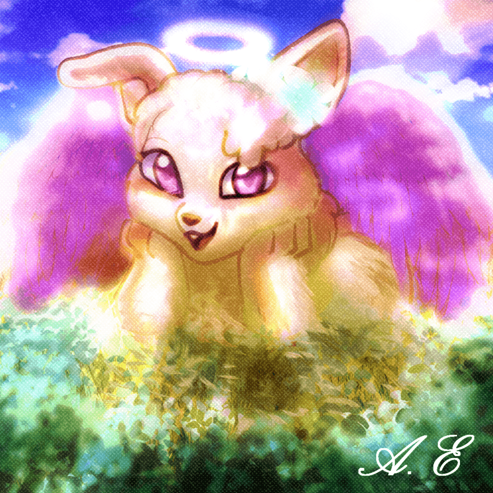
This video is a timelapse of my process =)
Step 01: What's the story?
For me, this is the most important step, even before defining reference lines or how the character will look.
Let's say you go out with your friends to a concert. You enjoyed the band, brought snacks and water, but had to eat in line so as not to lose the items after discovering that it was forbidden to bring anything in. You sang in line and ran to stay together and close to the stage. Just before the show starts, you decide to take a selfie together with the stage behind you, and in the middle of the photo, a guy who was super drunk and happy photobombed you, posing and smiling while accidentally spilling beer on one of your friends' shirts. But you decide to keep the photo because the show was about to start, and you needed to save your phone battery to get back to the hotel later. After returning from the concert, this will probably be one of the best memories you have! And why? Because the photo had a story, a reason to exist, and had natural and unpredictable elements that will always remind you of that random guy who was so tipsy but so happy that you all just had fun with the situation!
For me, character composition is like that! Think about what happened in that situation for the characters to be in that pose, with that angle, with those elements around them! In the end, the composition can also tell a story, making it even more interesting, as if we were taking a picture of them =D
Take some time to think about the story behind your photo/illustration; from there, it's easier to define the rest: type of characters (age, clothing, etc.), quantity, pose, angle, and style of drawing and painting.
Step 02: Give your art a KISS (Keep It Simple, Seriously)
It’s basically the same rule for making an animation (by the way, "KISS" is adapted from a book I’m studying specifically for animation, but I’ll carry it with me for life, and it applies here too).
If you’re like me, you’ll end up getting excited and wanting to do a million things—it's normal! In my original idea, I wanted to draw the couple at the counter while the older man served the children, but I also wanted to incorporate a scene with four people playing "truco" with various poses and different expressions! Can you imagine the headache of fitting in so many characters???
- "But why didn’t you try?"
Simple: with more than five characters, you need to be extra careful with the hierarchy of the composition. You would have to:
a) shrink the characters;
b) enlarge the scenario (still shrinking the characters); and
c) create millions of different perspectives.
————————————————————————————————————
a) In the first option, you lose the focus on the characters—they wouldn’t be the protagonists anymore, and a normal scenario with small characters would look bad depending on the intention...
b) In the second option, the focus would shift from the characters to the scenario too;
c) In the third option, you’d either go crazy or become the next genius of compositions (let's hope for the second option, but it's better to leave that idea on the back burner for now).
When you’re creating the composition of your group of characters, also consider their positions in the image.
For example, my primary focus is the girl with the beer cup, and from her, I created the perspective of the image, taking advantage of the hierarchy of each character's order. The closer they are to her, the more focus they receive. However, to avoid making the characters farther away seem dull, I added more movement to them in the image. This way, it creates the story of a neighborhood bar in Brazil, with children climbing and asking for candy while the young man admires the girl he's interested in, enjoying his weekend drink.
About the sense of 'flow' in the illustration: it's basically the combination of circular or arched movements (as they are associated with greater naturalness, something non-robotic) AND harmony between the characters.
For example:
* A character looking at another creates an invisible line, a path for the audience to follow next, helping them interpret or understand the relationship between the characters.
* The positioning of the characters forming arcs, triangles, continuous path perspectives, rule of thirds framing, or any other technique that ensures the characters aren't 'floating' or wandering without connection to the group in some way, as the intention is to form a cohesive group.
And when I say simple, consider the work as a whole. Keeping the background simple, blurred, with just colored shapes, or any other technique that directs most of the audience's attention to the group of characters is always welcome.
Step 03: Hierarchy among characters
Choose the character who will define the pose of the others, so your photo/illustration will have a well-defined focus, helping to guide the viewer's attention in your art. And just like your main character, the whole scenario will follow them, as your intention will be to direct the viewer's gaze to your photo/illustration.
From there, it’s basically about coloring and checking if everything is going in the direction you’d like, if the colors make sense with the story of your photo/illustration, if the poses look natural, and so on.
The positioning of your characters can also have any other dynamic or pose. For instance, if they were warriors from a tokusatsu show, you might choose a cliché image to work with and innovate with small characteristics of the composition based on your main character.
If you were imitating a boy band album cover, there would also be a certain pattern. And what is that pattern? Harmony with the focus of the image. It could be an arc to visually balance the image, perspective like in my main drawing, or use the logic of multiple planes viewed from the front, forming an unconscious background image, such as a triangle to show the central character is the main one, an ellipse to create fluidity with your image, and so on.
When we stop to think, the composition of an image follows some design principles (since you will direct the viewer's gaze) and animation principles (showing hierarchies and clarity in poses, as in theater, where the audience needs to understand the scene, unless the intention is to cause visual confusion—then the sky's the limit).
I hope you have a lot of fun in your next drawing!
See you next time =D
Users who liked this post


Comment