10 Tips for Character Animation
Check out the video version for more visual cues with narration:
Introduction
I’ve compiled 10 tips and tricks for character animation that I use daily. I’m a 2D animator currently working in the Japanese industry and Clip is the software I use for my job!
If you’re a beginner knowing these tips will facilitate things for you, and make animation more enjoyable. If you’ve animated before, you may find something new!
#1 Separate stills
Separate the character’s still parts from the moving parts.
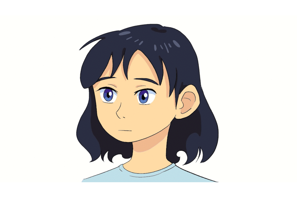
For example in a blink animation, the still drawing is the body and the animation is only the eyes. We can separate them by having two animation folders, one for the body and a second one above, for the eyes.
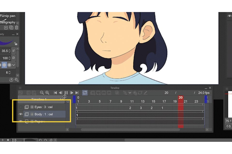
The still drawing could also be a regular folder with normal layers. However, sometimes it’s convenient for them to be animation folders with one cel. For example, you can move it along the timeline more easily, regular folders are harder to move. You can also jump between cels and layers more intuitively.
This separation is also common when a character is not moving and the wind moves the hair or clothes. Or in dialogues where the mouth or jaw is the only thing moving. But you could separate the character however you find convenient!
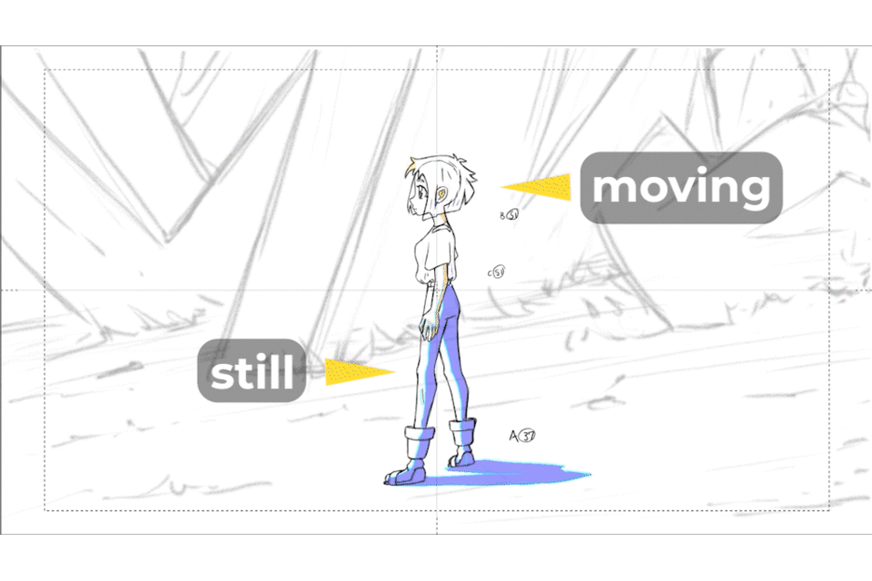
#2 Separate by timing
We not only separate the stills from the moving parts but also if they have a different timing with more drawings. In the following example, the body stops moving and the hair has additional bounces, because of the momentum of the action.
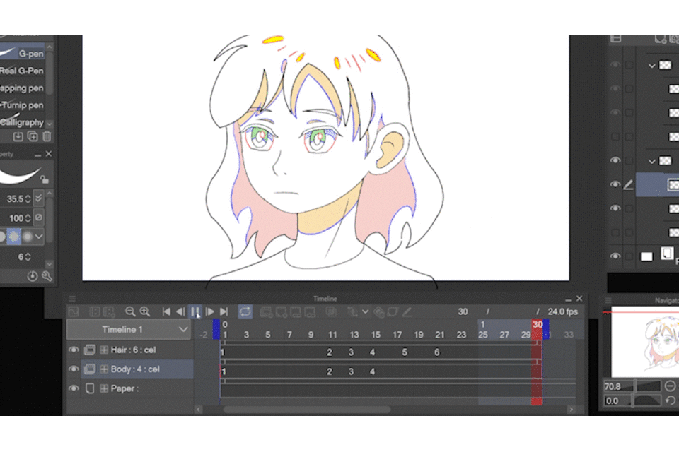
Again, the body is separated in the first animation folder, but this time it has cels with movement. The hair is in a separate folder above. This separation is also convenient while animating because the hair follows and moves according to the body, so I solved the body’s animation first and used it to know how to animate the hair.
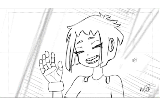
From here you can scale to more elaborate scenes. Just remember the rule of thumb: separate elements that have different timing.
#3 Use folders as cels
Instead of creating a new animation cel by clicking the button in the timeline, create a new folder over the layers panels.
The animation cels in the timeline can also be folders, this way you can have multiple layers within the same cel, or even multiple folders with more layers and make all the mess you need, in the timeline there’s only going to be that one cel looking clean.
This way you could work all the stages of your animation within the same animation folder. Or you could draw characters using several layers, maybe to try different poses, like with a normal illustration. Without using folders, we’re stuck to 1 single layer per cel, wasting the layers panel advantages.
Another amazing feature is that after creating a folder with its layers, the new cels will appear with all the layers, in the same arrangement and even with the same names as the previous cel.
Since that first folder was created through the layers panel, don’t forget to assign it to the timeline. Right-click on the first frame, and select the corresponding number that appears in the menu.
#4 Reassign cels
You can reassign cels, anytime you want along the timeline, this way you can reuse your drawings. For example, the blink animation only has 3 drawings but it’s reusing two of them to open the eye again. This is an example of a boomerang type of loop.
Reassign cels in the timeline to make a regular loop.

You don’t have to right-click the timeline and get to the menu every time, you can click the cel, press alt to duplicate, and drop it to another frame in the timeline. Or even select several cels, press alt, and reassign them by dropping them in other frames.
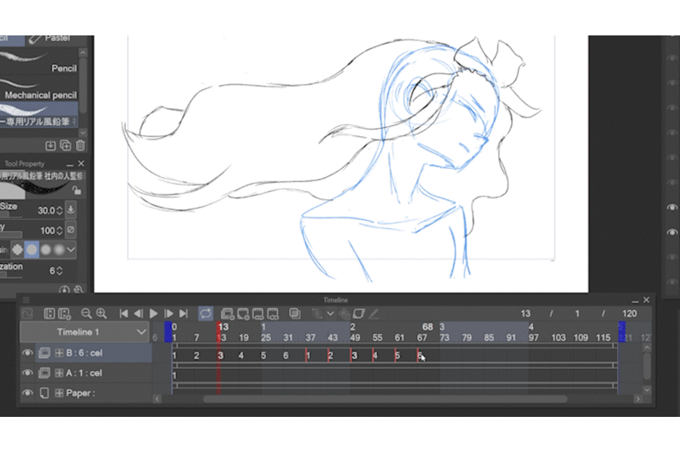
Just be careful with moving cels because you could overwrite by mistake. Don’t worry, they are still in the layers panel, but you may lose track of their position in the timeline.
This is not only useful for loops, animation has lots of situations where you would want to reuse a drawing. Take into account that all cels with the same number are the same, so any change you make to one of them will happen to the rest.
So what if you want to reuse a drawing and be able to make changes to that particular cel?
#5 Copy-paste cels
We can reuse a drawing and be able to make changes to it with the good old copy-paste.
Select the cel you want, and you can use the shortcuts ctrl-c to copy, and ctrl-v to paste.
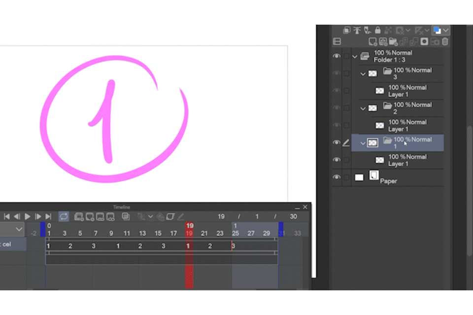
The copy won’t show up in the timeline, but it’s in the layers panel, so just assign it.

And now we have an independent copy, any change we make, won’t affect the original!
By the way, adding cels between consecutive numbers creates weird naming (like 1a, or layer 1) because cels names have to be unique. You can rename them by right-clicking in the animation folder>edit track>rename in timeline order.
Going back to tips number 1 and 2: Sometimes is easier to start drawing the character together, or maybe you realize later that you better separate the character in parts…
You can also select a part of your drawing to copy and paste to another cel.
This tip is not only for reusing drawings but to reorganize them however is best for your animation!
#6 Onion skin visibility hack
The onion skin is a very common tool for animation. In the settings, (animation>show animation cels>onion skin settings), you can modify the number of previous and next visible cels.
I almost always have only 1 cel visible. Whichever the case sometimes I want to reduce the number of visible drawings. And maybe I’m concentrating, animating fast, so it’s kind of a drag to go to the settings and modify the number, especially because I have to return to the menu to change it back.
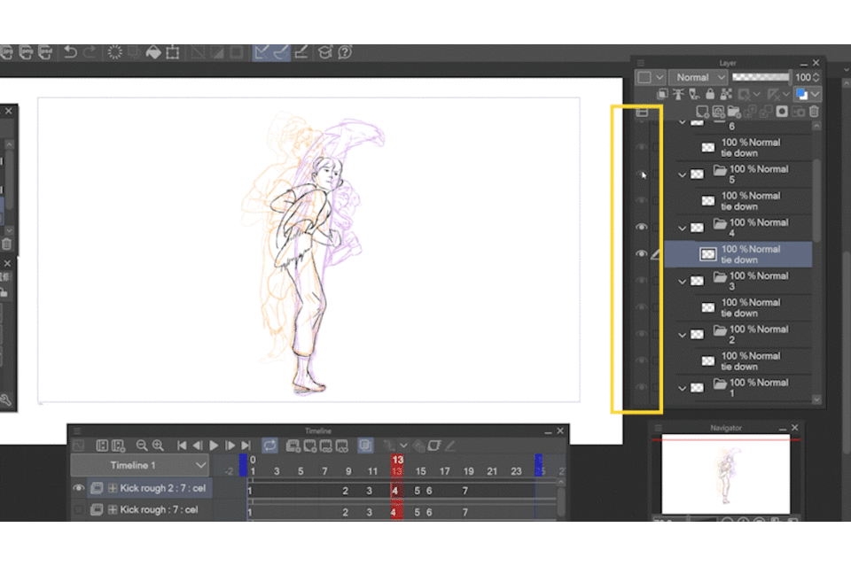
So what I like to do is turn off the visibility in the layers panel, the onion skin’s visibility is affected as well. It’s a quick way to change which and how many cels you see without going all the way to the settings menu.
#7 “Flip” drawings with shortcuts
The onion skin is cool but sometimes it gets in the way, and the best way to visualize the animation’s flow is “flipping” the pages.
To do that digitally I sometimes scrub the timeline, moving the playhead back and forth.
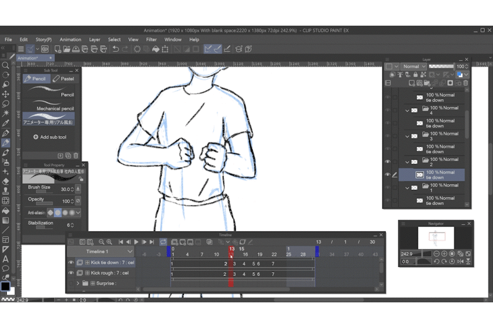
But since I’m using the pen to do this I cannot draw at the same time. So I also have shortcuts. I use the number pad, numbers 1 and 3, to jump between previous and next cels. This way, I can draw while “flipping” from one cel to the next.
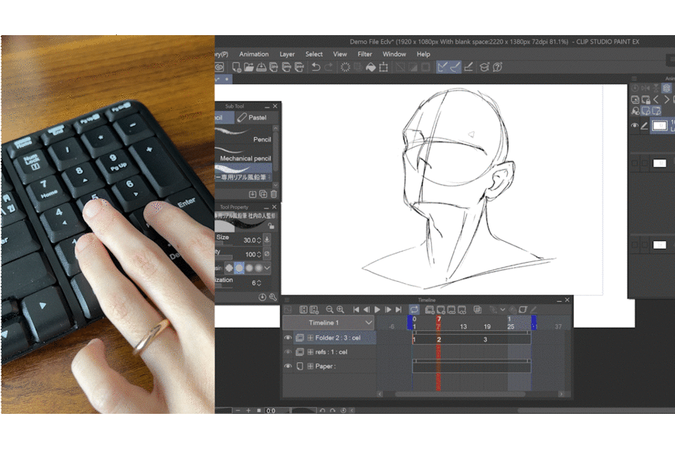
I also use 4 and 6 to move to previous and next frames, number 7 to create a new cel, and number 9 to play and stop the playback. In keyboards that don’t have a number pad, I rewrite shortcuts that I do not use.
#8 Light table
The onion skin and flipping the pages are useful, but sometimes we need something more powerful: the light table.
In short, it’s like a more powerful onion skin: it allows us to use any layer as a reference, with the possibility to move it around, rotate, and scale it, without affecting the original layer!
On the window menu, there is a panel called animation cels. In this panel, we enable the light table with this button, and I also toggle on the cel-specific light table and the general light table:
You must have three sections, they may be collapsed down, so bring them up.
The first section is the actual layer where we draw and edit. If you add a new layer in the layers panel, it will also appear in this section. So it is a reflection of the layer panel.
The second section is the cel’s light table, and to use it you can grab and drop any layer from the layers panel.
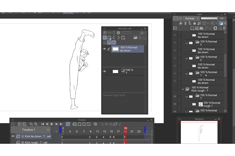
You can change its color, the same color modes are available. You can move it and rotate it. You can even add more layers if you want.
The third section is the general light table, as the name suggests, whatever we put here will be available across all cels. You could add the character sheet or any reference that you’d like to see all the time.
You can also use the general light-table to move layers around. For example, if you want to use the cel-specific layers for another cel: you can drop them in the general light table, move to the cel you want, and drop them back to the cel’s individual light table.
Another very cool use of this is that sometimes the layers panel has a lot of folders and layers, maybe with the same names, and it’s hard to look for what we need.
So, we can use the timeline to go to the cel we want to use as reference, grab it from the editing section (remember that it’s like the layers panel), drop it in the general light table, move to the cel we’re working on and drop it in the individual light table.
#9 Colored rough passes
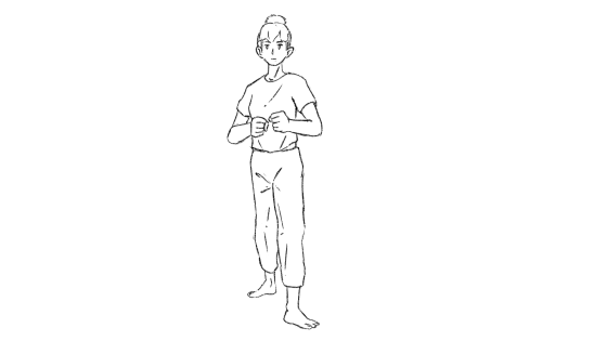
In general, but especially for full-body animation the recommendation is to start with stick figures, or in fancier words, the gesture drawing. This helps us focus on the idea, the energy, and solve the movement first without worrying about the character design.
The gesture drawing is also useful as a planning stage. Here we can decide if we are going to divide the character, how many layers will we need, and how to arrange them.
The gesture pass for the kick animation looked like this:
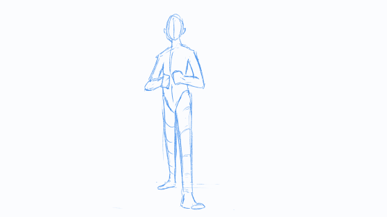
For the gesture drawing, I like to apply the “change layer color” filter; I particularly love the default blue color. I even call this first animation pass “blue pass.”
You can use “change layer color” to distinguish your rough animation passes, especially if you end up with several rounds.
You can apply it to each layer, to the cel’s folder, or to the whole animation folder.
Reducing the opacity works, but sometimes it’s convenient to have a bigger contrast particularly when doing the tie-down pass or clean pass.
#10 Tie-down with vector layers
Speaking of tie-down. Whether you’re working on a crew or working all the processes solo, there are stages of tidying up and cleaning the drawings. It may not be the final lineart (particularly if there are clean-up artists in the project), but I still recommend using vector layers to tie down your animation.
The animation is already done, so for this process, you don’t need to draw fast and freely. Instead, you need precision and meticulousness, drawing freehand may strain your arm. Instead of making a line and undoing infinitely, what vector layers offer is the possibility to edit your lines.
You can draw lines using the figure tool, my favorite is the bezier curve sub-tool. And because it’s a vector layer, I can use the sub-tools available in the correct-line tool to change and fix them. Maybe with the control point sub-tool to move the points, or maybe with the pinch line sub-tool.
You can also draw free-hand, even with your preferred brush. And because this is a vector layer, you can use the pinch sub-tool to move it. However, the control point sub-tool may have a problem because free-hand lines have tons of points.
But we can use the simplify vector line sub-tool, go over the line one time, and this will reduce the points to the necessary, making the line movable.
There is also the amazing vector eraser. You can draw your lines intuitively, not worrying about where they have to end, because with vectors, the software detects where two points cross, and just a simple stroke of the vector eraser, deletes the leftover lines automatically.
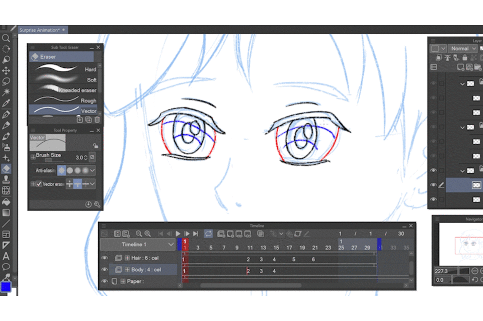
I invite you to explore their possibilities, vector layers are a game changer!
Closing thoughts
Those were the 10 tips I had prepared. Did you find something useful?
Character animation may seem overwhelming, but I believe that knowing the software makes it easier. We have tons of tools at out disposal, so better use them!


Comentario