Elevate Your Drawings With the Right Perspective
Welcome, I’m lilyxxssi! If you’ve ever wanted to make your drawings pop with depth and look more realistic, understanding perspective is a game changer. It might sound a bit technical at first, but don’t worry! By the end of this guide, you’ll know the basics of perspective and how to use it to bring your favorite spaces or scenes to life. Let’s dive in!
a. What is Perspective?
Think of perspective as your magic tool to turn a flat drawing into something that feels like you can walk right into it. It’s the technique that makes things look like they’re closer or farther away, just like how your eyes see the real world. Imagine standing on a road and seeing it narrow as it stretches into the distance—that’s perspective at work!
Parts of Perspective (And How They Help Your Drawing)
· Horizon Line (Eye Level)
The horizon line is your view of the world. If you’re standing, it’s at your eye level. If you’re lying down, it’s much lower. This line divides the sky from the ground and is key in determining where things start to vanish as they get farther from you.
The horizon line represents the viewer's eye level and significantly impacts how a scene is perceived. Placing it in the middle creates a balanced view, while a high horizon line suggests an elevated perspective, showing more ground detail. Conversely, a low horizon line gives a sense of looking up, making objects appear taller and more imposing.
· Vanishing Point(s)
Imagine all the parallel lines around you (the edges of a road, train tracks, or long hallways) meeting at a point far off in the distance. That’s the vanishing point. It’s where everything seems to disappear, and it’s what helps make your drawing look like it’s going off into the distance.
When vanishing points are closer together, you create a more intense, dynamic, and sometimes distorted scene. It’s a great way to add drama or a surreal touch, but for more realistic or balanced drawings, it’s better to keep them farther apart for a more natural look.
· Orthogonal (Converging) Lines
These are the lines that lead your eyes right to the vanishing point. You can think of them like invisible strings pulling everything into the distance.
When drawing things like roads or walls, use these lines to make sure they’re all going in the right direction, making your space feel deep and real.
· Transversal Lines
These lines are the opposite of the orthogonal lines—they’re horizontal or vertical and help keep your objects in proportion as they shrink into the distance. They keep things from getting too squished or stretched.
Think of transversal lines as the "safety nets" for your drawing. They make sure everything stays the right size as it moves farther away.
b. Types of Perspective and When to Choose Them
Choosing the right perspective for your artwork can make a big difference in how your scene feels and tells its story. Whether you're aiming for a calm, intimate setting or a dynamic, action-packed scene, understanding perspective will help bring your vision to life. This part will show you when and how to use each perspective. By considering factors like mood, focus, and space, you'll be able to select the perfect perspective to enhance depth, realism, and storytelling in your drawings!
· One-Point Perspective
One-point perspective is a fantastic way to create depth in your drawings using just a single vanishing point on the horizon line. All the orthogonal lines in your scene will converge towards this point, making it perfect for capturing views where you’re looking straight at an object, like a hallway or a long road. This perspective gives your artwork a straightforward and stable feel, helping viewers easily understand the spatial relationships in your scene.
Mood
Creates a calm, ordered mood. Ideal for quiet, intimate scenes like a cozy room or workspace.
Focus
Directs attention to a single, central object. Use when you have a clear focal point, like a door or desk.
Space Type
Works best for narrow, enclosed spaces like hallways or corridors, giving a tunnel-like depth.
Storytelling Direction
Ideal for narratives with a clear direction or journey, focusing the viewer’s attention on a single point.
· Two-Point Perspective
Two-point perspective adds a bit more dynamism to your artwork by using two vanishing points on the horizon line. This approach is great for illustrating scenes from an angle, like the corner of a building or a room where you can see two sides. As you draw, the orthogonal lines will diverge towards both vanishing points, creating a sense of depth and complexity. It makes your composition more engaging and visually interesting.
Mood
Dynamic and engaging. Great for lively, complex scenes such as a busy street or angled room interior.
Focus
Multiple objects in a dynamic space. Ideal for showing different elements without skewing focus.
Space Type
Best for wider rooms or outdoor scenes, like large interiors or plazas, showing breadth and object angles.
Storytelling Direction
For stories with movement or interaction between objects, creating dynamic relationships within the scene.
· Three-Point Perspective
If you want to take your perspective skills to the next level, three-point perspective is your go-to technique! This method uses three vanishing points—two on the horizon line and one either above or below. It’s perfect for capturing extreme angles, like looking up at a skyscraper or down from a bird’s-eye view. The result is a dramatic emphasis on height or depth, making your scenes feel expansive and awe-inspiring.
Mood
Dramatic or intense. Perfect for scenes that feel towering or overwhelming, like skyscrapers or cliffs.
Focus
Exaggerates height or depth. Use for showing tall structures or looking up/down at objects.
Space Type
Ideal for tall or complex spaces, such as skyscrapers or cliffs, emphasizing scale and magnitude.
Storytelling Direction
Suited for stories involving height, danger, or scale, adding tension and verticality to the scene.
· Curvilinear (Fish-eye) Perspective
Curvilinear perspective offers a unique and dynamic approach to capturing a scene by using a curved horizon line and multiple vanishing points. This method creates a captivating fish-eye effect, making it perfect for stylized artwork or wide scenes that require a sense of curvature and distortion.
Amount of Scene to Show
Great for showing a wide-angle view, often with a surreal or exaggerated effect, suited for fantasy or action.
c. How to Use Clip Studio Paint's Perspective Ruler
· Setting Up the Perspective Ruler
In Clip Studio Paint (CSP), you can set up perspective in two main ways: through the Layer Window and by using the Ruler Tool from the Tools Palette. Each method offers unique advantages depending on your workflow and how you prefer to set up guides for accurate perspective.
Using the Layer Window
Adding a Perspective Ruler Layer: You can add a perspective ruler directly from the Layer Window by selecting Layer > Ruler/Frame > Create Perspective Ruler. This method allows you to create a dedicated layer for the perspective ruler, which is separate from your artwork layers. You can choose between 1-point, 2-point, or 3-point perspective options, and customize the vanishing points and horizon line right within the Layer Window settings.
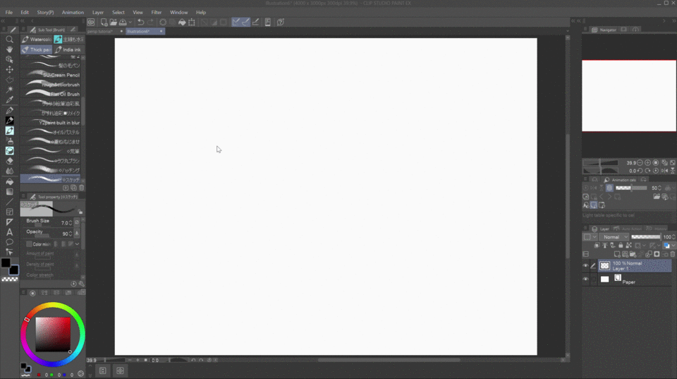
This approach is ideal if you want your perspective rulers organized on a single layer and prefer to keep your ruler adjustments separate from the drawing layer. This makes it easier to toggle the rulers on and off and adjust the perspective guides independently without affecting your artwork.
Using the Ruler Tool from the Tools Palette
Directly Drawing Perspective Rulers: You can access the Ruler Tool in the Tools Palette and select the Perspective Ruler option. Here, you manually place vanishing points on the canvas and draw your perspective lines according to your scene’s needs. This method provides more hands-on control over the setup, as you can freely position each vanishing point and horizon line on the canvas.
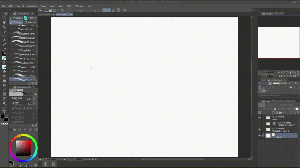
Using the Ruler Tool is excellent for custom or irregular perspectives since you can draw the guides where you want them. It’s also useful for quick adjustments if you need to change the perspective on the fly, as the vanishing points and ruler lines can be manipulated directly on the canvas.
· Adjusting and Moving the Horizon Line and Vanishing Points
In Clip Studio Paint (CSP), adjusting and moving the horizon line and vanishing points is straightforward, whether you're working in 1-, 2-, or 3-point perspective. Here’s how to do it:
Selecting the Perspective Ruler
First, make sure your Perspective Ruler Layer is active by clicking on it in the Layer Window. This ensures that any adjustments you make will apply to the perspective rulers.
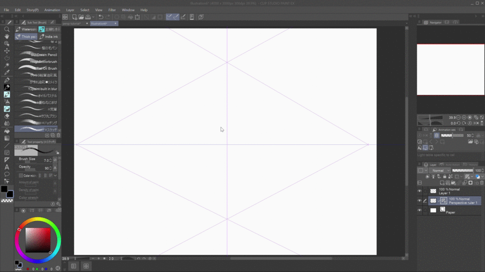
Use the Object Tool (shortcut O), which lets you interact with and manipulate the perspective ruler directly on the canvas.
The above image shows all the essential functions available when you click on the ruler with the Object Tool (shortcut O). Each handle or node serves a specific purpose, designed to make setting up your preferred perspective easier.
Moving the Horizon Line
With the Object Tool selected, click on the horizon line (the main line that runs horizontally through the perspective ruler). You can then drag the horizon line up or down to adjust the level of the viewer’s eye in the scene.
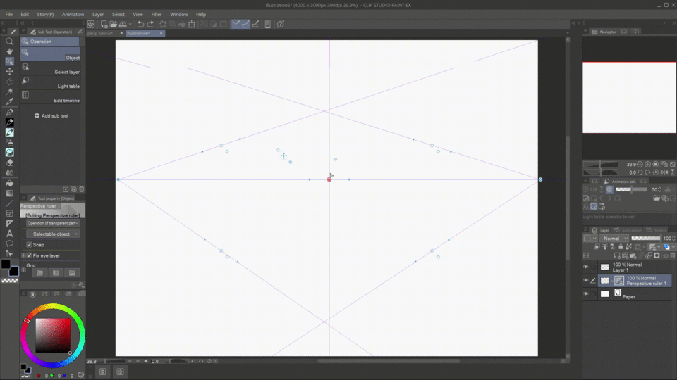
Additionally, you can tilt the perspective ruler using the two small blue nodes beside the main handle of the horizon line, adding a dynamic angle to your drawing.
Adjusting Vanishing Points
The larger blue nodes on the horizon line represent the vanishing points. Selecting the ‘Fix Eye Level’ option ensures these points move strictly along the horizon line. To adjust the perspective, simply click on a vanishing point node and drag it left or right along the horizon.
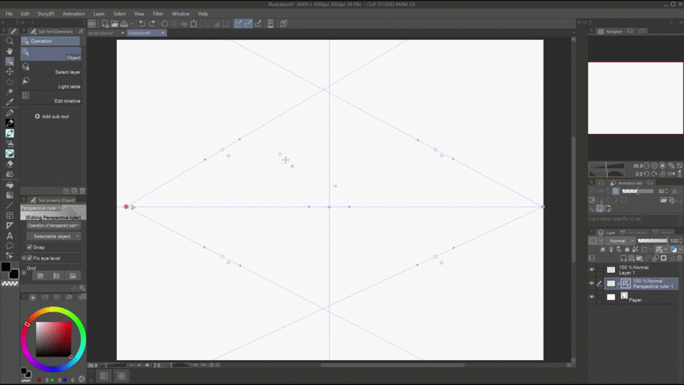
Similarly, the handle on the guide (or orthogonal) lines functions much like that of the horizon line. The main difference lies in the blue nodes on the guide lines, which allow you to adjust the position of the vanishing points—especially useful when the vanishing points are located outside the canvas area.
· Snap to Ruler
After setting up your perspective ruler, you're ready to start drawing. However, make sure that Snap to Special Ruler is turned on. This setting ensures that your lines automatically align with the perspective guides, following the vanishing points and horizon line you've set up.
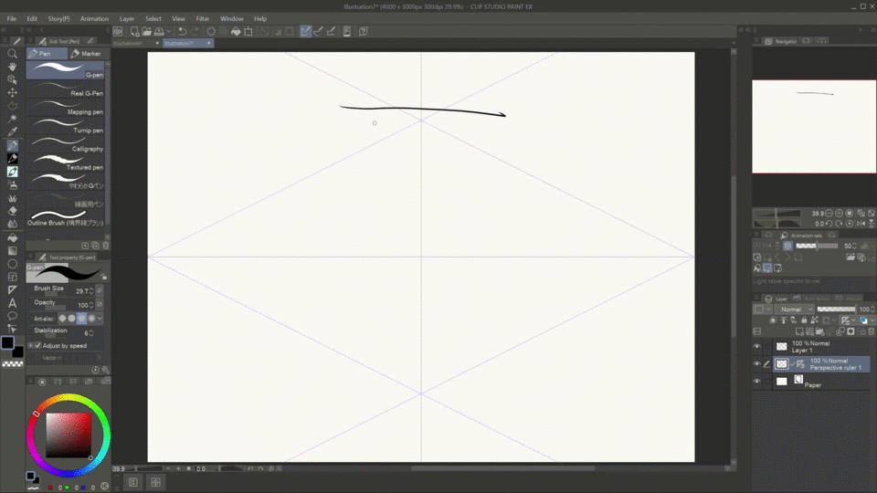
To enable it, go to View > Snap to Special Ruler or select it directly from the Command Bar. With snapping enabled, your strokes will follow the perspective accurately, making it easy to maintain consistent depth and angles as you draw.
· Adding Perspective Grids for Guidance
Perspective grids in Clip Studio Paint act as visual guides, helping you maintain accurate depth, angles, and proportions in your work. To set up the grid:
Select the Object Tool (shortcut O). Click on the Perspective Ruler to activate it. In the Tool Property window, you’ll find an option to Enable Grid—check this box to display the perspective grid on your canvas.
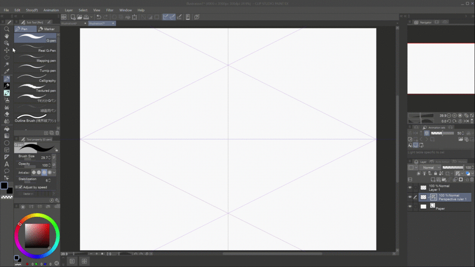
You can activate the grid on different planes or enable all of them at once. Additionally, you can adjust the grid size to suit your preferences, enhancing your ability to maintain accurate perspective in your artwork.
Grids are especially useful when drawing architectural scenes, interiors, or landscapes, as they help maintain accurate alignment, depth, and proportions of structures and elements. They guide the placement of walls, windows, and furniture in relation to one another, making it easier to create cohesive and believable environments.
· Snapping Figure Tools to Perspective
Lastly, another helpful feature is the snapping of figure tools to the perspective ruler. This functionality allows you to create characters or objects that automatically align with your established perspective, enhancing the overall cohesion of your artwork.
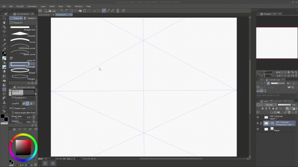
Simply select the Figure Tool from the Tools Palette, ensuring that Snap to Special Ruler is enabled. As you draw your figure or object, it will automatically align with the lines of the perspective ruler, maintaining correct alignment and depth throughout your artwork.
d. Application and Drawing Process
Now that we’ve covered the basics of perspective, including the best types to apply for different situations and how to use perspective rulers, we can move on to practical applications!
For this tutorial, I’m going to choose my favorite space: surprise, surprise, the bedroom! This intimate and personal setting provides an excellent canvas to apply the principles of perspective and create a cozy atmosphere. I’ll definitely make some tweaks to ensure it reflects my ideal cozy space, adding elements that enhance comfort and warmth.
· Choosing the Right Perspective
In the second part of this tutorial, we learned that different situations call for specific perspectives that best suit them. In my case, I’ve chosen a bedroom, which I find to be an intimate and cozy space. While we could use various types of perspective to illustrate it, narrowing it down to one-point perspective will help us create a clear focal point and effectively express the warmth and comfort of the room in our drawings.
In a bedroom setting, the window often serves as a focal point, drawing the viewer's eye. Whether I'm lying down or simply relaxing, a well-framed window with a beautiful view can evoke a sense of tranquility and connection to the outside world.
By positioning the window prominently within the composition, I can emphasize its role as a source of natural light and inspiration.
In this way, the window becomes more than just a functional element; it transforms into a vital part of the emotional experience of the space, inviting the viewer to imagine themselves in that serene environment.
· Creating the Sketch
In this part, we’ll focus on arranging the setup of the bedroom. With one-point perspective, it’s much easier to position the window as the focal point since you can directly align it with the vanishing point.
For my sketch, I typically start by drawing without the perspective ruler. I find this approach allows me to arrange the different elements more freely and intuitively. By focusing on the overall composition first, I can better visualize how the various components will interact in the space. Once I have a solid layout, I can then incorporate the perspective ruler to refine the angles and ensure everything aligns correctly.
The key is to start with a general idea of where to place your horizon line, as this will make aligning the perspective ruler much easier later on.
· Using the Perspective Ruler, Grid, and Figure Tools
Perspective Ruler
Once the rough sketch is complete, the next step is to place the perspective ruler on the canvas. This will allow you to refine the lines, creating a cleaner and more readable illustration. The perspective ruler helps ensure accuracy in alignment and depth, setting up a solid foundation for the coloring and rendering stages.
A quick tip to avoid confusing the lines in perspective is to remember that objects positioned above the horizon line will display their lower portions, while those below the horizon line will show their top portions.
Grid
I primarily use the grid for elements that require even spacing, such as floor tiles. This approach ensures consistent proportions and alignment, making it easier to achieve a polished and organized look, especially in areas where precision is essential.
Figure Tools
For elements that aren't too detailed or that don't involve straight lines or abstract shapes, I use the Figure Tool to quickly create them. This tool allows for efficient and accurate rendering of simpler forms.
Clean Sketch
· Coloring and Details
Since this tutorial focuses on using the perspective ruler, we’ll gloss over the coloring process (base colors, lights and shadows, details and paint over) and move directly to adding details that enhance the perspective.
Material/Brush Assets
Just like the Figure Tool, most material and brush assets in Clip Studio Paint also snap to the perspective ruler. However, to achieve accurate angles and depth, they often require additional adjustments. Adding subtle tweaks to the brush strokes or rotating materials to align with the perspective can ensure that these elements fit naturally within the scene, enhancing realism and cohesion.
These are just a few of the assets I used when creating the bedroom perspective. Clip Studio offers a wide variety of downloadable assets that you can explore and choose from on Clip Studio Assets, allowing you to customize your scene with additional details and textures. The range of options can help bring your space to life and tailor it to your personal vision:
Free Transform
While not directly related to the perspective ruler, the Free Transform tool in Clip Studio Paint is helpful for adjusting elements to fit within a perspective setup. For maximum accuracy, it’s best used when transforming elements that have an existing guide to transform into like what is shown above.
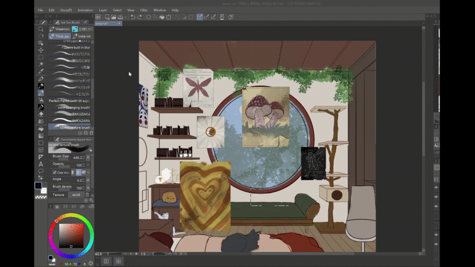
There are two ways to access the Free Transform tool:
Edit Menu
First, select the area you want to transform with the Selection Tool, either rectangular or lasso. Then, go to the Edit menu, select Transform, and choose Free Transform. A transform box will appear around your selection, allowing you to scale by dragging any corner or side handle, rotate by moving the cursor just outside a corner (it will turn into a curved arrow), and even skew or distort by holding Ctrl while dragging a corner handle. Once you’re satisfied with the changes, press Enter to apply them.
Using the Keyboard shortcut
To transform an object in Clip Studio Paint, use the shortcut Ctrl+T. This opens a transformation box around your selected object and a pop-up window with different options. Click on the Transform symbol. In the Tool Properties panel, choose Free Transform to freely scale, rotate, or skew the object. This flexibility allows you to perfectly position and adjust your object within your artwork.
Free Transform is ideal for making adjustments to fit perspective or composition needs in a scene. For more complex modifications, such as adding perspective to flat shapes, you can use Mesh Transformation under the same Transform menu
Conclusion
And that's a wrap for this tutorial! The output could use some polishing, but my goal here was to show you the basics of perspective and how to use the perspective ruler effectively. I hope this guide helps you feel more confident tackling perspective in your own illustrations—now it's your turn to experiment and bring your spaces to life!


Commentaire