How to PAINT SKIES [Video Tutorial + Tips]
INTRODUCTION
Hello everyone !! It's been a while and I hope everyone is doing great :)
I really wanted to hop on this monthly challenge as it included one of my favorite things to draw and that is skies. I love drawing whimsical night scenes, clouds, and stars so this was a perfect opportunity for me to share my knowledge on this topic.
In this tutorial I'll be talking about the science behind sky gradients and clouds, then move on to the techniques regarding painting skies. I also included short tutorials on other sky elements like galaxies and auroras.
The video tutorial includes all the painting videos and also a bonus speed-paint where I apply all the tips and tricks I mention and talk about the entire process.
Hope you all like it and benefit from it. :)
UNDERSTANDING SKIES AND IT'S COLORS
To start off we need to understand how color works when it comes to the sky. Even though this is a little sciency, it's really worth understanding these details as it also helps a lot with understanding color.
If you look at the sky, you'll notice that the color of the sky looks different around the clock, ranging from beautiful pink skies, clear blues, to bright red sunsets.
Here's an example of some sky gradients at each time of day.
This is due to the phenomenon called RAYLEIGH SCATTERING.
When sunlight travels through the sky, it passes through tiny molecules, evaporated water, gas and other particles in the air. These particles both refract and reflect the light, causing it to scatter, and colors along with it. The longer sunlight travels through the sky, the more color it loses.
Firstly the sky is not blue. It's colorless and sort of transparent, with tiny molecules and atmospheric particles suspended in it.
Secondly, sunlight might look like its yellow, but in reality it's white, and a range of colors, from violet at the blue end of the spectrum, all the way to red at the other end. Violet has the shortest wavelength and red has the longest wavelength.
Since blue has a short wavelength, the blue colored light is scattered more effectively than other colors, making the sky normally appear blue to our eyes.
At the time of sunrise or sunset, sunlight travels a much longer distance. This means that the blue light is scattered away along its path allowing the red colored light, having the longest wavelength, to easily pass through and reach our eyes. This creates a red - pinkish sky.
SKIES AT DIFFERENT TIMES OF DAY
Here's an illustration I made showing the different times of day.
The red line represents the horizon. It's the viewer's eye level or a boundary separating the sky and land.
DAWN - Right now the sun is below the horizon and this time is called the twilight stage. Twilight before a sunrise is called dawn and twilight after a sunset is called dusk.
During this time, the sky often appears pinkish. This is because the sun is below the horizon and the sunlight is travelling a much longer distance, causing all the blue light to scatter away, leaving us with red, but as I said before the longer sunlight travels the more color it loses, this is why instead of a bright red color we get to see a dull pinkish color.
SUNRISE - During sunrise, the sun is closer to the horizon compared to dusk, the blue light is still being scattered away, leaving us with the red colored light coming through, but since at this time there are other factors like fog and the air is much cooler it causes more of the blue colored light to bounce off everything and reach our eyes. This is why a sunrise can appear cooler and bluish to our eyes.
MORNING - The morning sky is a softer blue due to the cooler air and the sun now being above the horizon. Sunlight travels a shorter distance causing the blue light to scatter all over the sky giving us our typical blue color during the day.
AFTERNOON - The afternoon sky appears a more crisp and darker blue, due to the sun being at the highest point in the sky, allowing sunlight to pass through the least amount of distance and atmosphere, giving us bright and crisp blue skies.
SUNSET - A sunset has the same concept as a sunrise, but sunsets appear much redder to us because the atmosphere has been warming up all day, so it now has more water vapor and dust particles, so when the red light is passing through the atmosphere to scatter much more drammatically due to the presence of all these particles compared to a sunrise. This is also why we can get intense red sunsets after volcanic eruptions.
DUSK - The time of dusk follows a similar theme to dawn but the added factors of a sunset making the sky look more saturated and warm toned.
NIGHT - At night the sky turns dark blue because it's now being illuminated by the moon.
UNDERSTANDING CLOUDS
Clouds are basically just water droplets or ice crystals stuck together floating away in the sky.
Clouds are not ACTUALLY white but mostly appear white against a blue sky. This is because when white light hits a cloud, it reflects and bounces off equally due to all the water droplets and ice, and when white light is bounced back we get back white.
This is also why clouds can change color depending on the time of day.
There are also different types of clouds that have their own scientific names but we wont be focusing on them in detail this time :)
Now that were done with the science, let's move to the artsy stuff.
Drawing clouds is really easy, but you have to keep in mind a few things before painting clouds that look good.
1. PERSPECTIVE - Are you viewing the sky directly from underneath? or at an angle? or from up above like in the case of flying.
Considering your perspective, the clouds closer to your view appear larger and gradually shrink away as you move towards the vanishing point at the horizon.
2. SHAPE OF CLOUDS - Clouds come in all sorts of shapes and sizes. Fluffy clouds, wispy clouds, puffy clouds,flat clouds, and whatnot. Also when it comes to art, there can even be different styles of clouds depending on the artist :)
They're 3D objects and painting them as such instead of plain 2D clouds makes them blend along with all other 3D shapes around us.
3. DIRECTION OF LIGHT - This depends on position of our light source, the direction of it, and where it hits the strongest. During a sunset the clouds are illuminated from below and if it's morning or afternoon they're illuminated from above.
4. SHADOWS - When there is light hitting an object there's also a shadow it casts. Shadows depend on the direction of light and shapes of clouds. Since clouds are 3D objects, clumps of clouds in front cast shadows on clumps of clouds behind them. That's how you know where to draw the shadows and where to draw the light.
5. TIME OF DAY - Clouds usually reflect whatever color the sky is. Combining it with the theory of light and shadows, you now have clouds with a range of different colors.
PAINTING TECHNIQUES
When your'e painting skies, its not just one plain color, it's usually a gradient of colors.
You can get this gradient effect by either using the gradient tool or painting it freehand and blending it with a blend tool. The [GOUACHE] brush blends the color on the canvas as we paint just like how a real paintbrush would.
Start off by sketching a basic concept of where the clouds are. When you have the the base sketch down, you can then move on to defining the clouds.
I usually use a brush that blends as I paint (like the gouache brush) and do circular motions to get that "fluffy" effect. You can also use specific cloud brushes that you can download for free from Clip Studio Assets. I'll link all the brushes that I use and recommend them at the end of this tutorial.
Drawing clouds on separate layers helps if that's what your'e comfortable with, but since clouds have these really irregular shapes we have lots of freedom while painting and not much to worry about as long as everything is within perspective.
[TIP] - Avoid using pure white or pure black as clouds are always reflecting some type of colored light. It usually corresponds to a more diffused version of color from the light source
[TIP] - When it comes to painting anything, never be afraid of using references. By using references you won't waste a lot of time trying to get everything right. The more references you use, the better you will get at painting, since you are basically doing a study.
Here's a study I did of a variety of clouds at different times of day. You can watch the time lapse of this in the video I linked above :)
MORNING - This is just a regular morning sky with soft and fluffy clouds.
SUNSET - The shadows of clouds here have a more purplish tint cause of the darker blue of the clouds mixing with red being reflected from the sunlight. As this is a sunset, the clouds are being lit from below giving them red and orange highlights.
SUNRISE - This is just a regular sunrise sky. The clouds are being lit from below but the gradient is now a bright yellow - bright blue.
NIGHT - Here the sky is a gradient of purple-dark blue with the clouds being a much darker blue. They are dimly lit from above by a lighter blue, since that's supposed to be the moonlight.
DAWN - The sky here is pinkish-purple and the clouds are being illuminated from the bottom, giving them a dull orange glow.
AFTERNOON - These are just some wispy clouds. These clouds are really easy to paint since you just use a lighter blue and blend as you like.
[TIP] - I'm using the [Finger Tip] blender since its like a smudger and gives a really beautiful effect of the clouds being swept away by the wind. I really love this tool and use it a lot when drawing clouds.
PAINTING A STARRY NIGHT SKY WITH GALAXY
For this tutorial I'll be showing you two styles of galaxies. When applying these tips and tricks you can create beautiful galaxies for your paintings be it in fantasy style or realistic style.
Start off with a saturated dark blue sky. I just painted some hills and used the default [Trees] brushes in the [Decoration] sub-tool.
For our galaxy, we need to get that swirly bleeding effect a galaxy in the sky usually has, so I'm using the [Running watercolor] brush from the default watercolor set.
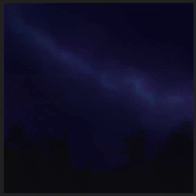
I used a bright saturated blue for this and laid out the initial position of where I want my galaxy to be in the sky.
I blend away using the default brushes [Blend] from the blending sub-tool and the [Wet Bleed Blender] from watercolor for that swirly fluid-like effect.
I repeat this a few more times with bright blues and bright purples to get that cool glowy - swirly effect. Just keep repeating this step till you are happy with how the galaxy looks.
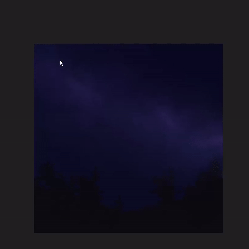
[TIP] - If you want your layer to look more bright and glowy without painting over it, just copy and paste the same layer on top. They will combine and look much brighter and glowy. This effect multiples along with more layers you stack on top. You can then play with the opacity and layer modes to achieve your desired effect.
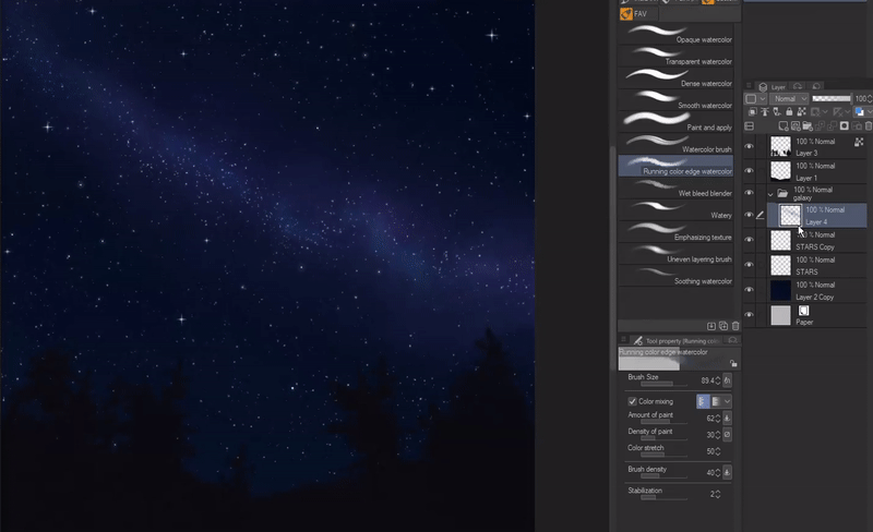
For adding stars, I used a default brush called [Droplets] from the [Airbrush] sub-tool. You can use this brush for stars, snow and other effects when played with it's different tool properties.
I added more stars in the center of the galaxy since that's what a galaxy looks like.
[TIP] - Copy and paste your star layer for brighter stars.
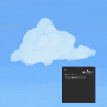
To give the stars a faded glow around them, I used this really amazing feature clip studio paint has called [Border effect] in the layer property panel. The [Edge] effect gives your entire layer a solid border of any color around it, whereas the [Watercolor edge] gives your layer a diffused border of your layer color around it. When using this for stars, it gives a really beautiful glow effect when you experiment with the settings.
This is how the first style of galaxy looks like when finished :)
Now you can leave this as is, but usually our Milky Way galaxy looks more like its split into two from the center. This is gonna be our second style.
Instead of using the eraser tool to get this effect, simply use the same [Running watercolor Edge] tool to draw through the center, but this time using the transparency button under the two color boxes. You toggle between these by pressing [C]. When you activate this, any brush your'e using will act like an eraser but with your brush settings. This can be really helpful if your'e looking for a specific texture when erasing something.
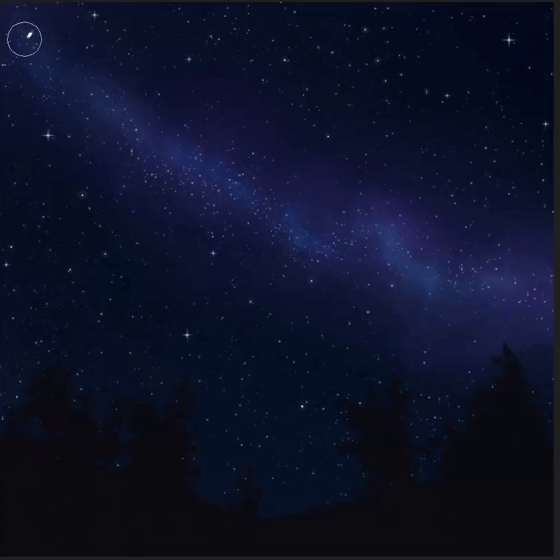
Once I'm happy with how it looks, I define it by blending away the edges and making it look swirly and flowy and following with some added highlights to the edges for the glow.
[TIP] - I use the [Highlight] brush from the [Airbrush] sub-tool to add more glow to parts of the galaxy. I used darker colors as they appear more saturated when used with this brush.
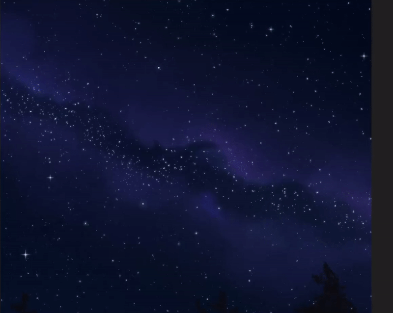
And that's our beautiful galaxy sky :)
PAINTING THE AURORAS
Next I'm gonna show you how to paint the stunning Auroras in, yes again - TWO STYLES.
Auroras are best seen at night and mostly consist of bright neon colors like green, blue, pinks and sometimes red.
To draw the auroras, we need to, yet again, consider the perspectives. Auroras are wavy in nature and when viewed at an angle from below they look like they're blending away towards the atmosphere.
The sky also often appears to have a greenish tint since its now being dimly illuminated by the auroras.
So to start off, I'm picking a saturated cyan color and drawing some wavy lines until I'm happy with how they look.
Next, to get this really cool effect as if the light is smoothly blending towards the sky, I use the [Motion Blur] filter.
Go to [Filter] -> [Blur] -> [Motion Blur]
Set the direction to [Forward] and the angle to [-90]; play with the strength to get the desired effect.
I'll be using this effect as a base for our two different styles of auroras.
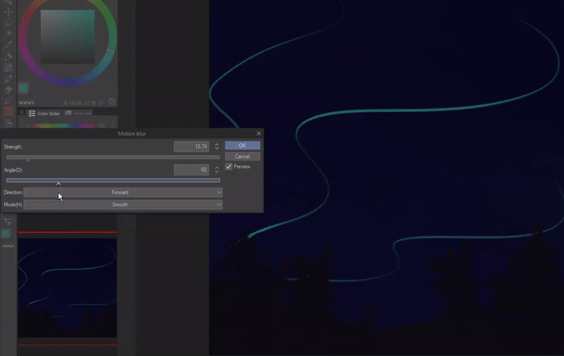
For the first style, I'm using the [Colored Pencil] tool since it was perfect for the look I was going for. I used quick upper strokes following the lines to get the similar motion blur effect.
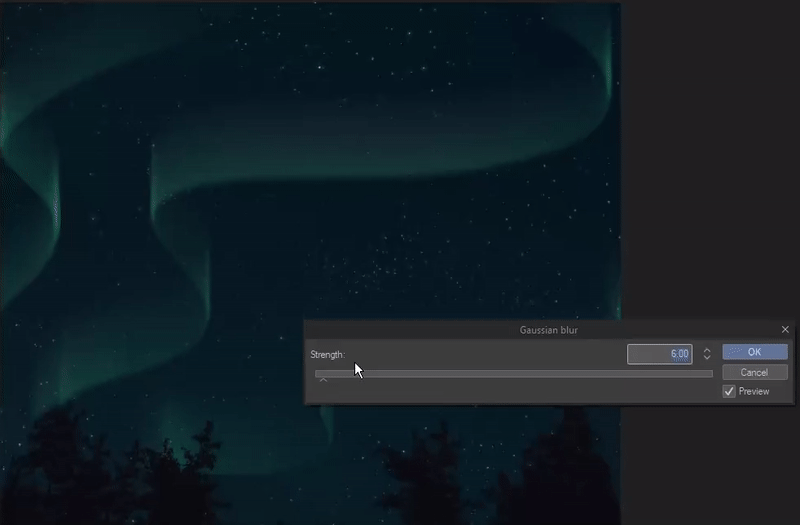
Using more of the [Motion blur] filter you can multiply the effect and get a smoother blend as it also blurs everything along the way. If you want a stronger blend or blurring effect without any motion, you can use the [Gaussian Blur] filter.
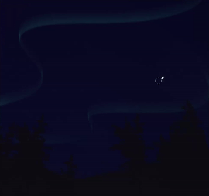
Repeat all the steps and add different hues of colors for a realistic look. Remember to use the copy-paste tip if you want a more saturated look as well.
Play with the Tone curves to change the color of Auroras if you are not happy with the initial color you started with.
Since auroras are wavy and irregular it can be really fun to keep blending the top and bottom without having to worry about a perfect look.
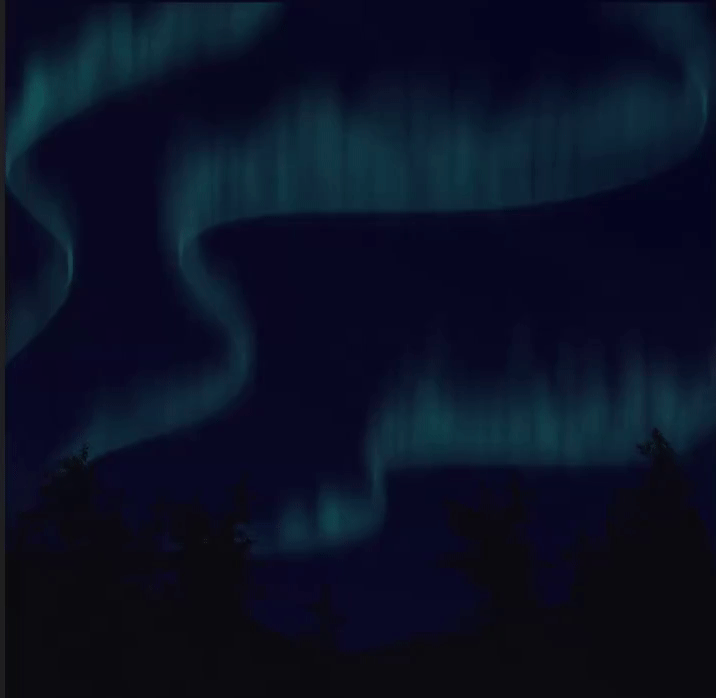
After lots of blending and playing with the blur filters and tone curves, this is the final painting of our first style of Auroras :)
For the second style, I'm mostly using thick wavy lines as the base and following with the [Motion Blur] filter to get brighter and larger auroras. I also used [Gaussian Blur] and the blend tool to make the harsher lines look softer.
Next you can use a simple airbrush to define the dazzling ripples or, like me, use a free aurora brush I downloaded from the Asset library to add soft bright purple ripples to the auroras for the final look.
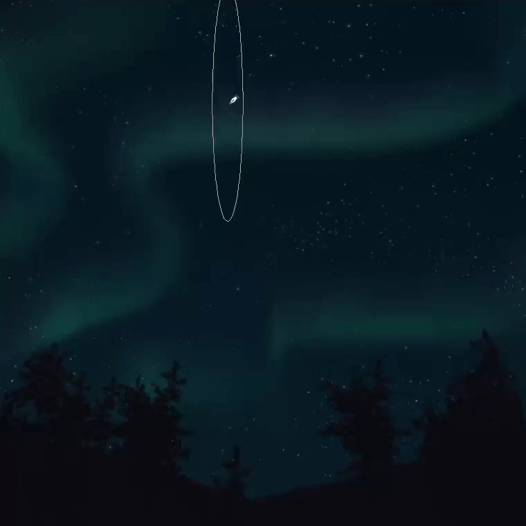
This is our final painting for the Second style :)
[SPEEDPAINT] - THE NIGHT LIGHTS
Applying all the techniques, tips and tricks we talked about in this tutorial, I painted this Night scene. I call it The Night Lights. The speed-paint for this is in the tutorial video I posted where I talk about all the thoughts and process regarding this painting. Please do check it out if you're interested :)
CONCLUSION
So that's it for this tutorial. Thank you so much for making it to the end of this tutorial !!
It turned out to be really long but I wanted to do a really in-depth tutorial and include as many tips and tricks possible to teach Sky painting techniques. I hope you enjoyed it and learned something so that you'll be able to apply everything in your future paintings.
I'll be doing more speed-paints and Clip Studio Tutorials in the future so please stay tuned :)
- Miss Bean
BONUS - CLIP STUDIO ASSETS
BRUSHES USED
RECOMMENDED ASSETS







Commentaire