Webtoon 101 [By an Original WEBTOON creator]
Hi hi, I’m Michi! Better known as 69Michi online, but you can just call me Michi.
I’m the creator of “Rebirth”, an original comic that you can find on WEBTOON.
I’ve been using Clip Studio Paint to create my webtoon for about 4 years or so. Comics are a painfully long process, and I understand how intimidating it looks at first glance. By making this tutorial, I hope it’ll help streamline your work process if you’re already making a webcomic. Or give you that little light in the dark to lead you on your path to become a webcomic creator! I promise, it’s not that bad.
Video Instruction
WEBTOON?
First you have to understand what makes a webtoon. Unlike traditional comics and manga, webtoon is a vertical format comic.

This is to adapt to modern technology and allows people to read the comic easily on their mobile devices.
At first glance Webtoon format and traditional format aren’t so much different from one another. But trying to reformat a traditional comic into Webtoon gives rise to the biggest problem: traditional comics can’t utilize the perk of vertical scrolling, which is panel/scene transitioning.
*On that note, Webtoon has a hard time utilizing manga’s horizontal panel, but that’s the topic for another day.
Format
The new CSP’s update came with a Webtoon format for your convenience.
[File] > [New] > [Webtoon]
I suggest going for a canvas as big as your device can handle because it’s always better to have a better resolution version of your work. You can always scale down the resolution to fit your needs.
Below is my resolution that I find work best for both printing purpose and viewing on mobile devices.
_____If you're wondering what is that "template" in my preset, don't worry, I got you cover.
Making a Comic template!
Naming and organizing layers/folders can get repetitive as you work on multiple pages, episodes after episodes. CSP offers the ability for you to register layers/folders template so you can skip the folders organizing steps and jump straight into making your episode.
How to make a template:
Create a blank canvas. ([New] > [Illustration])
Start making and naming your layers/folders.
Make sure any other extra layers (including default background when you created the blank canvas) are deleted.
Then hit [Edit] > [Register Material] > [Template]
Once registered, the template will show up in your [Material]. From there you can just drag and drop it on a new canvas to automatically create all your desired folders and layers!
You can also attach the template to a new blank canvas, shown in my previous screenshot.
Storyboard? But it's vertical!
Repeat after me: Vertical, vertical, VERTICAL!
The vertical format tends to play with the distance between the objects and the camera. Think of it as if you are an audience sitting at a stage play.
Avoid long horizontal panels at all costs unless you want to force your audience to tilt their device 90 degrees just to read that one panel. This doesn't mean you aren't allowed to do it, just try to be careful if you ever decide to do it!
Scene transitions
Scene transition is one of the perks that scrolling format has over traditional format. By utilizing the scrolling action, you can express the passage of time or building tension for a surprise reveal!
1- The most common scene transition is the use of sky background to express a passage of time.
2 - Another method is to combine background!
When several of the panels share the same setting, the background can be extended behind the panels to give a continuous feeling.
3 - Trees, leaves, clouds, water, buildings, etc, are all good background elements that can be extended to give a smooth transition feeling for panels.
Making the background elements break out from the panels is a good way to give a more connecting feeling between panels!
4 - Dramatic zoom
This method of panel transitioning is best to express character's emotion.
5 - Scene transition with SFX
6 - Special effect? Aka imagination is your only limitation
Your character is having a bad dream? Maybe have the darkness being broken apart as they wake up and catch the first sunray that slips through the window.
Your character is running from a killer? Have them dashing from one background panel to another!
Think outside of the box! Explore the scrolling effect!
Action scenes
"Can you explain the process of putting your idea/story into panels like idk for an example if a person were to kill another one (nice example) how do you know how many panels it will take and how you adjust those panels?" [A question from one of my reader]
In my opinion, the general course of action would be:
1st panel - The anticipation [Person prepares to perform an action]
2nd panel - Action happens [Person strikes!]
3rd panel - Outcome [The strike hits? The other person reacted in time?]
The most important thing to keep in mind is the pacing of the action. The more panels you add in between the action, the slower it'll feel.
Action scenes in webtoon are quite unique because of the nature of vertical scrolling. Same rules regarding the placement of objects and panel transitioning should be considered when doing an action scene.
How many characters are on the screen?
What are they doing?
Where are they?
Spacing between panels? How does that work?
Perhaps the most different aspect of Webtoon format compares to traditional is the spacing between each panel. This is purely a personal preference, but for me, I tend to use the spacing between panels to set the pace.
The larger the distance, the more readers have to scroll. That means there is a bigger pause in between the 2 panels.
My general advice for the normal distance between panels is that leave enough space to fit dialog bubbles nicely! Font size in Webtoon tends to be larger than traditional comics to accommodate the mobile device reading experience. And since the comic is almost a full illustration on every panel, avoid having the bubble speech overlapping on top of your character by using the spacing in between the panel is generally a good idea. (Of course, there are exceptions, like when you're using the bubble speech in a smart way to contruct a specific panel)
Dialog bubble speeches
A few things to keep in mind when constructing your bubble speeches!
1 - As stated before, try to go for a big font size that's easy to read.
2 - Font choice should be something that's easy on the eye. Don't be like me and chose something like this.
Fonts like CC Wild Words or Comic sans are pretty good.
*PS: I use Ames Pro.
Just make sure to check the license of your font if you do make money off of your comic. (You will then need a commercial license!)
3 - CLUSTERS ARE EVIL
For the love of everything holy, do your readers a service and space out your dialog speeches. Try to have no more than 4 sentences in a dialog bubble, s p a c e them out! You can have multiple dialog bubbles that're smartly connected to one another when your character's speaking.
4 - You can either hand-draw your bubble speeches or download bubble speeches online to use.
Tips:
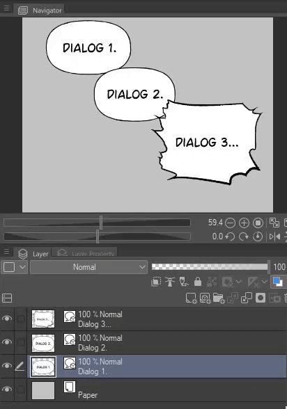
You can merge your dialog bubbles into 1 layer to keep your layer organization less of a painful task! Don't worry, you can still move your individual bubble or dialog around if needed.

If you noticed, all my bubble speeches have a slight transparency to them. I actually separate the texts and the bubbles to achieve this effect. And thanks to CSP's auto action, this task is actually a lot easier than you thought!
Speaking of auto action...
Auto action?? What god sent!
If you haven't been using auto action... what are you doing? It's time to explore!
Auto action is a set of recorded actions that allows you to execute with just a click of the button. You can download pre-set of them on CSP store or record them yourself!
Please use them.
Drawing process tips
Everyone goes around their drawing process differently so I won't dwell too much on that! But I do have a few tips for you and hopefully, they'll speed up your process!
1 - Shading
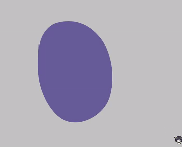
My favorite shading tool has to be "Lasso fill".
I use 1 color, set it to multiply layer to shade over my flat. I then use airbrush to apply different color on the shading layer depending on lighting.
This tool has really sped up my process!

2 - Subview

Subview works almost like the Navigator, you can fit it neatly into your sidebar. You can have multiple reference sheets + color palette sheets open and cycle through them. You can also enable the eyedropper tool to automatically pick the color in the subview to quickly color your art.
To enable subview, go to [Window] > enable [Subview].
3 - Reference program
This is not a CSP function, but having a program that you can store all your reference arts in is pretty handy. Personally, I use PureRef.
4 - Register your materials!
If you have materials that keep appearing in your comic or on your character design, REGISTER IT!
I have an episode in my comic where there were ice pillars EVERYWHERE! I drew multiple ice blocks on a large ref sheet and register them all individually.
You then can just drop them into your panel and transform them according to your needs.
You can watch them all in action here:
To register a material:
[Edit] > [Register Material] > [Image]
5 - Lineart
2 useful tools when it comes to lineart with CSP.
[Correct Line Width] can thicken or narrow your lineart. Work best with vector layer, but can work on rasterized layers too.
Vector layer is actually really good! CSP struggles to retain the same resolution of a rasterize layer once you transform it either by shrinking it, enlarging it, or simply tilt it. But using a vector layer, you won't lose any quality!
(*Personally I don't use vector layer because I heavily abuse bucket tool even during lineart process, but I'm sure vector is more useful to a lot more people out there.)
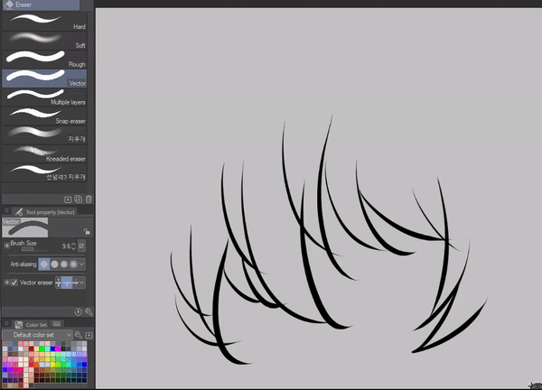
If you do decide to use vector layer for your lineart, don't forget to check out "Vector eraser"!

Background
There are a few ways to go about this.
1 - Hand-draw your background
Admirable, if you decide to do so! But very time-consuming. My other comic "Aum Records" has backgrounds fully hand-drawn, but that's also because it's not my main comic that I've to update weekly!
2 - Stock photos
If you do make money off of your comic, please be careful to not use any images that you find on google due to copyrighted reasons. Try buying images from sites like Photobash, they have a lot of good stuff that you can use for the background!
Check out "I'm the Grim Reaper" on Webtoon for examples of an amazing ways to incorporating stock backgrounds.
3 - 3D Models
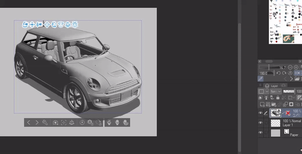
The most common way that a lot of Webtoons use nowadays is 3D model! Using Sketchup and other rendering programs can give you quick background material to use. You can build your own 3D model in Sketchup/Blender or purchase them through 3rd party website like Acon3D.
CSP also support 3D Model if they're in .obj format. You can save a lot of time by using 3D model for complicated objects. The best way to blend a 3D Model into your comic is by turning it into lineart through LT conversion (If you have CSP EX!)

Typography
I usually hand-draw my sound effect. But you can use specific fonts to make SFX if you prefer consistency.
I rely on the brush to deliver the kind of sound effect I want the sound to deliver. If it's a rough sound like nails scratching on the board, I'll choose a brush with a rougher edge to it and write the sound in a more jagged shape.
Another technique I usually use is have the SFX follows a specific movement that's happening in the panel.
Finishing it up!
Check with the website that you're uploading your webtoon for the size requirement!
Tapas allows up to 4000px in height and 940px in width while webtoon only allows up to 1280px in height and 800px in width.
Adjust your setting accordingly for exporting.
[File] > [Export Webtoon]
I tend to cut my strips into 1200px pieces but you can do 1280px.
If you for some reasons can't cut your strips to upload with CSP, you can use a 3rd party size like Croppy!
In conclusion
People always ask me when do you know you're ready to dive in and make that comic. Or "should I wait until I improve my drawing skill?" But I just want to say, there's no better time than the present! You can improve AS you make your comic. Comic making has helped me understand so much more about art and about my own style. If you want to wait until you improve, you'll never be ready, because you don't just simply stop striving for improvement!
Sorry, that was a long article. Thank you for reading through all of that! I hope the little Webtoon techniques I have could be of some assistance to you.
Alright, that's everything. Thank you for coming to my TED talk. Please drop a like, comment, and share if you find this helpful!
Michi's signing out~


Commentaire