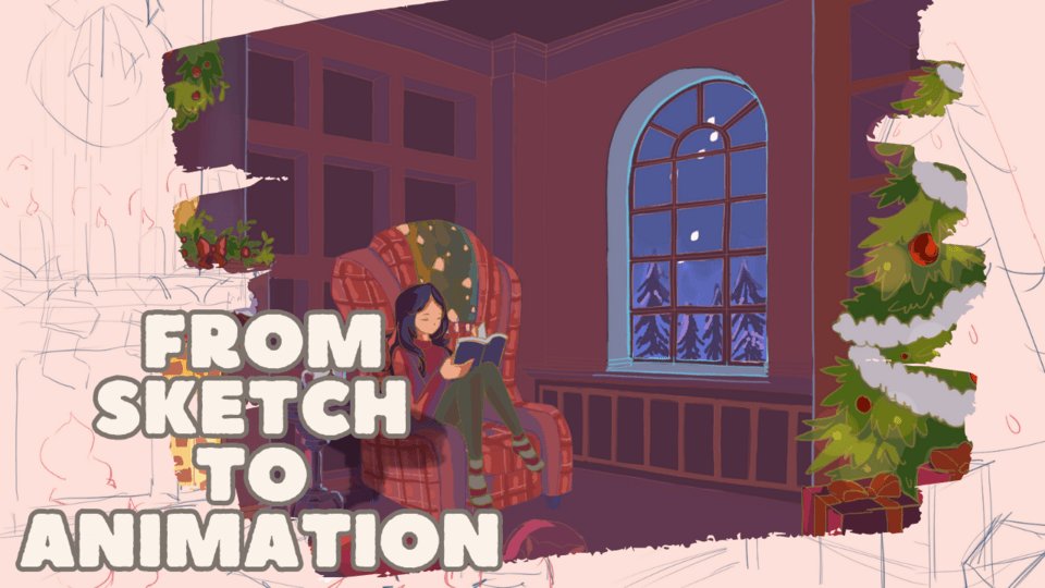
Picking Colors for Your Characters and Scenes
Remember the bacis of color theory.
The next thing is color value or how light or dark your colors are.
A darker shade of blue gives off a different mood from light shade. A use of a lot of soft or light colors can give off a much friendlier and gentle approach, however dark colors can give of a more mysterious a foreboding energy, darker warm colors like brown can have a more natural and grounded feeling to them as opposed to light warm colors like pink or yellow, that give of a more friendly and childish feeling.
Hue is the color of the light produced. you can change the hue on the colorwheel. For example cool colors such as blue green and deep purples, can be used for more calming, moody or mysterious scenes, but warm color can be used for some more energetic scenes.
Color Placement
The other important thing is color placement. Think about your lights vs. darks or your warm vs. cool. Using an analogous or monochromatic palette can show a particular mood across the scene. A monochromatic palette is using different shades of only one color. An analogous palette uses colors that are next to each other on the color wheel. Ex blue, indigo, purple
Picking colors for my character
To start off simply, I’m going to show how layed out my characters' outfits and colors.
I wanted to give her a soft girl vibe so pick her outfits based on that aesthetic. I wanted to show her gentle and friendly personality through her color palette.
First I made a gray scale drawing of her, limiting myself to only 5 different shades so that each section of her design was distinctly shaped which serves as a guideline for which colors I may pick. Clip studio has pure grays in both the default color palette and additional color palette.
After laying out the flats, I went ahead and shaded with some bluer colors to add more contrast from the warm base color. I use multiply to shade my characters and scenes and pick some Grayish blues and purples to shade her clothing
When choosing her pallete I went with mostly soft and warm colors while giving her blue jeans or dark leggings as a grounding color. The palette ended up being a split complementary palette with a neutral blue, warm pink and warm browns. I used some of the colors from the additional color palette to aid in the color picking process
I hope this helps with deciding colors for your characters.
Thanks for reading.


Commentaire