
Introduction
Hello, everyone! Today, I’ll teach you how to create typography reminiscent of the 80’s style. This style can be called outrun, synthwave or retrowave. It’s characterized by chrome letters, neon colors, and vibrant gradients. There are many things you can do to achieve this effect, but today I’ll teach you how to create chrome letters, and neon effects for typography.
For this, you’re going to need some bold typographies and some handwritten typographies. I’ll be using Montserrat Black 900 for the bold type, and Mr Dafoe for the handwritten type. Both are open source types that can be found in Google Fonts.
Alright, with that out of the way, let’s begin!
Chrome letters:
[1] Let’s do the chrome first because they are the most difficult ones. For the main fill:
[1.1] Write the word you desire in a bold font. Rasterize it by right clicking on the layers and selecting [Rasterize]
[1.2] Duplicate the word you want to create the effect in. In this case, it will be the “RETRO” word. We’ll work on the top duplicate by now.
[1.3] Create a gradient with two parts black blue and white; and black, purple and white (you can do it with other colors!). The first white and second black should be very close, with no gradient between them.
[1.4] With the transparency locked, give the word the gradient you created. Make sure that both the first and last color are visible. Keep the gradient straight by pressing [shift] in your keyboard as you place it over the letters.
[2] For the borders:
[2.1] On the bottom duplicate, click on the [Border effect] on the [Layer properties] panel. This will give the letters a border on the thickness of your choice.
[2.2] We’ll work on this border, so we’ll need to Rasterize the layer after we get the desired width.
[2.3] Since we’ll only use this border, we can delete the part that contains the fill by right clicking on the fill layer, selecting [Selection from Layer] > [Create Selection] and deleting this space on the border layer.
[2.4] Now, we’ll color it with a gradient of two light blues. Lock the layer’s transparency. Our gradient will have several repetitions of the colors (6 to 8 repetitions is okay). We can do it in the gradient itself, or with the [Edge process] > [Reverse] option in the Gradient’s [Sub tool detail palette] (the wrench symbol at the right bottom corner of the Tool property panel).
Try different angles for the gradient, until it creates an effect you’re pleased with.
[3] Let’s make these border look metallic:
[3.1] Create a new layer on top of the borders. This layer will be set to [Color burn].
[3.2] Create a selection of the border layer and go to our new layer.
[3.3] With the [Polyline selection tool] set to [Remove from selection], deselect different portions of each letter. Do this orderly, you want to create the illusion of each area being a reflective face of the border, as such:
[3.4] Cover the selection with a black to white gradient set to [Edge process] > [Reverse]. Try it until you’re satisfied.
[3.5] Only a part of the border has this effect, let’s do the rest. Create a selection form the border layer again. Go to the new metallic layer and delete its area from the selection by right clicking on the layer and going to [Selection from Layer] > [Delete Selection]. This will give you the area that you didn’t select previously.
[3.6] Repeat step [3.4]. You can do it in the same layer or a new one, it will not affect the previous area. By doing this in two badges, you have different angles for each part.
[4] Let’s finish the Chrome effect by adding some shiny spots with the Decoration brush, Sparkle A:
[4.1] I made it give a single sparkle by going to the [Sub tool detail palette] > [Stroke] > [Repeat method] > [One random cycle].
[4.2] I also changed the Angle in the Tool property panel.
[4.3] Randomly sparkle your letters!
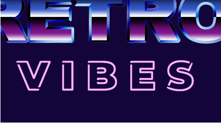
Alright, we’re done with the chrome effect! It should look something like this:
Group all these layers together, we’ll do something with them on step [7]. Let’s do the Neon letters for now.
Neon letters:
[5] First, let’s make the letters look like neon tubes:
[5.1] With the text selected, in the [Text editing] panel, open the [Sub tool detail palette] > [Font] > [Open face] > [Open face bold]. This will give you some thin borders.
[5.2] We’ll give it a Border effect to widen the borders. Follow step [2.1]. You can rasterize the layer now.
Neon signs are made of tubes filled with a gas that shines a color when electrified. The gas and the electricity connect at the end/beginning of the tube (don’t quote me on this, I just saw it on a documentary, je, je). To create this effect, I erased some areas of the “tube”. You can do so if you desire.
[5.3] Duplicate the layer. The top layer will be a light pink, and the bottom layer will be a hot pink.
- There are many ways to change the color of a layer. With the color you want selected: (1) Go to [Edit] > [Convert to drawing color]; or (2) Lock the layer transparency > Click on the Bucket icon on the [Command bar]. A more advanced way could be to use tonal correction: Go to [Edit] > [Tonal Correction] > [Hue/Saturation/Luminosity], or ]Gradient map], or ]Level Correction], and many others, I recommend you to get acquainted with this menu.
[5.4] In the bottom layer, go to [Filter] > [Blur] > [Gaussian Blur] to give it a glow effect. Duplicate it and merge the duplicates to intensify the color.
[5.5] Set this layer’s blending mode to Add (glow)
That’s all! Really simple, right? Let’s make the hot pink letters, and then move to the background:
Pink letters:
[6] Let’s give them some color:
[6.1] Give them a gradient with two pinks, one darker than the other. I put the darker pink at the bottom. Duplicate the layer.
[6.2] In the top duplicate, go to [Filter] > [Blur] > [Gaussian Blur] to give it a glow effect. Set it to Add (Glow) and lower the opacity.
[6.3] In the bottom duplicate, go to [Filter] > [Blur] > [Strong Blur] to soften the borders.
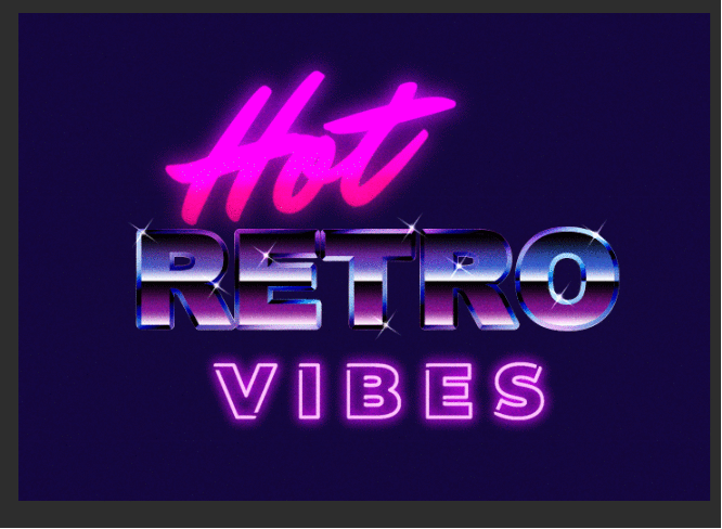
This is how it should all look:
[7] We’re almost done! We’ll make the glow of the pink and neon letters reflect in the chrome letters to create the illusion of them being in the same space.
[7.1] Create a new layer on top of the group containing the Neon letters. Clip it to the group.
[7.2] With the [Soft] airbrush, take the color of the pink letters and sparse it through the top area of the “RETRO” letters. Do the same for the bottom with the neon letters. Avoid covering them in their entirety, the effect should be subtle. Imagine that it’s a shinny sing on top of a metallic one.
[7.3] Set the layer to [Color] and lower it’s opacity.
Background:
[8] Alright, we’re done with the letters. Now, let’s spice up the background a little:
[8.1] In a new layer below everything, take the Soft airbrush and pick up the main colors from the words. For me, it was pink, blue and pink again.
[8.2] Paint the area below the letters and around the canvas to create ambient and a soft glow.
[8.3] Set this layer to Add (Glow) and lower it’s opacity.
- You can do this in several layers for variable effects.
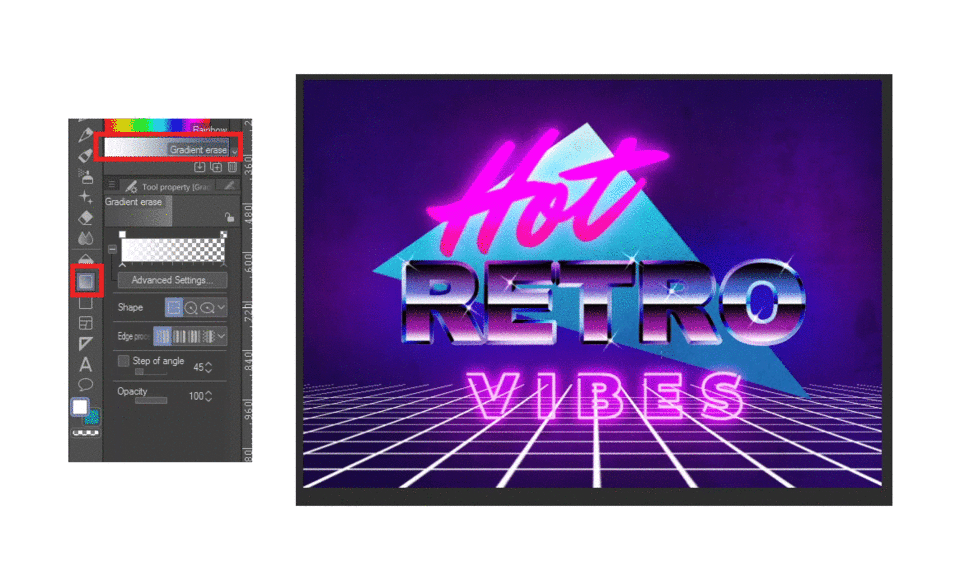
[8.4] Now, to create some contrast and make the design more readable, I added a triangle to the background. Simply draw an irregular triangle with the polyline tool, give it a gradient and it's done. I felt it loaded the thing a little bit too much, so I was undecided.
- In these pictures you can start seeing texture and noise. I normally leave this step for last, but I was experimenting with new textures, and did it prematurely, je, je. If you want noise, create a layer on top of everything, fill it with gray, go to [Filter] > [Render] > [Peril noise] and play with the options. A small Scale and Amplitude always give me the result I want. When you’re done, set it to Overlay and lower the opacity.
The synthwave aesthetics have been heavily inspired by video games. As such, it’s common to see elements from them in the compositions. Wireframe terrains are very popular, they make it look as if you’re playing an incomplete game. I’ll show you how I make two versions.
[9] For a wireframe as the one in the thumbnail:
[9.1] Draw a square with the Figure tool. Make sure to have the tool’s anti-aliasing set to None, if you don’t, it will leave a space in between the squares when you tile it.
[9.2] Convert the layer to an Image material by right clicking on the layer, selecting [Convert layer] > [Type] > [Image material layer]
[9.3] Select the Operation tool. At the bottom of the Tool property panel, check the Tiling option. This should give you a grid.
[9.4] Edit the main square until you find the right size. When you do, rasterize the layer. I recommend you to duplicate it before rasterizing because step [9.5] can get a little tricky.
[9.5] Go to [Edit] > [Transform] > [Free transform] and move the corners of the box until you have a trapezoid shape similar to the one pictured. The squares should now look like a perspective grid. The boxes may seem too small or too big. Try going to step [9.4] and making the square bigger or smaller, maybe draw it again (step [9.1]) setting the figure tool to a thinner brush size. Try until you are satisfied.
[9.6] Draw a straight line on another layer and place it where the horizon should be.
[9.7] Duplicate both layers, and give the top duplicates any color you want. We’ll create a neon effect as we have done previously.
[9.8] Give the top duplicates a Gaussian blur (steps [5.4] and [6.2]). Set them to [Add (Glow)]. You can duplicate the blurred versions if you want the glow to be stronger, as I did with the horizon line blur.
[10] I feared this effect would compete with my neon subtitles, so I decided to design them another way.
[10.1] Follow steps [9.1] to [9.5] exactly.
[10.2] Lock transparency. Select the Gradient tool > Gradient erase and erase the horizon line. That way it looks like it goes on forever.
[10.3] Go to [Edit] > [Transform] > [Mesh Transform] and move several points on the grid to make it look like irregular terrain. It’s up to you how subtle or pronounced it is. Look below for two examples, one subtle, and one very pronounced.
[10.4] Change it to the color you want, lower the opacity, and it’s done!
You can also add irregularities to the first grid example. Experiment and have fun.
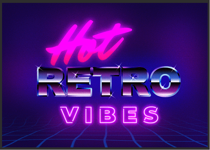
That's it! We're done!
Closing thoughts
My design has different elements on it, because I wanted to give you different things to mix and match as you wished, but it ended up looking a little loaded, je, je. It doesn’t yell 80’s style if it isn’t vibrant and obnoxious, right?
With this and every other design you want to make in the future, I’ll always recommend looking for references, selecting the ones you like, and try to reverse engineer how you think the designer made them. Why did they choose these colors? What can I do differently? How do I get this effect? It will lead you through a path of discovery and experimentation that you’ll need throughout your entire career as an artist.
I hope you enjoy this tutorial. If you have any questions, you can write them as a comment I’d love to help. And if it was useful, I’d love to see what you did! You can tag me on Instagram at @apey.art or Twitter at @apey_art.
この投稿を「いいね!」したユーザー


コメント