Easy Lighting Tips for Character Design in CLIP STUDIO PAINT
Introduction
Hi Everyone,
In this tutorial I'll be talking about how to paint light for Character Design using easy tips and techniques in Clip Studio Paint!
You can watch my Youtube video tutorial on my channel "Brush Impact" below and see how I demonstrate and explain these lighting tricks in more detail.
Ambient Light and Direct Light (First Character)
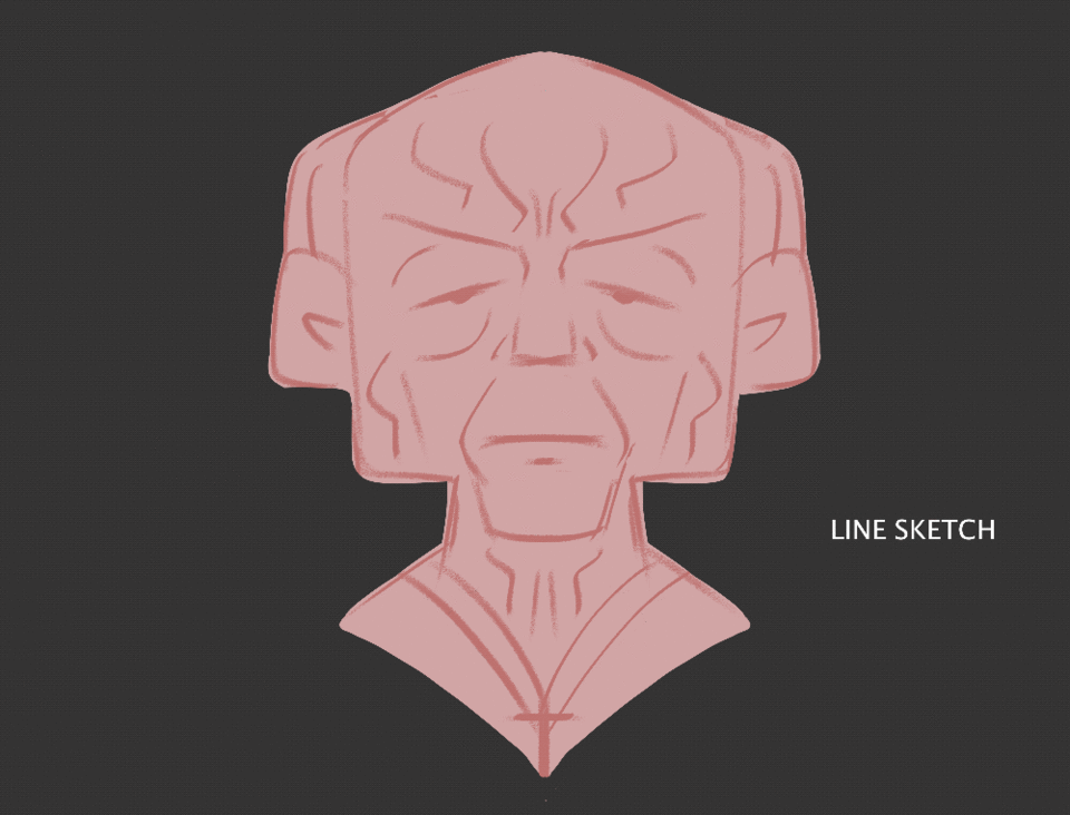
I started this series by painting my original characters using the [RULER] tool's [LINE SYMMETRY] option on a layer set to [NORMAL] mode. It is important to have this ticked to paint with ease and save time. The same has been done with the other characters above.
While still on the [SYMMETRICAL RULER], I continue to paint and refine my "Diffused Lighting Layer" set to [NORMAL] mode. I like to think of Diffused or Ambient lighting similar to doing my values in grayscale but with zero direct light. In this case, planes that face down receive less light and thus, more Ambient Occlusion.
Next, I create a layer set to [COLOR MODE] and clip the layer it to the underpainting below. I have set the [CLIP TO LAYER BELOW] shortcut to Cmd + X since I am using Mac OS. You can see how I have stacked up my layer structure in following images below too.
I mainly paint all my colors in the [COLOR] layer mode, but sometimes I use the [OVERLAY] mode on top for that extra punch in color saturation as seen below.
Here’s the formulaic part of the process, I create a new [CORRECTION LAYER] and set it to [HUE SATURATION/LUMINOSITY]. This basically coats the underpainting with one dominant color.
Now for the exciting part, the Direct Light. I made a [LINEAR LIGHT] layer mode and painted a strong yellow rim light on one side of the face, and a cooler reflected blue light for visual contrast. To paint light means to sculpt with depth. Rim lighting is a trick often used to pop a character effectively out of a background. I painted light values on planes facing upwards. Human skin is quite smooth and reflective so it is bound to have some specularity to it.
The area where the light meets shadow, known as the colored penumbra is where form shadow saturation is visible. It occurs when sub-surface scattering happens in human skin. You can imagine the saturation is coming from the scattering that occur beneath the skin due to the presence of blood.
Since the yellow light is a stronger light source, I used the [POLYLINE TOOL] to create shadow casted from the jaw. Painting light is a spectrum, I softened the shadow using a default [SOFT BRUSH] in Clip Studio Paint.
Feeling confident about this linear lighting stage, the light structure in the painting is reading quite well. It’s now just a matter of polishing it. I can go ahead and paint a [NORMAL MODE] layer on top to finish this character.
Unconventional Lighting - Bottom Lighting (Second Character)
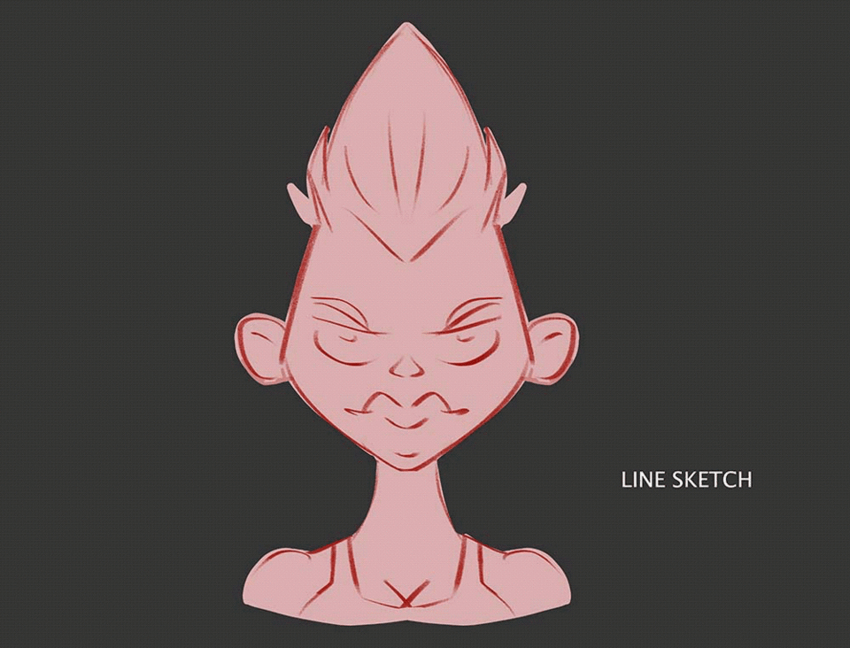
Here’s the gif process (below) for my second character which I eventually transformed into a ghost. Same process is repeated here: 1) Sketch, 2) [NORMAL] Diffused Light Layer and then created a layer set to 3) [COLOR MODE]. To create more color interest, I create a layer set to 4) [OVERLAY] and filled it with a bluish hue to tie things together. 5) With the [HUE SATURATION] sliders, I can quickly turn his human color scheme into spine-chilling greens and blues.
I picked a bottom lit scene, which is cliche for ghost flashlight stories. While blocking in light in this 6) [NORMAL] Diffused layer, I had to keep in mind this time that, all planes facing down will receive light and planes facing up will get more shadow.
For the Light Source, I used 7) [COLOR DODGE] (which is similar to Linear Dodge mode). My shadow colors are leaning towards blue so i made the light color into a garish yellow-green.
The light structure in the painting is reading quite well, it’s now just a matter of polishing it with a 8)[NORMAL] layer, and there we have our second character done.

Storytelling with Light (Third Character)
A) Character with Hidden Agenda
We can hark back to the previous formulaic process discussed in characters 1 and 2, to achieve the same result with the 3rd character. However, this time I will utilize the power of Gradient Maps after painting the Diffused Light layer.
As always, I start with a Line Sketch and a Diffused layer. See images below:
I went to [NEW CORRECTION LAYER] and clicked on [GRADIENT MAP]. In Layman’s terms, Gradient Maps change the colors of your image according to the values of your painting.
I’ve already tailored these to my liking and it’s always worth to play around with these sliders and see what you come up with.
With the [COLOR DODGE] layer, I start painting the rim lighting to pop out my character even more. With the rest of her face enveloped in shadows, this indicates that her personality may have something to hide.
B) Character In The Shadows
Let’s play with another light set up. I imagine that the she is hiding behind a structure ready to pounce at an intruder in her hideout. I created a warm [OVERLAY] layer on top to mimic sunlight. I then use the [POLY LINE LASSO TOOL] to carve in purplish shadows.

C) Two-faced Character
On the last lighting set up, I want to portray a two-faced character. I learned this lighting while watching Harvey Dent in “The Dark Knight.” Literally, dividing the facade of a character conveys a foreshadowed dual or torn personality. I divided the character's face into two, by pressing (M) as a shortcut for the [RECTANGLE SELECTION TOOL]. I filled the character with a cool purple in [MULTIPLY] mode and used the [GLOW DODGE] layer mode to sculpt forms in light. You can adjust the [HUE and SATURATION] by pressing Cmd +U or Ctrl U to tweak sliders. With another [GLOW DODGE] layer, I paint in some rim lighting so that the figure doesn’t get lost with the background. Last but not least, don’t forget to consider skin and hair specularity.

Conclusion
Thanks for viewing this tutorial. Hope you learned something new and try these techniques out! If you enjoyed this tutorial, hit the like and subscribe button for more content from me. See you on the next video, and happy painting!
You can find me on:
YOUTUBE: https://www.youtube.com/watch?v=tQ0zrHLWbZQ&t=30s
INSTAGRAM: https://www.instagram.com/brushimpact/
GUMROAD BRUSHES:
https://brushimpact.gumroad.com/l/kqtbi
Thank you so much for your support!


コメント