
Intro
Hi, I'm Senli a.k.a ahogemon. In this tutorial, I will show you how to finishing webcomic panels by using blend modes into anime-like shaders to level up your webcomic or webtoon series on ClipStudio Paint.
Note that this tutorial is not for beginners who are just getting started using CSP as this tutorial may not include the basic tools tutorials like for example how to create a new layer, move, merge, etc. So, I assume you already familiar with the basics.
But at the end of the tutorial, if you have any questions, please leave a comment down below, I will answer asap.
Preparation
Since we are about to give shading for finishing which is done at the last step, the first thing we need to do is have our panels ready.
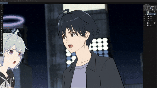
I have my panel here ready, we can see two characters have been applied flat colors, and they are separated in each folder, I also separate the halo ring. And lastly the 'bg' or background layer which I rendered in blender.
It is a good practice to put layers in their own folders to keep organized and easy to find if you work with many layers.
Everyone could have different UI layouts, so don't get confused, the screenshot below is my layout, I know it looks simple and clean since I mostly use keyboard shortcuts, but this does not affect the basic function in CSP. We are not talking about UI today, let's focus on blending.
I've provided the exact panel of clip file for this tutorial just in case if you want to follow this tutorial and have the same page, you can download it on the link below.
Note that this file should not be reposted anywhere, to share the file, you have to redirect the link to this tutorial first. Please use it only for practice, do not abuse it, and use it responsibly.
Webcomic art is Different From Illustration art
Before we begin, making webcomic panels is about speed and efficiency, but not focus on the quality. Unlike a piece of illustration art which can be done in a month, webcomic creators have to produce at least three or more panels per day to catch the weekly schedule. So, it is actually fine for webcomic arts without shading or just a minimum shading, but if you still have time to spend on your panels, then this tutorial is good to follow as I will show you just a couple of steps to level up your panels to look better.
Step 1: Light Source
Decide where the light source coming from. Here in my sample, the light source is a full moon coming from above, behind the camera, so it’s not appeared inside the scene, but we know it’s there.
Step 2: Pick the Color for Shadow
The key to pick the color for shadow is what affects the ambient light. For this example panel, is the night sky.
This is an optional step but it's a good practice before we pick the color, let's switch the color to default black (foreground) and white (background).
Now switch the color to foreground which is now the black one (assuming you followed the optional step), then I will pick the color right at the middle, above the horizon.
Obviously, the color of the night sky is too dark. We don't want the shadow to look too dark, so, what I'm gonna do is adjust the color by increasing the value to about 60% and reduce the saturation to about 15%. And you want to save the color into a new slot for quick access when needed and to keep the shading color consistent.
Leave the background color as white.
Step 3: Prepare the Shading Layer
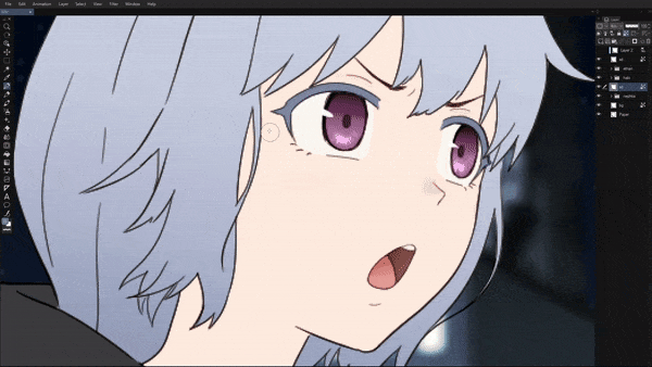
Here I will start shading from 'ethan', there's no rule to which object to start with.
Let’s duplicate it and then merge it into a new layer.
Rename the layer to something else like in my case I’d like to name it ‘sd’ for shadow.
Lock the transparent or the alpha channel and then set the blend mode to Multiply.
Now switch the color to background color which is white and fill it with white.
Step 4: Start Shading
Now switch back to foreground color, let's start shading according the light direction.
Note that you don't have to worry about the realism and accuracy as I mentioned before, we are shading webcomic panels.
Let's use a sharp pen for shading. In my opinion, cel shading looks a lot better than soft shading for webcomic, so I don't recommend using a soft brush or airbrush.
Use your imagination where the shadow lands on.
Q: The scene is at night, why it looks bright?
A: I wanted to dim the brightness down, afterall, this is a webcomic, readers will complain of how dark your scenes especially if you have an editor, they will tell you to brighten up the scene!
Don't use eraser to fix the shadow, instead, use background color, in this case is the white color.
Use bucket fill tool to quickly fill the space.
Keep shading until you think it's enough shading
Now you satisfied with the shading, let's have a quick inspection before we continue.
After the shading is done, your panel will look better and pop! Less plain than before. The image below after my shading result for this tutorial panel.
It took me about 20 minutes to complete the shading this panel, but the duration may be vary depending on the complexity of the scene. I would say from 5 to 30 minutes per panel.
This might be already good for a webcomic panel, but hey, if you still have time to spend 5 more minutes, let's give the final blend to get those nice anime-like shaders!
Step 5: Differentiate Objects and Background with Outer Glow Layers
Sometimes, your characters and the background blend in and hard to spot for some readers.
So, to lessen the world from complains, let's add outer glow layers!
In this panel, both characters wear darker color outfits and the scene is at night, so it's a good Idea to add outer glow layers to differentiate the characters or the object with the background.
To do that, first, let's copy the object layers that we want to add outer glow effect, in my case here, I will select the folder 'ethan' and 'nephtia', next duplicate the selected layers.
After we duplicate the layers, let's merge them into a new layer, rename the layer to OuterGlow and then move the layer below the object layer right above background layer.
Next, lock the alpha channel and fill it with background color or white color.
Note that the blend mode for this layer is normal.
After we fill the OuterGlow layer with white, let's turn off the lock for the alpha channel.
Next, go to filter and then select Blur, then Gaussian Blur, and set it to 100.
Now you have the outer glow layer but let's lower its transparency level to 50%, so it will look nicer.
Good job! Now, turn off or hide the OuterGlow layer from visibility. Yes, don't worry, we will turn it back on later, trust me :)
Step 6: Bloom Layer
Now let's create a 'bloom' layer to lighten up our scene!
First, select the top layer, in this case the 'sd' layer is at the top, now merge all visible layers into a new layer at the very top layer, then rename the layer to 'bloom'.
While the bloom layer is selected, let's open Tone Curve, inside the tone curve, click from the middle and drag it into something like in the screenshot below. Click OK.
It will look something like this screenshot below.
The bloom layer is still the selected layer, now hold down Shift + Ctrl and click the character layers, for this sample I will click the 'ethan' and 'nephtia' folder. Now you have the selection of the characters.
Open tone curve once again and inside the tone curve, click and drag the point into something like in the screenshot below. Click OK. And then deselect the selection.
Still on bloom layer, now set the blend mode to screen. It will look something like the screenshot below.
If nothing is going weird, then it's great!
Still at the bloom layer as the selected layer, now go to filter, and select Gaussian Blur.
Set the Gaussian Blur to 300, but because CSP limits its Gaussian Blur to max at 200, so drag it to max (200) and then click OK, and once again open Gaussian Blur but this time set or drag to 100.
Alright!
We are almost done. Now let's turn on the OuterGlow layer back to visible. Yay! See!?
Step 7: Atmospheric Tone Layer
After you've gone this far, you can't just forget this last thing to add into your scene, the atmospheric filter. It's easy and fast!
Create a new layer above the bloom layer and name it as 'filter' or anything you like.
Set the blend for this layer to Soft light
The same like how we pick a color for shadow, we are going to pick a color for the atmospheric filter, now go ahead and pick the color at the night sky in the middle above the horizon, but this time set the value to 50% and the saturation to about 30%.
You might want to save the color into a new slot for quick access later when needed.
Fill the 'filter' layer with the color.
Congratulation, you've just level up your webcomic panels!
Now, for this sample panel, there's something that makes the readers distract their eyes away from the character, that is the light behind the character 'nephtia' on the left screen, it's too bright, right?
To fix this, you can use gradient tool and gradually cover the area with dark color like black until you think it's no longer distractive.
But because I made this panel, I already calculate this, so I will cover it with a dialogue balloon.
There you have it! An anime-like shader for webcomic panels.
And down below it's my recap video for this totorial on YouTube.
A Recap Video
This my first video on YouTube, watch the recap video for this tutorial, and if you have any questions, feel free to leave a comment(s) I will answers your questions regarding this tutorial asap.
この投稿を「いいね!」したユーザー


コメント