Top 7 Practical Uses of Align/Distribute Tool
0. Introduction
With the newly introduced Align/Distribute Tool, you can quickly and precisely position and space objects with respect to each other. This guide will give you the complete steps for seven different usage scenarios where utilizing this tool will streamline your workflow and give you well-organized results.
1. Understanding the Tool
Before discussing the use cases, we need to understand how the tool works. Here I will elaborate on how to access the tool palette and what are the functions of its various sections.
1.1. Opening the Align/Distribute Palette
To access the align/distribute palette, you need to be using Clip Studio Paint Version 2.0.
Go to [Window] and scroll down to the [Align/Distribute] option and click it.
This will open the Align/Distribute tool palette.
1.2. Selecting the Layers or Vector Elements
Knowing how to make quicker selections of objects and layers will streamline your align/distribute process. Following are the four main ways of selecting elements when applying align and distribute actions to them.
1. Select the desired layers from the layer palette or with the [Object] tool. For the layer palette, simply tick all the layers you want to align and distribute.
2. When using the [Object] tool for selecting the layer, click on the object, and the layer in which the object is will be selected. Hold down Shift to add more layers to your selection in this way.
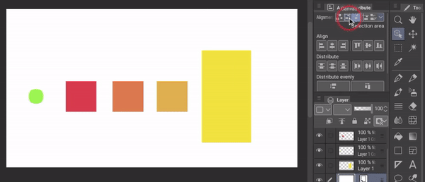
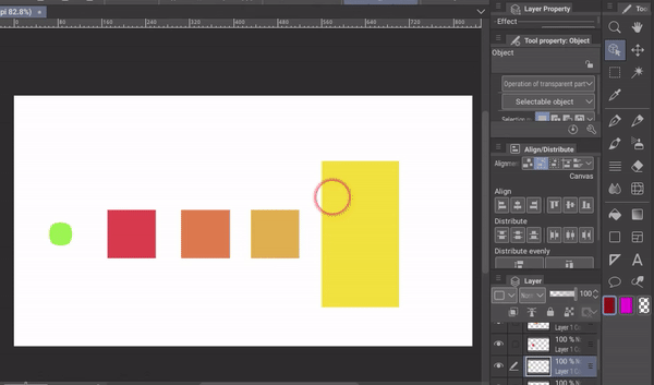
3. You can also make quicker selections by clicking in a transparent area and dragging over the objects whose layers you want to choose. For this, go to the [Object] tool’s tool palette and then its [Operation of transparent part] menu.
Tick [Select area by dragging] and select [Layer] in the sub-option.
4. For working inside a vector layer, you can individually choose to select or not select the various elements inside the layer and align and distribute them.
To select like this, change the [Select area by dragging] setting to [Objects in this layer] in the [Object] tool palette’s [Operation of transparent part] menu.
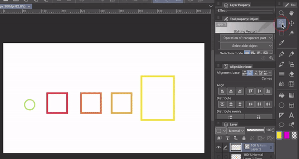
If you only select the layers, all the layer elements will move as a single unit, like with raster layers.
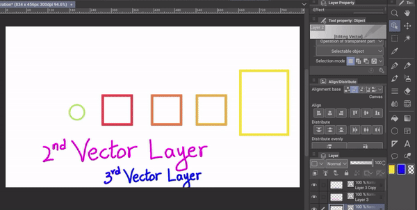
1.3. Difference between Align and Distribute
[Align] options are in the second section of the Align/Distribute palette, whereas the [Distribute] options are in the third section.
[Align]:
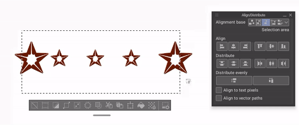
[Align] lines the objects along a straight line so that one side, edge, or center of every selected object touches that invisible or visible line. The elements may overlap or have uneven spacing between them.
The following are six Align options in the tool palette from left to right:
1. [Align left edges]: Using this option, we can align the left edges of all selected objects or layers along a straight line.
2. [Align horizontal centers]: With this option, the horizontal centers of all selected objects or layers are aligned along a straight line.
3. [Align right edges]: This option aligns the right edges of the selected objects or layers along a straight line.
4. [Align top edges]: With this option, the top edges of the selected objects or layers are lined up along a straight line.
5. [Align vertical centers]: This option aligns the vertical centers of the selected objects or layers.
6. [Align bottom edges]: Using this option, you can line up the bottom edges of the selected objects or layers.
[Distribute]:
[Distribute] will space out the elements across the permitted area. The spacing will be equal across all selected objects and according to the objects’ edges or centers.
For example, if I distribute the left edges, the distance between the left edges of the first and second object will be equal to the distance between the left edges of the second and third object, and so on.
Note: You need to select at least three objects or layers to use the [Distribute] options.
The following are the six Distribute options from left to right:
1. [Distribute top edges]: This option spaces the objects or layers such that the distance between their top edges becomes equal.
2. [Distribute vertical centers]: Using this option, you can equal the distance between the vertical centers of the selected objects or layers.
3. [Distribute bottom edges]: With this option, the bottom edges of the objects or layers become equally spaced.
4. [Distribute left edges]: This option creates equal distance between the left edges of the selected objects or layers.
5. [Distribute horizontal centers]: With this option, the spacing between the horizontal centers of the selected objects or layers becomes equal.
6. [Distribute right edges]: Using this option, you can distribute the selected objects or layers such that the distance between their right edges becomes equal.
If your objects are of different sizes, you might notice that the blank space between the objects is not equal. We will be addressing this occurrence in the section below.
1.4. Difference between Distribute and Distribute Evenly
[Distribute] spaces out the objects according to the coordinates of the objects, such as their edges or centers. Due to this, the size of objects impacts the visual blank space between them.
The larger object will seem closer to the object next to it and the smaller object will look farther away from the object alongside it (purple arrows), even though the distribution is equal (red arrows).
To evenly distribute the blank space between the objects without concern for their sizes, we need to use [Distribute evenly]. It is the fourth section in the [Align/Distribute] palette.
[Distribute evenly] creates equal spacing between the starts and ends of the objects and distributes them across the permitted area.
Following are the two [Distribute evenly] options:
1. [Distribute vertical spacing]: Use this option for equal vertical space between objects.
2. [Distribute horizontal spacing]: Use this option for equal horizontal space between objects.
Sometimes, the permitted area is too small for the objects to have blank space in between after being distributed. In such cases, the negative distance between the ends and starts of the objects is equal.
1.5. Choosing an Alignment Base
The alignment base is the area you permit for alignment and distribution. The objects are aligned and distributed within that area. This can be the entire canvas or an area defined by guides or selections.
[Alignment base] is the first section in the [Align/Distribute] palette.
Its options are as follows from left to right:
1. [Alignment object]: When this option is used, the alignment and distribution occur within the area covered by the selected objects. This area can change as you apply various align/distribute options.

2. [Canvas]: With this option, the objects are aligned and distributed across the entire canvas.
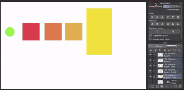
3. [Selection area]: You can make a selection with the [Selection area] tool and the alignment and distribution of your object will stay within that area (if no selection is made, the area covered by the selected objects is the selected area).

4. [Guide]: You can use guides with this option to constrain the area covered when aligning and distributing. On sides where there are no guides, the edge of the farthest object will determine the edge of the permitted area.
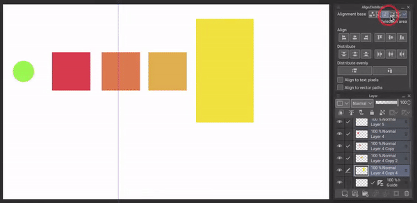
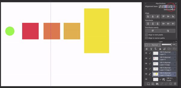
5. [Auto]: This option takes context into account. If any guides are active, it will align according to the [Guide].
If multiple objects are selected, it will align according to [Alignment Object]. If there is a selection it will align to the [Selection Area] and if there is no selection of an area or multiple objects and no guides, then it will align to [Canvas].
Use 1: Snapping to Center for Complex Motifs
Apart from simple alignment and distribution of your objects, you can also use this tool to create complex motifs from simpler elements.
First, create the motif elements. They should preferably vary in size. Once made, select all their layers.
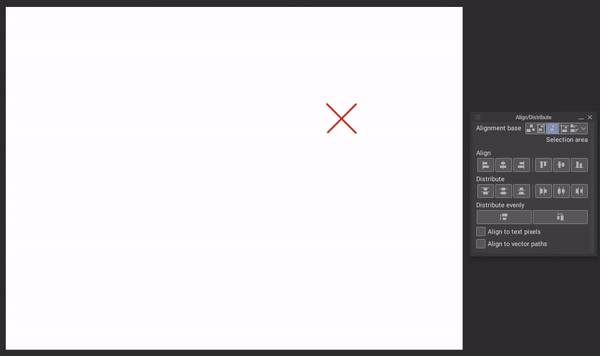
Now, click [Align horizontal centers] and then [Align vertical centers] or vice versa. This will align the center of each element to the center of the canvas or selected area and the resulting overlapping will create a complex motif.
You can also try out different variations of your motif by changing the layer order.
You can also use this method to precisely snap a singular object to the center of the canvas or a specific area.
Use 2: Adjustments for Brush Creation
When creating a new brush you can precisely align and distribute the elements of your brush tip without needing to eyeball things.
Align/Distribute will also help you quickly experiment with multiple variations for your brush.
Note: For the complete steps to creating brushes, you can refer to Section 3 of the following one of my previous tips:
Use 3: Aligning Text (and [Align to text pixels] )
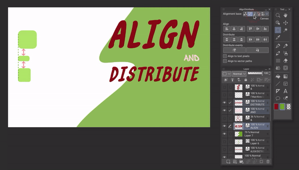
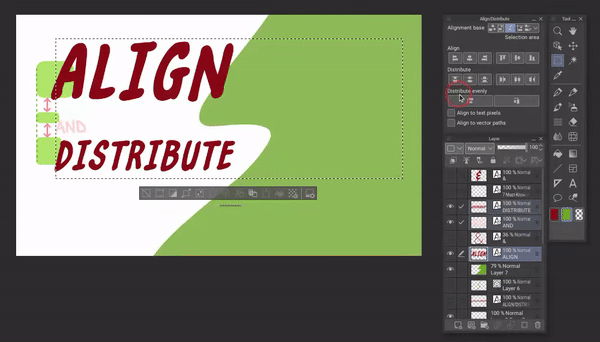
Aligning text present in different layers has been made really easy with the Align/Distribute tool. For example, when working on a thumbnail, I can quickly try my options for aligning text and distributing the spacing within my selected area for the text (with alignment base [Selection area] ).
Align to text pixels:
You might notice that sometimes text does not align perfectly (especially noticeable in the text of different sizes).
To fix this, checkmark [Align to text pixels] in the [Align/Distribute] palette and it will remove any unwanted deviation of the text from precise alignment.
Use 4: Diagonal Distribution
If you want to distribute your objects diagonally, it is very easy to do with the align/distribute tool.
First, select all your objects or layers and click [Align left edges] and [Align top edges].
Then choose [Distribute vertical spacing] and [Distribute horizontal spacing] or vice versa. This will distribute your objects in an evenly spaced diagonal.
The object in the lowest layer will start the downward diagonal from the top left corner. The objects in the above layers will continue the downward diagonal according to the layer sequence until the object in the top layer ends the diagonal at the bottom-right corner.
By rearranging the layers and repeating the above steps, you can adjust the position of your objects in the diagonal distribution.
Use 5: Creating Patterns
Let's create a simple pattern. To create a pattern with Align/Distribute, first place the pattern elements or motifs in their approximate positions with each element in its own layer. Set the [Alignment base] to [Alignment object] in the tool palette.
Select the [Object] tool and go to [Operation of transparent area] in its tool property palette. Check mark [Select area by dragging] and select [Layer] in the sub-option.
Then drag across the first row to select the layers in which the row objects are. Align the row with [Align vertical centers] and then click [Distribute horizontal spacing] to space out the row objects evenly.
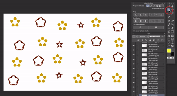
Repeat for other rows.
Likewise, align and distribute each column individually with [Align horizontal centers] and [Distribute horizontal spacing] after selecting the column objects with the [Object] tool.
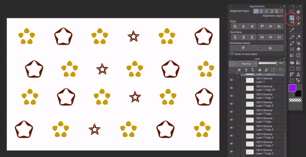
Now our pattern is aligned and distributed evenly, but it is not center aligned to the canvas. To move the entire pattern, we will group the element layers into a new folder. To do this, select the layers, right-click, and then choose [Create folder and insert layer].
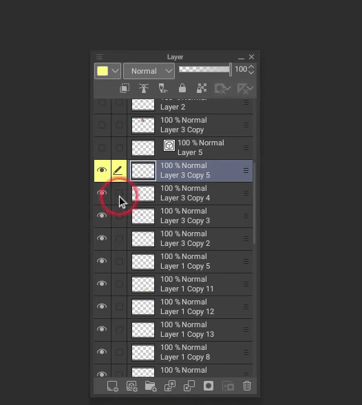
Tip: If you are working inside a vector layer, select the vector layer instead of the objects inside it.
After the pattern folder is selected, change the [Alignment base] to [Canvas]. Then, click [Align vertical centers] and [Align horizontal centers].
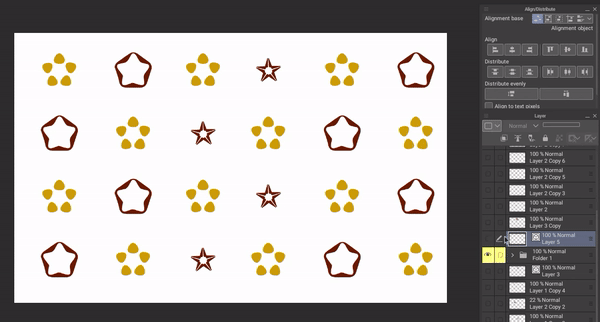
Your pattern is now complete and centrally aligned with your canvas!
Use 6: Making Sprite Sheets
Sprite sheets are often used for game animations of characters or objects. It is crucial for them to be perfectly aligned or it could mess up your animation.
Even though sprite sheets can need some custom alignment tweaks depending on the movement being created, Align/Distribute can help you reach the final result faster.
Let's look at how we can quickly create a precise sprite sheet with the help of the Align/Distribute tool. I’ll be demonstrating the steps with a sprite sheet for a heart unfolding animation:
STEP 1: Open the grid by going to [View] and then [Grid]. Next, open the [Grid/Ruler Settings] from the [View] menu.
Adjust the [Gap] pixels such that your largest image can fit inside one of the larger grid cells that have heavier outlines.
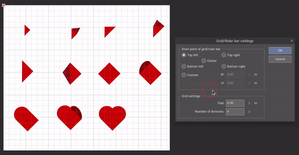
STEP 2: Line out your sprites in the approximate positions you want for them, each in their own cell.
STEP 3: Set the [Alignment base] to [Selection area]. Select the area covered by the first row with the rectangle [Selection area] tool (keep [Snap to grid] in the top icons row on) and select the row’s sprite objects with the [Object] tool.
Click [Align bottom edges] (or [Align vertical centers], depending on your need) in the [Align/Distribute] palette.
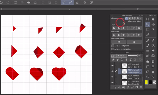
Repeat for all other rows.
STEP 4: Now we need to align the horizontal centers of all sprites. We will first select the area covered by the first column with our [Selection Area] tool and the active [Snap to grid].
Then, select all the sprites in the first column with the [Object] tool and click on [Align horizontal centers] in the [Align/Distribute] palette.
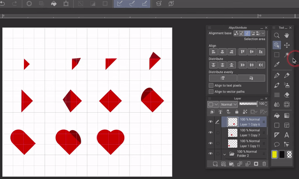
Repeat for all other sprite sheet columns.
Your sprites sheet’s main alignment is now complete. For my sprite sheet, the individual sprites are too variable in size and shape for the heart tips to perfectly align. With the grid’s visual aid and the [Object] tool, I will adjust the heart tips so they consistently fall at a single point.
As is evident, due to the Align/Distribute tool’s aid, I only need to make minor adjustments to my aligned sprite sheet instead of trying to align it manually from scratch.
Use 7: Making Objects Containing Aligned Components (and [Align to vector paths] )
When drawing (scenes and background especially), we can encounter objects that are composed of aligned or evenly distributed elements. It could be gates, fences, cupboards, picture frames, bull’s eyes, etc.
Align/Distribute is the perfect tool to use in such instances. For example, I am drawing a grilled double gate. First off, I want to know the center of the double gate where the two gates meet. For this, I use the 'snap to center' method discussed under Use 1.
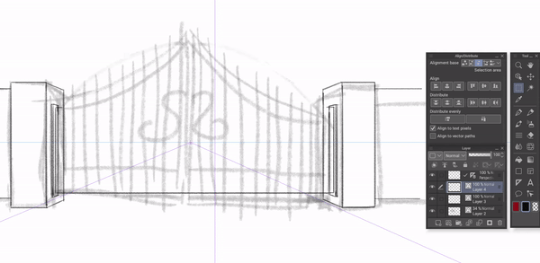
For the grill, I draw a single grill unit in a new layer and copy-paste the layer around fifteen times. Now I select the layers with the Object tool. With the [Selection area] tool, I select the area of one of the gates.
With the [Alignment base] set to [Selection Area], I click on [Distribute horizontal spacing].
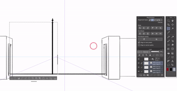
Align to vector paths:
The grill is evenly distributed but there is blank space on both ends which should not be there. This can happen if you are using vector layers and you can easily correct it by selecting the [Align to vector paths] in the [Align/Distribute] palette.
Now I select [Distribute horizontal spacing] again and the gate’s grilling has been perfectly distributed across the selection area.
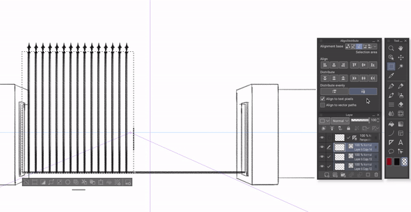
The layers are still selected, so I right-click one of them and select [Merge selected layers] so the complete grilling is in one layer instead of being scattered across many layers.
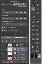
After duplicating the grill layer for the other gate, making some design adjustments, and transforming the perspective of one gate, here is the final result:
Final Thoughts
That is all for the tutorial. I hope this article helps you make the most out of this impressive new Align/Distribute feature and the wide possibilities of its use.
Thank you for reading. Feel free to let me know if you have any questions or comments!


コメント