Fashion Tutorial - Designing
Welcome to my tutorial on Fashion Design!
This can be used to help with either outfit concepts or character drafting when it comes to their looks. This will be made as simple as possible, though with what information I wanted to share may be a bit of read. It’ll have pointers on how to put together outfits from a concept board to playing colors and patterns.
Beginning - Idea Board
First thing first- What do you want for your outfit(s)/Character(s)?
I suggest using Pinterest, if you can’t, any search engine you can input keywords will do. You’ll want to think of words the can bring up the needed images to help make the board. In this case, Pinterest was where I searched, the general look I was wanting was something with pastels yet a very nature feeling and a mix of fantasy; so the words I decided to go with were: Mermaid, Fairy, Cottage Core, Clothing, Fashion, and Mood Board. Using those, I found clothing that peaked my interested I wanted to have in my design, as well came across objects that I wanted to include some how and some collabs that inspired me.
(Example of the reference boar had to be removed) I went with anything that felt right and inspired my imagination for the designs you’ll see. You can choose clothing, objects, nature, patterns- Anything! Put together what you got and save it for later.
Drafting - Base 2D Model
We’ll need a... Model!
You’ll want to draft out a few poses to what you’ll want your model to have, keep it front facing with a slight side view and limbs somewhat spaced out. Have the model’s body shape in mind and if they might be a different race, this is important as an outfit for a thinner model may not look the same on a larger one; including if the character has longer ears or tails or wings- etc etc.
You don’t need to worry about it being neat/clean, this is just drafting, so as long as the messy shapes form the idea, all that matters.
Choose which pose you’d like, with another layer over it sketch out a more clear outline of the body. If you need guidelines to help remember the curve of the body, add those if you like as I do with the head. The body doesn’t need to be detailed, perfect, or even have a face, just understandable and have space.
Now, what you’ll want to do is get your board, make it smaller or in another window off to the side. Lighten the sketch, add another layer over it and begin to use the board to help draft the outfit. Sketch out what comes to mind, replace what you might think needs to change or shift around where you might want something to layout- Take my design as an example, study the design and board to see what I did.
————————————————————————————————————————
| REMEMBER |You can be as creative as you want to with the design, there isn’t any rules to fashion designing when it comes to exploring new ideas and styles. Don’t worry about what’s popular, in style, or what’s others may consider abnormal. Fashion is self-expression.
Most of all, you don’t need to have it as detailed as mine, it can be simplistic or even more extravagant.
————————————————————————————————————————
I’ll break down this part into two sections, Character - General Outfit. You read which ever fits what you need.
| Drafting for Character |
If you’re designing around a character, then you’ll want to consider a few things:
| Personality | If your character is lazy, stylish, self conscious, rebellious, etc.
-Lazy might wear jeans with sneakers and a t-shirt. Stylish might wear more expensive looking clothing or might be simplistic with bit more of a flair. Mix personality can have mixed together styles or changed their type of fashion time to time.
| Life Style | If they’re busy on the go, always home, always traveling, or take their time with their clothing.
-People on the go will tend to wear easy to slip on clothing, as to where, those typically stuck at home may stay in their pajamas or get semi-dressed. Can even consider if they fight, they’re wear some sort of gear or armor or have bandages- Wise older characters may be dressed simplistic with clothing easy to put on.
| Social Status | If they’re among elite, lower end, within a magic, so on so forth.
-Their place among the world can influence what they wear, if it’s the only clothes they can afford or have to keep up their image for their boss.
Generally all around, you’ll want to take into consideration who your character is going to be, what role they have in the world, and where they came from in background context. None of it has to be overly detailed, unless it helps, but having a bases understanding will help.
| Drafting for Clothing |
If you’re designing around clothing, then it’s going to be a bit different than for character.
Take into consideration what sort of style and theme-ing you’re wanting to design. Is it for a season, a specific type of event, inspired by a time period, a more abstract style and so on so forth. All of these can influence how to go about designing, if you’ll need research for historic and if you’ll need to think a certain way while putting together an outfit.
| EXAMPLES |
Lolita Japan fashion is centered around dolls, Victorian styles, and cuteness/prettiness. Looking at the fashion it’s very detailed, with frills/ruffles, usually pastel, lots of extra unique accessories and seeing it speaks a lot more for itself.
Techwear Street fashion is more rebellious, mainly black, use of buckles, unique use of clothing, and very loud even for it’s lack of color. It’s simplistic with subtle detail that sometimes covers the whole body or shows off areas of it.
Look at any fashion to see what makes it what fashion it is, there is a sort of theme and key focus to each of them.
——————
List out what you’re after and keep it in mind while looking at your concept board as you sketch out drafts for the outfit(s). Studying my design again, I kept in mind it possibly being for summer or spring wear, the style is a mix of mermaids and cottage core accents; the unique part being the side lacing for the overalls and pattern added to the bottom of the sleeves. You’ll get to see the other designs around the similar concept, yet different personalities to them.
Expanding the Idea - Exploring
Here you can see I used a new layer over the base pose to sketch out two more designs. They keep the base concepts in mind as stated before above in this tutorial:
The second I use the fish net with pearls for the top and hat for the mermaid feel, as well the skirt being layered with frills as if the mermaid tail, but the ribbons and sweater for the cottage core feeling. I did keep the side lace up as the design before it, but with shoulder tie on straps and both have chokers. What I changed was the shoes and removed the patterns.
The third I wanted to be more tomboy, so I decided high waist shirts with a simple tank top, but the sweater is now a crop top with the lace being on the arms instead. Her belt and longer lace up shoes match with the sleeves, as the patterns return for the shoulders on the sweater and corner front of the shorts.
——————
This is a good example keeping to concept of what you’re wanting to design, but, expand on those ideas to make unique looks and explore new ideas. Don’t be afraid to remove some aspects, change them around, or place with a few outside additions.
Adding Life - Color, Pattern, and Flair
NOTE: Apologies this part is so long, there is a lot of advice and things I wish to note from my experience, onto here.
This part may take some time to do and may come to some frustrating parts, but don’t worry, it’s still a lot of fun. Here are all three outfits with three different color concepts, this will serve as the example as to what you can do with clothing.
——————————
First, I suggest adding a layer for the background as a light/medium grey. A bright white background can make it hard to see exactly what you’re throwing together, especially if the choice of color is a pastel or vibrant hue. You can toggle this layer on and off as seen fit during this process.
——————————
Next, choose your skin color. This is very important to do first as not all colors work well with all skin tones. Some colors can be hard to see on certain types or not match up very well, you’ll want to know who these outfits may be for. You are welcome to make copies with different skin color if you’d like for each section.
——————————
Finally, coloring! Take your concept board, it should have the general colors you are after. Start color dropping the core colors you’d like off to the side to use ease of access. While coloring each outfit, remember you can do gradients, patterns, a lot of color, few colors, and anything that might come to mind. Take all what I’ve done as examples for some of what you can do.
————————————————————————————————————————
—One Note Color—
You don’t need to have tons and tons of colors, you can do like Techwear and just have all one color. It’s about the easiest for outfit designs if it’s what you want to do. Even with this you can add different shades and tints of the color if you’d like, as well patterns.
————————————————————————————————————————
—Few Colors—
| Row one, second outfit | Row two, first outfit | Row three, second outfit |
——
When using few colors, use different hues of that colors from shades and tints in that color family. You don’t have to stick to that specific color, you can shift more towards the left or more the right, so long it’s within the similar family. Such as Yellows you can still use tans or Teals you can still use more green or blue. Important is to have separation colors, those being like whites, blacks- Anything not of that family to help break up the design a bit. The listed outfits are examples I did of using few colors.
————————————————————————————————————————
—Many Colors—
| Row One, third outfit | Row Two, Third Outfit | Row Three, any |
Using a lot of colors can be tricky, especially a rainbow of all things! It’s not impossible however.
—————
-The first listed outfit has the many colors as the small details, the sweater fabric, and part of the weaving in the hat. This works all together because the overalls are mainly one color acting as a separator, along with the many colors being soft mixed with white you can still see with hat and sweater.
-The Second outfit listed is very exaggerated, the skirt and sweater being mainly all rainbow! How does it work? Well, the white accents and the teal top help separate the rainbow, helping to be readable and not being so muddy together. The ribbons aren’t colored to help add that separation unlike the other two outfits. When dealing with rainbows you want one or two main separation color, this one having: Teal, Used for the top, shoes, and hat. White, acting as accents then larger gap with the socks (though you can add a very small pattern them with multicolors, still works).
-The third doesn’t have an example like the other two, but instead a more subtle one. Using multiple colors doesn’t have to be BOLD, it can be subtle too.
Between all three of these, you can study them and how they work.
————————————————————————————————————————
—Extra—
Look at any outfit, you may notice gradients and/or patterns. There is no rules where and how to use them, even combined together. Gradients are great for multiple colors blending together as where patterns are great to add softer detail for few or multiple colors. In whole, study these designs and any you find from real life to character designs, you can see all the ways you can do fashion.
Even as walking art in French Runway fashion!
(Note: These are just examples from some of my work, a few are my characters. Please don’t replicate or copy the designs, just use as examples.)
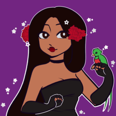
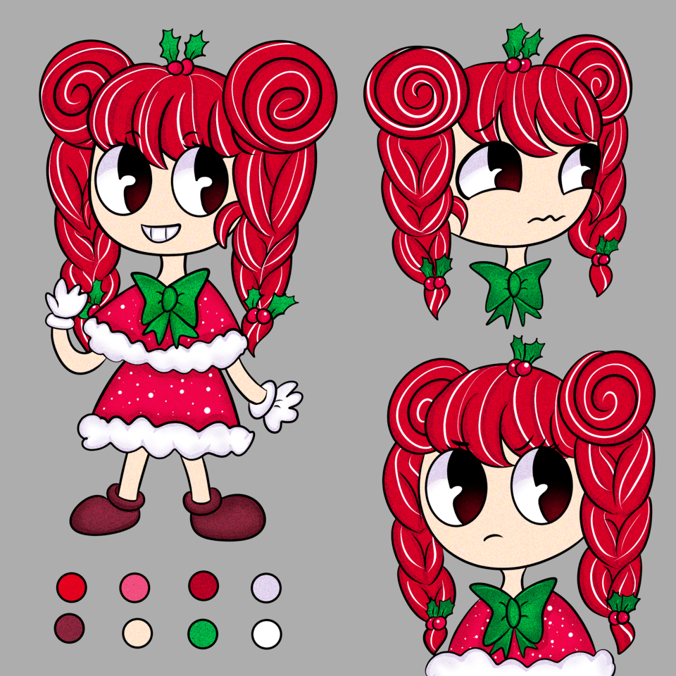
These are other past designs I have done that I pulled together to show other ways you can do fashion/character designs. All these having their own themes that I was inspired by to sketch out. The first being around a battle arcade angle, the second a Royal like stylish pool party, the third a breakfast pancake mouse knight, and last a morally grey other world woman ready to fight. I tend to lean more towards detailed, but the second one is a great example of simplicity can still work as a great design.
Final Notes
These are the three outfits I ended up liking the best out of my own sets and wanted it as the end card.
Fashion.
It’s self-expressive, creative, exploration, and freedom. The only standards set are ones set by you for yourself, so how will you show the world who you are?
Hope this tutorial helped if you’ve been having trouble and that you enjoyed my designs. If you liked it and found it helpful, leave a like or save it. I also love any all feedback you can leave in the comments.
Thank you for reading my first tutorial!


댓글