Creating looping animations: tips & tricks!
Hello! I’m MYE0N, a student artist and animator. I’ve been using CSP since I first started digital art, so I’m excited to create a tutorial and hopefully share some of my process.
As only a “self-proclaimed expert”, I’m still learning myself.
And because I am smart, I forgot to record the actual drawing of my animation process. But I tried to recreate everything to the best of my ability so I promise you won’t regret suffering through school and learning how to read, just to be able to comprehend my godly tutorial with words instead of a video.
…
Don’t forget to like and favorite…?! ?
Enjoy~!
Let's get started!
Today, I’ll show you how I made this simple animation loop, similar to ones found in lo-fi music videos I like listening to while doing homework and having an existential crisis. So let’s get started!
NOTE: I now use CSP EX, so I don't have a limit on the FPS and time. The Pro version is pretty difficult to animate with these limits. However, it's definitely still possible with the Pro version, although a lot more restrictive. Just something to keep in mind! :)
First things first, create a canvas.
There are two options for this. The first method is to use a normal illustration document, and check the box for “Create moving illustration.”
The slightly more complicated one is the animation document:
Image notes:
A- You can adjust the FPS and playback here.
B- You can adjust the space that extends beyond the blue lines in the canvas, and things drawn within that space won’t show up in your final render. This is typically for more complicated animations that may need to have things drawn a bit out of frame.
Workspace for reference:
Since it’s just animating simple loops from an illustration, the moving illustration doc works better in this scenario.
The canvas size is up to your choice as well. I went with 1980x1080 and 144dpi settings (and an animation document, before realizing the other choice was easier).
You can always change the sizing later. Just make sure to set it to your preferred size before you start animating or adding frames!! It sometimes won’t allow you to change this without deleting all your frames.
NOTE: IF YOU PLAN ON EXPORTING AS A GIF, 2000px by 2000px is the max size!! (Same goes for the animated sticker option. Just something to keep in mind when deciding how big your canvas will be!!)
1) the idea, design and illustration:
The first step I take is to thumbnail and sketch! It’s a good idea to plan out what you want to animate, especially if it’s going to be more complicated.
- PLANNING ANIMATED ELEMENTS -
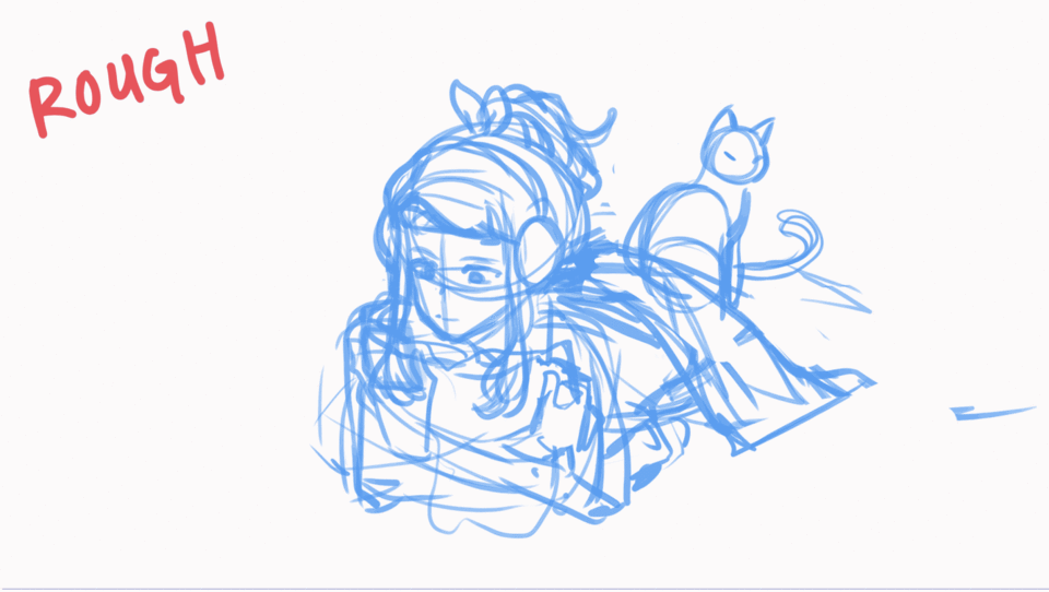
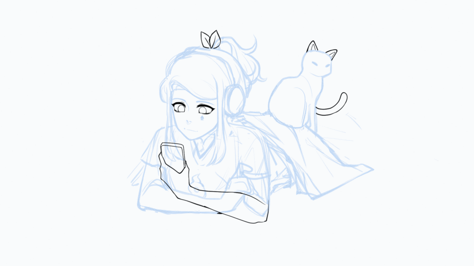
After sketching my initial idea, I’ve marked the places that I plan on animating/moving in a different color and layer. It’s a personal choice but helps me keep track of what exactly I need to animate later on.
I make a new animation folder for every individual moving part (highlighted in blue), so each object can run on it’s own loop and not interfere with other loops. Since it’s looping, I can set the sketch position as the starting and end point. More on this later.
After organizing which objects that will be animated, the rest of the illustration that doesn’t move has to be drawn.
- INK -
I fill in the gaps left behind, to make it easier to color and the areas that will be exposed by the animated movement, such as the front of her shirt. Clean up the sketch lines, and ink with either a vector or raster layer.
- COLORS -
Since I already planned the colors out, I decided to color here as well. This can also be accomplished after animating as well (which I believe is what I actually did. Doesn't matter too much, as long as it's done at some point.)
2) animation basics and breakdown:
In my opinion, this is probably one of the more difficult stages. Animation is definitely not my strongest forte, so I find references extremely helpful for the planning.
- REFERENCES -
I usually try to find anime or anime-styled GIFs and loops as a reference, since I’m not trying to mimic real life so much as just moving them a little. Maybe I just like the aesthetic, but I find it super helpful for more simplified movements!
There are also amazing real-life references (try Kevin Parry’s 100 ways to animate on YT!), but for something small, it doesn’t have to be extremely accurate or true to life.
NOTE: If you are not familiar with animation or are struggling, I recommend turning towards Youtube for help- there are plenty of great videos that can explain animation far better than I can! I would recommend starting with the 12 principles of animation, and finding process/tutorial videos about how professionals work and animate. Good luck!
...
After I created the animation folders for each new object, I need to rough out the animation for all of them.
Open your timeline and click this button to create a new animation folder. The end result should look a little bit like this:
If your animation folder is empty, you can add a raster or vector layer to the folder. Then right-click on the timeline to select that cell, and it should appear on the timeline!
- 2CEL ANIMATION -
Most of the animation I did for this illustration was super simple, consisting of only 2 cels. They honestly don’t look very different, either!
One of the easiest ways to create movement is just to have the object slightly moving back and forth. This is what I did for the leaf hair tie, the cat ears, and arm. It can look pretty decent, even though it’s only 2 frames.
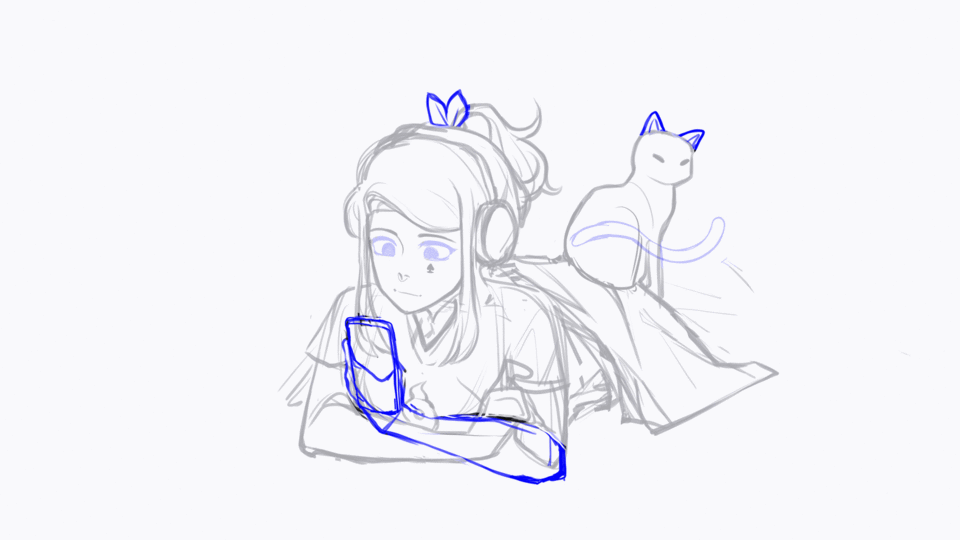
You can easily make your illustration move with only two frames! There is a bit of variation to make the movements a little more interesting, but mine loops again after 3 seconds.
These animation folders only hold two frames, and you can see how the frequency of a frame affects how fast/slow the final animation appears! (The hand texting types and vibrates a lot faster, so there is less space between the alternating frames to showcase this faster action.)
- EYES -
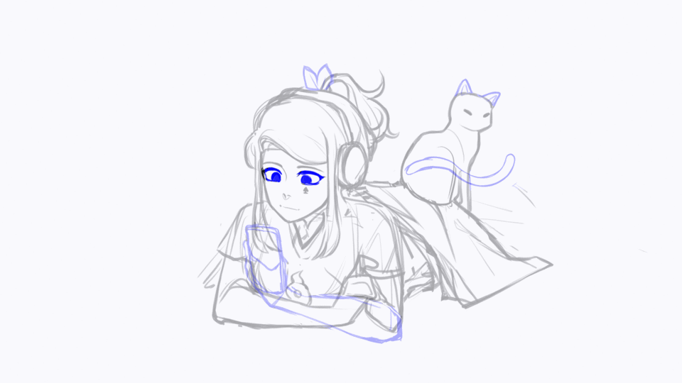
The easiest way to animate eyes is to draw it in three shots- open, closed, and a middle point.
After these frames are drawn, you can mess around with timing a little to achieve your desired effect. A faster blink would have frames closer together while having eyes closing slowly might have frames farther apart.
- CAT TAIL -
This was the most painful part for me, since I still don’t know how to animate cat tails lol.
References were a lifesaver, and that’s pretty much the only way to take more complex animation. I used mostly straight-ahead animation, meaning I went frame by frame to animate the tail motion.
Typically, for 24FPS you want a frame about every 2-3 frames (this does depends on the type of movement) but I decided not to inbetween. It wasn’t worth the effort for me, and although the tail looks a little choppy it looked good enough so I just left it at that.
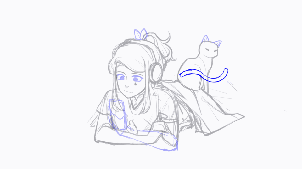
Disregard the messed up frame numbers, I usually end up adding frames in between others and CSP automatically adds letters after them lol.
3) animation lines and colors:
After you have your basic rough animation down, you can now ink and clean up the frames!
I suggest using a vector layer to do this since it’ll be easier to adjust separate lines or erase with the vector eraser if you make a mistake. When creating a new animation folder, adding a vector layer into the folder will automatically set every frame after as one too!
Honestly, inking is just a tedious step of retracing everything.
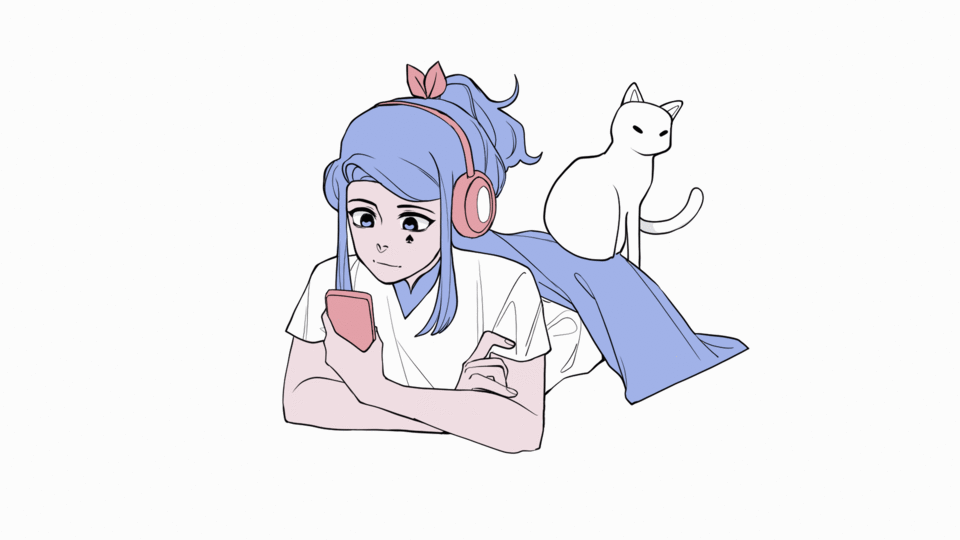
After inking, I made a new animation folder for all the elements and lined them up with the frames. These folders are for coloring purposes.
I labeled all my ink layers to begin with "v" to represent vector folders, and "c" to symbolize color folders. (I also use "r" for rough animations)
And boom! The loops are looking a little more colorful.

The frames are now a bit more cleaned up, and adding on the still image underneath this is the clean version for the animation loop!
4) and for the finishing touches:
Tada! You’re basically done at this point- you can add some more effects/finishing touches to make it nicer if you would like but that’s basically it for the tutorial.
Basically, the hard part is over and now the goal is to make the result look prettier! Sorta like compositing. :)
- SHADING -
I used a multiply layer at 30% to shade (although the opacity depends on the shade color used). I first colored in the shades for the still image and depending on how you shade, the moving parts can be optional.
You can either make a new animation folder for shades, or just color on top of the flats.
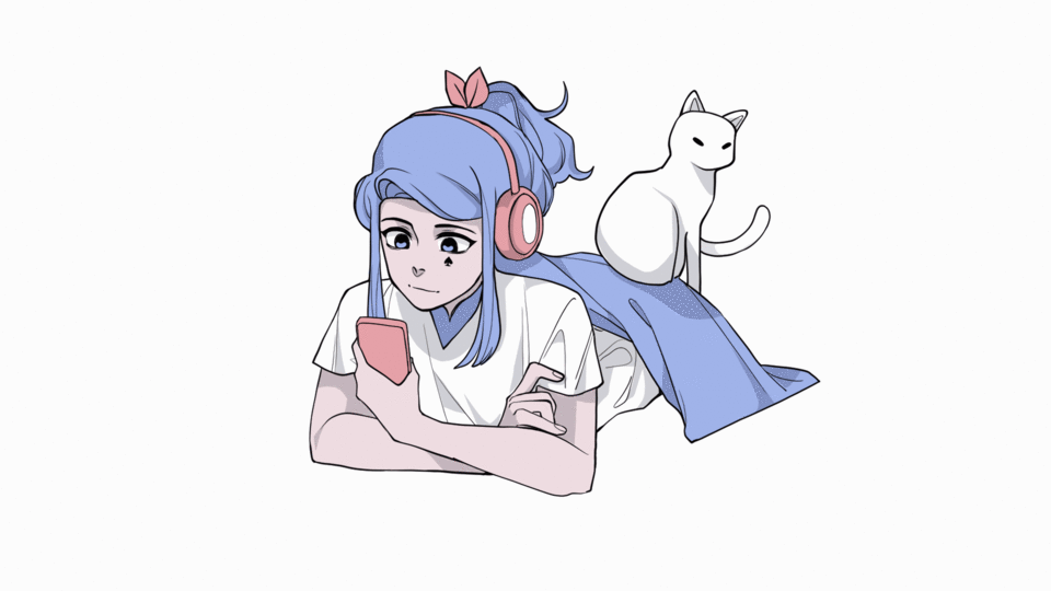
After that, you can move all the layers into one giant folder in order to apply some overlay and effects to the entire animation if you wish.
And this is the final result I went with!!
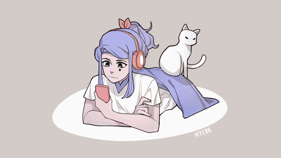
(Doesn't overlay make everything like 10x better??)
- EXPORTING -
To export your final animation, go to "File" > "Export Animation"
I just used the "Animated GIF" option to export, so that my animation will continuously loop.
If you want more control over your frames, exporting as a sequence into a video editor is also an option.
5) closing:
Hi there! Thanks for coming, and sticking with me all the way until the end.
This is my very first tutorial, so I hope it was helpful to you somehow! I think it was definitely a bit rushed, and that I can definitely do better. Lol.
If you have any questions or suggestions, feel free to let me know! Idk if CSP has comments or messages?
I do have an Instagram, but I haven't posted in like a year so if you want to follow me @catmyeon feel free (I'd rather you didn't, but who am I to stop strangers). I plan on revamping it a bit since summer is coming soon, and I have some new better art so :D
Don't forget to heart and favorite the article if you liked it!
-MYE0N ✌︎('ω'✌︎ )


댓글