Tips on dynamic pose
Hey guys, in this tutorial I'm gonna talk about a few points or tips that I would suggest when drawing a dynamic pose. These points are often used by professionals as well as beginners and are key elements in building a dynamic pose. So I hope you guys have some good level of understanding in anatomy so that you can apply these points when drawing dynamic poses.
Avoiding symmetry:
When you're drawing a dynamic pose especially in any kind of scenario it's better to avoid symmetry because symmetry not only makes the pose a bit boring but also there is not much flow so it also makes the overall pose stiff. When you avoid symmetry in your drawing poses you can create a more interesting and engaging artwork. It adds a sense of movement and energy which are essential in creating a dynamic pose.
To give you an example: let's take a look at this figure, it has a symmetrical posture . This kind of pose works if you're drawing character design but other than that the pose will be a lot better with different movements.
So I will draw this pose again with no symmetry . it's gonna be very slight changes in pose but it will make a big different. You can already see that the asymmetrical pose looks more dynamic.
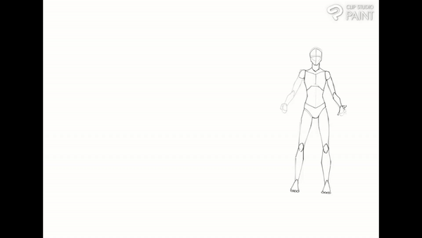
If I exceed that asymmetry more , the more dynamic pose we will get.
Another symmetry thing to avoid in a pose is the shoulder and hip line. I see a lot of people drawing their pose with a symmetrical shoulder and hip. Basically the shoulders and hip being in the same place on both sides and not tilted Which creates this symmetry and a more of a stiff posture which hinders creating a dynamic pose .because when you look at your shoulder and hips they always tilt according to your action they only stay straight when resting . a tilt in the shoulder or hip line will create a more dynamic pose and momentum in the body. And the overall pose will look lifelike and flowy.
To give you an example : I'm drawing a character with symmetrical shoulder and hip lines. The overall pose will look good but not dynamic. Even if you draw your character with asymmetrical posture it will just look stiff.
But when I draw the same pose but with tilted shoulders and hips, creating this asymmetry adds that flow and automatically makes the pose more dynamic compared to what we drew before.
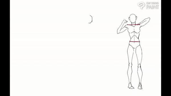
MORE EXAMPLE:
If you want to draw a character who is up right and being stiff is their character trait then it is fine to have a symmetrical shoulder and hip level. But other than that i would suggest the tilted asymmetrical pose and line.
------------------------
BODY TWIST AND TURNS:
Another tip I would suggest to remember when drawing a dynamic pose is to give the body some twists and turns even if it's not exactly necessary. Essentially, this involves reorienting specific body parts in different directions than the overall pose's original direction,while preserving a sense of balance and gravitational force.
They add movement and dramatization to your drawing while increasing the visual interest. Which is essential when drawing a dynamic pose. You can incorporate the twists and turns anywhere in the pose, it can be the hand or the waist or legs or all together.
To give you a simple example: I have a drawing of two characters walking , it looks fine but it lacks the dynamism and energy and it is quite boring to look at. What can we do to make pose better here?
I'm gonna draw the same pose but with some twists and turns. I'm gonna add a twist in the waist area which will make the upper body face one direction and the lower body in a different direction which creates a dynamism. And I have turned the face in this direction .
With just a simple twist we can incorporate energy and excitement in a pose. Basically you're amplifying poses even if the pose doesn't require any twist you can still add it to dramatize the pose.
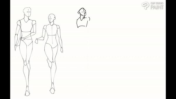
This tips best works for poses in action . if your action poses lack that dynamism and kind of looks static incorporate twist and turns to give you an example . i'm drawing a character holding guns but it has no twists in its body .
Then I will draw the same pose but with some twists and turns and automatically uplight that action pose by making it dynamic.
Line of action:
The concept of the "line of action" is crucial in establishing a basic guideline for crafting a dynamic and fluid pose. It is basically a line that runs through the body , hinting the main action of the figure. If you look at any professional's works you can see this imaginary curvy line.
Line of action goes hand in hand with what we learnt before the twists and turns . we can use the line of action as a basic guide to draw the whole figure but as well as the twist and turns. Understanding and using line of action will help you create dynamic and action filled poses.
Avoid straight lines in line of action since they only make pose stiff and unnatural, the s and c curves lines are the ones often used to create the dynamic poses.
Here how you can incorporate these line of action as basic guidelines in creating a dynamic pose
Here I have a character throwing a punch but the line of action is straight which is how beginners draw , without a proper guideline We often tend to draw stiff poses.
I'm gonna draw the same pose but with a curved line to help me with the dynamism and flow.
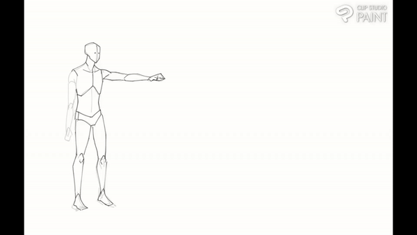
Now if you compare both , the one with the line of actions has better pose and sense of movement with proper flow throughout the body. And these kinds of dynamic poses can be only drawn when you have the basic guide to follow through. That's why line of action is important. Of Course the punch was just an example you can almost do any pose using the line of action
-------------------------------
Mid action:
One of the best tips I can give you to draw better dynamic poses is to draw mid action poses. What I mean by mid action is to draw poses that capture a character in motion. Instead of drawing a character in a static state, like drawing a character in a resting position . Drawing a character in mid action adds energy and a sense of movement is what creates a dynamic pose. it also makes your character look lifelike and interacting with the environment. Especially if you're creating an action comic i would suggest you to draw mid action poses to create a visually appealing pose
To give you an example: I have a character here who has fallen down . It's pretty simple and does convey the story but it's boring since it's in static or resting posing which has no dynamism in it.
So let's draw a character falling down again but in mid action
Now if you look at this one it definitely has more dynamism and movement and it just looks natural.
In this particular tip the accessories ,the hair , the clothes of the character also matters a lot. Basically when your character is in mid action the hair and clothes also move in a direction and will not be in a resting state. If you remember to do this in your pose you can draw dynamic poses like a pro because these elements just add another layer of dynamism .
If the characters' clothes are static or appear unaffected by the action, it can break the flow and make the scene less realistic
clothes and hair movement can add a sense of movement and energy in the scene , it helps create a more dynamic and immersive experience.
For example:
A. if your character is jumping the air will go up the clothes so will the hair flow up.
B. If you're character is running the clothes and hair will flow to the opposite direction
C. if your character is twisting and turning the clothes will also have some twists so will the hair.
So don't forget about the clothes and hair especially when drawing a mid action since it's never in a resting position.
This just accentuates that dynamism that we create with the body pose to another level. I would recommend you to watch an action scene on youtube and pause the character in mid action and try doing a quick gesture drawing sketch,this will help you create a more natural action pose.
Perspective and angle:
Perspective and angle are powerful concepts as individuals but combining them can create a more dynamic and impactful pose. People commonly draw poses in straight on view but when we change things and try drawing a pose in a different perspective and a bit more challenging angle it gives the pose the dynamism that you just cannot get in a straight view.
Many people don't understand how powerful and dynamic your pose can be based on the angle of the pose. A pose that looks normal and not so dynamic can be made visually appealing and dynamic just by changing its angle even by a little.
For example: I'm drawing a character jumping, instead of drawing it in a straight view like this
if i draw it from a low angle which makes the pose dramatic, it makes the pose look dynamic that you just can not get in the straight view.

For example , Low angle poses are known for making the character look imposing and dramatic.
While high angles can show a character looking vulnerable and in tense.
So whatever is your storytelling in the pose you can make it dynamic by including these perspectives and angles.
But to draw these complex perspectives you need some knowledge in foreshortening and anatomy .
Another thing about using perspective and angles in your character is that you can make your pose look dynamic but at the same time it can be used for storytelling or to visualize the characters mood
But as i said you need a lot of practice to achieve these angles but there are some features in csp that can help you create dynamic poses in various angles and perspectives even as a beginner
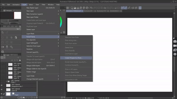
Csp has the perspective ruler which gives you a guideline to draw your pose . to access the ruler go to [menu] layer> ruler> create perspective ruler .
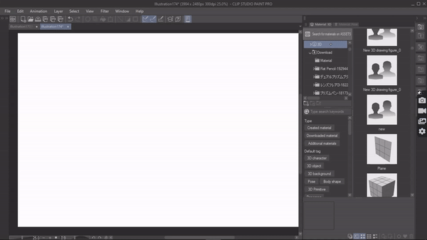
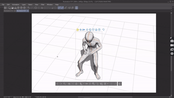
You can also use the 3d model available in clip studio paint, after dropping the model onto the canvas , adjust the body part to create the pose . If doing a pose with these controls we can control and place character in whatever perspective and angle we want .
now we can just take it as reference and draw our pose or just trace over it.(Work on it)
Exaggerate :
Exaggeration is the easiest way to draw or level up a dynamic pose. Exaggeration will add a little bit of drama and can make the pose appear impressive which creates a more compelling and dramatic pose. By exaggeration I mean to purposely draw body parts that are close to the viewer bigger even if it's not anatomically accurate. Exaggeration doesn't play by rules.
Normally the legs , arm and hands are the parts that are exaggerated but it can change according to the angle and what's closest to the viewers.
You can take a simple pose like a character standing or walking which doesn't has such dynamism in it and just exaggerate any particular part and it will automatically look like a dynamic pose
When you exaggerate these body parts it adds this movement and energy to the pose that the viewers can feel the motion of the overall pose like its an animation or something .not only that you even exaggerate a movement / action almost like it's a cartoon animation . Where everything is exaggerated .This is such a powerful trick and also be seen in alot of action mangas. So how can we incorporate exaggeration in our poses to make it dynamic?
I'll give you guys two example :
One will be about how we can make a non dynamic pose and make it dynamic just by exaggerating it
So here we have a character who has fallen down.
I'm gonna draw this pose again and by exaggerating the movement or action of the pose, I'll lift his leg up creating a comical effect to make it more dynamic.
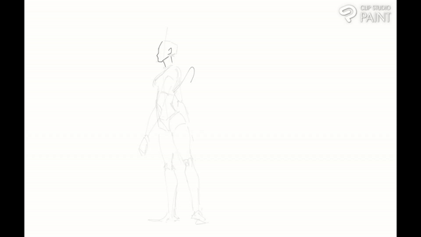
As for the second example we will take an already dynamic pose and make it more dynamic by exaggerating .
By making this legs bigger I'm playing with perspective and making the dynamism of the pose better.
There is also a CSP feature that can help you with exaggeration using a 3d model. Once you have your 3d model posed on the canvas . Go to settings , sub tool detail will open up . Under which select camera . You will see a perspective option by increasing the slider we can intensify the perspective making whatever close to the camera bigger . This feature will help you with exaggeration
This exaggeration can also extend to the clothing and hairstyles of characters. As previously stated, the attire and hair contribute significantly to establishing a dynamic pose. There are two methods to amplify the characters' clothing and hairstyles.
Exaggerating the movement of the clothes/hair. When illustrating dynamic action poses, it is common to depict the hair flowing in a specific direction. By deliberately exaggerating this movement, we can add more dynamism to the attire and hair. It creates the impression that the character is moving faster than their actual speed, thereby intensifying the overall dynamic effect.
By adding wind,another method to enhance the dynamism of a pose is by incorporating the element of wind and making the attire and hair have motion even if the character itself is in resting position. This adds a dynamic quality to the overall composition, making it visually engaging





留言