Character Groups Easily: Tips for Composition and More!
Video version:
Text version:
Hello!
I’m .avi. I work as a professional game illustrator and creating comics and webtoons is my hobby.
In this tutorial, I’d like to show you tips and tricks on how to draw a group of characters from various angles easily.
🟪 PREPARATION
Before you start drawing, it’s good to summarize your characters’ info:
🟠 personalities
🟠 typical traits and postures
🟠 relationship to others
It will help you create an interesting composition true to the characters’ personalities.
🟧 Story
As in any other type of picture, it’s much more interesting if you tell a story through it.
It doesn’t have to be an epic saga, just a simple tale of the relationships among the characters and their surroundings, and the kind of atmosphere and mood they create.
🟧 Body language
You have probably heard about body language – it’s the types of postures people subconsciously make in certain situations.
It can vary depending on culture, but the basic rules are more or less the same across the world.
🟨 Angle of the body
For example, the angle towards which a character leans in relation to another character is a powerful storytelling device.
If their body axis is straight up, it shows their dignity and inner strength. Leaning towards another character shows positive feelings like affection, friendship and trust, while a character leaning away from another is cautious, nervous or reserved.
🟨 Open poses vs closed poses
Another type of body language are open poses and closed poses. The most typical examples are poses people make at meetings…
A character who sits with their arms and legs crossed is cautious of the others and is less likely to be convinced of others’ ideas.
On the other hand, a character who sits in a relaxed position with arms open and even leaning towards others is open to ideas, friendly and isn’t wary of others.
🟪 COMPOSITION
What kind of mood are you trying to convey? You can show a lot just through the basic shape of your overall composition.
A sharp, especially triangular composition works great for dramatic scenes…
… while rounded, organic shapes are perfect for calm and heart-warming scenes.
In the two panels from my comic below I wanted to show you how a scene can change from dramatic, using sharp angles pointing towards the victim, to a non-dramatic, where the sharp lines and angles are gone and the overall composition is rounded.
🟧 Focal point
Even in group scenes there’s always one focal point around which everything evolves.
Since people automatically first focus on faces, the focal point should be the face of the main character, whether it’s a human member of a group, or an animal surrounded by a group of kids.
🟧 Flow
From this focal point, guide the eyes of the viewer through the whole picture to meet the other characters.
You can achieve that by their line of sight, curves of an arm or a body, a piece of furniture or an asset, or an alignment of heads or even the imaginary lines connecting eyes.
Sometimes, the focal point is clear, like how the curves of the bodies of the choir of cats point towards the character’s face.
Sometimes it may seem like the focal point is an inanimate object, like this pine cone that the girl’s pointing at and everybody looks at. However, the cone points towards the girl’s face and because humans first focus on faces, the focal point is her face, despite everybody looking at the cone.
In these two examples various elements are used to emphasize the flow of action.
On the left, the kids’ heads are lined up in a curve in which the kids are running, and on the right, the arms, direction of sight, as well as the perspective and frame shape add another level of energy to the excitement of going on a trip.
🟪 PRACTICAL TIPS
🟧 Start with simple shapes
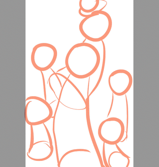
Breaking down the characters into simple shapes first makes things easier.
I’ve learned to use a shape similar to a bowling pin for quick drafts. Like this, it’s not hard to play around with various compositions and angles because these shapes are much easier to imagine in 3D space than a full body.
When drafting a scene, I always start with positioning the heads in the available space.
That way I can ensure that the most important part of a character is visible even in a cramped space like inside a car.
To add the previously discussed flow, I try to place the heads to form a curve, which always makes the image more interesting not only by enhancing the composition.
You can also use it to convey something!
In the particular case of the cast of my comic, where there’s one guy and a group of pre-school kids, positioning the kids’ heads in a wavy line helps emphasize the guy’s feeling of being waist deep in a sea of sharks :D
🟧 3D models to the rescue!
If you have trouble positioning the characters in the 3D space, or keeping their proportions, make the most of the 3D models and related functions that CSP offers!
🟨 3D figures
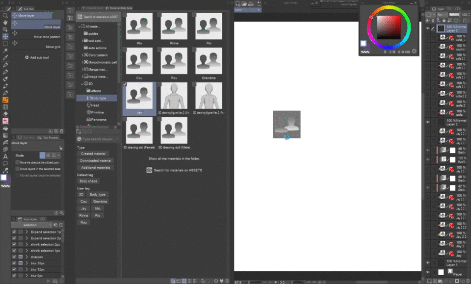
For example, I struggle to keep the height of the characters. For each character, I set up a drawing figure by adjusting the default body shape.
Now if I just drag and drop them onto one layer, they share the same space and I can roughly position them based on the scene to prevent drawing one character taller than they should be, etc.
I’m not going to dive into all the 3D functions since there are official tutorials on them:
I’ll just show you which functions can be particularly useful in this case:
⭐ Customize the 3D figure's proportions
Adjusting the 3D figure roughly to your character’s proportions is easy!
In the Sub Tool Detail palette in the tab 3D drawing figure you can play around with the modifiers.
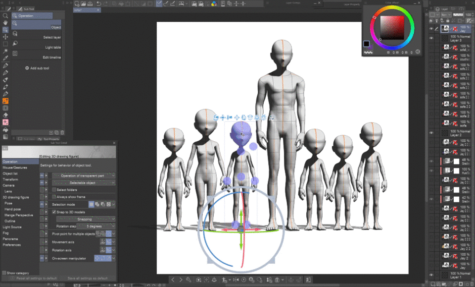
Depending on your stylization, you can even get quite close to the real body shape of your character. My characters are quite stylized, especially the shoulders and the shape of the head, and my attempt to modify the figure to match that resulted in these kinda creepy aliens…
But hey, they serve their purpose just fine! XD
⭐ Object snapping
Another thing I want to point out is the snapping function, found also in the Sub Tool Palette in the Operation tab.
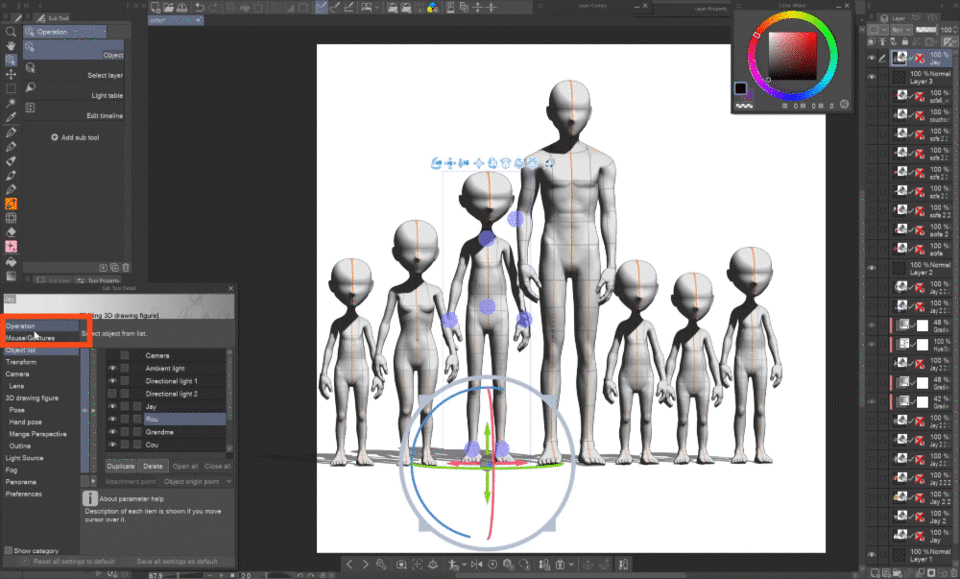
This allows you to snap 3D figures and models to each other, like lining them up or placing a pillow on a sofa.
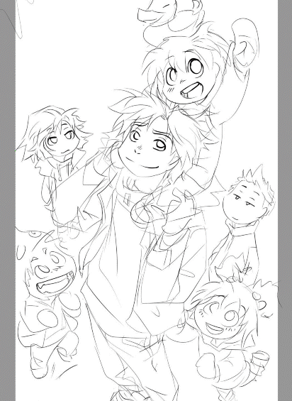
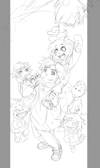
This unfinished painting was originally a panel from my webtoon that I decided to expand and use as a promo material, because it perfectly portrayed the turning point in the characters’ relationships.
Before inking I set up the 3D figures to check the proportions of the sketch.
⭐ How to position objects without changing your camera angle
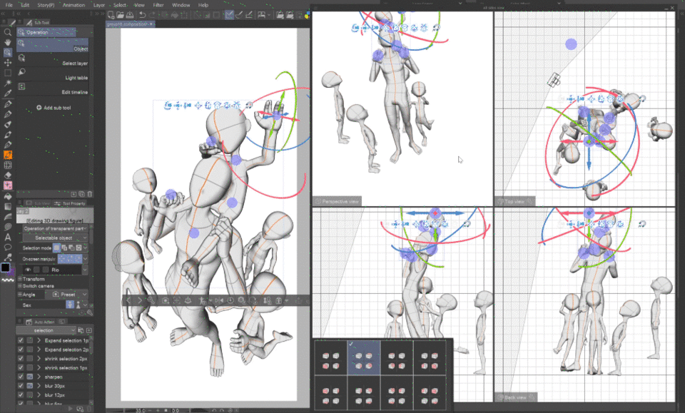
The EX version has this handy All sides view palette (in menu under Window) that lets you see the composition from various angles to precisely adjust the models without having to move the camera on your canvas.
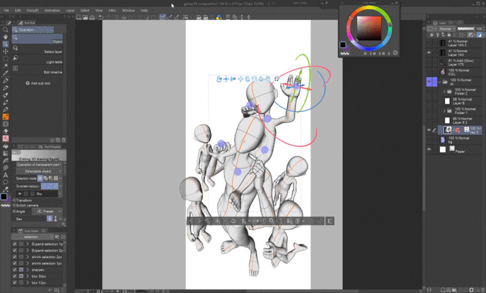
In the PRO version you can duplicate your camera and lock the original so that if you move around with the duplicate you can always go back to the locked original camera angle that you have set up for your scene.
This is possible both in the Object list tab and the Camera tab of the Sub Tool Detail palette.
As you can see below, I didn’t really keep to the 3D models when outlining, I only used them as a guide - because I like drawing the characters in curved shapes, which is unrealistic and thus not possible in 3D.
Also, there are some inevitable technical imperfections that you don’t want to transfer to your drawing, like the deformed heads and feet due to the exaggerated perspective.
🟨 3D models
Another great feature is that you can place other 3D objects in the same 3D space on one layer, effectively making a whole scene!
I’m not good at drawing technical stuff so I use this car model. By adding the figures I can check the proportions and adjust the sketch before inking.
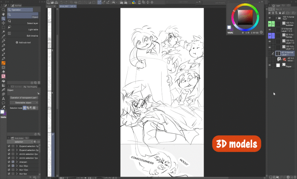
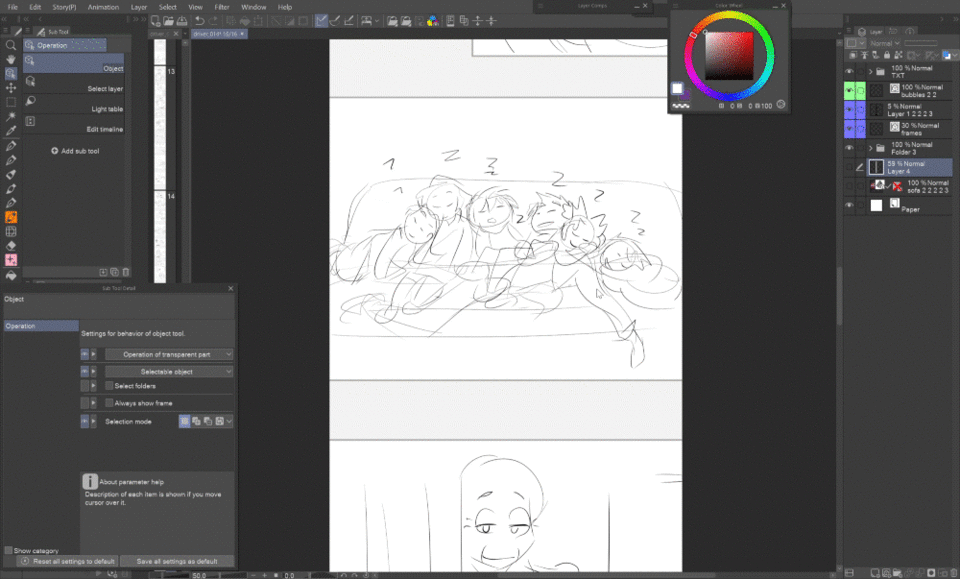
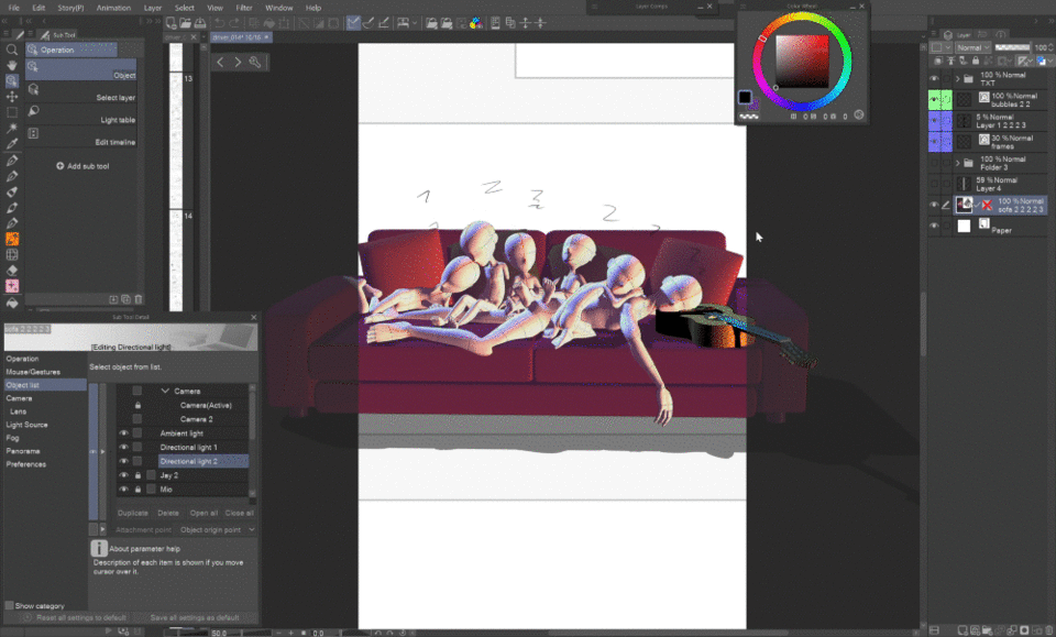
Similarly, there’s this scene where the kids fell asleep atop the guy on a sofa after partying all night. I used a sofa I made in Blender and a guitar from Assets, and positioned the figures according to the sketch to get a better picture of the overall space and possible collisions.
Most 3D models can be readily used as part of the background if you set up the lights and hide the figures. Like this, you can quickly add background behind your drawn characters!
🟪 Conclusion
These are the tips I wanted to share regarding drawing groups of characters. I hope they were useful to you and helped you boost your courage to draw illustrations of your characters together or even start a comic!
🌟⭐✨ If you enjoyed this tip, it will make me happy if you give a like so that I know I’m doing things right, eventually leave a comment on where I could improve :) ✨⭐🌟


留言