
Introduction
Buying all the tools you need to make traditional oil paintings is expensive, and can be a real mess. But! Many traditional methods of painting have been translated to digital software such as Clip Studio Paint. With the right tools and knowledge, even you can make a digital oil painting with ease, and I’ll be the one to guide you there through my painting process!
I’ll be going over these topics:
✱ Preparing a value plan
✱ Creating an underpainting
✱ Process of applying color
✱ Different brush techniques
My name is Qilin, and I’m excited to have you here to follow along with me. Let’s get started!
Video Tutorial
► Oil Painting Brushpack
Before I get into the rest of the tutorial, I created a simple brush pack that I use for oil painting that I use for this tutorial. You can download it for free. It includes:
✱ Oil sketch
✱ Thick oil paint
✱ Dry oil paint
✱ Super dry oil paint
✱ Textured smudge
✱ Fingertip smudge
✱ Toothbrush
In this tutorial, I also use this excellent ✱ Filbert (dual) brush from the asset store.
✱ Quick tip: Using brushes
I’ll do a quick demonstration using these brushes by painting a classic practice subject: an apple!
Finished apple! Ok, no more interruptions, let’s get on with the tutorial!
► Preparation: Composing Value Structures
A value structure refers to the organization and composition of light and dark shapes. This sounds like a simple concept, but it’s not as simple as it seems! When painting, your goal is to really boil down the essence of light and shadow to create form. Planning your lighting by designing values first makes the later process much easier.
This is why art teachers usually make students study still life, as it allows you to gain an understanding of designing basic forms and structures with the most extreme limits. Try look at an object in your room and simplify it into 2 values – light and dark.
When you study forms, it can be helpful to squint at what you’re observing. This can help your eye separate the light and shadow more easily by adding more contrast to your perception.
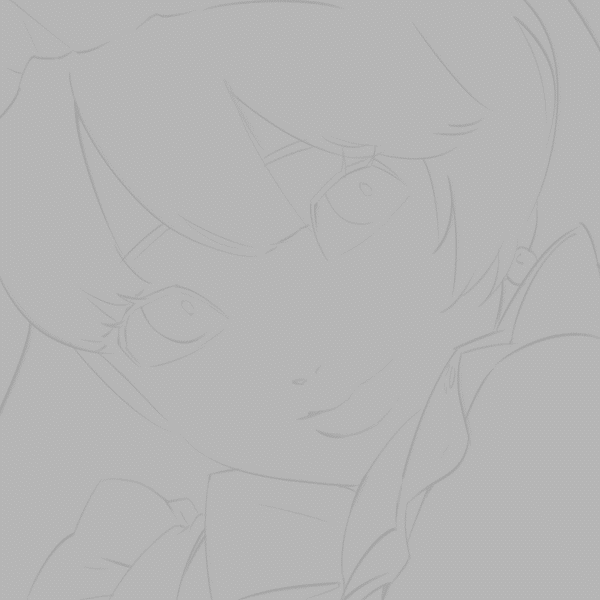
I’m going to make a 2 value plan out of my sketch.
Here I have drawn a closeup portrait of a lovely maid character, and I’m going to design a two value structure in a few different ways, to portray different lighting scenarios. I’m putting each value on it’s own layer.
I’m attempting to really accentuate the round form of the top of the head, while also considering how the light might affect more complex shapes in the facial features and clothing. Don’t be shy from looking at reference photos, I looked at 3 different pictures to help with all three!
Let’s look closer at this example, where I designed the value structure according to a light source coming from the upper right corner.
Most of the facial features became merged into one block of shadow tone. But specific details like the light on the nose and eye, the shadow of the lip edge and strands of hair, are compelling and give enough context to allow our brains to fill in the blanks.
A balanced composition benefits from a combination of a focus area and spaces of breathing room. Too much detail all over the whole canvas can be overwhelming, so there needs to be places for the eye to rest!
Below, you can see the general separations of the composition. Having that big block of dark values on the left means you end up drawing more focus to the more detailed areas on the right.
To summarize, when designing value structures make sure to simplify enough so that the value structure is clear, and shows form. In compositions, try strike a balance between high detail and breathing room.
Keep practicing, and definitely look at plenty of reference images when learning how to design your value structures!
► Painting Process
• Creating an "underpainting"
You may be wondering, what was the point of making those value structures? Aren’t oil paintings about color?
Ok yes, you’re right. But trust me – we’re going to turn this value structure into an underpainting.
In traditional oil painting, an underpainting is basically the “first step”. You use thin paint to place values and develop forms. Often they’re painted using only one color, as it helps painters focus on values first. It also works as a nice way to tone the canvas, and allow the overall colors to develop more harmony.
From value plan -> underpainting with texture.
Here’s how we’re going to change our canvas to become an oil-like underpainting with a canvas texture.
First, I’m recoloring the two tones+sketch. There’s many ways to recolor, you can lock transparent pixels on your layers and use the fill bucket, or add a color overlay layer on top of your values.
Try to keep your two colors generally monochromatic, meaning being the same (or similar) hue.
In oil painting, you might see these colors being commonly used for underpaintings (burnt sienna, alizarin crimson, cerulean blue, sap green).
Second, I’m applying a canvas texture over the underpainting.
To do this, search for “canvas” in the materials folder, and simply drag it in and adjust the texture size.
Then, under “layer properties”, select “recolor layer”. I find that the best color to use for recoloring is whatever the lighter tone is.
Now change the layer mode to “Overlay”, and you’re done!
• Blocking in color
During the color blocking process, I’m treating the underpainting almost as a coloring book – you can see how I fill in each segment with its own color. I’m keeping the brushstrokes loose, since I like how the underpainting interacts with the colors being painted.
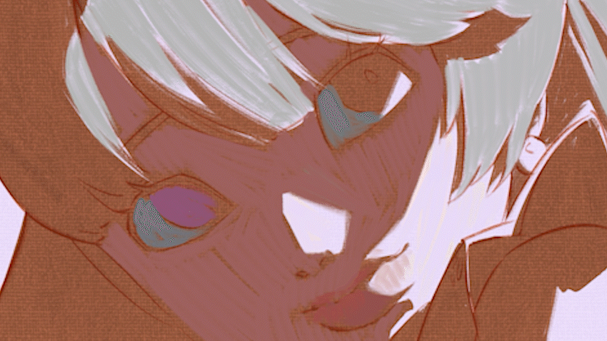
At this stage, be sure to pay attention to the color relationships: meaning checking that they still work with the value structure, and that they work harmoniously next to each other.
Don’t worry about backtracking or picking the ‘wrong’ color - since it’s digital, you can still use the beloved Ctrl+Z/undo to your heart’s content until you get your desired results.
Here is my first layer:
All my base colors have been manually painted in - no lasso tools or anything - all in classic fashion. My color relationships look like they work with each other, and they all align with my value plan.
• Rendering
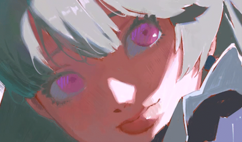
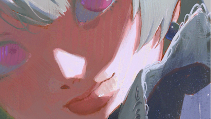
Now that I feel satisfied with the general colors, I’ll start rendering!
I usually start by refining the facial features, adding details to the hair, and doing some overall cleanup. In the shadowed portion of her face, I’m keeping the contrast somewhat low to align with my value plan, and using the texture smudge brush to mix colors directly on the canvas so my colors somewhat blend in with each other.
Moving on, I’m adding more detail to her clothes and adding hints of color saturation here and there to offset my rather monotonous colors.
Within big solid chunks of color like in her skin, I’m subtly adding some color vibrancy for more texture.
Before I show the finished painting, let’s talk about some different and useful brush techniques!
► Different Brush Techniques
Different brush techniques can really make an impact in oil paintings, and I’ll show you a bunch that I used for this painting.
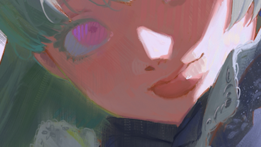
• Hatching
During painting, I like to use a hatching technique. It involves adding color with brushstrokes following the same angle. It can accentuate certain parts of your painting in a loose but interesting way!
I also use hatching in other areas of the painting to add texture by using subtle color changes.
Brightening different areas of the face with added saturation using hatching technique.
• Edge Control
I mentioned before how I wanted to keep contrast low in the main shadow area. One way to maintain low contrast is using softer edges.
I’m doing this is by slightly feathering some sharp edges using the “super dry oil paint” brush at a big size, or using the “textured smudge”.
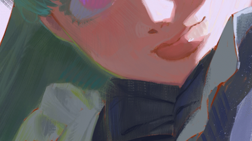
This way, there is a visual contrast between the shadow area looking really soft, and the area in light which looks much sharper.
• Scribbling to suggest detail
Truthfully, I’m just not the type of person who enjoys doing super perfect rendering. So this method is perfect for me! It entails using a very thin brush to suggest details out of scribbles.
You can see this most clearly in the sleeve section, where I used the “oil sketch” brush to scribble lace. If you look closely, it looks nothing more than a mess, but it suggests enough that you get the idea.
• Add vibrancy with hue shifts
Color is another way you can apply texture to a painting. Sometimes when I feel that my color is lacking, I’ll add more visual interest by enhancing the color vibrancy.
This refers to colors being the same value, but different hues. It’s a technique often used by painters during the impressionist movement!
You can do this easily by toggling the “color jitter” effect in the brush settings for whichever brush you’re using.
Go to the brush settings → Color jitter → turn on “Randomize per stroke” → increase hue by 100.
Let’s see this in action! On the skin, I’m eye dropping the underlying color to get its value. I’ll dapple some brushstrokes on. It looks shocking at first, but I can easily use the textured smudge brush to blend it in to look more harmonious.
• Embrace imperfections
Less of a brush technique, and more of a mindset.
Imperfections contrarily offer a lot of visual interest and charm in oil paintings. Throughout the painting process, take a step back now and then to evaluate whether you like how certain imperfections interact with the rest of the painting.
Embrace your brush imperfections and happy accidents!
► Final Painting + Closing words
And that’s it! Here’s my final painting:
Thank you so much for joining me with this tutorial, and I hope you learned something new and maybe useful from my strange techniques. I put in a lot of effort making this, so I’d love to hear your feedback. I’ll see you in the next one!
Dieser Beitrag gefällt


Kommentar