How to draw a Store front in Perspective
Introduction
As fun as it to draw from real life, imagination or reference, your drawing will be even better and more accurate if you know how perspective works, so that you don’t trace lines blindly but rather draw according to your own preferences and style.
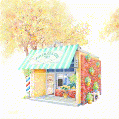
In this article, since I love Store Fronts, I will be showing you how I drew this store front (hair salon) step by step using a simple perspective guide, so that you can apply the same steps to draw your own building/store.
What is Perspective
Perspective is how and where you perceive your view/object from : near, far, left, right, from above, from beneath, and so on.
In this tutorial we will be talking about linear perspective.
It is made of a horizon line : which is the eye level.
And vanishing points where the lines converge to.
The horizon line can be a straight line, or a tilted line, which would also suggest that the view is tilted.
I recommend using a straight horizon line for beginners and it’s what I will be using in this tutorial.
The vanishing point is where all the lines converge to.
The more vanishing points there are, the more complex the drawing gets, so I would recommend only one or two vanishing points for starters.
Here’s an example of one point perspective :
You can place your object far, near, beneath, above, right or left and it will always converge to the vanishing point.
as you can see, in one point perspective, there are 3 sets of lines :
-Lines that are parallel to the horizon line.
-Lines (pillars) that are perpendicular to the horizon line.
-Lines (that make the object have a 3D form/perspective) converging to the vanishing point.
so first, draw a simple cube or rectangle.
then draw lines from the angles, converging to the vanishing point, depending on the size.
and then connect them with straight and perpendicular lines.
And now your flat square is more of a 3D cube that can fit an object inside of it.
This is how simple it is to draw anything in perspective.
Here’s an example of a 2 points perspective, and as you can see (below) :
The lines of the right side of the object (cube) all converge to the right vanishing point.
While the left side of the object converge to the left vanishing point.
Draw a square converging to one vanishing point.
then draw another square converging to the second vanishing point.
then connect the two squares (since the object is beneath the horizon line (our point of view) we can see its top, so connect them on top).
And there you have a cube in 2 points perspective.
You can draw any room, object or building using these simple steps.
Perspective ruler
However, it can be a bit of a hassle that you have to converge all the lines to the vanishing point, especially when it’s a outside the canvas.
In Csp, there’s tool called “perspective ruler”, which essentially sets your perspective in a way that you don’t have to manually connect your lines to the vanishing point because it automatically leads you there, so drawing in perspective is made easier.
So first you open Csp, go to files, select a new (illustration) layer, adjust the length and width according to your preferences and click OK.
Go over to the tools bar, select “Ruler” and choose “perspective ruler” (process : add vanishing point).
Now you set your perspective on the canvas on one layer, and make your drawing on a new layer.
Drawing Guidelines
The best way to have the perfect perspective as a beginner is to take reference from real life. So for example, if you want to draw a room, take a picture of a real room (or a just cube) in the perspective that matches your illustration vision, and trace the vanishing points from there.
As you can see in this following example, I used a simple small box to trace my perspective :
First, I connected the lines of one side in one point to the right. (This will be my first vanishing point)
Then, I connected the lines of the other side in another point to the left (this will be my second vanishing point).
Then I connected the two points to make a straight line (This will be my horizon line)
And this is how to make a perspective guide.
Now to make things easier, go to the tools bar : pick up the perspective ruler (process: add vanishing point)
Go back to the canvas, make a new layer, trace the horizon line first, then make one vanishing point on the right dot (mark) we made earlier.
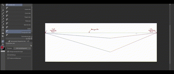
repeat the same process, trace the horizon line and make a second vanishing point on the left dot (mark) we made earlier.
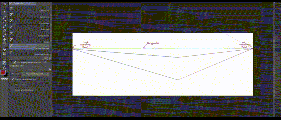
Please keep in mind that this perspective layer guides your lines on any layer you as long as it’s turned on.
After you have set it, make a new layer to draw on, so that your illustration doesn’t disappear when you need to turn off the perspective layer later on.
And now you have a perspective layer that will guide your lines in the right perspective so that you don’t deviate from it, and you can turn it on or off whenever you like.
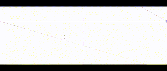
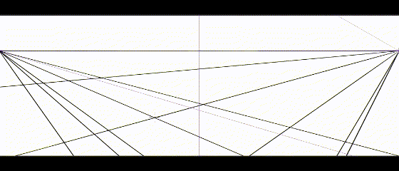
Store Front in two points Perspective
For this tutorial, I will be using a 2 points perspective to draw a store front (Hair Salon) in Perspective.
Setting the perspective
So after I had an idea of my perspective from a reference, I knew how far I should place my 2 vanishing points :
-First I picked the perspective ruler from the tools bar.
-I set my horizon line, and then added a vanishing point.
-I set the horizon line again exactly on top of the first one and added my second vanishing point on the other side.
The Hair salon front will converge to one side of the perspective, while the back of the salon will converge to the other side of the perspective.
Store base : Cube
On a new layer, I drew a square following the red side of the perspective I had set earlier (this will be the store front).
You can adjust the length/width according to your preferences, as long as it’s in the same direction of your chosen vanishing point.
Then I drew another square converging to the other vanishing point (this will be the back/side of the store), making a cube (box), which is going to be my store base.
Ps : Unlike earlier with the cube, I don’t have a visible top or bottom to my store, because it is situated exactly on the horizon line (my eye level) and not above or beneath it.
Details : Defining the store shape
I then drew some extra lines to set apart the roof and the floor from the rest of the building :
Once you decide the thickness of your roof and floor, draw a straight line, and where it meets the wall, connect with another line.
For the outer wall : I drew two lines (guided by the perspective ruler) starting the first line where the roof meets the box and the second line where the floor meets the box.
Then I drew another line on the floor to set a step.
And where that line ends, connect it all the way around the box.
Then delete the extra lines (since we have now set a ‘step’ we should delete the extra wall).
Now again, to give shape to my store, I drew extra lines on the front to define the entrance and give thickness to my walls.
I personally like to have some free space between the store step and the entrance, which is why I drew another line (on the side) to make another wall later.
then, where these new outer walls connect, I made new lines for the new inner wall like we did earlier.
then, i followed up on that side line all around the store, to make a new inner wall, creating a free space between the step and the entrance.
and deleted the extra lines.
Now, we (more or less) have the store base.
Following the same (left) side of the perspective, I drew the door and windows.
Since it’s all a bunch of straight lines, I simply glided the pen and the perspective ruler guided me to the vanishing point.
I then wanted to make an extra brick wall to hang some pots.
Despite it being a thin wall, it has two sides, so one side will follow one side of the perspective and the other side will follow the other one.
I first drew a square (converging to the right vanishing point).
and the i drew the second side, the one that faces the same direction as the store front, converging to the left vanishing point.
and then deleted the extra lines.
then I added some details to the front according to my preferences, guided by my perspective ruler.
Store banner
We need to know that everything can fit in a box of perspective no matter its shape.
So for the store banner, I drew a cuboid (long cube) following the same steps i used earlier :
I first drew a rectangle on one side of the store, where I want my banner to be.
It starts where I want my banner to start, and ends where I want my banner to end.
I made continuous lines from the edges of the rectangle to the other side of the store (guided by the perspective layer).
and then drew another rectangle on the other side of the store (by the outer wall) limited by those lines.
I deleted the extra lines.
I drew a middle line (from the upper side to the opposite side below) inside the rectangles defining my banner shape.
I deleted the extra lines, added bars to hold it (following the same steps) and this was my banner.
Cleaning the sketch
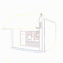
Then I cleaned (deleted) the extra lines (lines that should no longer be visible under the banner).
Finer details
After that, I proceeded to add finer details and make some flower pots following the same steps :
Draw a cube in perspective (Dimensions according to the shape of the pots) and fill the shapes.
Delete the extra lines and refine.
Always using the same perspective rule.
Ps : For circles (or other shapes that aren’t linear) to be in perspective, draw a square (or rectangle) in perspective, draw a circle, click the right side of the mouse, choose ‘free transform’ and make the circle fit inside the square and this will automatically put it in perspective.
The same thing goes for pots :
Draw a cube or cuboid, draw circles (one for the top and one for the base) and make them fit onto the cube (one on top and one on the base) and then connect between them with lines.
To draw flowers and other details, Turn off the perspective layer (by clicking on the eye next to the layer) to have more freedom of shape.
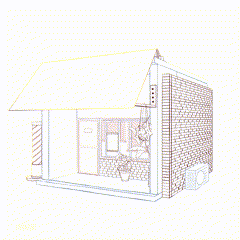
Finishing off
After I had all I needed in perspective, I turned off the perspective layer and finished my sketch.
And this is how to draw a store front in 2 points perspective.
For the final step, you can color and render depending on your style.
(You can check my previous Csp Tips for some coloring/rendering techniques) .
I hope you enjoyed this.


Kommentar