
Hello Hello designers, all as much as you are!
I am here today, to write a tip! (Obviously)
This one will carry a post on: "How to make a bookmark with CLP"
Here is the brand page that I will create here:
Being a full-fledged love of literature, I have a lot of bookmarks on my desk, some of my own creation, and others bought in bookstores most of the time.
I often want new brands pages, and it's true that it's much more fun to do so than to go buy a ready-made store!
So in this tips, I'll teach you how to make a digital, draft, through the realization, until the printing. `
! IN THIS TIPS, I USE THE CLP VERSION ON IPAD 12.9!
- Summary -
1: introduction
- sizes of bookmarks
2: Realization
choose the size
sketches / ideas
line
colorization
finishes
second side
3: Export
- convert to JPEG file from CLP format
4: Printing
selected paper
latest finishes
final result
Now that everything is ready, we can get to the heart of the subject!
Let's go !
1 : introduction :
In general, the page mark sizes, for the standard, are 5x29 cm, there are smaller ones in 7x10 cm, and larger ones.
In short, you understand, there is for all tastes and shapes.
2: Realization:
- choose the size -
As seen above, there are several sizes of bookmarks, but for the majority, it is still small enough for me.
My library has a lot of very large books (the encyclopedia of medicine in 10 volumes for example, or some of my art books and art history), so I wanted to create a bookmark to theirs size, long and wide enough not to lose it and keep my reading of these big books!
So I used these measurements on digital:
In cm, this amounts to 8.5 x 29.5 approximately.
- sketches / ideas -
After creating my page, I started to think what my design would look like. After a few moments of calm and reflection, I had the idea to represent something quite Zen, calm, and pretty to look at. With very soft colors, as well as flowers (I wanted at all costs to put flowers!)
So I think of the spring and calm by making my sketch, where I then ask very roughly my colors, to have an idea of all the rendering that I wanted to achieve.
Here is the sketch in question:
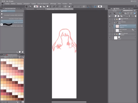
- lineart -
Once I finish my sketch, I remove the colors to make it more understandable, and put the layer in blue, like this:
So, over the folder of my sketch, I add a vector layer above. I always use vector layers when I do my line, it allows to make a line much more easily, quickly, using tools such as the eraser vector or what I call the line corrector (can grow or refine the drawn line).
This is what the order of my layers looks like at this point in the drawing:
Then I draw my line in a normal way, since I'm pretty obsessive with the order and content of my layers, whether for lineart or colo, I always do one element per layer. It's much clearer and cleaner for me.
Here is the current order of my layers for the lineart at this level, as well as the finished line:
- colorization -
You surely guess, but once the line is done, we go to color!
And again, to stick to the spring atmosphere that I wanted to give to drawing, I used very soft colors, calm, see pastel.
To make my colo, I put the bases everywhere first, to have a very precise idea of the colors, and thus to be able to test, and change the colors if it does not stick.
To begin, I just create a folder between the line and the draft, I add a normal layer in it, and pose, elements not elements, layers by layers, my colors.
To color large areas and I do not have the motivation to do everything slowly, I use the CLOSE AND FILL tool just here:
Thanks to this, the colorization has become much faster! First, I just delimit the outline of what I want to color, then I come surround this area with the tool above:
Here is an example of when I made the hair base:
(I had already colored the skin)
I advise removing the line and other colors or elements of the drawing, I do not know if it makes the operation easier, but it makes the action clearer for me anyway.
However, this system is not perfect, sometimes it happens that it colors elements that should not be, do not panic! Do not take your gum away! Look I have an even simpler way than erasing manually with eraser!
It happened to me when I colored the skirt, the front petals were also colored.
So I used the tool below:
I then went to the folder of my line (no need to go on the layers themselves, select from the folder is enough), then I select the areas that have been colored by mistake, like this:
Once done, I go back to the layer where the color of the skirt was put, and I erase the selected areas, like this:
Here is the result:
Then, I did the rest of my colo, here is the result, once all my bases are posed:
(actually, the colors have changed over the drawing, it's often the case with me)
After laying my foundations and determining my colors, I go to shadows.
To do this, I lock the layer where I placed the base of my color, and I add a layer over it:
It is important not to forget to put the option surrounded at the top, it allows the shadows that are going to be drawn not to be outdated.
I thus gradually make the entire shading of the drawing, until I reach this result:
I colored the petals, put more movements on this one with the directional blur, and also added a small green gradient in the background, very soft.
The stage of the colo is now finished, I go to the finishes!
- finishes -
Given that the decor is pretty loaded with petals, I wanted to finish with a small details, big enough and fine at the same time, harmonizing in my opinion all.
So I get the RECTANGLE tool
I rule it this way, and choose a brush shape with small strokes:
So I add a layer above all others, and come draw a rectangle on the entire canvas. (I removed the other items and put on a brighter color for you to see better.)
I change the color of the layer to white, and here is the result once finished:
- second face -
Once the front is finished, I take care of the back of my mark page, ie the other side behind the one we just made.
this time, unlike what I have just shown you, I want to do something very empty, with not many elements, and without characters.
First I create a second canvas, with the same dimensions as the first:
For this second side, I do not sketch, and draw only with the small image that I had in mind.
I decide to take again the petal which fell around the young woman, and the copies thus glue of the canvas1 to the canvas 2.
Like this :
Then I put a pink gradient in the background:
With the gradient tool set this way:
Then I add everything down, a small gradient (always with the same tool), takes a color violet / blue, and the pose very slightly, to be able to give a little more depth, and not to use only pink in this drawing ci.
Then, as in the previous drawing, I just copy paste the white rectangle that was done, I keep the color white, here's what it gives:
Once done, we attack the last part of this face, I will sign the bottom of the page mark.
To do this, I use this tool, set this way:
I take a black color, so that my name comes out more, place what I just wrote down, in the center, here is the final result:
The stage of the realization is now finished, here are the faces 1 and 2 finally finished:
3: Export
The files on drawing on studio paint clip are in "CLP" format, so it is obvious that a conversion for to print our wonderful brand page is necessary.
The final drawing must be converted to "JPEG" format in order to print it.
To do so, simply do as below:
AND THERE YOU GO !
The JPEG export from CLP is finished!
4 : Impression
- selected paper -
To print my brand page, I went to a printing house near my high school that has very good devices, can print color documents on thick paper, brilliant quality.
I could not print my own page, unless I wanted to have the result on a thin sheet, not at all suitable for a bookmark worthy of the name!
The lady who took care of this printing house made me choose between different types of paper, I chose a paper type: Glossy / 240g.
Which is a pretty thick paper, besides being brilliant!
Unfortunately I can not tell you how she printed, she did it in a room, out of sight, I could not see the different settings that she used. However, she printed the page mark, on one page, on both sides, I had only cut to get my du!
- Latest finishes and final result -
Once my bookmark cut, I made a hole with a punch on the top left of the paper, to hang a little decoration and more!
THIS IS THE FINAL RESULT IN REAL!
END
Thank you for reading this tips to the end! I really took a while to write because of all the work in high school at the moment, so I'm really happy to be able to release it!
I really like the realization of this brand page, and the result makes me even more happy!
If the design interests some, you can send me messages in private so that I send you both sides of the mark page!
Here is my instagram! Do not hesitate to follow me!
Hedonie_art
XOXO
Users who liked this post


Comment