
Welcome!
My name is Paulina and I LOVE letters. I think it's amazing how we can communicate and express ourselves with them!
In this tutorial I will cover some basic design principles and configuration tips for CLIP STUDIO tools so you can get the most out of them when creating hand lettering artwork.
This tutorial is specifically written for the Latin alphabet. While I know how to write using other alphabets, I'd rather stick to what I know best.
1. First and foremost: clarity!
The one thing your design must ABSOLUTELY have: clarity. Without clarity and ease of reading, it doesn't matter if your letters are beautiful. No one will be able to figure out what they say! We must always remember that our first goal is to convey a message.
This message should be easy to read. I'll show some examples of bad positioning of text that can make things confusing for our reader.
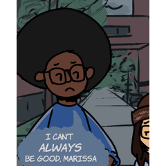
1. Trying to make the spectator read up to down instead of left to right
If you're from a country where writing is done left to right, your first instinct was probably to read it as "Don't this open door." And then you said "wait, something's wrong" and realized you had to read up, down, up, down. That second reading is what we will try to avoid as designers.
Here's another example of a common mistake:
In order to read faster, our brains are wired to recognize a word from an impression of the entirety of it. This means we don't have to read every single letter once we've reached a good reading level.
In this example, for many people it might be slightly awkward because they had to double check and realized they were missing reading the "an". Again, beware of designs that make you "second read"!
Always design with people who read really fast in mind. If a person who reads fast doesn’t have to come back and correct something they read in the wrong order, success!
Here's an alternative arrangement for the words in order to make it more clear:
You can modify a bunch of things if a word in your design isn't working! Here are some:
•Placement
•Color
•Height
•Width
•Add ornaments
•3D volume
•Shadows
•Uppercase/lowercase
2. Simplicity and contrast
I love letters. Absolutely adore them. But trying to use every single font/letter style known to man in a single design?
Yeah, let's not.
What's a good way to know which letter style to use?
Well, depends a lot on what you like and your own art style, but in general, I can recommend a few things.
1. Keep the number of styles to a minimum. If you use 10 different kinds of letters in one design.... things get messy. I made this mistake once. Trust me. Don't do it. Besides, aesthetically simpler designs are much prettier!
2. Make your letters contrast between each other. You can use several kinds of contrast. You can use bold, angular letters with thin, round ones. Like this:
Notice that we have several contrasts: angular/round, thick/thin, uppercase/lowercase.
Or...
Here the main contrast is thick/thin, and the other contrast that stands out is placement.
3. The most common letter categories are sans-serif, serif and handwritten or calligraphic. Mixing two of them will give you a neat looking design. Best if you have other contrasts around, too!
3. Creating a hand lettering design - raster
Now onto making! For this tutorial I'm going to create two artworks, one in raster and the second one using vectors.
The raster one is a pretty straightforward method. It will be the phrase "While there's life, there's hope". It's 5 words, what I'd consider a medium sized quote. I always restrict myself to quotes with a maximum of 10 words. More than that and I think designs start to get too complicated to draw.
First I'll make some thumbnails/sketches for figuring out the placement and sizes of my words. At this stage I don't worry about details or it being perfect. I'll draw a second version on top before drawing the final lineart.
I'm choosing the first one because it's the one I feel will give me the most good-looking final artwork. Here's how my process, from sketch to final colors looks:
For the small ornaments I'm using layer effects, which I find super neat. Instead of having to draw the borders, I use them instead. They allow me to experiment as well without having to remake everything from scratch.
Another thing to take into account is how much one single setting can change the outcome of a letter. Here's some examples with the CLIP STUDIO real G-Pen. The minimum value and the pen pressure can make the same brush work very differently.
Couple other tips for raster work:
1. You can use the Special Ruler set to Parallel for gothic letters.
2. It's not necessary for you to draw calligraphic letters all in one sitting. You can break the line every time you need, just take care of continuing it in a way it isn't noticeable. In the following image, the red dots are the places where I lifted my pen.
3. You can draw a line in a separate layer and set a color over it or low opacity to use as guide for writing. Hide it or delete it afterwards.
3. Creating a hand lettering design - vector
Vectors are useful tools when we want to create small artwork and then scale it up, since they're based on math formulas and can be changed sizes infinitely without losing information.
CLIP STUDIO has several great tools to handle vectors.
I made a sketch with the word "Lettering". Then I created a vector layer and used the mapping pen without pressure detection and to trace over my sketch. I turned the stabilization up to 80 for maximum smoothness of line. Since this is only a single word, I wasn't too worried about following the sketch 100%, as you can see in the image.
This is how the vector tools look in CSP:
I used the pinch vector line to make the ornaments look more round.
Next, I decided to change the weight of the lines in some parts to make it look like i did it with a brush pen. This method allows me more control while doing it faster, instead of having to retrace it again. For this I used the Redraw vector line width tool.
And finally, I added some screentone sparkles as a final detail. I made the drawing in a small space, but since it's vector, I can scale it up as much as I need for printing!
Final words
And that's it! Looking at other people's work and at fonts (yes, literally) is a good way of broadening your repertoire of types of letters to draw. Keep practicing and experimenting, and if you liked the tutorial or have any questions, please leave a comment!
Thank you for reading!
Users who liked this post


Comment