
Index
1. Introduction
2- Brushes that we will use
3- Designing the character - Sketch
4- Designing the character - Inked
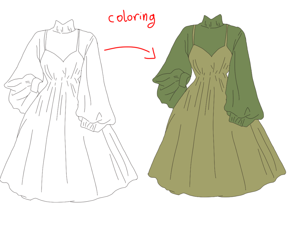
5- Designing the character - Color
6- Lights and special effects
7- Acknowledgments
1. Introduction
In this tutorial we are going to see how to give life to a character in what we know as Concept Art. In this particular case, it is a character for a video game in which the style is Cartoon.
To give life to our character we will divide the process into four important steps: (2) the sketch, (3) the inking, (4) the color and (5) the lights and special effects.
2) Brushes that we will use
To design a character it is necessary to make use of all the brushes we want the software offers us. It is important to know that the number of brushes we use and the type do not matter. It is about expressing the concept of our character as we see it to transmit it to the one who sees it. Therefore, in this tutorial we are going to use a few brushes with the default settings that are based on them, only changing the size of this one to adapt it to each moment of the drawing.
In this way we can verify that the brushes do not determine the final result of our drawing, they are only tools that adapt to our style and imagination.
We will classify the brushes used in each phase of the drawing to facilitate the task:
Sketch:
Real pencil (quick character sketching)
Inked:
Maru pen (Ink line)
Color:
Milipen marker (base flats or layers)
Soft airbrush (gradients in base colors)
Lights and special effects
Maru pen (draw and paint shadows and lights)
Soft airbrush (light and shadow gradients)
3) Designing the character - Sketch
The first step to start the drawing is to open a new blank canvas with the characteristics that we prefer for our character. In this case it is a canvas A4 size and 300 resolution.
As an initial step, we will use the “Maru Pen” brush to paint only the silhouettes that we would like our character to have. It is a very useful method in the Cartoon style, since it allows us to clearly see the importance of an effective and representative way for our character.
Once we have several silhouettes of different characters, it is time to choose the one we like best to make the sketch of our character from that base silhouette.
To do this, we will use the “Real Pencil” brush and begin to sketch our character. It is important to start with simple geometric shapes to represent the main body volumes. In the Cartoon style it is especially relevant since we play a lot with the contrasts of shapes in all the elements of the drawing.
Once these volumes are defined, we are adding details little by little. Do not focus on everything being perfectly defined since this is the sketch, the cleanliness of the line will come in the (2) inked drawing.
4) Designing the character - Inked
Before we start inking our sketch to define the line, let's lower the opacity of our sketch layer to 26%. In this way it will serve as a guide on which to ink the line of our character.
We can start to inking the character. To do this we just have to create a new layer on top of the layer of our sketch and use the brush "Maru Pen" in black to ink with precision and comfort. It's about using the sketch below to clean the line and keep the character ready to color it.
When we finished inking the line, we hid the layer of the sketch and the character would look like this:
5) Designing the character - Color
The first step to give color is to paint the base colors or FLATS of each element of our character, since they will constitute the main skeleton of the color. We will create a layer folder where we have to create a new layer for each base color that our character has.
Too many layers may seem, but it is absolutely necessary to do so in order to paint the lights and shadows very quickly. It's about being organized with the layers and being clear about what color there is in each one. Next, we can see how I painted each color in a different layer and all of them inside my FLATS folder.
To paint the FLATS we will use the “Milipen Marker” brush.
To check the effectiveness of having made the FLATS we paint small gradients that we want to give our character in its base colors. For example, this turtle does not have only brown skin color, the inner part has a lighter shade.
To do it without getting out and not painting over other elements of the drawing, as I just want to paint the skin, we keep the “CONTROL + left click” key on the skin layer and only that layer will be selected to be able to paint these tones only on the skin:
The dotted lines will indicate the surface on which we are going to paint, blocking the rest of the drawing and making sure we can paint only in the space that the layer of the character's skin occupies.
We will use the “Soft Airbrush” brush to make a smoother transition between the different tones.
When we have our character at this point, the most tedious part of the drawing will be over and the step begins to create the reliefs of our character playing with lights and shadows for a lively and striking final finish.
6) Lights and special effects
In this case we will start painting by the shadows. First we will create a new layer on top of the FLATS folder and fill it with a very dark and slightly saturated purple hue to create a general shadow in the drawing. Select the FLATS folder with “CONTROL + left click” and fill in the new layer with the shade of the shadows:
We lower the opacity to 16% and we already have the general shadow in our character.
Next, we will create a new layer where we will paint the first layer of drawn shadows. To draw these shadows we will use the “Maru Pen” brush and paint the shadows of the same purple color that we used in the previous step in that layer of general shadow of our character.
We will look similar to this one. Next, we lower the opacity of this shadow layer to 51% and we have it ready.
To give more depth of shadows, we create a new layer of shadows on top of the previous one and repeat the same process as in the previous one. This time lowering the opacity after painting them to 26% for a smoother transition between both layers of shadows:
We already have the shadows finished, to really see the effect they have we are going to paint the lights and see how we have the contrast between them.
To paint the lights we will use exactly the same process as for the shadows, but with a small exception, which will be the mode of the layer in which we will establish the layer of lights.
In principle we paint exactly the same as with the shadows. Using the brush "Maru Pen" to define the areas of light and using when we want the tool "Rubber" brush "Soft Airbrush" to create small gradients of light where we see that they are effective. This is how the character would look with the layer of lights after painting it:
To give a natural light effect we put the layer in "Soft Clear" mode and adjust the opacity as we like, in this case to 51%.
With the light we will do the same as with the shadows. We create a second layer of lights to give the strongest highlights where we should. In the case of our turtle warrior, we will add small glitters to the face and collar.
We already have the main lights and shadows of our character finished. Now there are only the lights of the special effects we want to give. In the case of this turtle warrior, what he carries in his hand is not a blue ball without further ado. It is a magical sphere that you use in combat, so we have to add the relevant special effects to convey that feeling of energy.
In this drawing I have done it in a very simple way. I have painted with the brush "Maru Pen" three perfect circles inside the blue sphere in white and I have lowered the opacity to each of them to generate the light that is inside the sphere. I created each circle in a new layer, I have lowered the opacity to 50% and then combined the three layers into one for comfort.
The light in this case is not as before. It is a much stronger spotlight than ambient light, so we will paint it following the same procedure as for the previous light and shadow layers but this time we will leave the opacity of the layer 100%.
To make a gradient of blue light we will paint on a new layer at 26% opacity with the “Soft Airbrush” brush. The final illumination of the energy sphere would look like this:
A second intense light comes in handy to highlight profiles, so we will do it on the opposite side of the magic sphere to compensate for the image and that not all the lights are gathered at a single point.
In the same way as in the previous step, we created a new layer for white light and applied it in a way that impacts our character from behind it, as follows:
In this case the white light layer is 70% opaque, to leave the magic sphere with the greatest lighting weight in the drawing.
We only have two more steps left and the character will be finished.
First, we are going to color the line, but only the line of the most magical or atmospheric elements of the character. That which is not entirely solid, such as the magic orb and the smoke of the pipe.
It's very simple, we create a new layer above the line layers (in the turtle there is one for her and one for the sphere, which I made it apart). In the layer above we right click and select the option “Fit to lower layer”, in this way we will only paint what is in the immediately lower layer, which is the line.
We paint a darker and less saturated color, but with a hue similar to the color of smoke and spherical magic and thus separate these two elements a bit from the rest of the character.
As the final touch of the character we will make a general gradient to the entire character. In this way, we will gradually darken the lower part of the latter and clarify the part where the natural light is most affected, so that it is much more integrated and defining the areas of greater visual importance.
We create a layer folder where we will put three new layers. Two will be dark gradients and one a light gradient.
With the gradient tool in the “From foreground to transparent” option, we select (“CONTROL + left click”) the FLATS folder to have the silhouette of our entire character and make a gradient with the color of the shadow that we have previously used from below and another from above on the left side. They are the areas where there is not so much light and where we do not want to focus the attention of the drawing.
Both gradients put them in opacity at 50%.
We do the same with a third gradient, but with the color of light. This time in the direction in which the light comes to our character, from the top right. The opacity we put in 15%, since if it would not be too flashy.
And it would be over. We can add to the background what we want, a dark, light gradient, a projected shadow ... anything we want to add to make it more striking, but without distracting the character's attention, which is the goal of character design.
This is the final result of our turtle warrior:
7) Acknowledgments
Thank you for following this tutorial!
I hope you learned something new to improve in your future artistic projects!
If you want to contact me or look at other of my works, you can visit me and follow me on Instagram and Artstation:
Users who liked this post


Comment