Creating a fantasy map
How to create fantasy or historical maps with Clip Studio Paint
Hi! I am Monica N. Galván and in this tutorial I will show you how to make a map. But not a current map, but an initiation to fantastic mapping. And this time we will use the tools of Clip Studio Paint to take away some of the work without losing our personal touch.
1. The first thing we need is inspiration
If you want to make a fantasy map for a book, comic or fantasy video game, the first thing that comes to mind is Tolkien. In fact it is what many writers of the genre have in mind when ordering a map.
But there are many other places to find inspiration. A quick view of the websites of museums or institutions in your country can discover wonders from centuries ago from which to get ideas for your maps. These can be very useful documents from where to get information for more realistic fantasy maps. In particular, those from smaller areas or provinces usually have the most classic elements that you will surely identify from the best known fantasy maps.
With all this in mind, let's start our map!
2. The sketch
The first thing we are going to create is a new document. If the map is going to be in a publication, it is best to use the proportions in which it will be printed, which you can enter when creating the document (Crtl + N). We have selected as standard the A4 size and 350ppp resolution in horizontal format.
On this document we will create a new layer and, using the pencil and color of our liking, we will sketch our map. I usually use the color blue for sketches, but in this case we will use a color for each type of element.
The idea I have is to make a simple map for a youth novel. We have left some space to make a poster and another for the wind rose.
3. Creating custom brushes and textures for maps
Although we can make the map completely freehand (I particularly love it), we will use all the versatility of Clip Studio brushes. For this we will show how to create the ones I consider most used in this type of illustration.
First we will prepare different types of images to make our brushes. This is the most laborious part of this tutorial, and it requires a lot of trial and error until you find the most suitable brushes. The more images they compose, the better. We can use them as a simple brush or more elaborate ones, which we will explain below.
It is advisable to make the brush in a separate document, with much more resolution (about 600 dpi).
We have created the image of a mountain. It is composed of two colors, black and white. White will help us to superimpose some images with others.
To create the brush, we select the layer of the element we want and add it to the library: Edit menu> Material Registration> Image. Remember to check the box “Use as a brush tip shape” (important, if not, it will not appear in the gallery), add a label and a location to find it later.
Advice
Keep in mind that if we want to color the map later, we have to add the right amount of detail to the brushes. Not having more detail will be better or having less will be worse. The format also influences here, since if the map is going to appear in a book the more detailed parts will disappear when the size is reduced. (You can try reducing the image on your screen, for example).
Otherwise, if we are going to draw only in black and white or in large format, we can add much more detail in the lines.
Remember
The more elaborate the shape of the brush, the more different elements must be added so that the repetition is not noticed.
3.1. Mountain Brushes
Step 1: To create our brush, we must use different images of mountains to form our “chain”.
To create the mountain range, we have to superimpose the strokes starting from the end (farther) That is why it is important that the image used for the brush has an opaque / white background (later we can eliminate it by putting the layer in “multiply” mode or with the great function: Editing> Convert brightness to opacity if we want to color the lines.
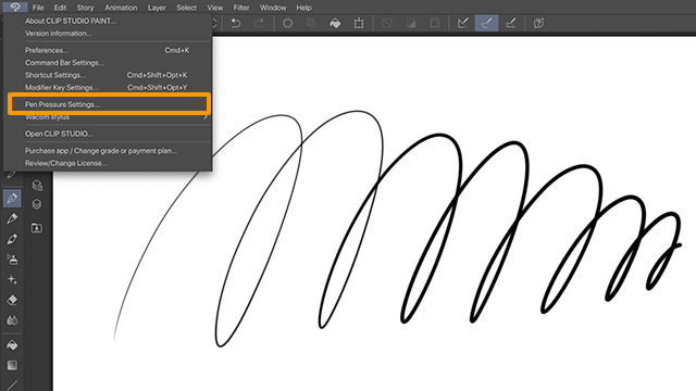
Step 2: We place the images that will compose the tip of the brush. To do this you have to open the brush settings, clicking where it is shown below:
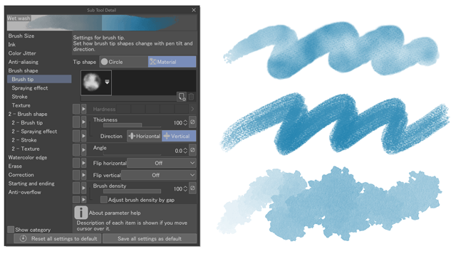
And add them in “Brush shape> Brush tip”, by clicking on the “new” icon.
We look for our images helped by tags.
Step 3: When we have already chosen all the images of the brush, we select to appear randomly. By varying the interval, the elements can be superimposed on each other:
Note: The pressure can be activated to change the size of the mountains quickly; also the dispersion effect for small elements such as hills or grass. This option can be left disabled to better control the size.
Here we see several examples of different mountains and hills that we can create. There are many ways to make the mountains and touching the numerous options of the brush you can find the one that best suits your style.
You can make some of the mountains by hand to distinguish them from the rest. Also modify those already created to create volcanoes!
3.2. Tree brushes
This brush is created in the same way as that of the mountains, with some differences.
Here we leave several examples of trees that can be useful on a map of this type:
We add the different images and from the options, we configure the thickness of the trees and the way in which each of the links of the chain will appear.
Note: You can always add new shapes and make variations of your brushes.
And so a mass of trees is finished:
Do not forget to play with the strokes until you find the way you like best.
3.3. Other brushes to decorate the map: grass, swamps, sea waves ...
This brush is created in the same way as the previous ones. It is important to disable the ribbon option to be able to stamp with single clicks.
For the different textures, we are giving touches in the areas of the map that need it. With the Lasso tool you can select and adjust these textures along the map.
3.4. Brush for the edges of water bodies.
This form of brush is very simple (it is composed of several lines), and in fact it can be done with one of the pens that comes by default in the program ("Textured"). If we want to give the effect of sea waves (or bodies of water) without having to take several passes, it is a great help.
The elements are 5 pieces of the same line with variations and with the random repeat setting.
3.5. Milestones (cities, ruins ...)
For the creation of the different milestones we will make different simple brushes without pressure sensitivity to mark the different areas of the map. As they will be very small they should be very clear and visible, so we will not detail them much.
These are inspired by those of a real map (the originals are colored).
We can also give them some more detail, but they could get lost among the other elements.
Another alternative to these icons is to use points or squares on the map (or combine both). For example: square = capital, point = city / town ... triangle = ruins ... This also facilitates the placement of names later.
Of course all these are just ideas, do not hesitate to look for other shapes or styles until you find the one that best suits you.
Idea
You can add the icons of the different landmarks in a box next to the scale (see reference maps)
4. Inking the map
Throughout this process you can see how I am inking the map using the brushes that were created in the previous step.
** Remember: It is very important to test until you find the configuration that best suits your brush designs and remember their sizes to avoid inconsistencies.
Step 1: Using our water border brush, we ink the outline of the map. You may have to correct the edges if a very closed shape is made.
Step 2: With the default pen "Textured" we inked the rivers, modifying the water bodies when necessary.
Step 3: With the brushes we have created, in another layer we create the mountains and hills. We will retouch with the basic brush tool the areas that have remained hollow or the endings of the mountain ranges with smaller mountains.
Step 4: We add the wind rose. It is a detail that I love about the maps to indicate its orientation. It can be as simple or elaborate as possible.
To create it ourselves we just have to use the Symmetry Rule tool, set the number of lines to 8, and start drawing!
We adjust the size of our rose on the map. As I did not like how wide the line of the map border has been, I reduce it with the “Correct line width” tool. Easy peasy!
Step 5: We add the trees alternating the brushes to change the landscape of each zone ...
Step 6: And the last details of the herb brushes, badlands, swamps, cities and landmarks ... to complete the land area.
Step 7: We add the waves of the sea ... and the occasional boat (to taste but without cramming the sea), and the map poster. I took the opportunity to sign inside.
For the final details, as with the poster, we can use the symmetry rules or freehand drawings to decorate the clearest areas, in our case the sea.
Step 9: (Optional) To decorate our map we can add borders of different types, like this one to define its scale. Eye, you have to take into account the margins when printing it and it is safer to leave it without it. If you do not want to border your map with this border but you want to mark the scale of your map, you can make a small line within the poster itself, as it was done in some old maps.
Sample maps on my Pinterest:
Press and hold "Shift" to make a straight line with the brush.
And that's it! Now we will see the different finishes that we can give to our map.
5. Advanced: different finishes.
If we want to give more life to our map, I propose the following finishes:
5.1. Grays: patterns and textures.
If the map is going to be in a book in black and white or with grays, you can apply shaded areas in the bodies of water with a gray layer or a weft. There are many frames with different density in "Material".
Idea
Here is an example with a map in which I used the simple borders and are shaded with a texture layer applied with a mask using the Airbrush.
5.2. Using textures to give "old" effect.
To use textures on our map we can use one of those that Clip Studio has in its “Material” (Window> Material)
You can download more from ASSETS. Or use any other image or texture that you have made yourself or downloaded from stock. It can be color or grayscale.
Link with sample textures on my Pinterest:
If you are going to use color on your map, it is probably best for you to use grayscale texture and apply the “Multiplication” or “Overlay” blending mode to this layer. It is a good idea to try several and stay with the one we like the most.
5.3. Color
Using all the previous inking as a top layer in “Multiplication” blending mode, we will add detail and color each area of the map to give more information about the landscape of each place.
From here the style is completely free.
To color the map I used a layer on which I colored the details with the soft airbrush and added the lights with the opaque Watercolor brush.
Water is colored in a separate layer, with a texture.
I have added some lines like rays on the wind rose with the same symmetric ruler tool, and some lines for the roads with the “dashed line” inside the decorative brushes by default.
5.4. Texts
With the text tool we can add names comfortably on the map. Another option is to add them by hand.
We use a background-like color for the edge of the letters to read better ...
And that's it! I hope you liked the tutorial and that you can create many maps with the help of Clip Studio!
You can find me at the following sites (with many more illustrations, tutorials, comics ...):


Comment