
Introduction
When I was just beginning to study / practice about color, one of these things always happened to me:
1) I chose certain colors that I thought would combine well to form a color palette but none of the first attempts were pleasant.
2) It achieved a satisfactory result, but it took forever to find the right colors.
The colors are sometimes misleading, but who has not happened?
On this occasion I will show you the process of a small ace under the sleeve that I have to color in scenarios with a particular light (different from the blue sky and the default colors with which you usually color) with one of my OCs.
I will use CLIP STUDIO PAINT PRO and as always, I will be detailing the brushes used throughout the tutorial.
- For a more complete monitoring of the process, I recommend seeing my Speedpaint.
Conceptual art
While it is true that the title of this tutorial is called "Sketching as lazy" personally I like to elaborate some conceptual art to fix my ideas well and choose the best option.
Of course, this is like a complement in the tutorial. Concept art are little detailed sketches in a small section of the canvas.
These were the first ideas:
Ah, but don't worry! I have not lied with the title, All the time we will save in sketching we will use it in the inking and coloring below.
Sketching as lazy I - How to draw different flowers
As I already have the clear idea, just clean the sketch of the conceptual art a bit and immediately continue with the inking.
Now the flowers:
For this illustration we will use both detail brushes (floral themed) and flowers drawn by ourselves.
First let's see how the flowers that grow from the character's back are made:
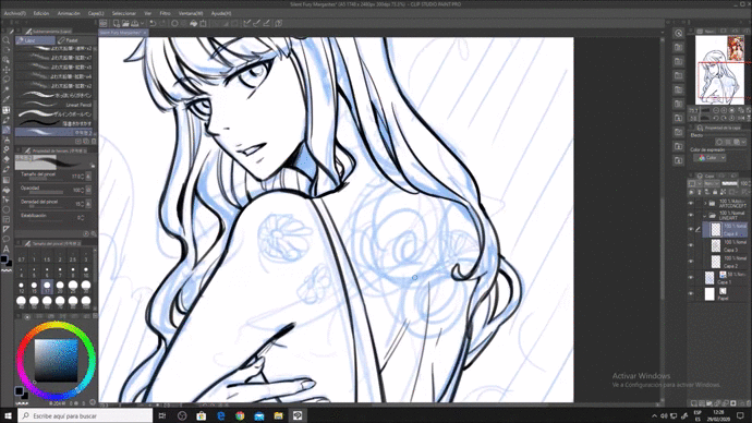
It is important to recognize what basic shapes the flowers you are going to draw have. I have drawn daisies and white roses, and as you can see, these (and almost all the flowers) can be formed from circles:
1) Daisies start from a circle divided equally.
2) Roses have more triangular petals, but they also start from a circle.
3) The tulips start with a cylinder.
The important thing is the shape, as you can see in the previous image, the circle varies depending on the position. Once you understand that, the rest are just repetitive elements (such as petals or leaves)
Sketching as lazy II - Tracing with decorative brushes
For the flowers of the bottom it is only necessary to apply the brush that I will adjust next:
Since the inking of this brush is different from the brush I use, I will draw freehand what is drawn by the brush.
(*) I recommend tracing the contents of the brush so that the composition looks unified. If your lineart style is similar to that of the brush, then this step will not be necessary.
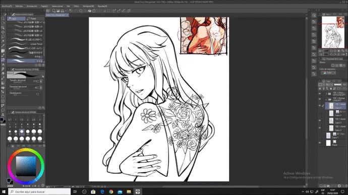
And ready! We already have the lineart of the image. Now only color remains.
Coloring as Spartan I- Defining color palette
To avoid being "painting blindly" on a separate canvas, or in this case, in our conceptual art we will desaturate the colors to the maximum until it is grayscale
This step is important, the gray scale is used to check how much contrast there is between one element and another.
And now, with 2-3 colors of your choice in a new layer Superimpose (In this example, use yellow, green and light blue) start to brush in at ease (maybe cold colors will determine the shadow or vice versa) And combine the layers.
It may seem somewhat random, but this will make more variety of color gradients in the image as soon as we add more colors, but later it will be better visualized.
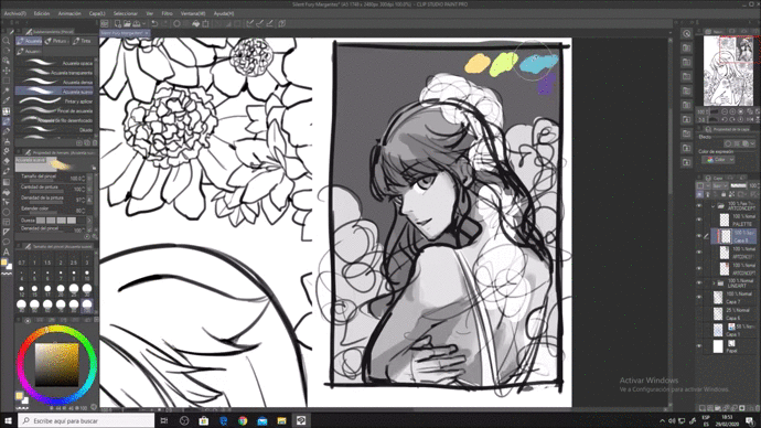
Then, in [Edit -> Tone Correction-> Color Balance] you can edit the colors (based on which shades you want them to stand out) in case you don't like the first color scheme.
In my case it looked like this:
Now, do you remember that at the beginning I mentioned about the "default colors"? It is those colors that artists usually paint 89% of the time.
They are shades that are seen in daylight.
We will use those colors, but not in a way that looks like daylight.
This is the logic:
1) Warm / light colors (from yellow to orange red): Layer [Multiply], or similar effects
2) Cold / dark colors (blue tones): Layer [Soft light], [Overlay] (Or similar effects) or [Under-expose].
(*) It is not a fixed logic, you can also experience and test the different effects that layers with different colors do.
Then, with the orange color in the Multiply layer we color the hair, and then the skin with its respective color:
Then, with a purple hue in the [Vivid Light] layer we paint the entire canvas:
The tone changed right?
We saved the time it would have taken us to be groping / guessing what colors to use for shadows and lights.
In addition, you can always try other alternatives:
Coloring as Spartan II- Color
Now that we have our color palette, we only have to paint our illustration based on the eyedropper and the default brush "Soft watercolor" (Which you find in [Brush-> Watercolor-> Soft watercolor)
To color the leaves, we will give "V" strokes with two shades of dark green-teal. Being the darkest shade to highlight the strands that have the leaves:
And ready!
Conclusions
I hope it helped you!
The color is extremely interesting to experiment, but it doesn't hurt to take shortcuts from time to time, especially when you're not used to dealing with colors outside your comfort zone.
I will attach some of my social networks in case you are interested in seeing more of my drawings!
Thank you for reading!
Users who liked this post


Comment