
Introduction
How many don't love Halloween? It is the perfect occasion to try some other "spooky" idea and to dress your characters in the most ostentatious and extravagant clothes.
If you still do not know what to draw for Halloween, I invite you to read this tutorial in which I will present the complete process of an illustration inside a Gothic style hallway of one of my characters from my webtoon "Wanderlust Artemis", Essie. And the funniest of all: anime style!
I will use CLIP STUDIO PAINT PRO and the brushes used will be detailed throughout the tutorial.
Concept art and sketch
A habit I have is conceptual art, which consists of trying out some compositions of an illustration until you reach something you like. (Although it is not a mandatory step if your illustration is simple or if you have a clear idea of what you want to draw)
Concept art does not need to be very detailed, it is enough to show the intention you are looking to achieve with your illustration.
In this case my goal is to get the "feeling of mystery", in the sense of exploring.
The sketch ① gives the feeling that my character is welcoming you to a haunted mansion; while option ② seems to be the character who is exploring the haunted house. Both coincide with the concept "mystery", but body language is what makes the difference.
I lean towards the option ②; because in my opinion it shows more easily the intention of "exploring the unknown" and the one I like the most because of its dynamism.
Once the decision is made, we proceed to sketch the chosen idea:
Important: Gothic lolita costumes consist of many details and lace, but it is not necessary to sketch everything (only what is necessary), since we will use brushes that will save us the work. The same with the corridor in the background, we will use materials and brushes to save time outlining
Quick Linework with Detail Brushes
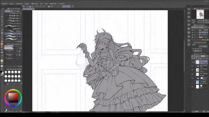
Now that we have the sketch, we will draw the Linework, like this:
In anime, Linework is thin and simple lines, so don't worry about too many details, just draw the simple shapes. The important thing is that they are thin lines.
Also, do not use black: anime does not usually use the color black since it is a very heavy color so I recommend gray or brown; depending on your color palette. But we will see that later.
As you may have noticed, I have not outlined the entire sketch, I have saved the wall, the lantern, the lace of the dress and the veil for last.
The reason? I found some brushes that we can use to save time:
For the lantern, I used the decorating brush attached above. On a layer above the Linework I traced the model and completed the design based on what I had sketched.
Also, it is possible to use steering wheel brushes to get the job done even faster, (although I usually prefer to draw them myself)
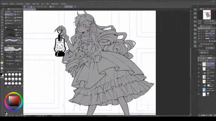
Now that we have the Linework "ready" we will select the layers and combine them into one. Then in [Edit-> Convert from luminosity to opacity] we will be left with only the lines. In this way:
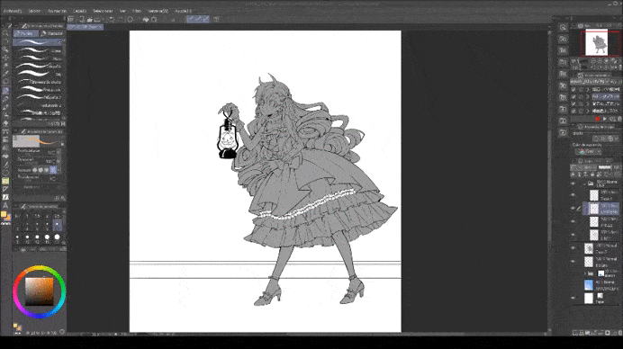
The next thing will be to color it.
Color - Background
Now that we have the base color for the entire illustration, it's time to work on the background. (And I also changed the color of the Linework, now it is dark brown)
An easy way to design ornate walls is with rectangles, outlines, and decorating brushes.
For example, (I'll do it on a separate canvas for better viewing) draw a series of rectangles, one inside the other. (You can use the [Shape-> Rectangle] or [Ruler-> Shape ruler] tool, whichever is more comfortable for you). Then trace all the diagonals to give it a sense of depth.
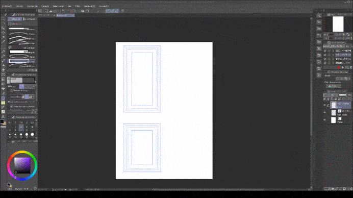
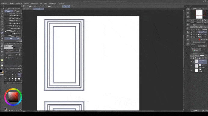
It's basically 3-4 rectangles, one inside the other:
Each of those rectangles must have its own offset, like this:
Now it only remains to join the diagonals of each frame and color:
(*) We are only making 1 section of the wall because then we can copy and paste the design in the background.
Here's the fun part: embellishing
With [Ruler-> Figure ruler] we trace the shape of the frame, select the brush and let the magic emerge.
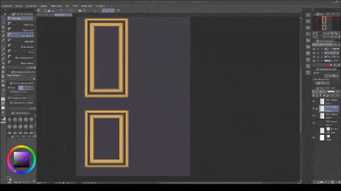
You can make as many designs as there are brushes. Once you have decided on your design, copy and paste the layers to your illustration. Mine was like this:
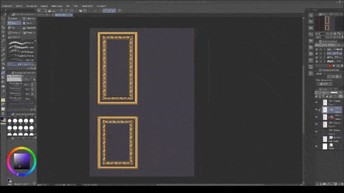
And we copy and paste the wall design to fill in the sequence:
These are the brushes that could help you:
I have also uploaded the wall model I created in this illustration to ASSETS, in case you want to use the same design:
Color - Gothic Lolita Costume
We will continue with Essie's wardrobe. All we have to do is fill the dress with a lot of lace and accessories, something typical of gothic lolitas. You can help you with as many references as you like.
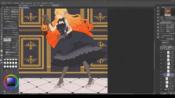
I also added pearls in the wardrobe and as necklaces to make the design more ostentatious.

These are the brushes used previously:
Only the veil remains, I will draw it on a new layer, above the Linework of the character.
Then, in a "Multiply" layer we color the veil:
Next, from the Materials folder, we select the lace texture that we like and drag to the drawing.
Then, on a clipping layer, scale the image if necessary:
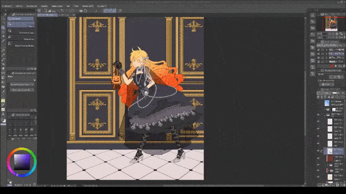
Color - Light and Shadow
The base of the illustration is ready for the shadows.
In anime the shadows are simple and flat. The easiest method is to shade with grayish blue (or reddish depending on the illustration) in a new clipping layer "Multiply", set the opacity between 40% -50%.
For the light, I use yellow-orange color, and set the layer to "Add (brightness)" with 30% -40% opacity.
Also, special effects are very common in anime-like illustrations. It may be something "extra" but use them whenever you can! gives the magic touch!
It will look like shiny dust!
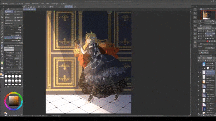
Now, let's combine the background layers and in [Filter-> Blur-> Gaussian Blur], we blur the background.

The further away the background is, the more blur you should apply. Between 20-40pts more or less.
Since the wall is close to our character, only apply 20 blur points.
Final steps
Our illustration is almost ready! It only remains to combine all the layers and make 2 copies of it.
With the layer that is on top of the rest, we will blur again. The more you blur, the more "magical" or "brilliant" it will turn out.
Finally, we set the unfocused layer to "Hard Light" and change the opacity to about 50-60%.
(*) Optional: In [Edit-> Tonal correction-> Color balance] you can edit the colors a bit.
And ready!
Hope this tutorial helped you understand how to design gothic ornament faster and understand how to make anime style illustrations easily!
Thanks so much for reading and Happy Halloween in advance !!
I will attach some of my social networks in case you are interested in seeing more of my drawings!
Users who liked this post


Comment